The Logo
Rock Paper Scissors needs an elegant logo that still feels modern. I explored dozens of options and eventually narrowed it down to the following four:

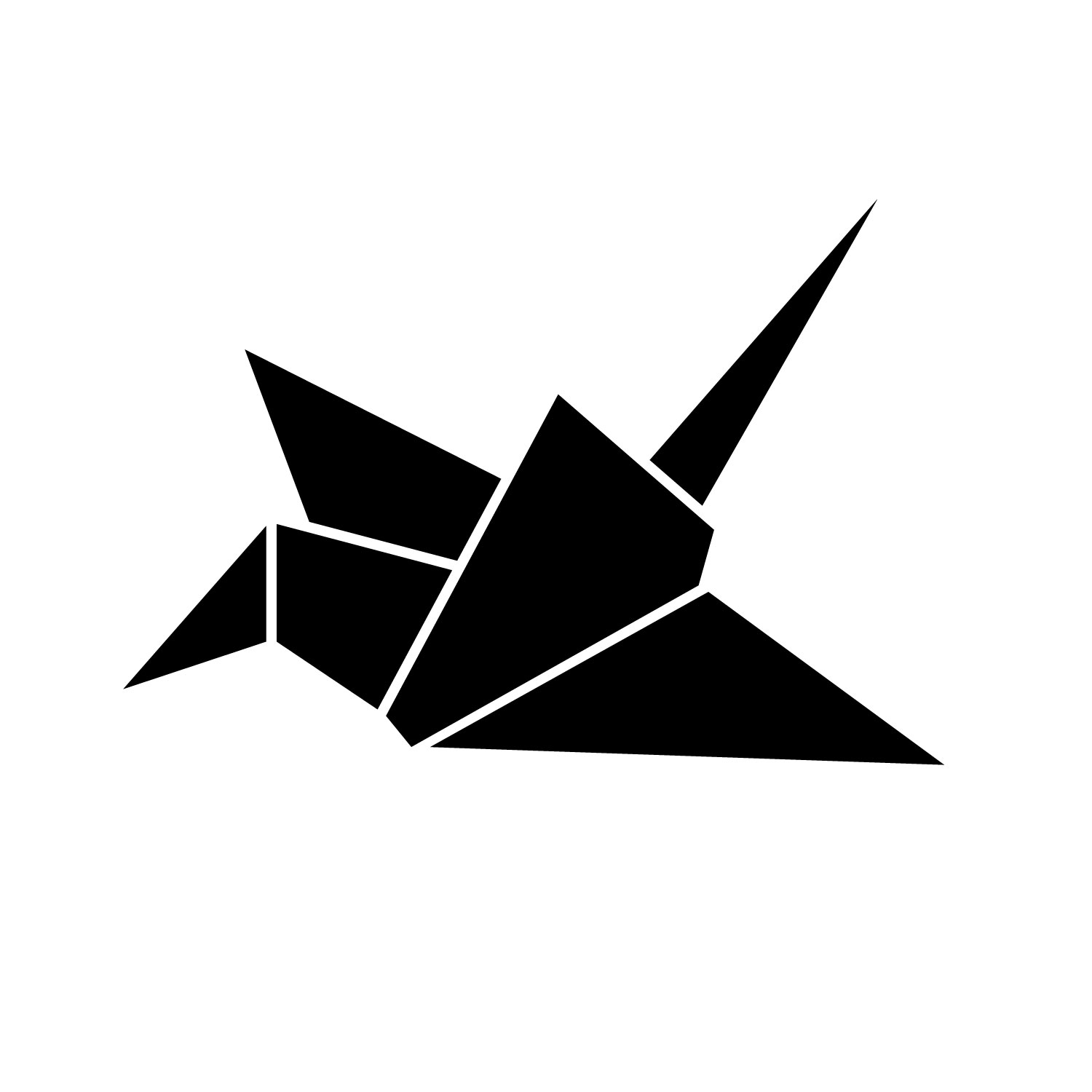
Ultimately, I moved forward with the paper crane logo because it’s elegant, is made of paper (Rock Paper Scissors’s main product), and stands for creativity, craft, and the process of making.
Identity Package
Rock Paper Scissors needs a letterhead, envelope, and business cards. All should be elegant, subtle, and reminiscent of paper and stationery. To accomplish the latter, I put a thin stroke around every element and emphasized the rectangular shapes. I also chose a subtle color palette of white, cream, and royal blue.
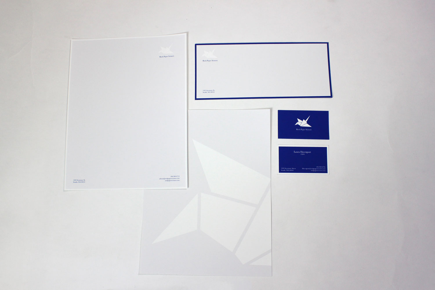
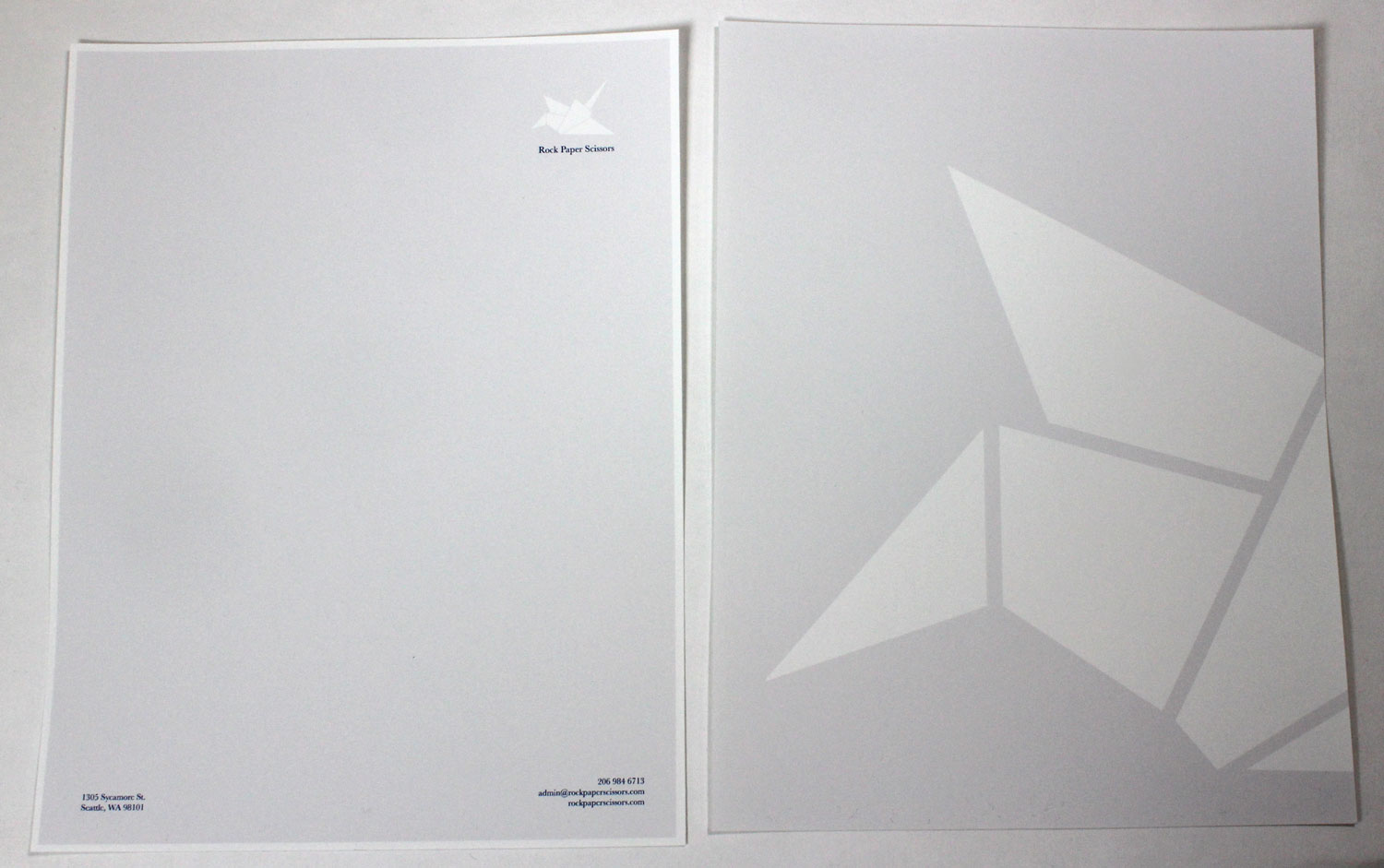
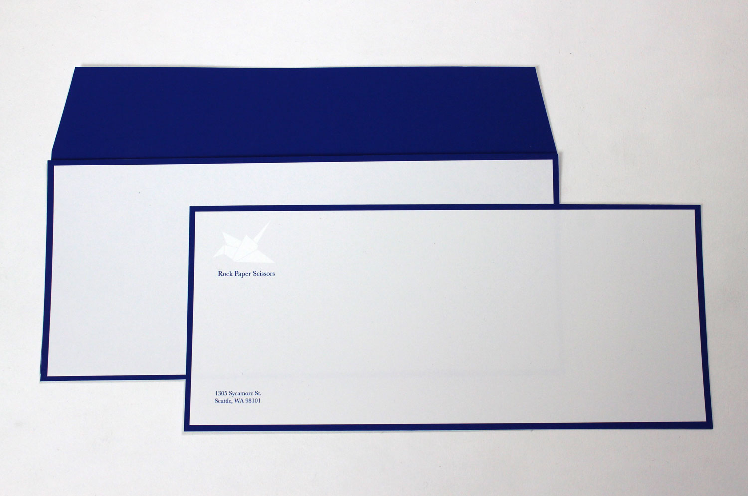
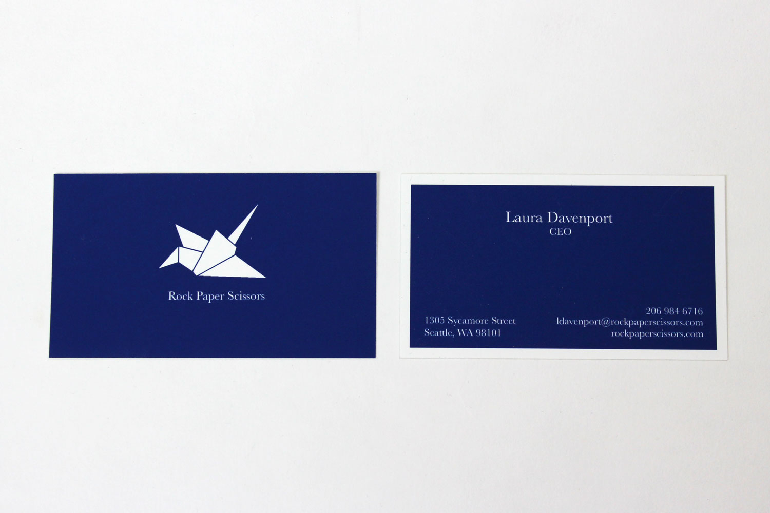
Because the logo for Rock Paper Scissors is an origami crane, it was decided that the company would sell origami paper in sets of ten sheets. Wrapped around each pack would be a band with the company’s identity, information, and address.


Website
Additionally, the company needs a modern, responsive website that also serves as an online store. It should also fit in with their overall identity system, using the same colors and fonts. I developed the front-end of the website.
See the live site (front-end only)
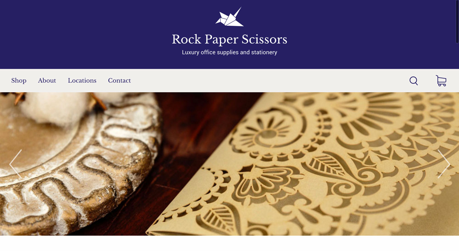
The navigation menu of course features the logo and name of the company. If the user hovers over the crane logo, it tilts to suggest flight. Since this is an online store, users should be able to search for specific products. When a user clicks on the search icon, a rectangular search box slides out to the left and pushes the search icon with it.
The desktop version of the homepage also features a slider showing Rock Paper Scissors products outside of the store environment to give customers an idea of what these products look like in use.
The mobile version of the site features an animated burger menu and a more accessible “Locations” link since most mobile users will immediately want to view store locations.
When users scroll down, they see a free shipping advertisement and the various categories of products the store offers. If they click on a category, they are taken to the shop page for products within that category. If they click “View complete collection,” they can see all of the products that Rock Paper Scissors has to offer.

When users scroll down further, they see information about Rock Paper Scissors as a company.

Because the Rock Paper Scissors logo is an origami crane and the store sells origami paper, I thought it would be fun to include a video tutorial on how to fold origami cranes so customers can create their very own Rock Paper Scissors crane.

Further down the page is a location section. The site automatically shows the user the store closest to them, but it also shows a custom Google map displaying all the stores nationwide. If the user clicks on one of the map markers, the address of that store is displayed.

Next comes the contact form, where customers can get in touch with the company. The form features CSS animations, so when the user clicks on a field, the label moves up to allow room for typing. The form also features complete validation, as well as a thank-you page upon submission.

The footer contains links to the company’s various social media profiles as well as a form for the user to join the company’s email list to receive news and special offers.

On the general products shop page (not category specific), the products are highlighted by deleting the backgrounds from the pictures. Users can also click the heart icon to save the product to their favorites.

The individual product pages feature a large photo of the product, as well as a name, price, and description. There is also a function to add to a user’s favorites and to share the product on social media.

At the bottom of each product’s page is a recommended section. The recommended products would be similar to the main product on the page, as well as products that the company is trying to push.
