Cover and Masthead
I wanted the masthead to be a symbol of everything Invest represents: young people investing to grow their wealth. I decided early on in the sketching process that the final masthead would have to be unique, eyecatching, and highly customized to give off a youthful vibe. Ultimately, I chose to portray the rise and fall of the market with type.
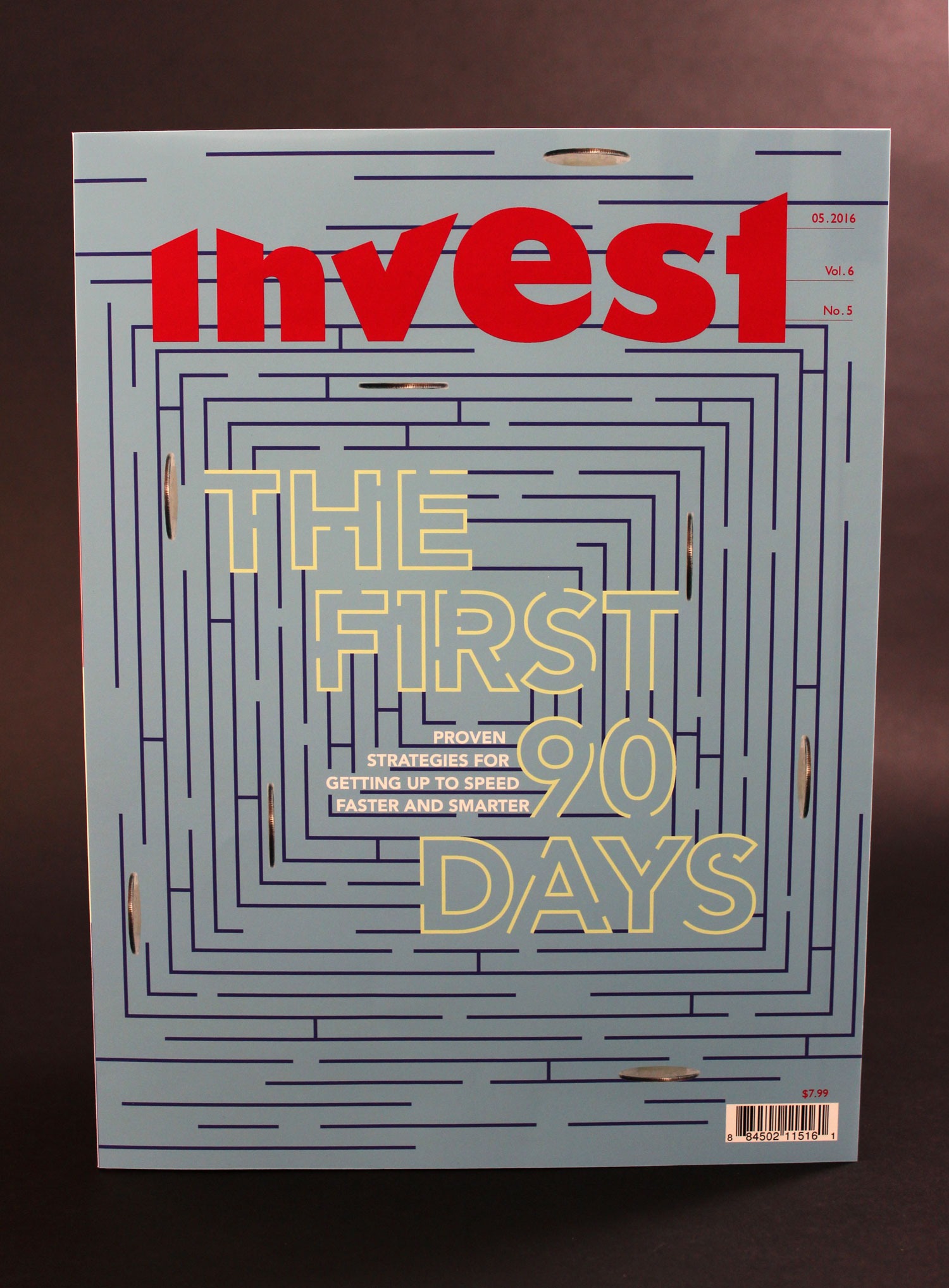
The article I chose to feature on the cover is the introduction of Michael Watkins’s book, The First 90 Days. In it, he articulates why the first ninety days of a new job can set you for either success or failure. I wanted the cover to convey how challenging it is to navigate your way through a new job, so I decided to illustrate a maze. The coins act both as road blocks to success and as symbols of the main goal of a job. The maze has a solution, so someone could sit down and solve it if they wanted to.

The structure of the stripes on the spine of the magazine will remain constant for all issues, but the colors will change. If someone were to collect the magazines and put them on a shelf, the spines would reveal a mosaic of colored rectangles.
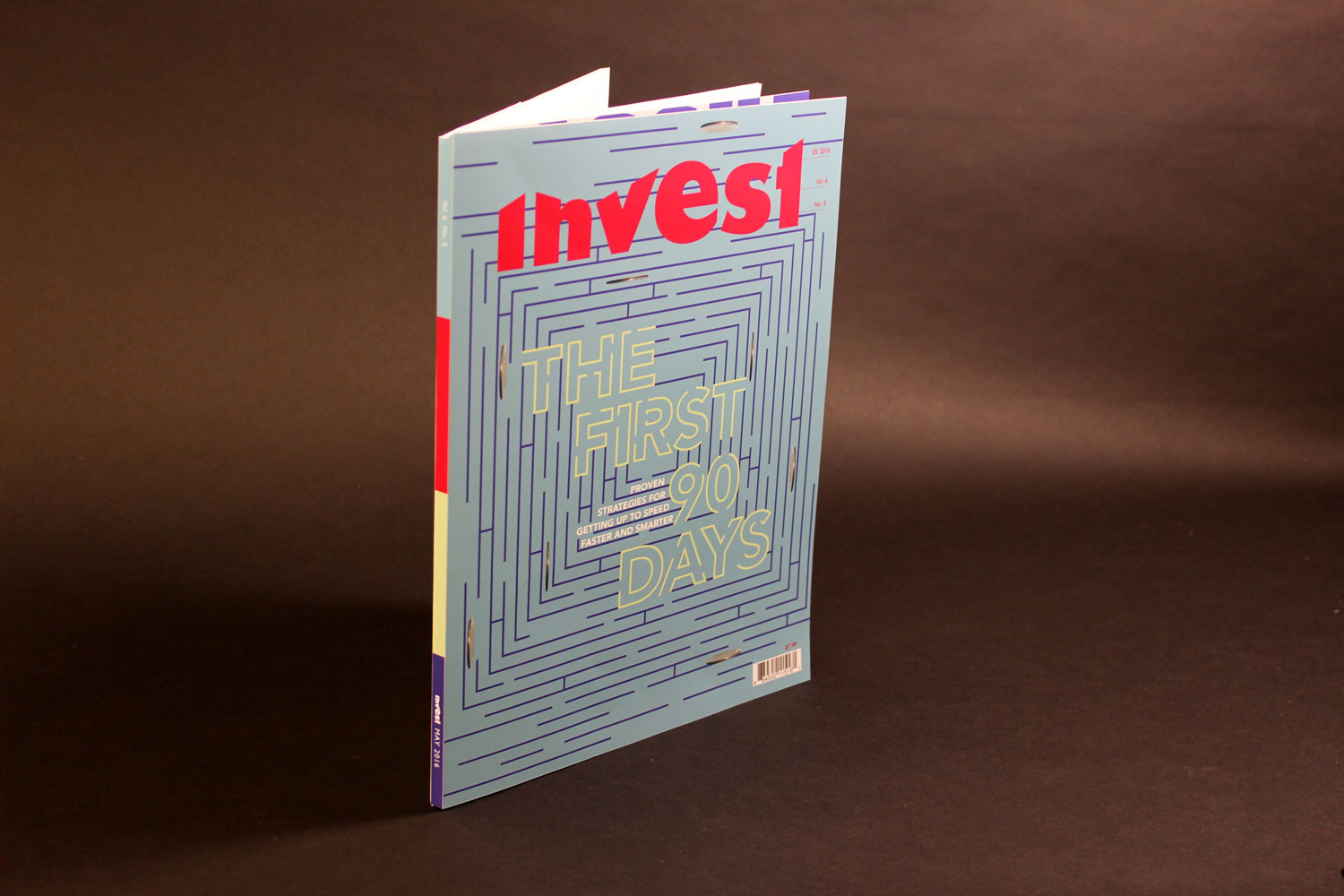
Because this is a financial magazine, I wanted to reference numerals, charts, and graphs as much as possible throughout the piece. Each masthead is a graph reflecting slowly-increasing wealth, complete with tick marks indicating the publication date, volume number, and issue number. These values are represented in the most numeric way possible, including the use of decimal points as separators.


Table of Contents
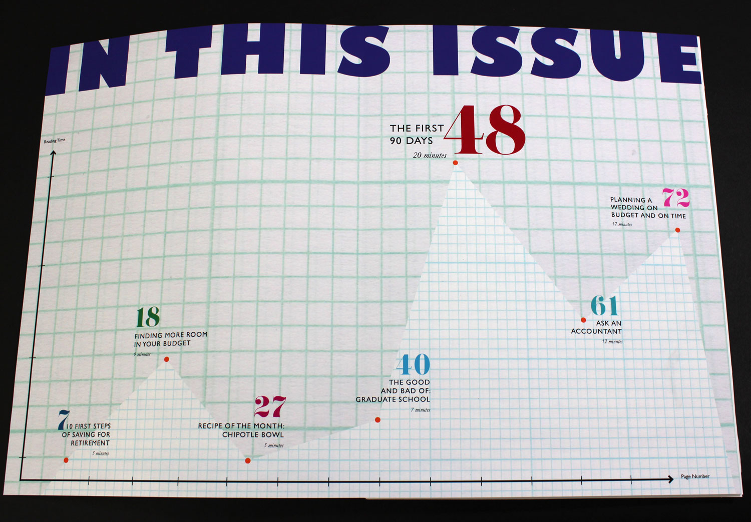
As is appropriate for a financial magazine filled with charts and numbers, the table of contents is a large graph. The x-axis represents page number, and the y-axis represents reading time. This allows readers to select articles based on how much time they have to read them. The smaller-sized graph paper also lines up with the values of the graph: each square horizontally coincides with one page, while every two squares vertically signify one minute of reading time.


First Spread
This is the first spread of the feature article. I wanted it to center around a huge, gorgeous illustration with only a small amount of text. The illustration represents the structure that is a person’s career: built with dead-ends and plenty of opportunities to make a misstep.
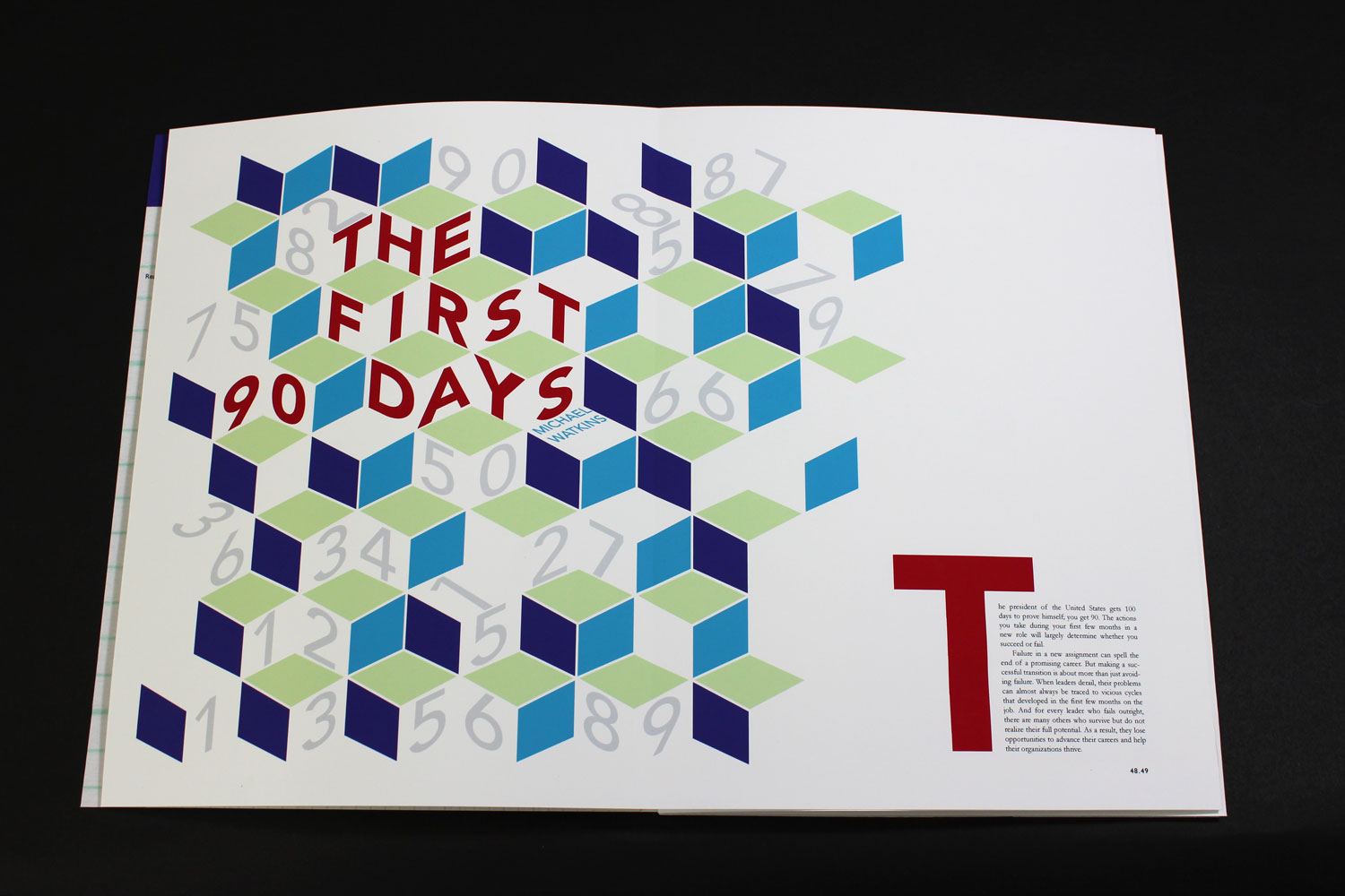

The page numbers at the bottom signify the page numbers on both sides of the spread, separated by a decimal point.

Second Spread
This second spread of the feature article contains the bulk of the text. The structure of the text is reminiscent of a bar graph, and the parallel lines created by justified type naturally fit with a magazine full of charts and graphs. I also wanted to incorporate the block structure from the previous spread into this one, so I arranged them to be falling into place at the bottom of the right page.
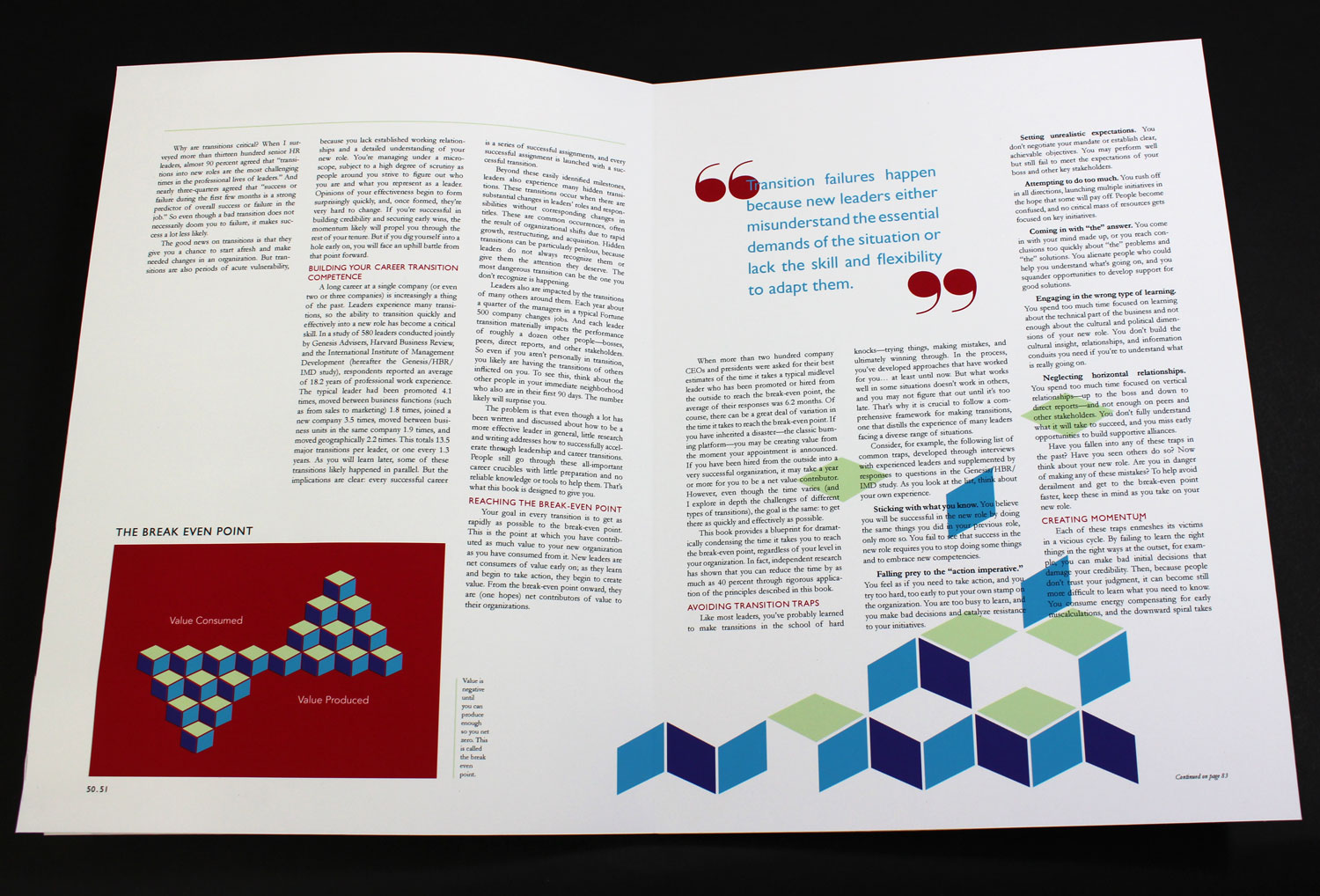


This chart illustrates one of the main concepts of Watkins’s article. When you start at a new company, you consume value. It’s not until a couple months later that you begin to add value to your company, and Watkins calls the point where you have added as much value as you have consumed “the break-even point.” Again, the chart references the block structure of the previous spread.

