Identity
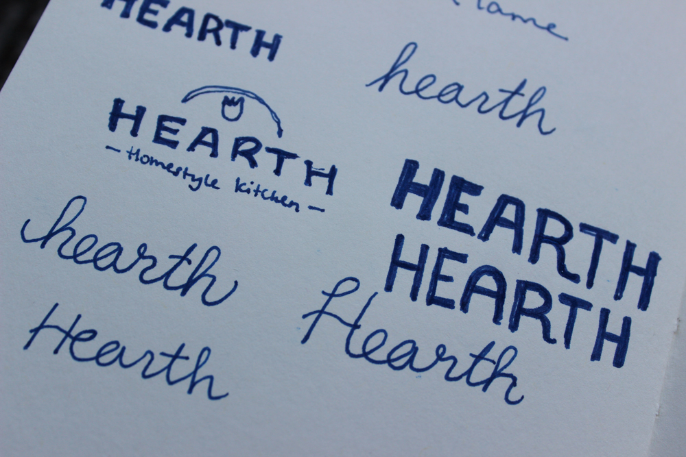
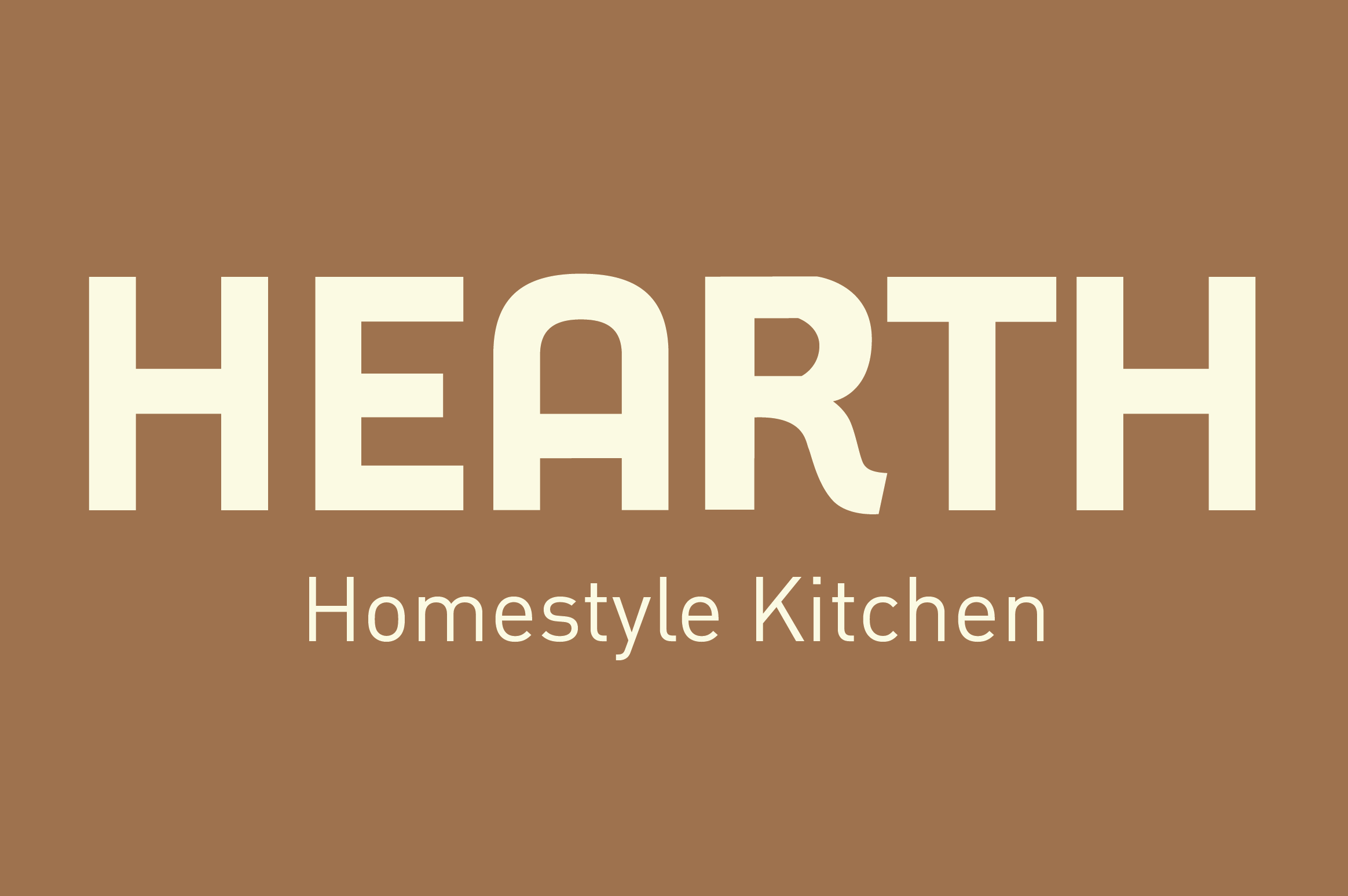
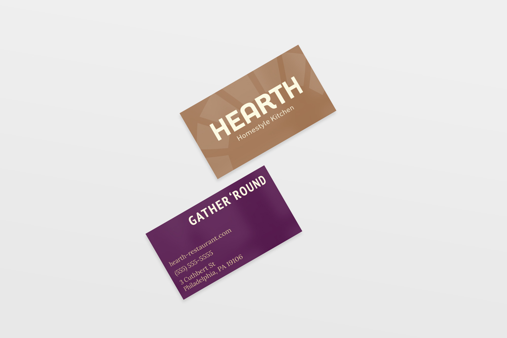
The identity was the hardest part for me, and I did a lot of sketching. In the end though, I came out with something I’m quite happy with. I couldn’t find a typeface that matched my sketches, so the logo is custom typography.
The Website
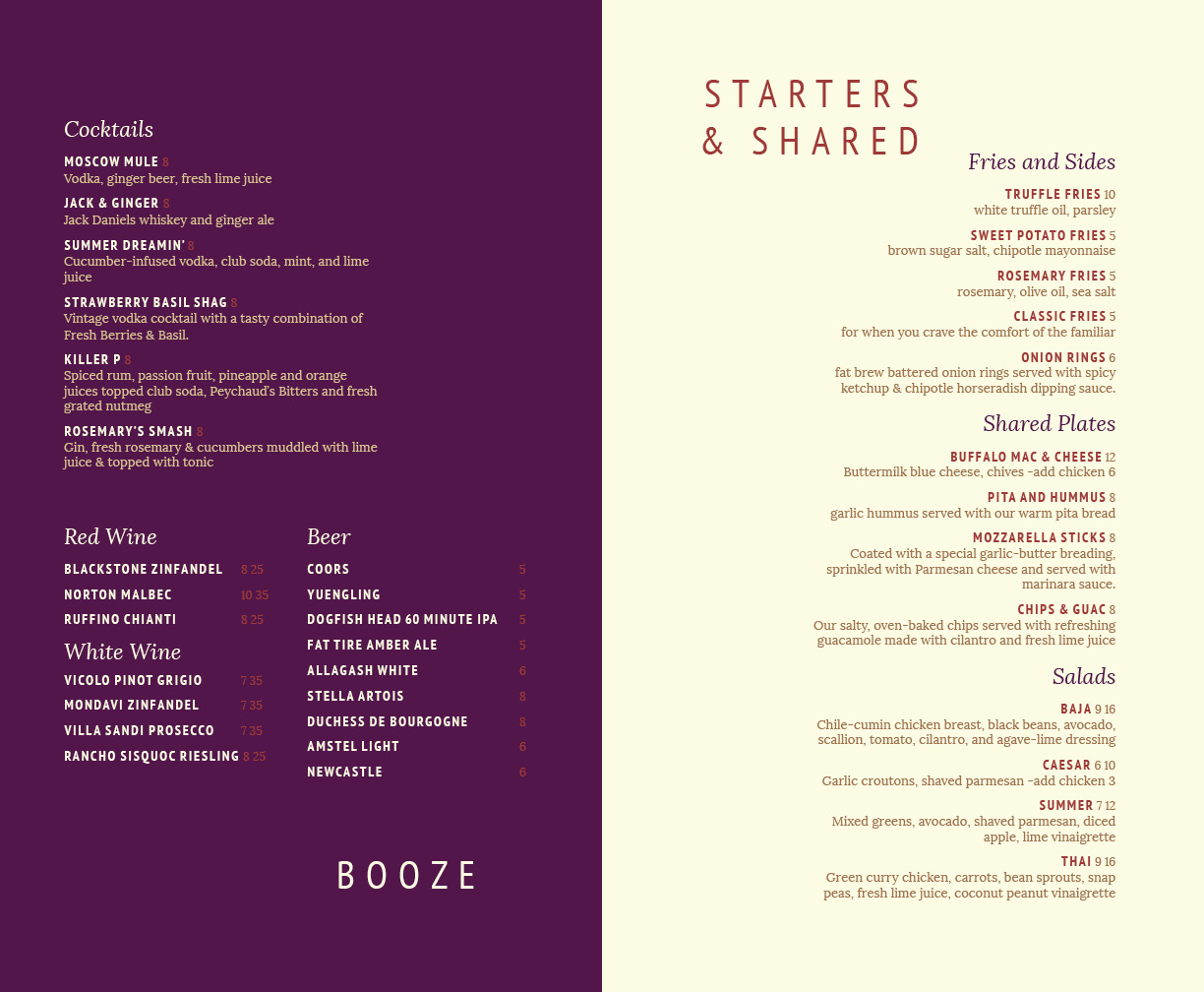
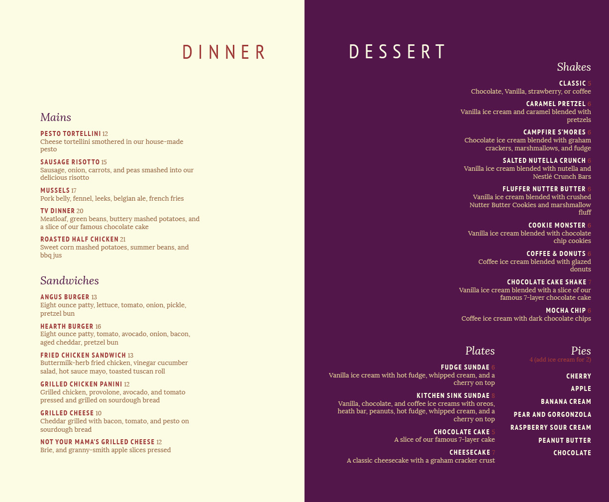
A restaurant like Hearth needs a gorgeous, responsive website that allows users to view their menu, hours of operation, and address, as well as get a feel for what kind of restaurant Hearth is. I decided to make the website one long page with multiple sections. This was also my first time using Javascript and JQuery, which I used to make the sticky main navigation as well as the tabbed menu navigation.
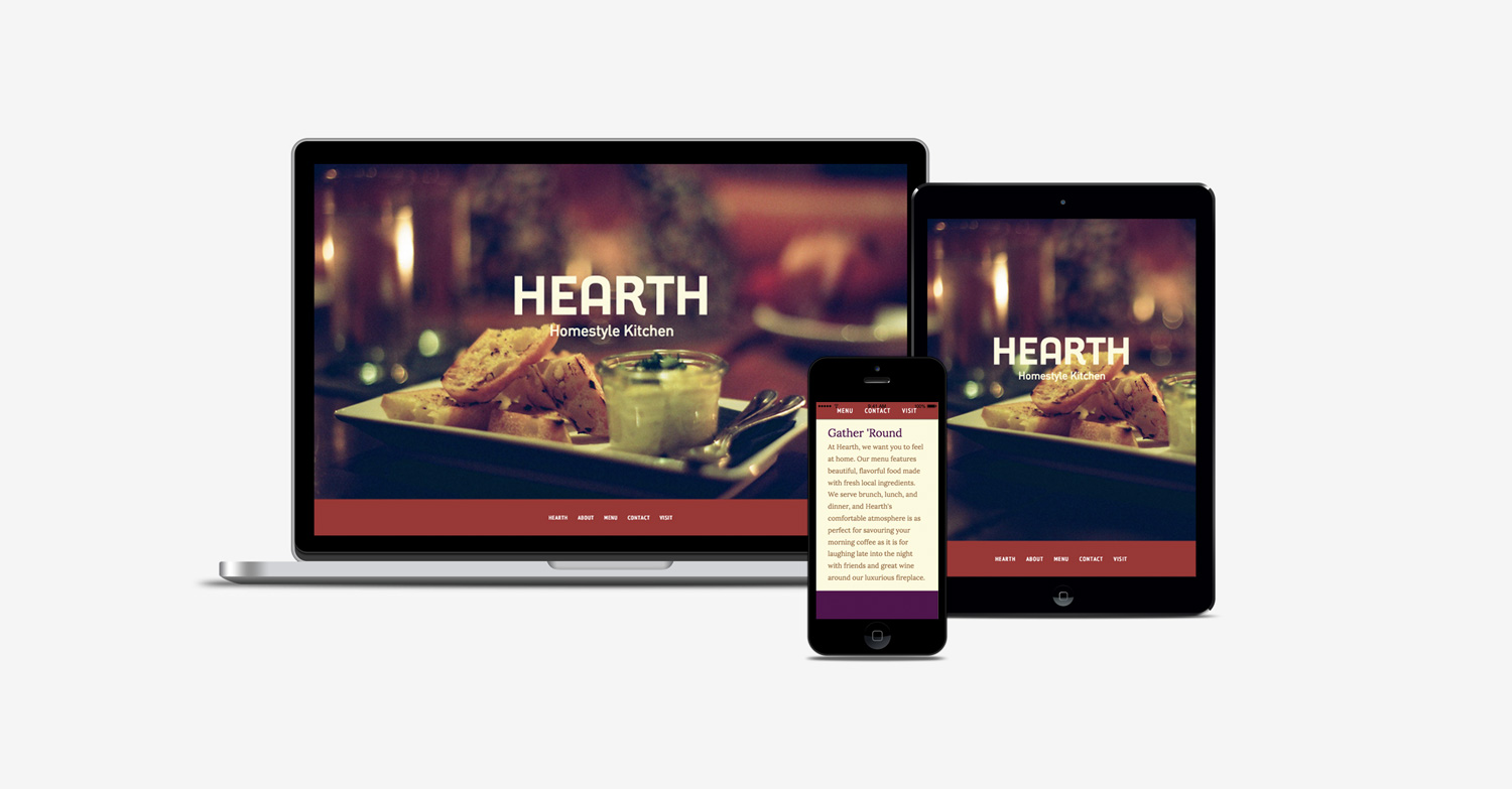
I knew that most of the users who visit a restaurant site are looking for basic information like hours and the address, so I wanted to make that as accessible as possible. I decided the footer was the best place (instead of hidden inside a Contact page) and made it additionally accessible through an internal ‘visit’ link. The restaurant would also want an easy way for people to join their mailing list and see their social media links, so I put those in the footer as well.

Menu

