Chicago: Rise High

Crafting a unique travel campaign for a popular city

August, 2015

Design, Illustration

This series was the final for my Computer Imaging class. The assignment was to create a travel poster, postcard, stamp, and souvenir for a city of our choice. Additionally, we had to draw inspiration from an artist that was randomly assigned to us (mine was Roy Lichtenstein). Chicago is a beautiful and intricate city that often feels monumental, especially the first time you visit. In my research, I noticed that Chicago travel posters normally featured Lake Michigan or Cloud Gate, which are both beautiful, but what I love most about the city is the height I see all around me (in fact, the first skyscraper was built in Chicago). I decided to focus on that.

Inspiration

Roy Lichtenstein

Roy Lichtenstein
Roy Lichtenstein's "Oh Jeff... I Love You Too... But..." (1964)
  • Primary color palette
  • Heavy use of pattern
  • Thick contour lines
  • Flat tones

Chicago Flag

The Chicago flag is a huge part of the visual culture of the city, and I knew immediately that I wanted the campaign to work with that rather than against it. I decided to use the same blue that's in the flag and to use the distinct, 5-pointed star as a prominent visual element.
Chicago poster
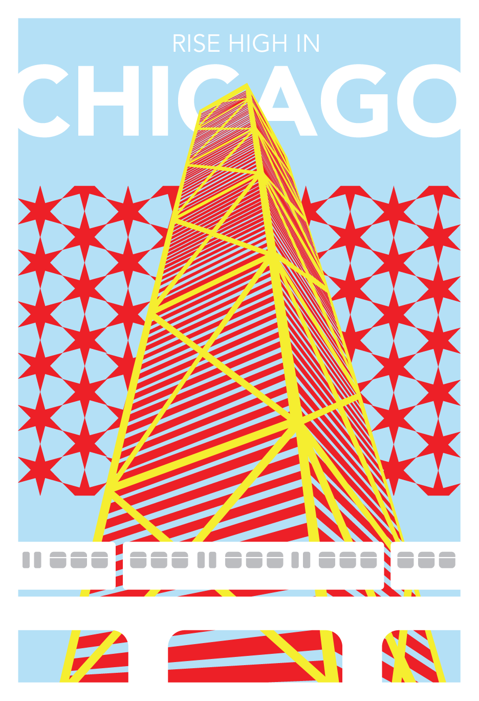
The poster (13" x 19") features the Hancock Center, the city's most recognizable skyscraper, and Chicago's unique elevated train, which gives the city a distinct look.
Chicago postcard
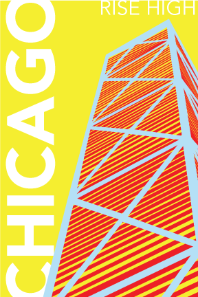
Postcard, 4" x 6"
Chicago stamp
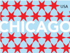
Stamp, 1.5" x 2"
Whole system of poster, postcard, stamp, and souvenir mounted
Entire system of poster, postcard, stamp, and keychain mounted on black museum board.