Cover
I wanted to create a fairly conservative cover, without it being boring. Because the publication was meant to feature type as much as possible, I constructed abstract mountains out of overlapping, textural type. I overlayed charcoal lines on top of the mountain and crumpled paper and scanned it in to give the cover a rougher sensibility. The final touch was adding color blocks to hint at the fact that the publication will contain photos of fall foliage.
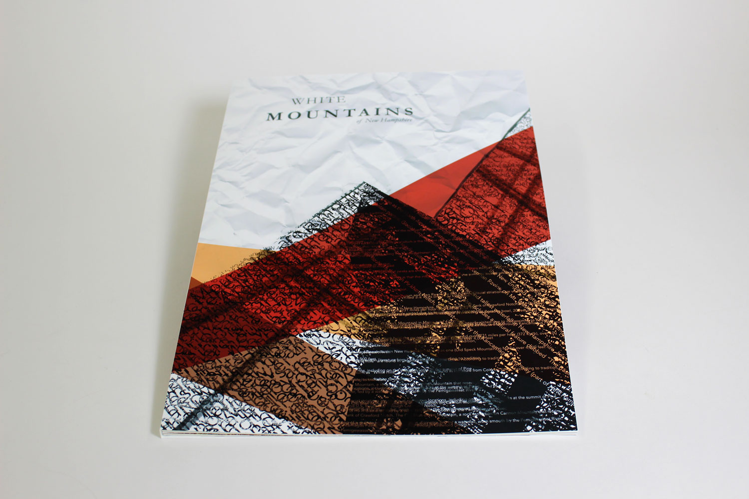
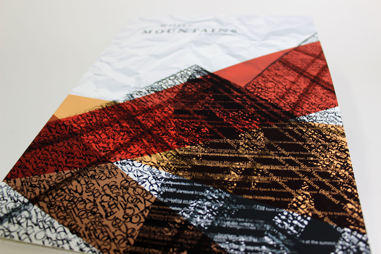
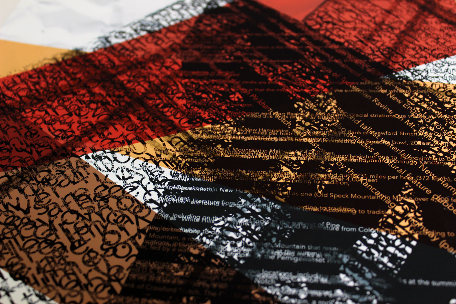
Table of Contents
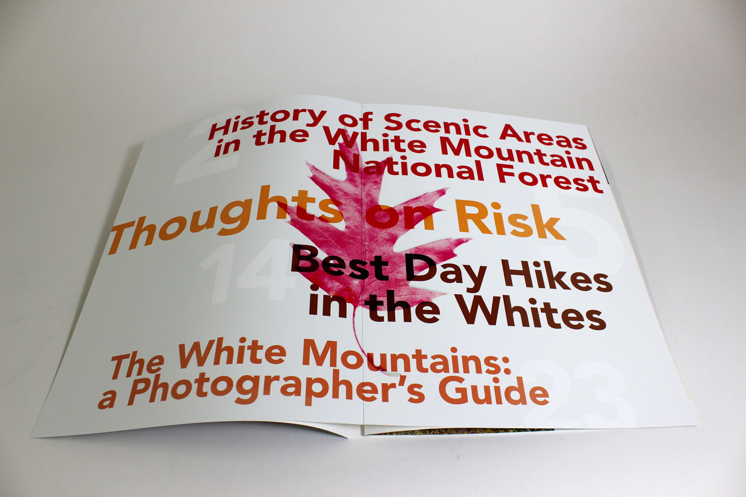
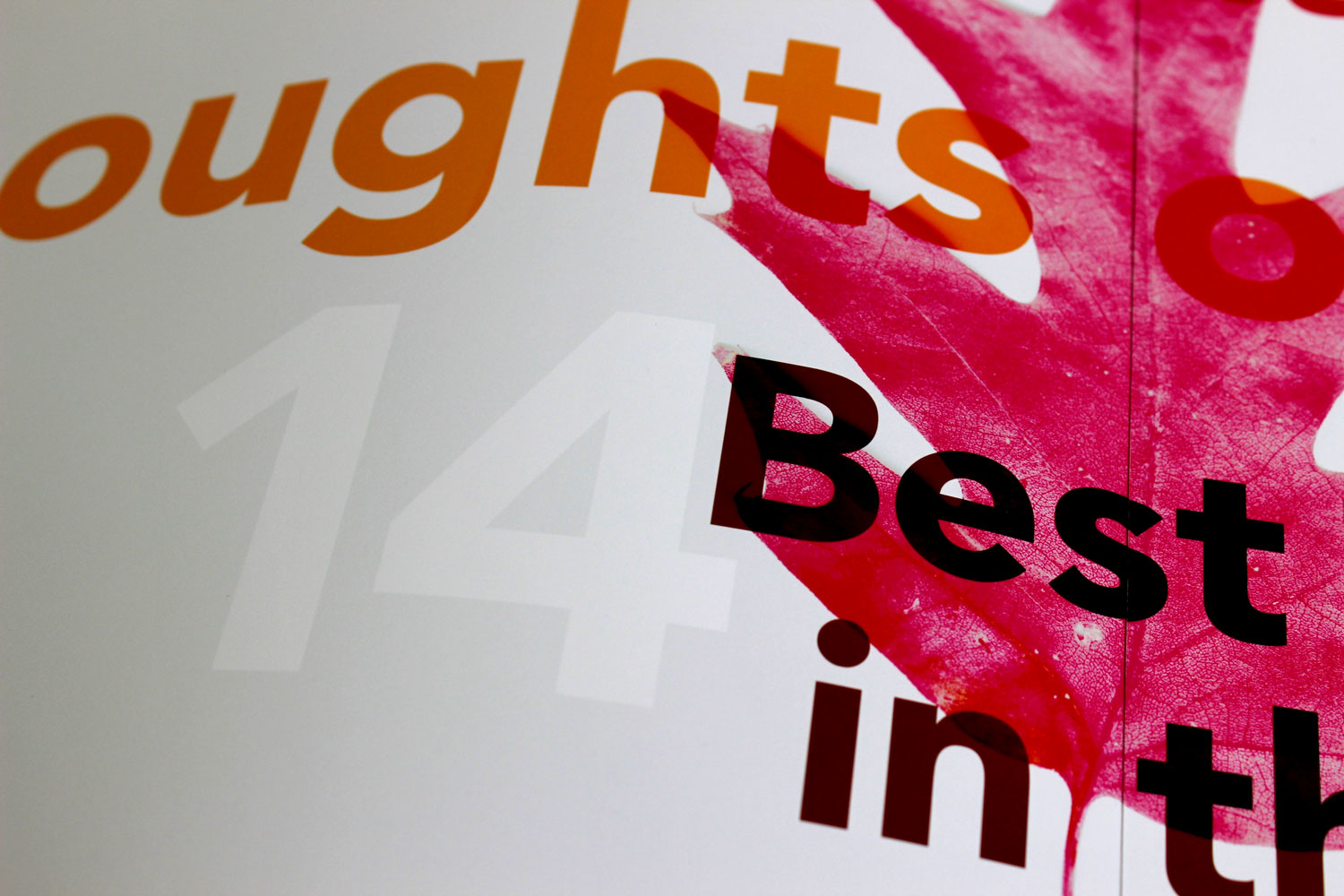
In contrast to the cover, I wanted the table of contents to emphasize color over form. The titles of the articles stand out due to their bright colors, while the leaf image represents the subject of the magazine on a spread otherwise devoid of context.
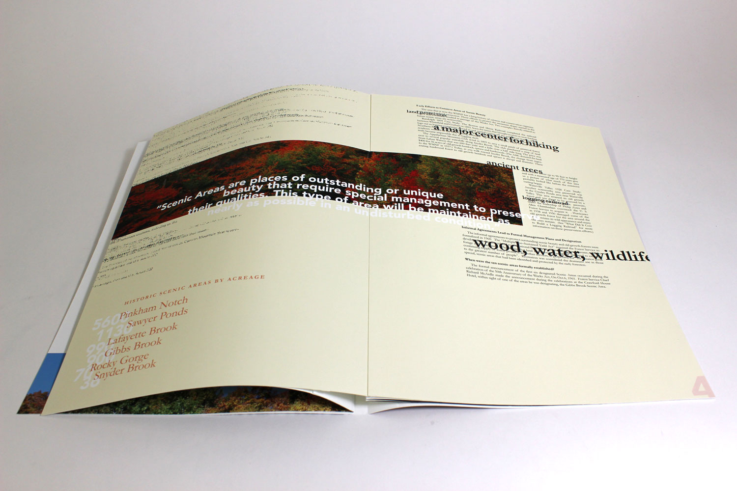
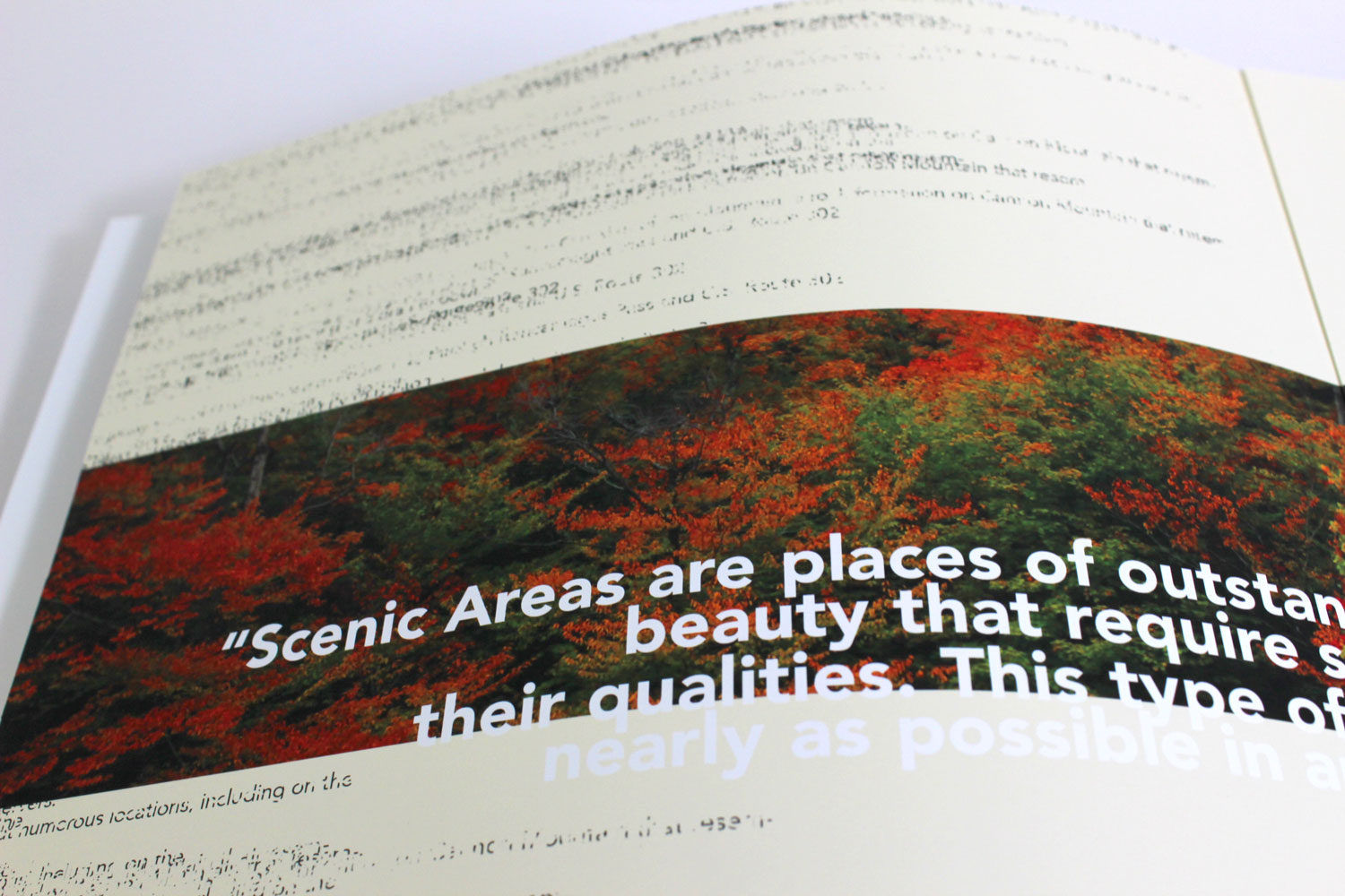
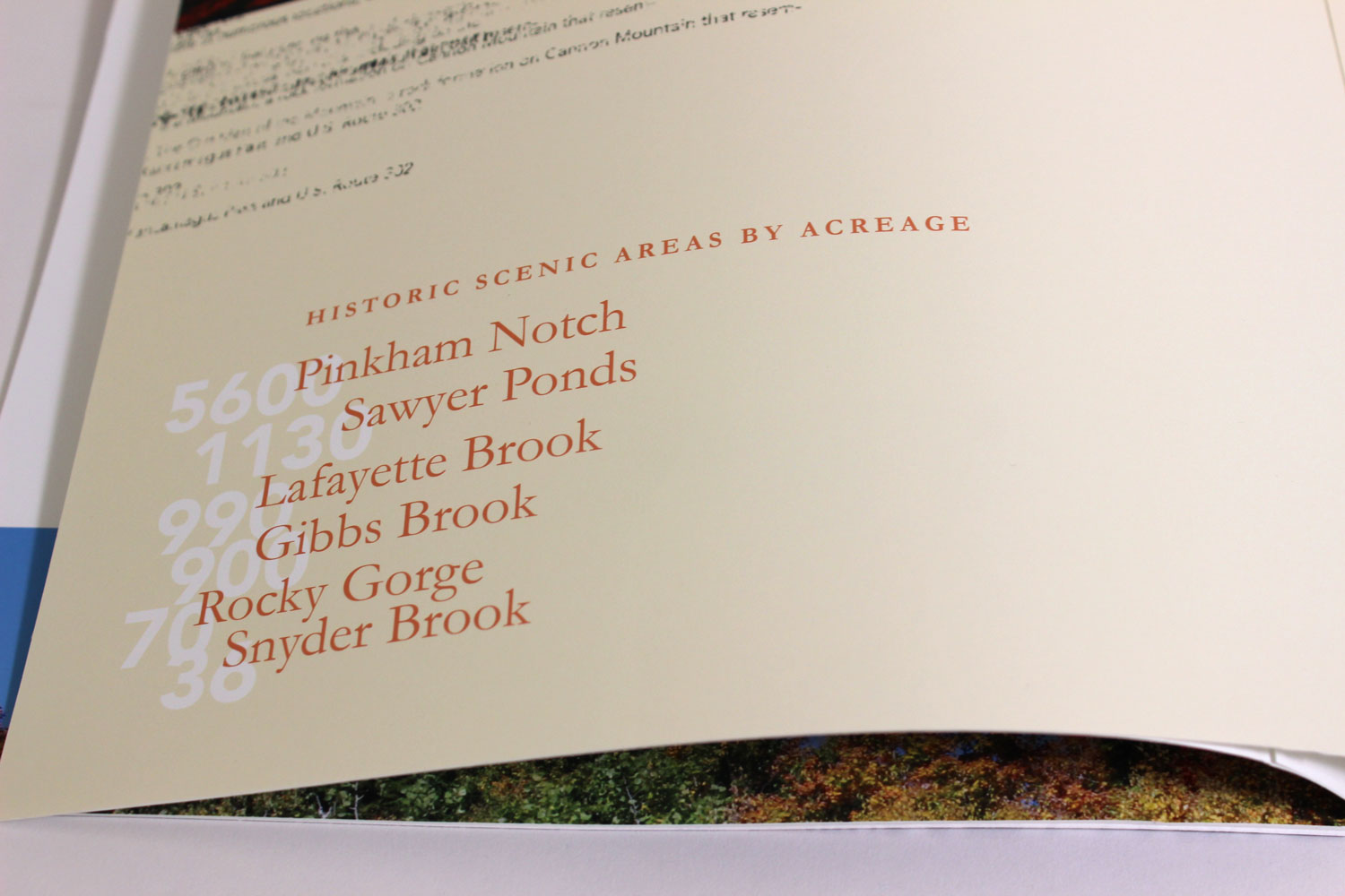
History of Scenic Areas in the White Mountains
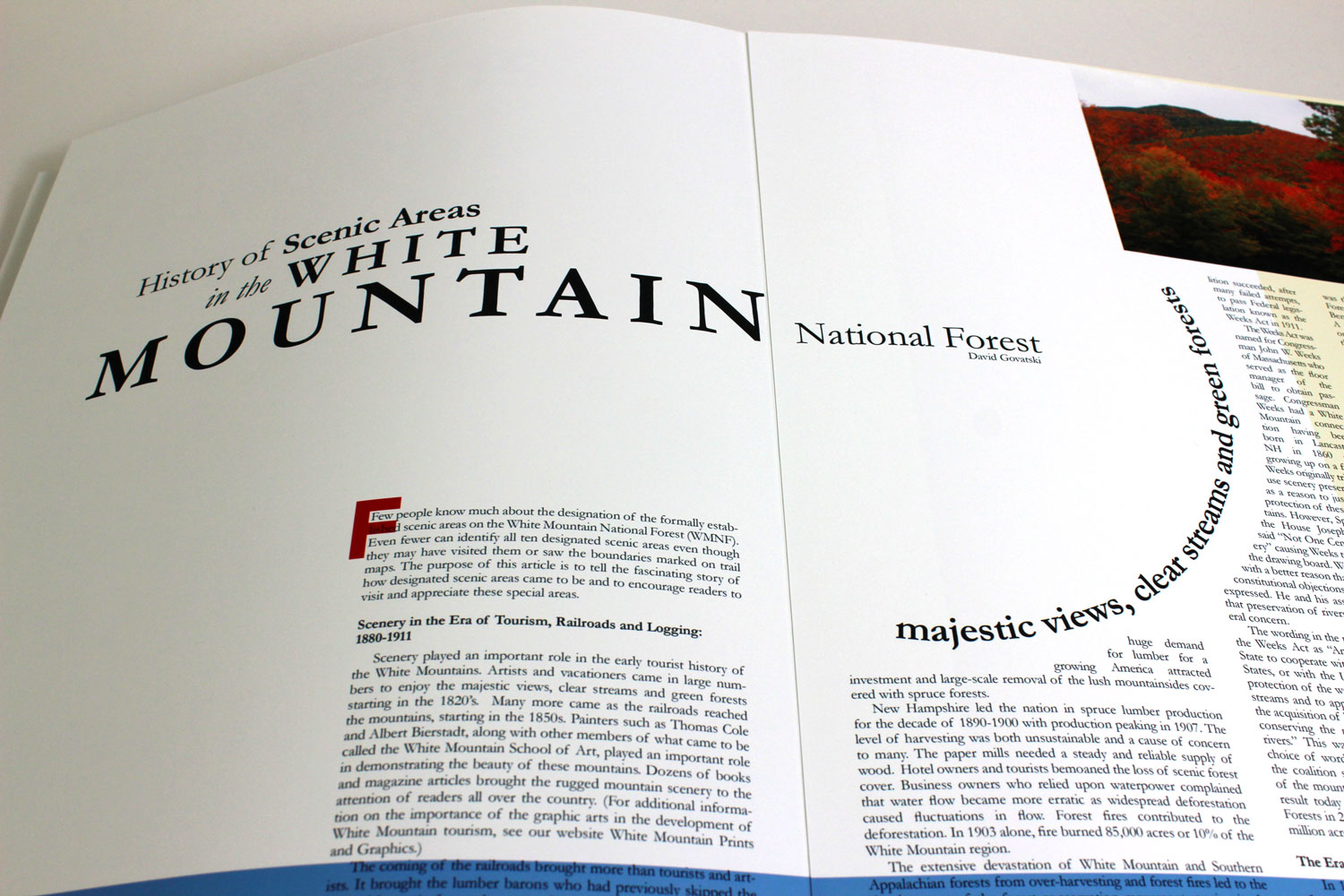
The text for the first article, written by David Govatski, details the history of the scenic areas of the White Mountains. Because of the subject matter, I wanted to take a more conservative approach with the typography and create a competent, legible spread with plenty of white space to give the viewer a sense of the vastness of the mountain range. Because the spread is so restrained, I wanted the photos to showcase the colors of the mountains.
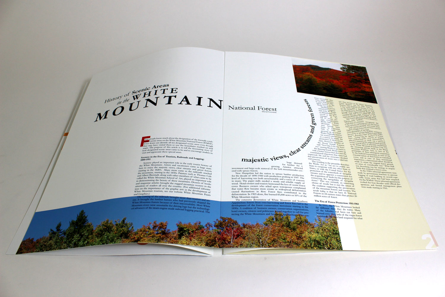
The second spread gets a little more experimental. The soft cream color provides a warmth to the page and allowed me to implement knock-out type. Again, the photo emphasizes color over form because we only see part of the trees. The texture in the background of the upper-left corner was created using very small, overlapping text in order to integrate the technique I used for the cover into the rest of the publication.
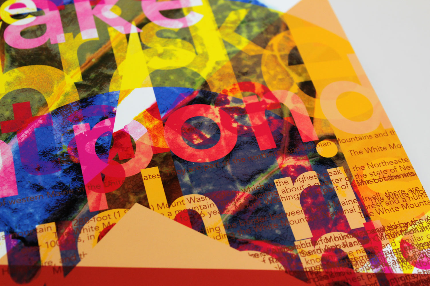
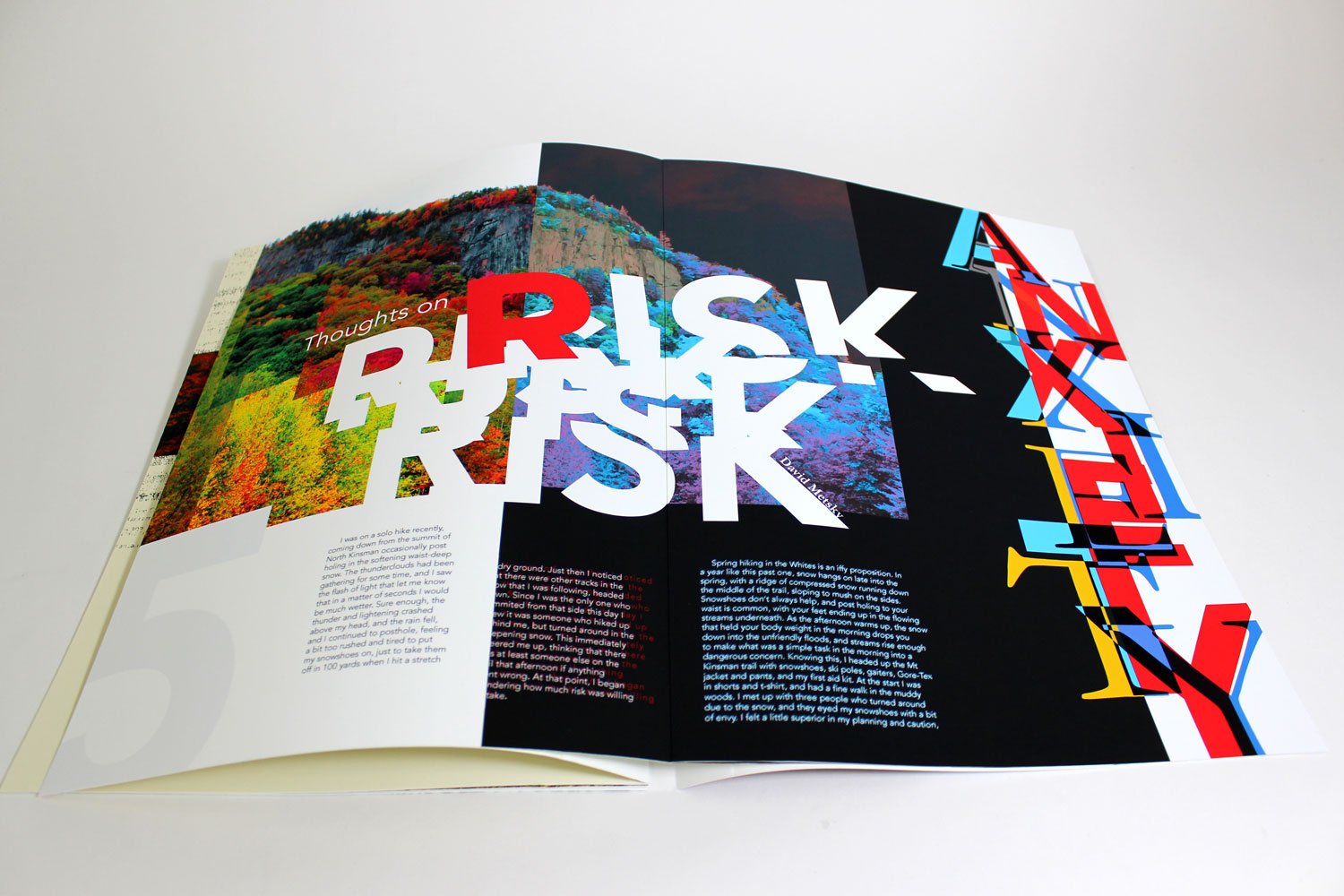
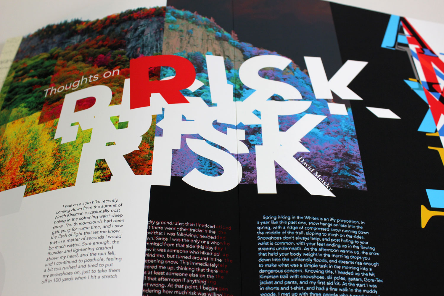
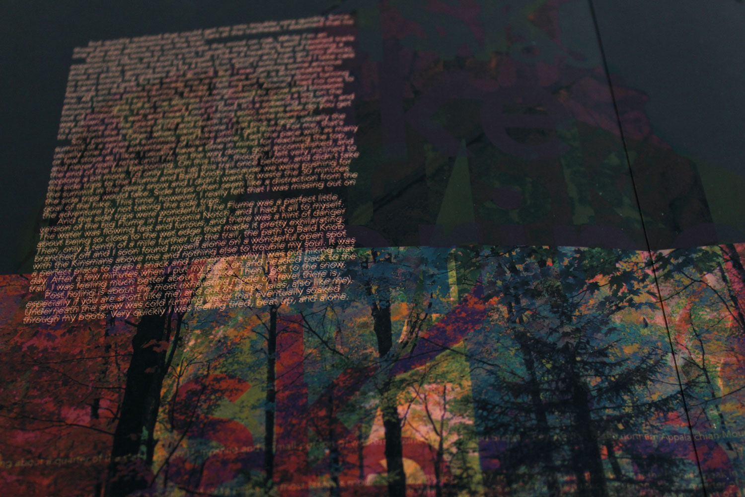
Thoughts on Risk
The second article of the publication is “Thoughts on Risk” by David Metsky. In it, he gives a first-person account of his dangerous solo hike in the White Mountains in early spring. The article emphasizes risk, anxiety, and danger, so I wanted to make the reader feel a sense of unease while looking at these spreads.
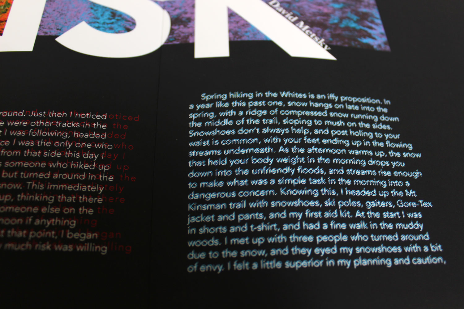
The use of the negative image creates an eerie feeling, and the large, overlapping type provides a sense of urgency. The text starts out legible, but gradually gets more difficult to read. By the final paragraph of the spread, the text is set in such a way to give the viewer a vibrating, uncomfortable sensation.
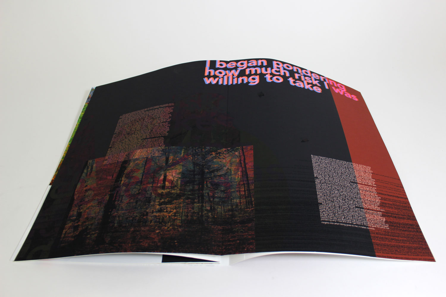
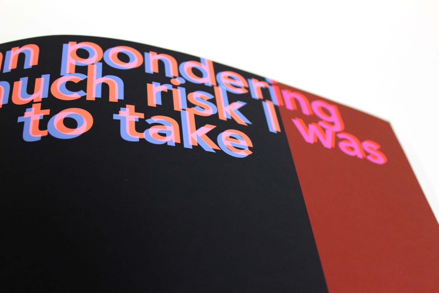
The final spread is the most experimental of the entire publication. Again, the text is pretty illegible, and would definitely give anyone who tries to read it for too long a headache. The main colors are dark and ominous, and the large, subtle, barely-visible text in the background on the left side is meant to make the viewer question if they are seeing something real or a trick of the light. Due to the subject matter, I manipulated the colors and elements of the spread to give off a hallucinatory effect. The pull quote, the only text that is clearly legible, still causes unease—both due to the content of the quotation itself as well as the vibrating colors it’s set in.
Back Cover
I created the back cover to be a sort of summary of the publication’s contents and represent the duality of the White Mountains. The mountainous forms from the front cover are present on the back, but they obscure a haphazard composition of type, bright color, and texture from various leaves.