Initial Research
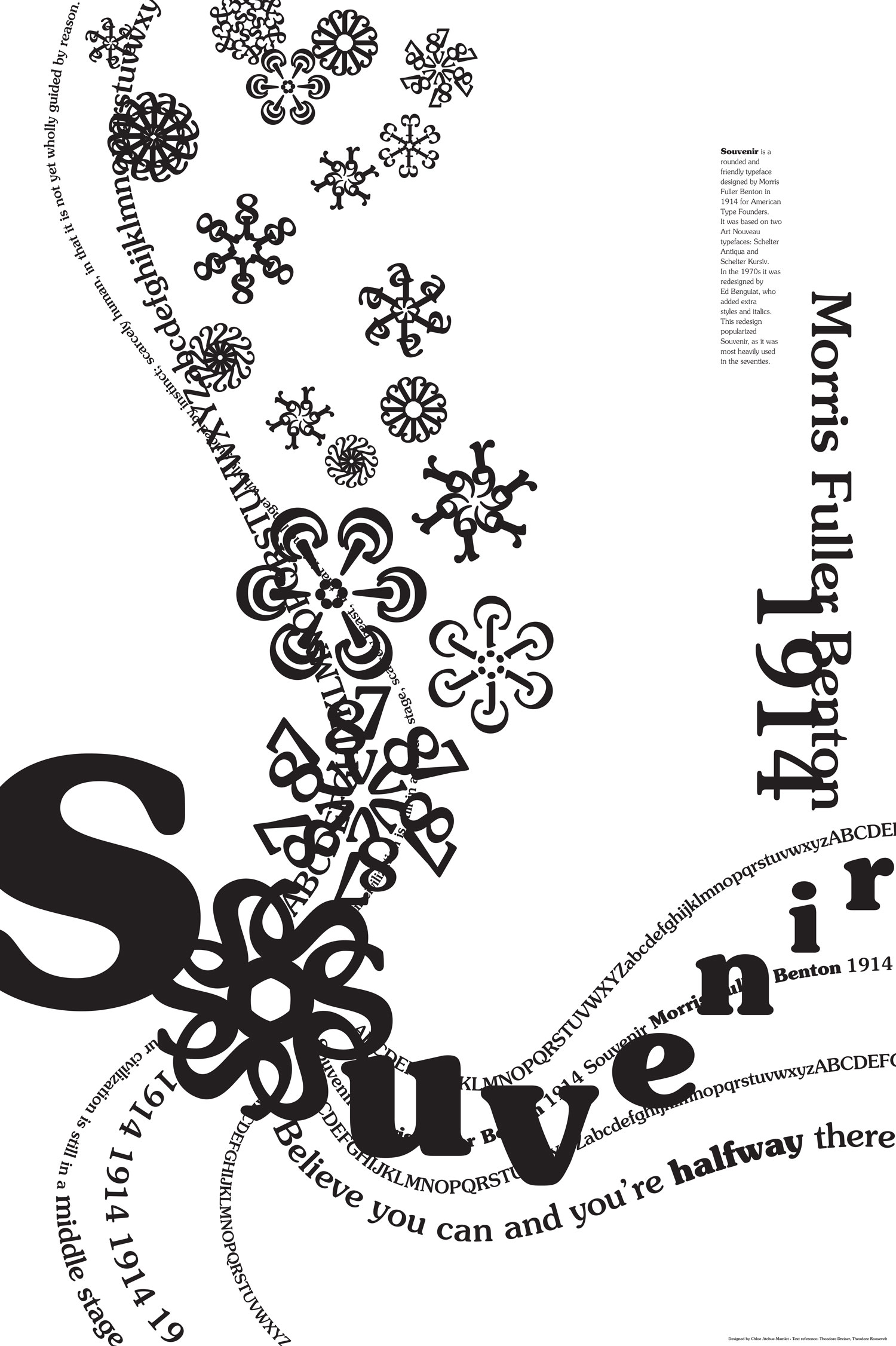
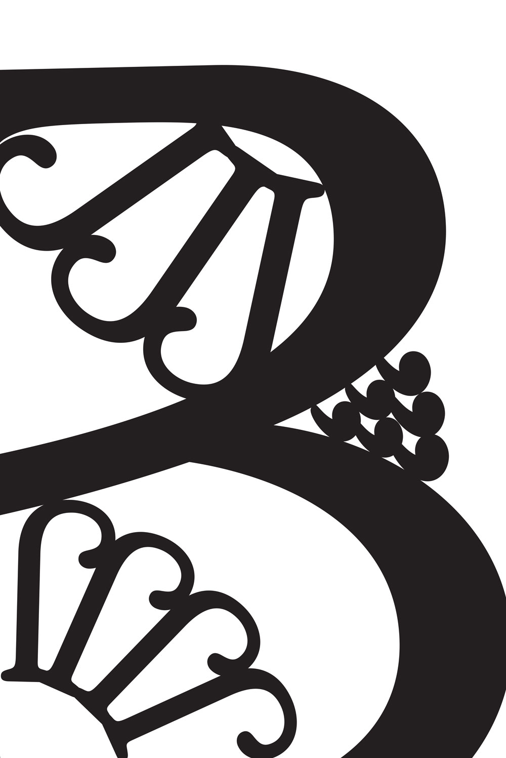
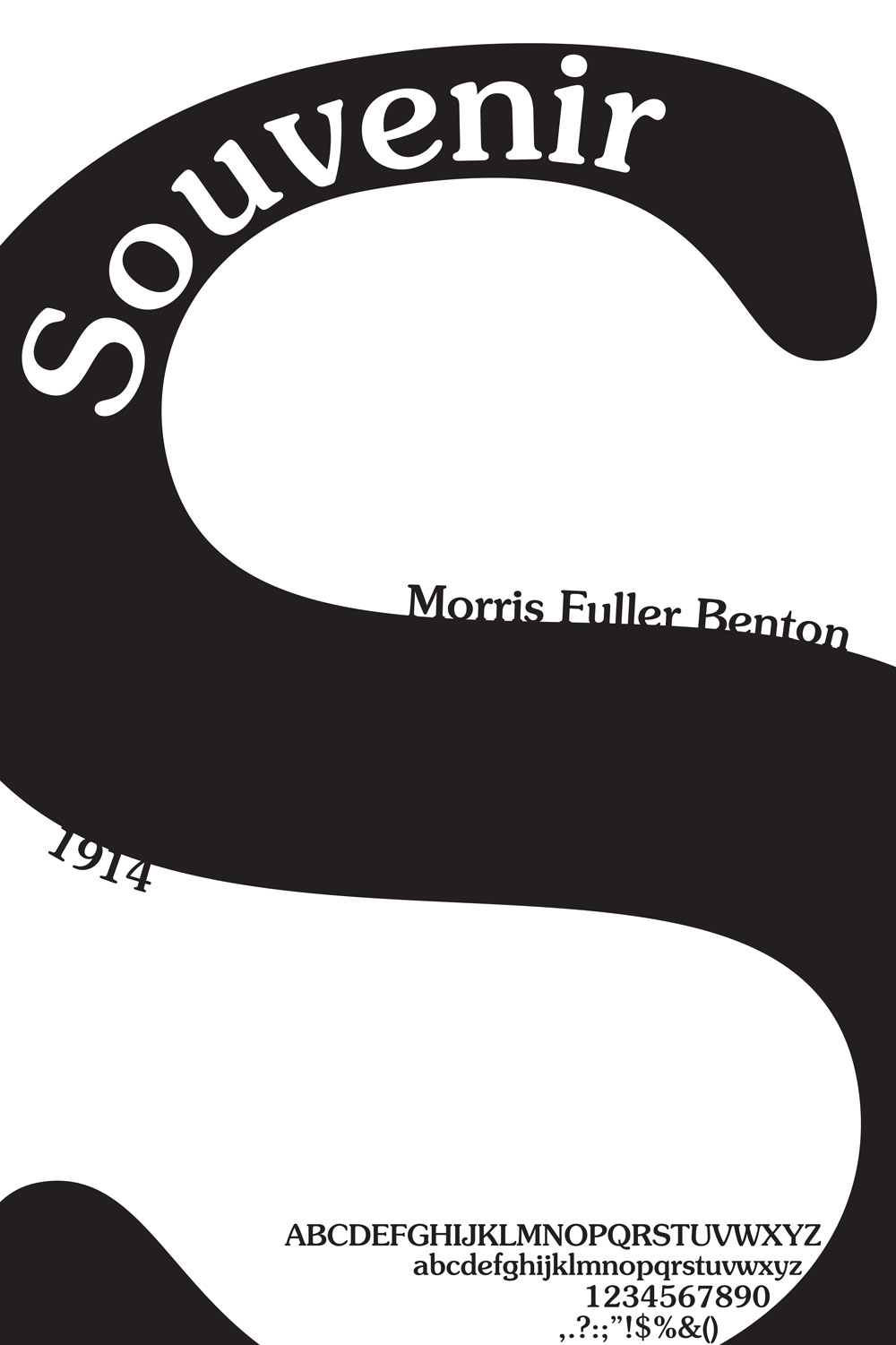
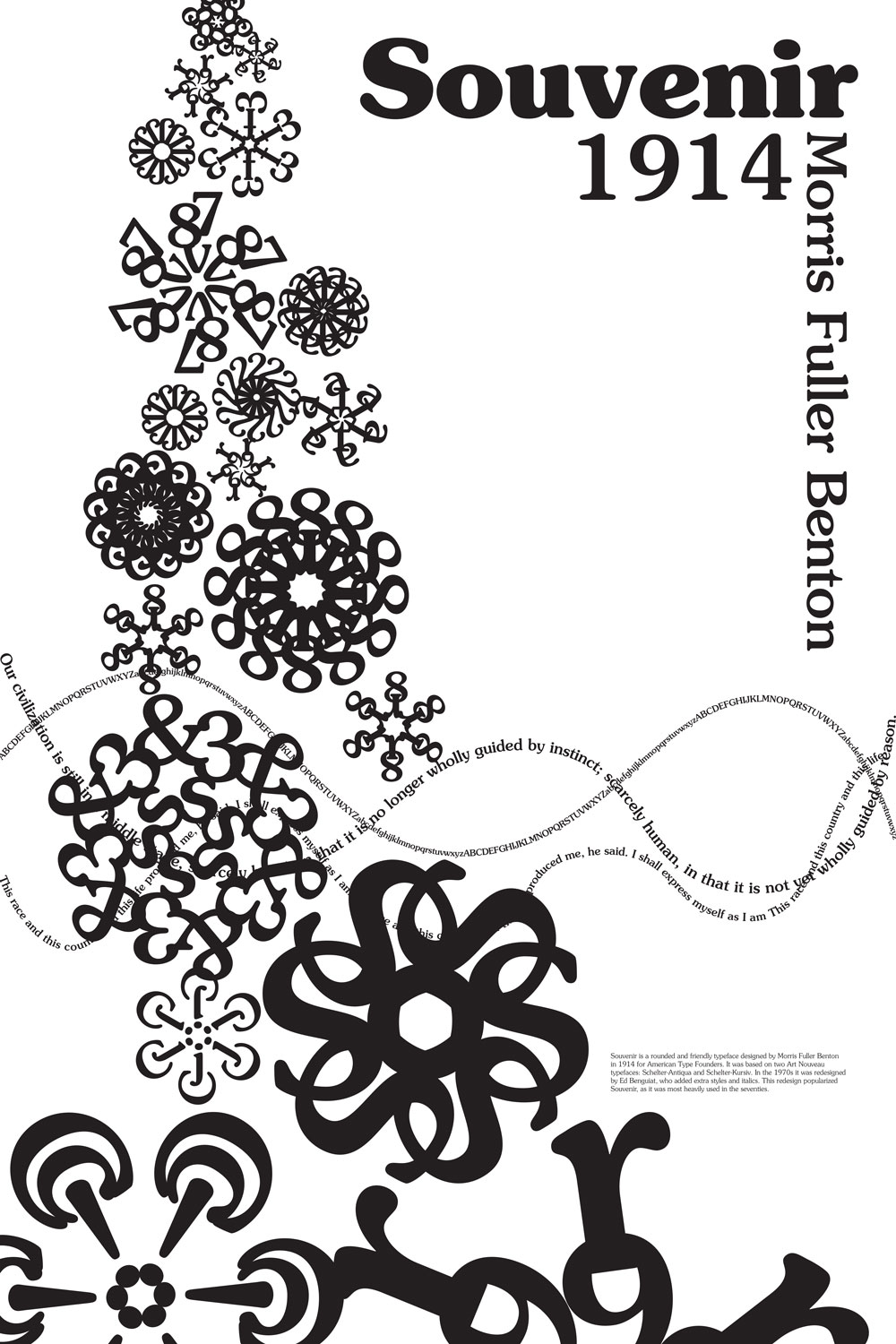
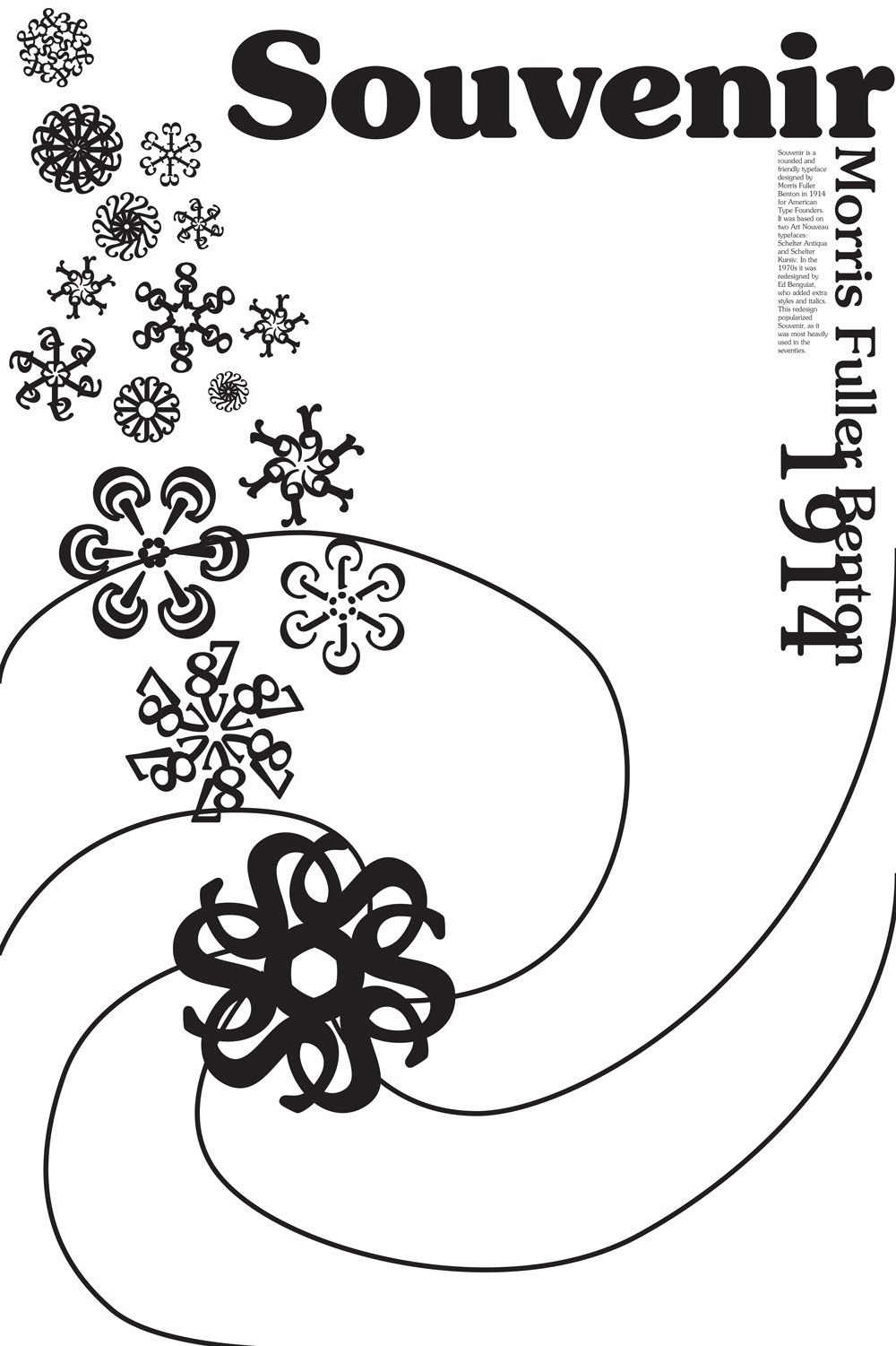
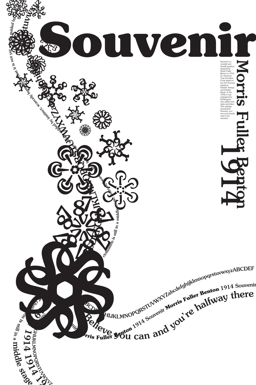
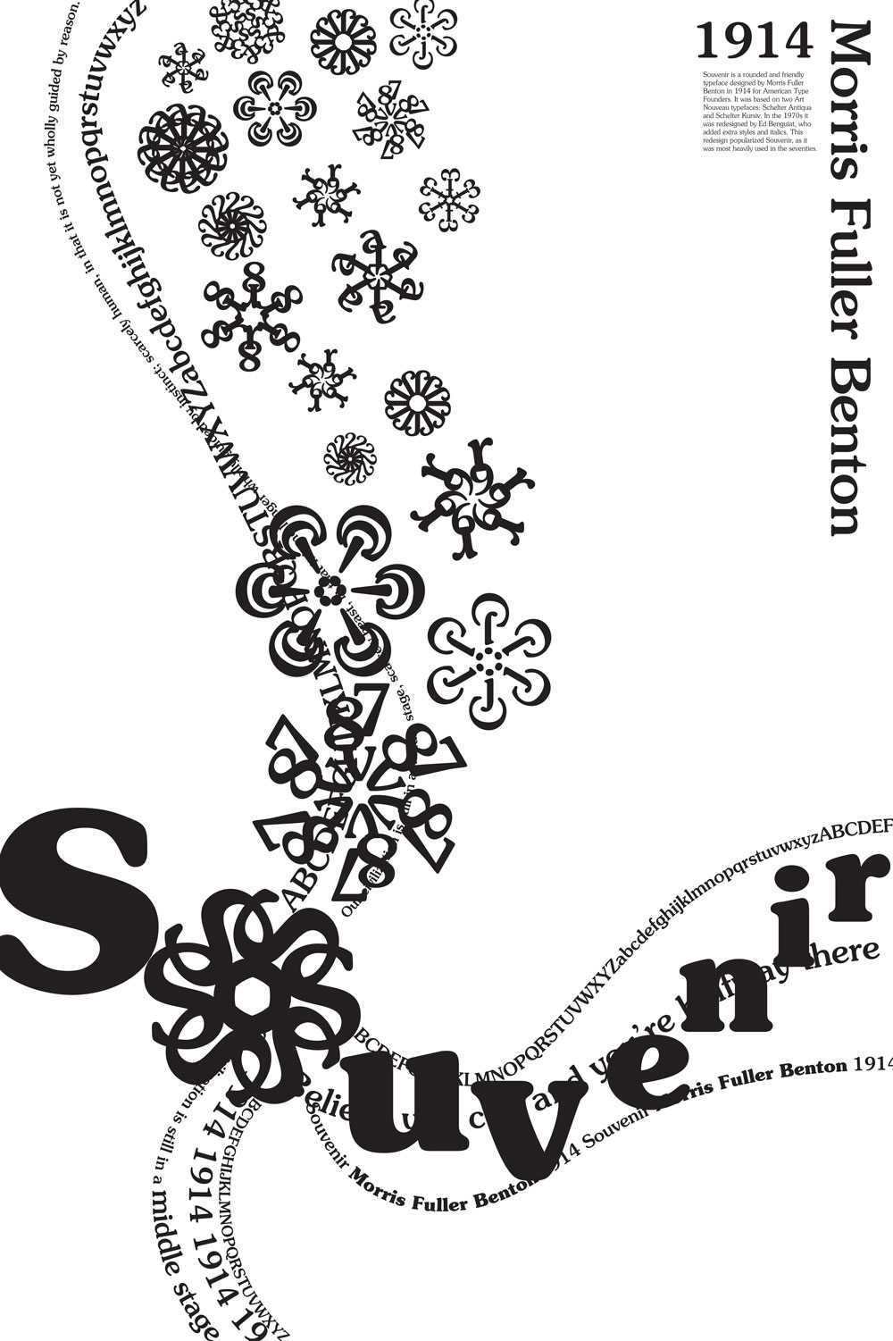
Souvenir was designed by Morris Fuller Benton in 1914 in America and is loosely based on Schelter-Antiqua and Schelter-Kursiv, two Art Nouveau typefaces. Souvenir wasn’t popular, however, until it was redesigned in the 1970s by Ed Benguiat, who added extra styles and italics. Because of this, Souvenir is often associated with the design of that era, and there was a backlash against it in the ’80s and ’90s. Souvenir is characterized by its rounded and friendly forms, and has been described as “Times Roman dipped in chocolate.”
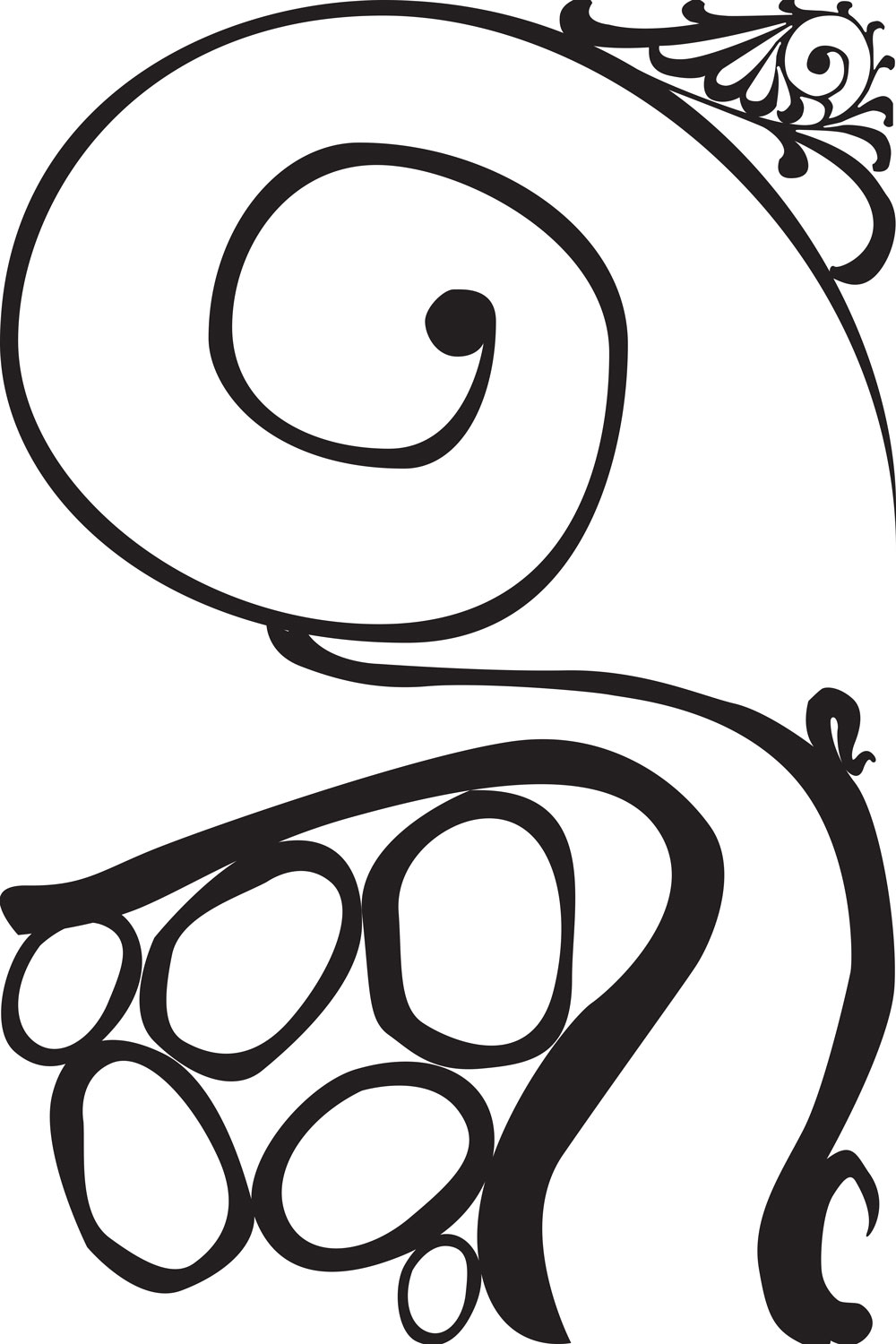
Because Souvenir was created in one era and popularized in another, I wanted to represent both the Art Nouveau and 1970s styles in my poster. Both are characterized by floral motifs and flowing, organic forms often inspired by nature.
Studies
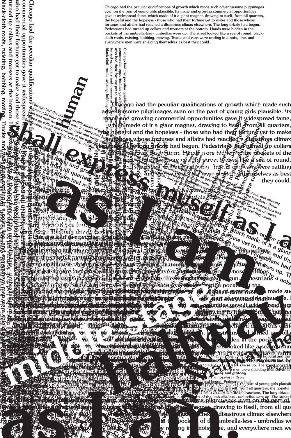
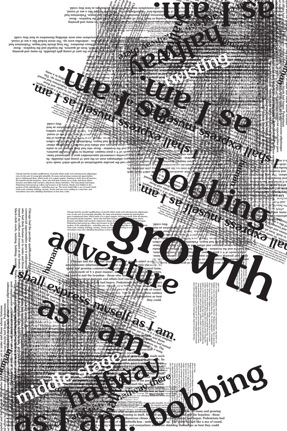
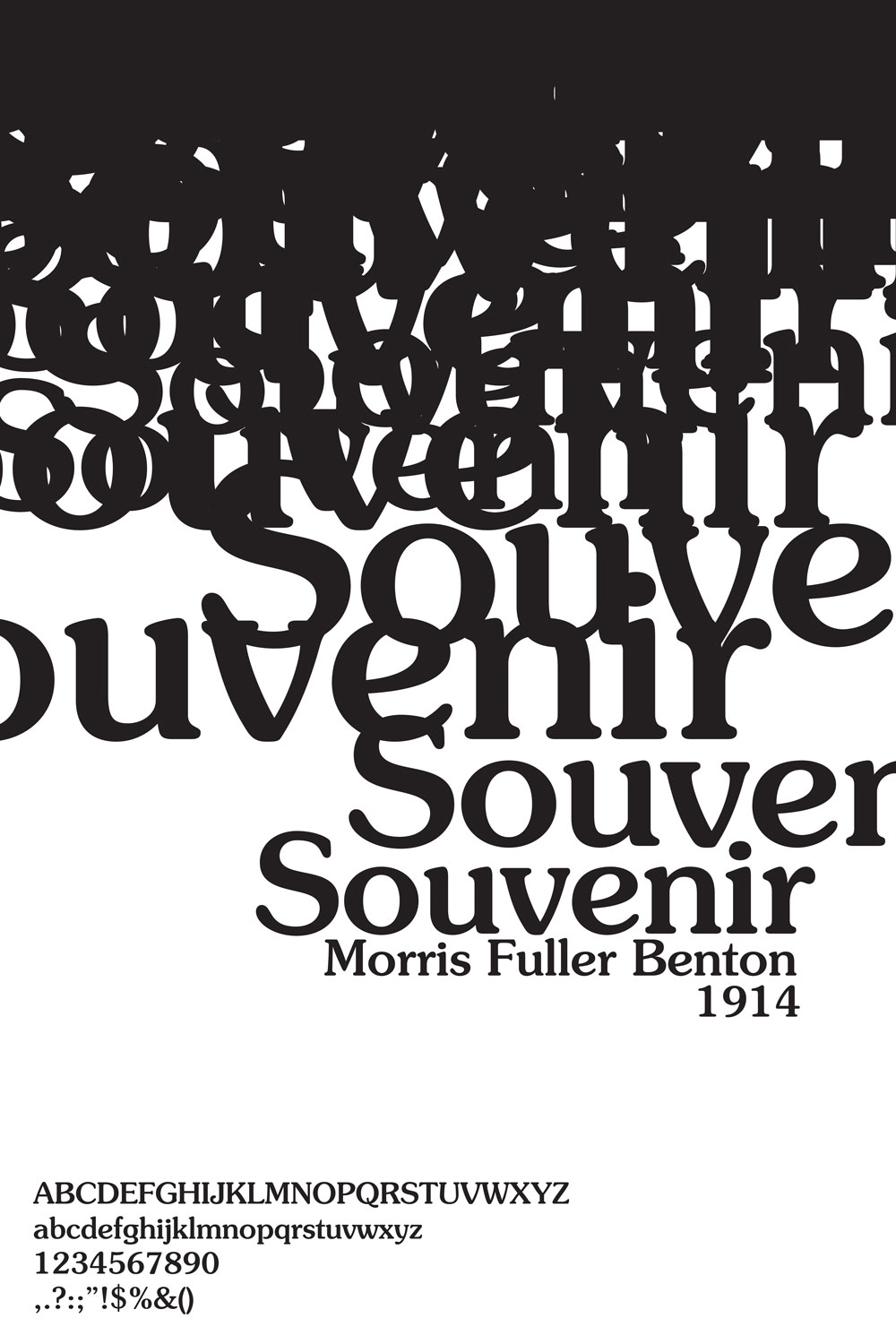
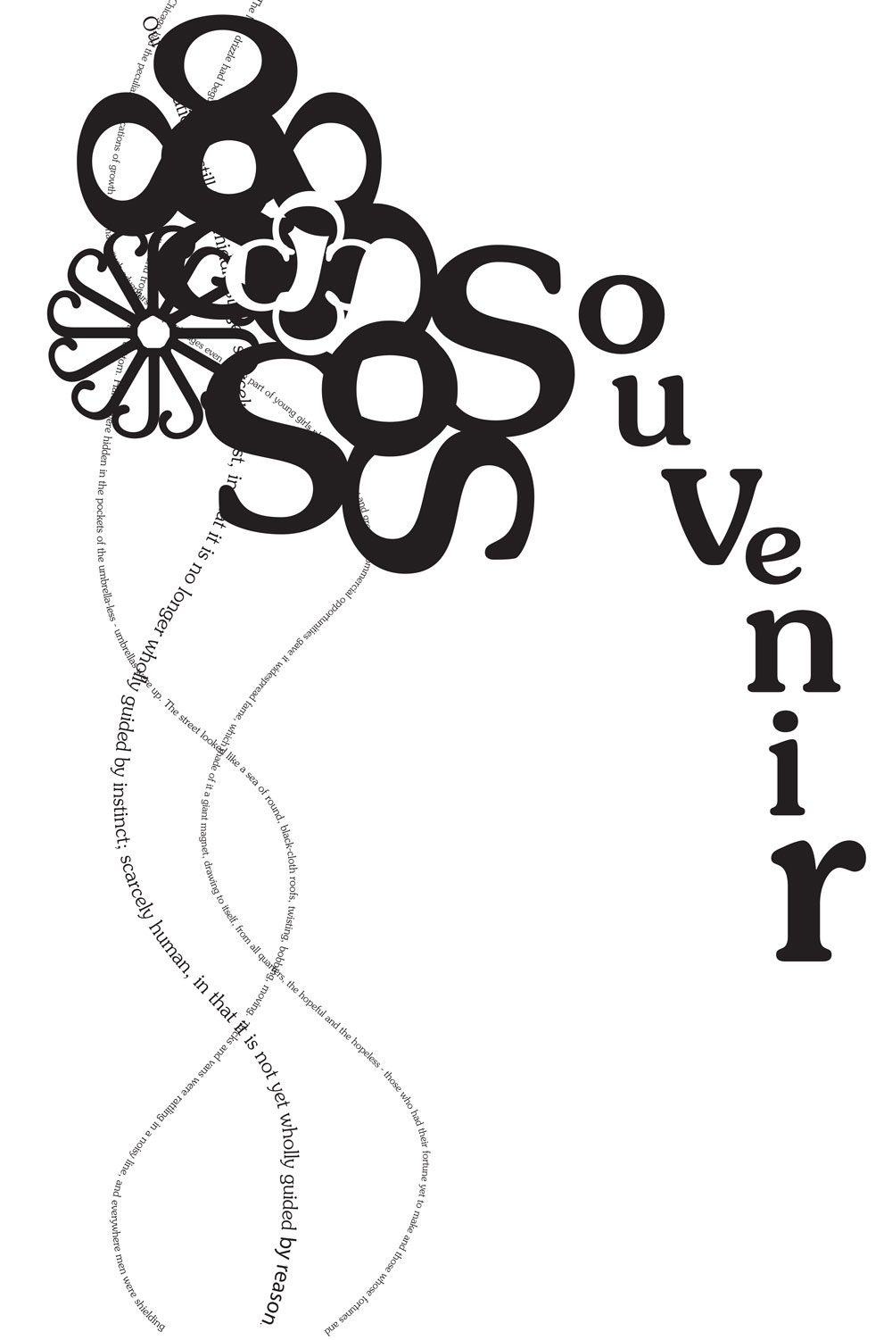
We started this project with an exploration of the typeface through a series of studies. I incorporated quotes from notable Americans around 1914 (Theodore Roosevelt and Theodore Dreiser) and experimented with creating textures with those words using Souvenir.
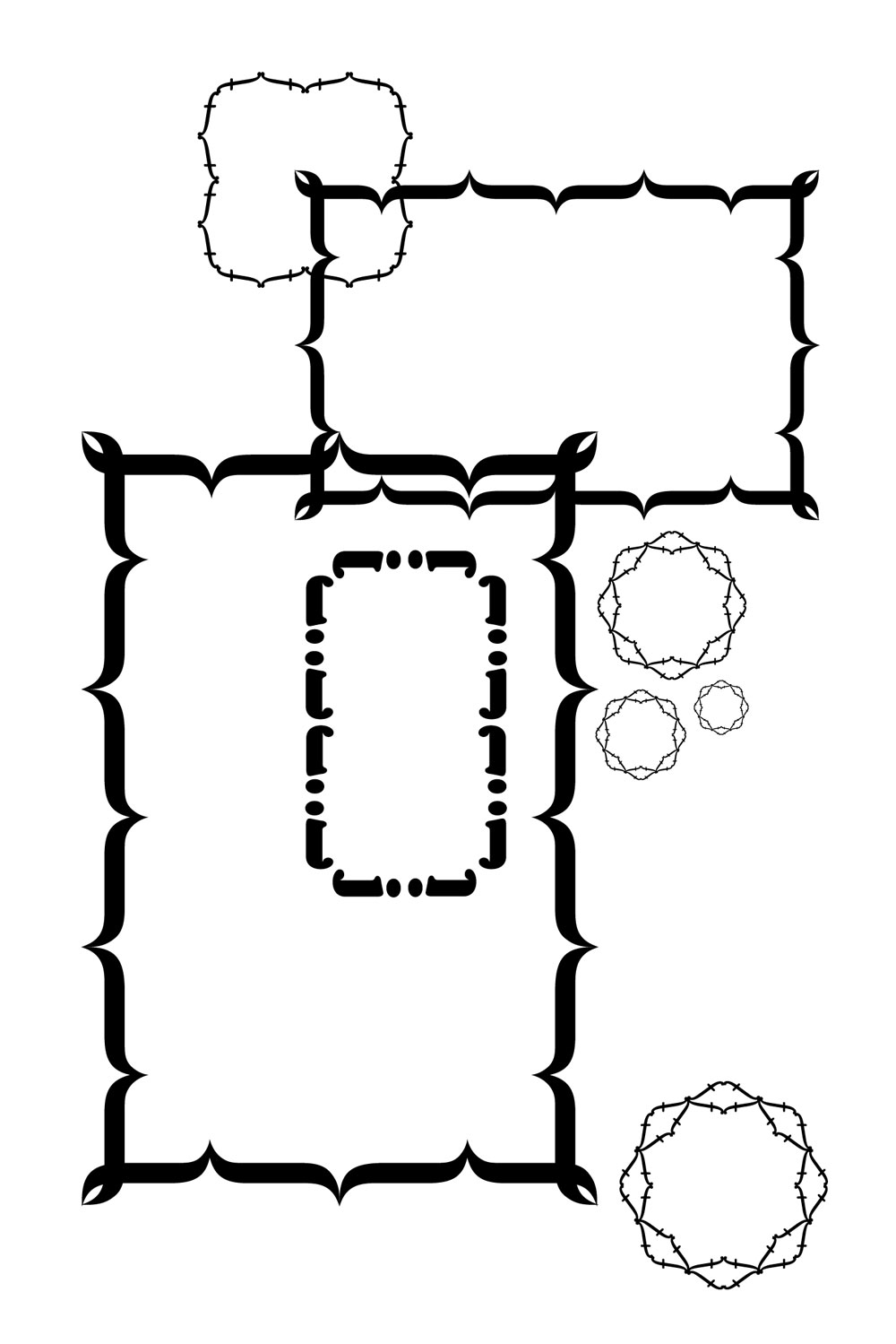
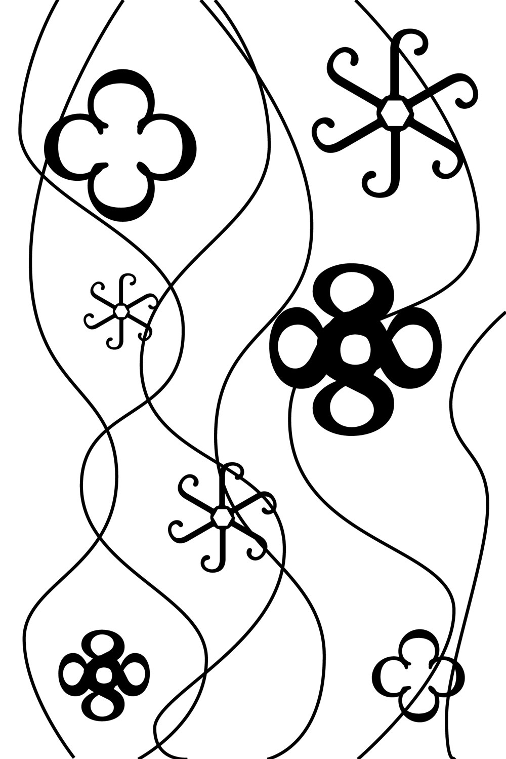
Next, I experimented with different elements that could be on the poster. Art Nouveau works often make use of framing devices, and I wanted to incorporate a flower pattern as well. Most elements are made out of Souvenir text.
Poster Compositions
I then moved on to experimenting with different configurations of the elements that needed to be on the poster: the names of the typeface and the designer, the date the typeface was created, and the alphabet. These slowly morphed into the final poster.
I started to incorporate the floral elements and quotations from previous studies into the composition.
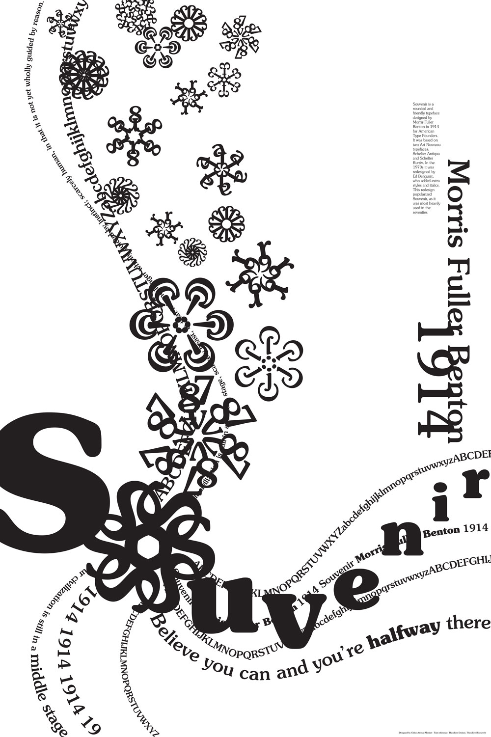
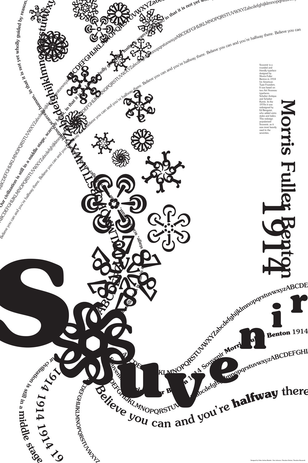
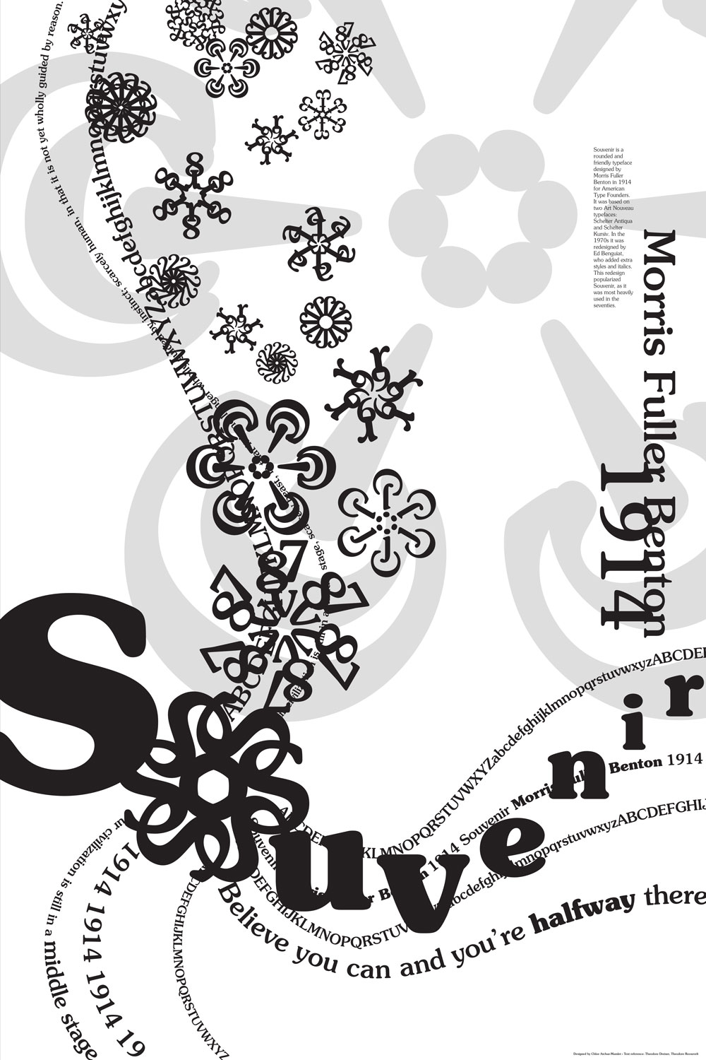
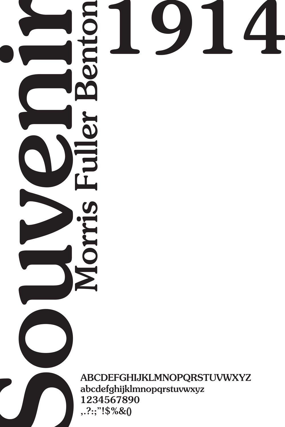
I ended up with the final poster about half way through the exploration process. I went further, adding more elements, but ultimately decided I liked my simpler composition better.
Here is the final poster in detail: