UChicago Body Project

Creating a recognizable identity within a larger brand

March, 2015

Identity, Design

The University of Chicago Body Project works to promote a healthy body image to the UChicago community. As an official University organization, the logo had to comply with the University's graphic standards by using Gotham for the typeface and not straying outside the given color palette. The challenge was to create a recognizable and unique identity for an organization centered around body positivity while staying true to the University's brand.

Logo Lockups

As per University standards, the logo uses Gotham and four colors from the approved palette.

Body Project logo
Main lockup (top), square lockup, and mark

Collateral Materials

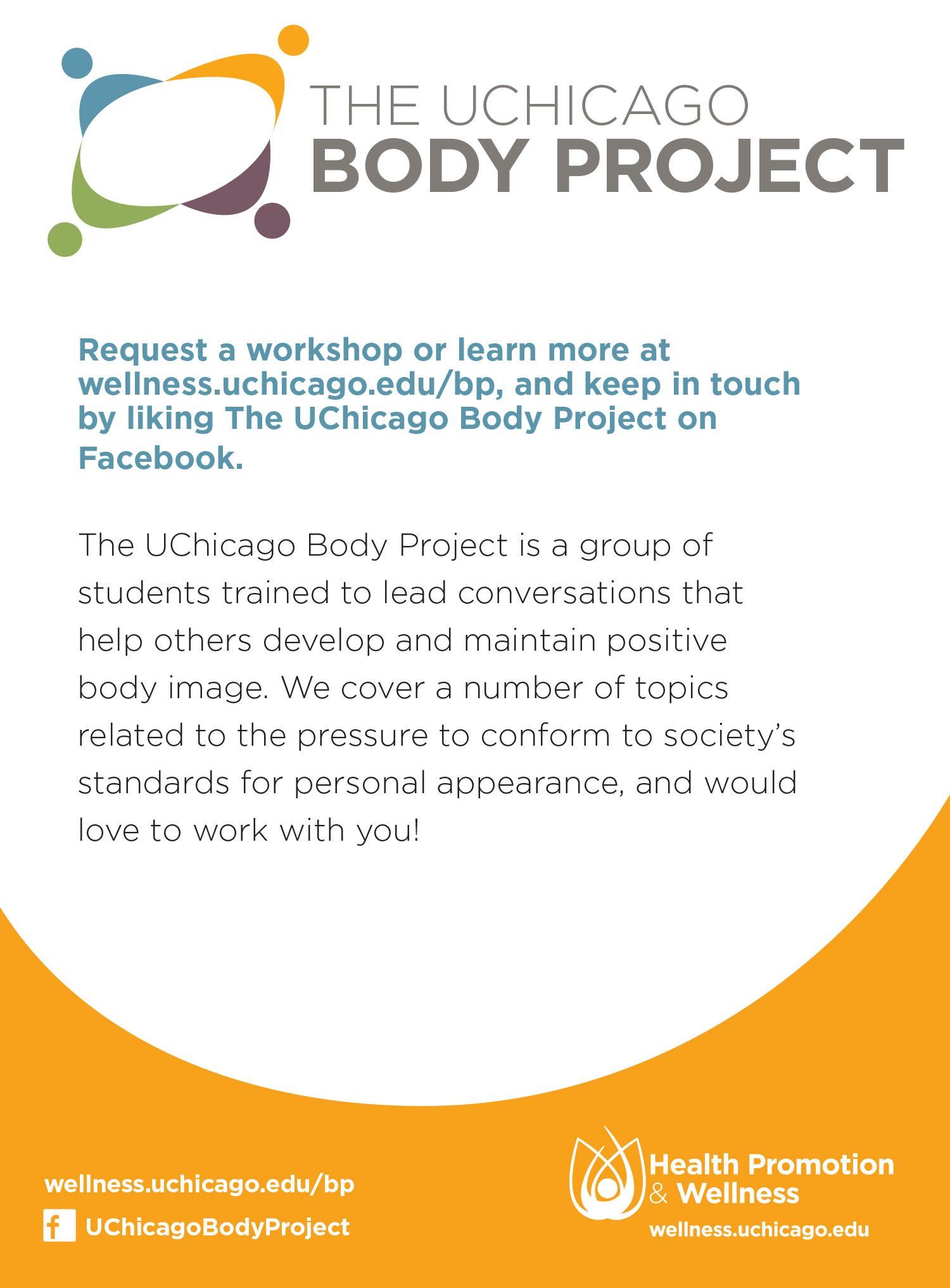
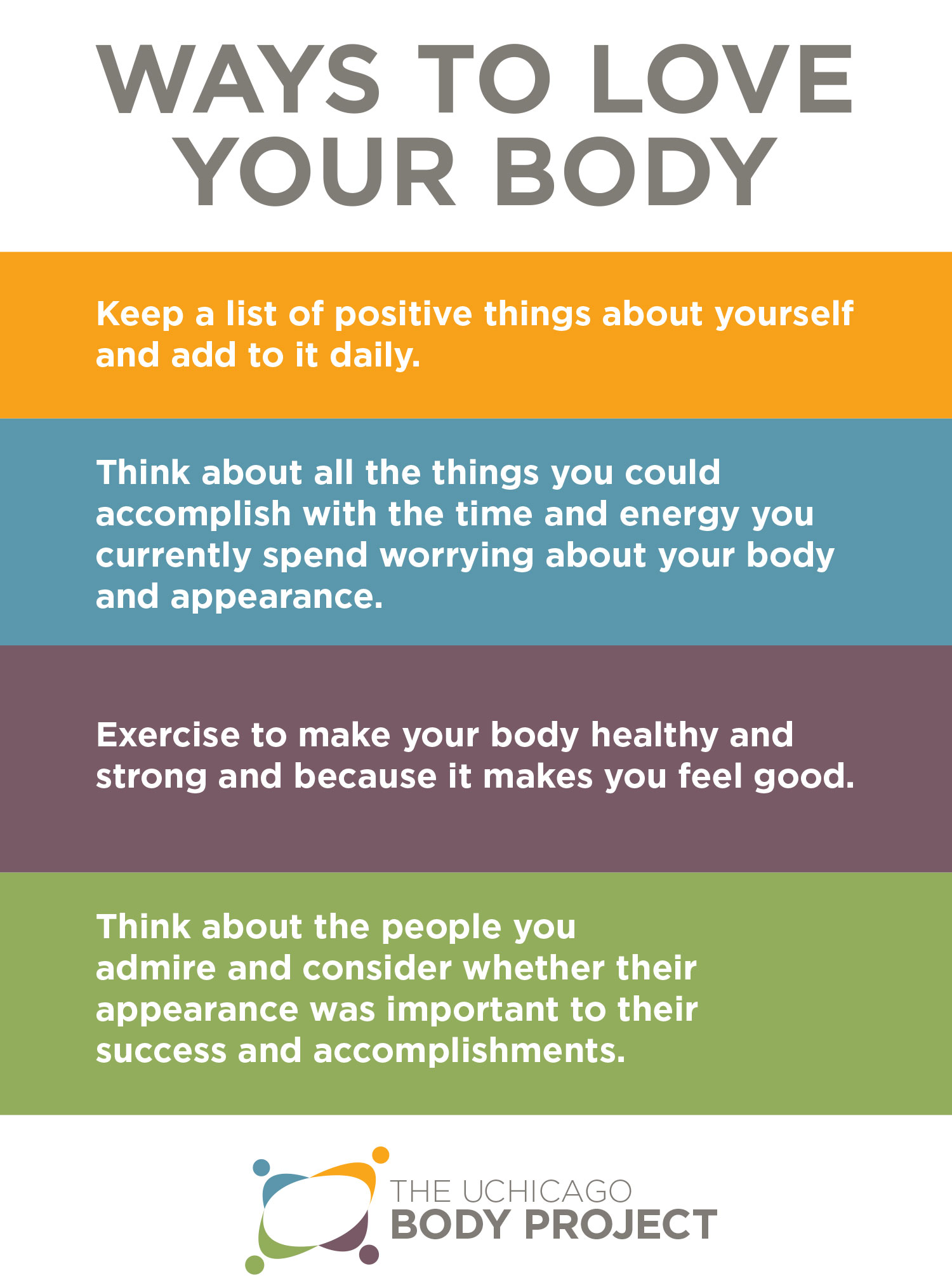
The Body Project also asked for two 5”x7” postcards to hand out at events: one to introduce them to the community and the other to list resources available to students on campus. They wanted both postcards to have the information on one side and have the other side be decorative and inspirational.

Body Project inspirational intro piece Body Project introduction text Body Project Ways To Love Your Body Body Project resources on and off campus

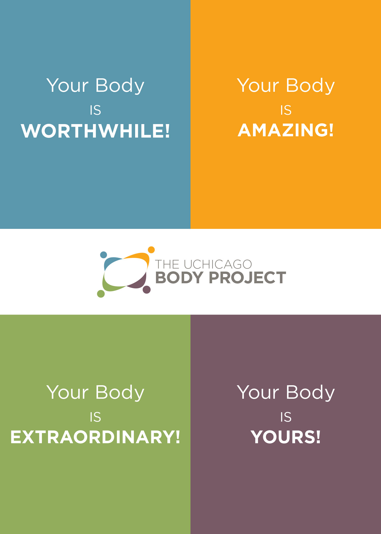
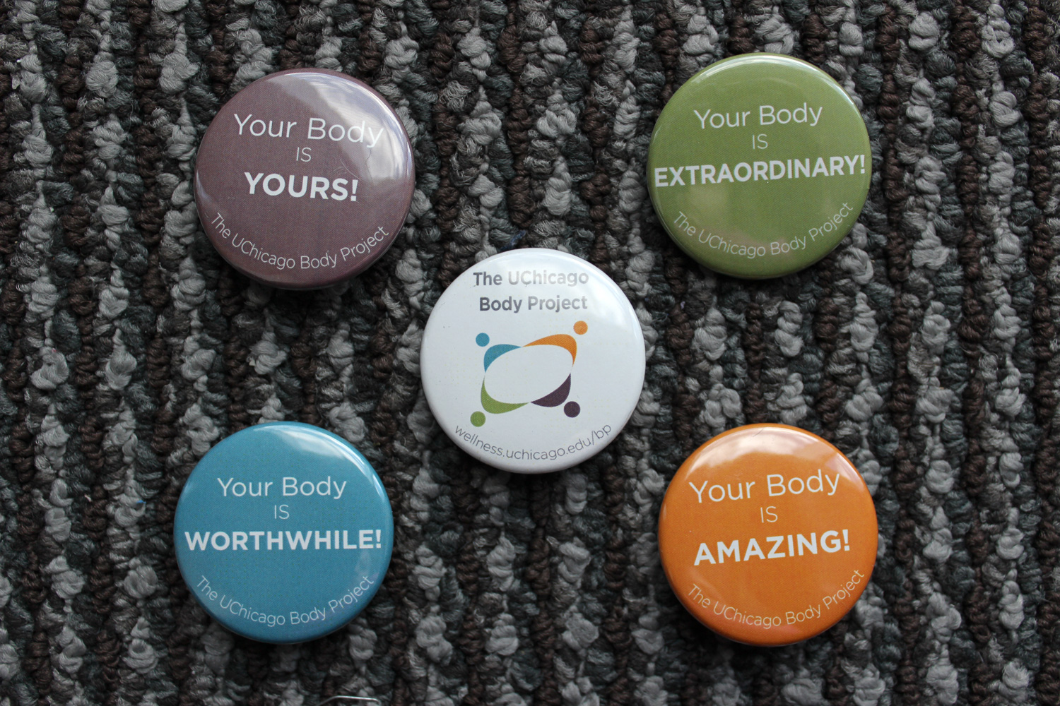
The organization also wanted pins, since they are a popular way to accessorize on a college campus. We decided the inspirational sentiments from the introductory piece would be a great jumping off point.

Body Project pins