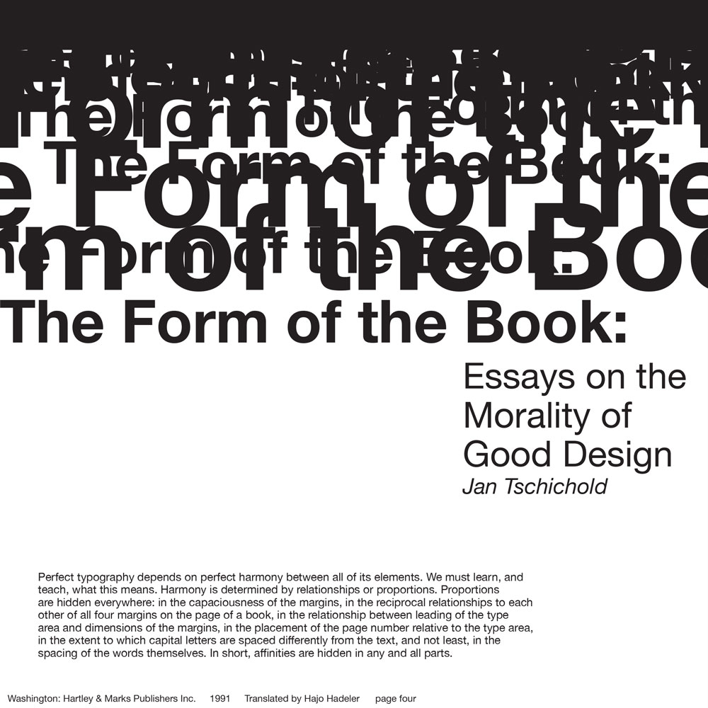
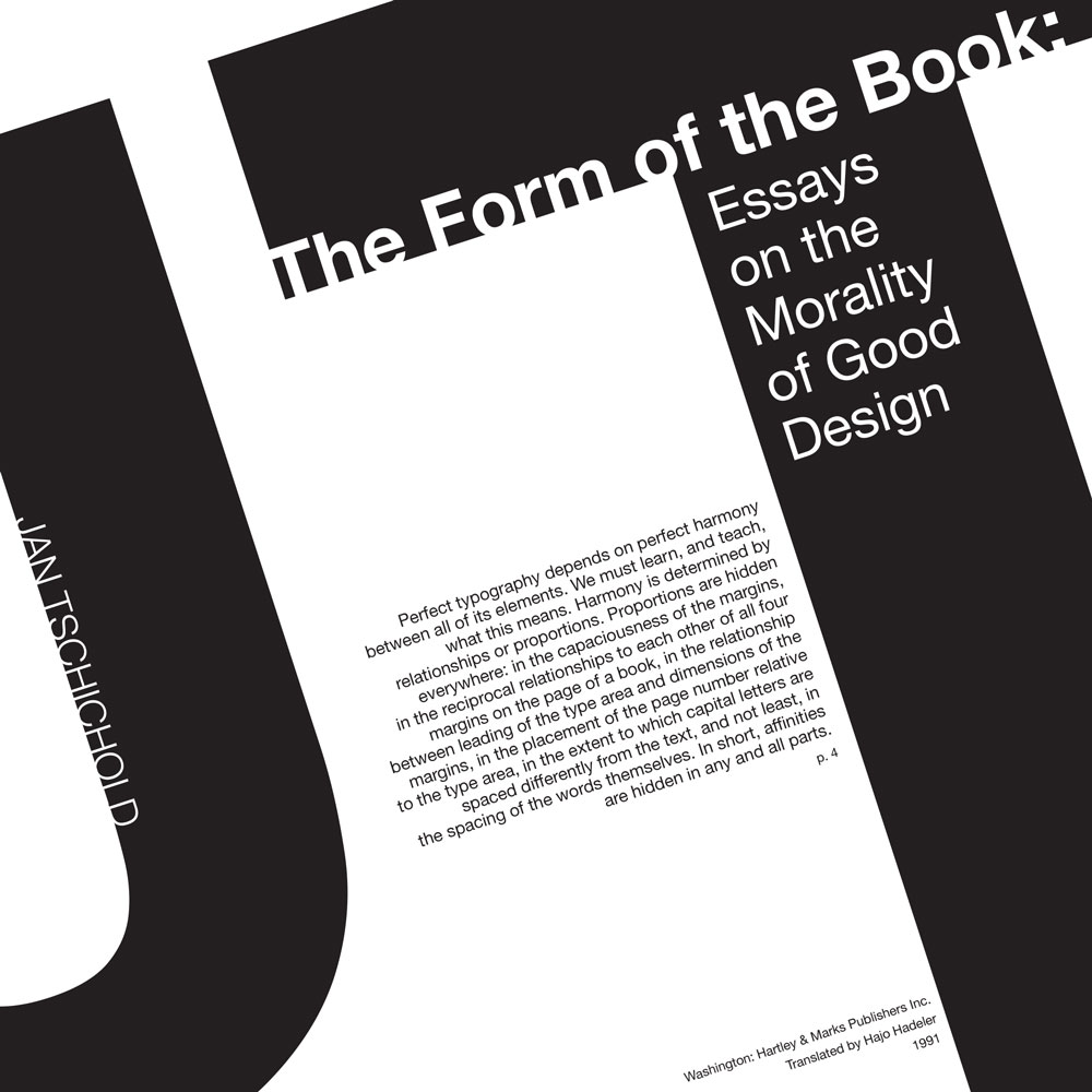
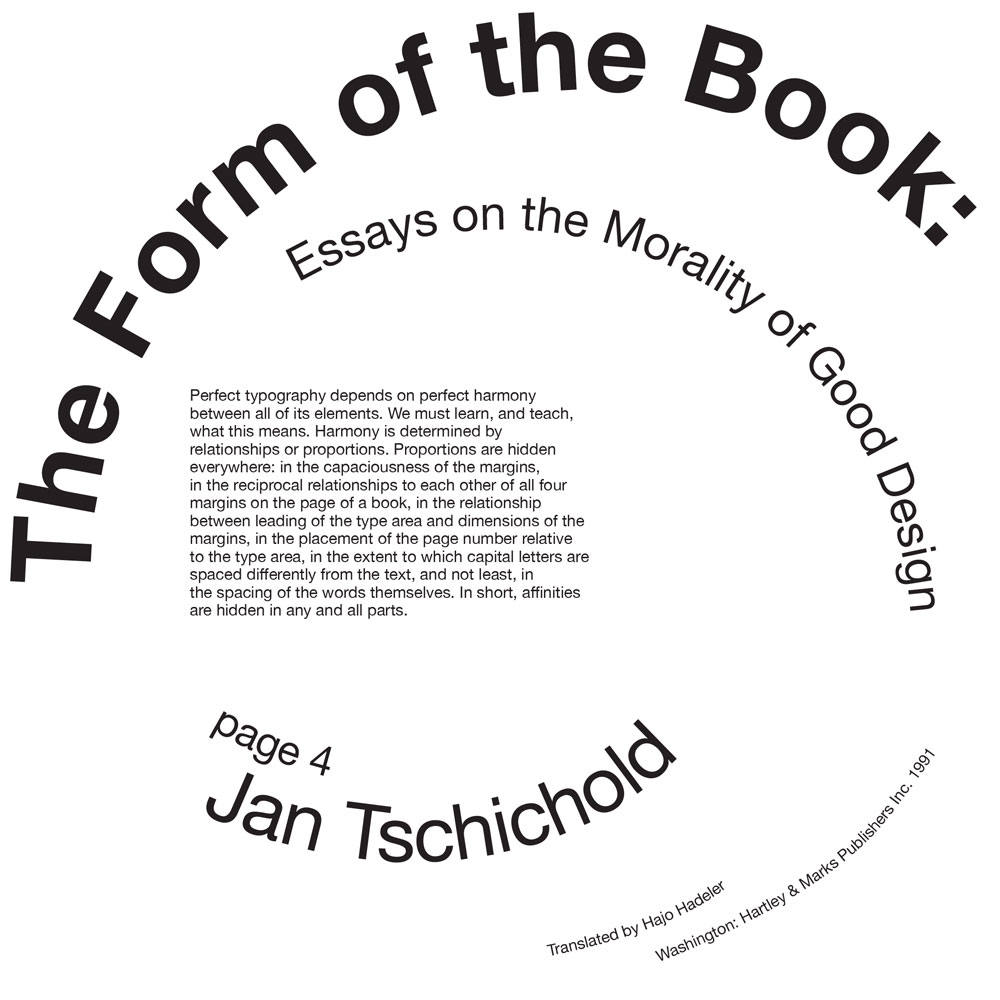
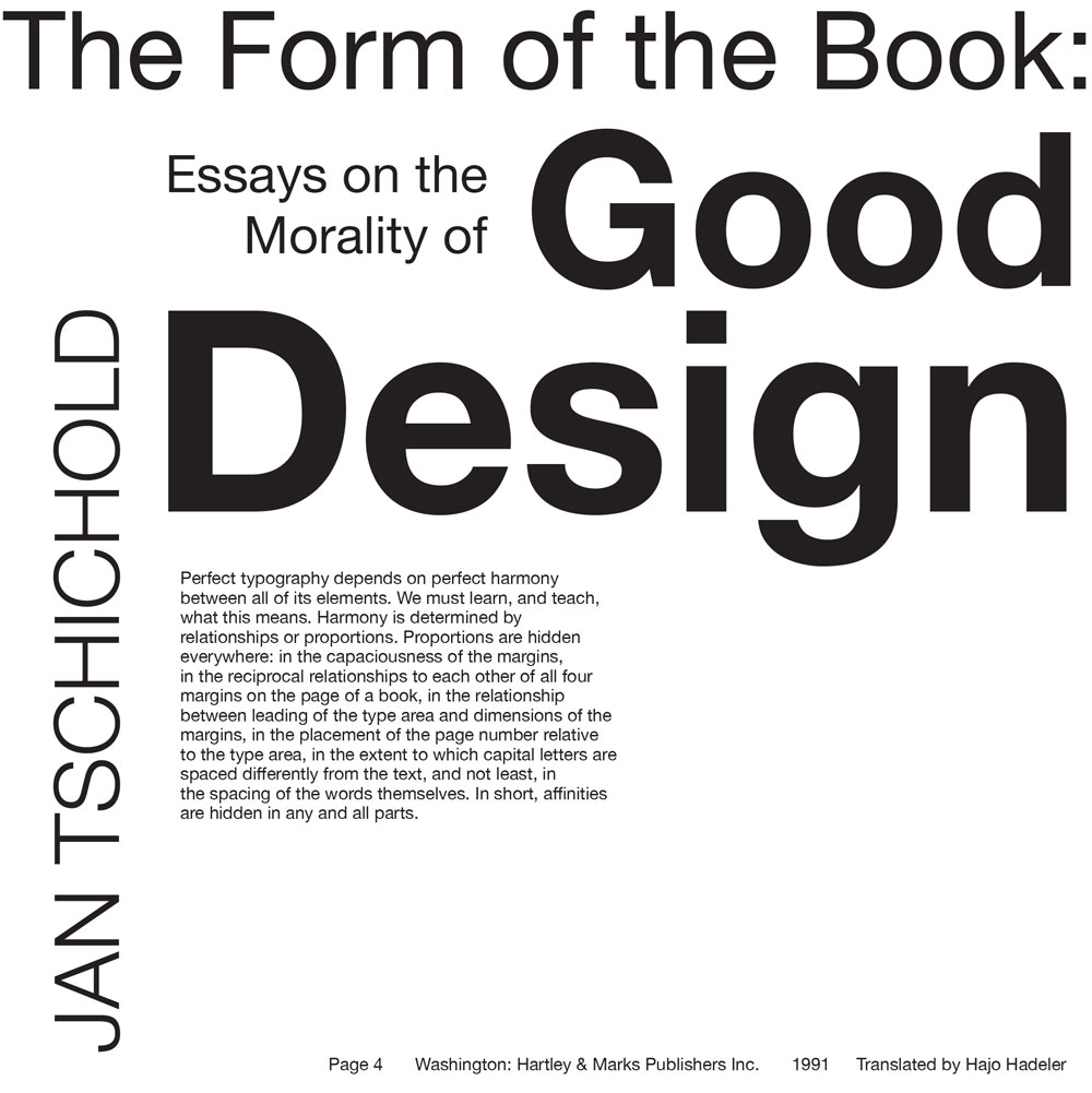
An Overview of the Second Quarter of My Second Year at Design School
After a great quarter in the fall, I was very excited to start winter quarter. This quarter, I took Visual Communication II (logo design), Typography II, Intermediate Photography, Art History: Ancient to Medieval, and Physics: How Things Work.
I didn’t produce nearly as much work this quarter as I did last quarter, but the work I did produce was much more thought-out and deliberate than most of my work last quarter. Single projects took weeks (or the whole quarter), and I’ve done more work that I’m proud of than I have in the past.
Visual Communication II (Logo Design)
This is the second in a series of six classes at the core of Drexel’s graphic design curriculum. This class focuses on logo design, and I was extremely excited, but nervous, to be taking it.
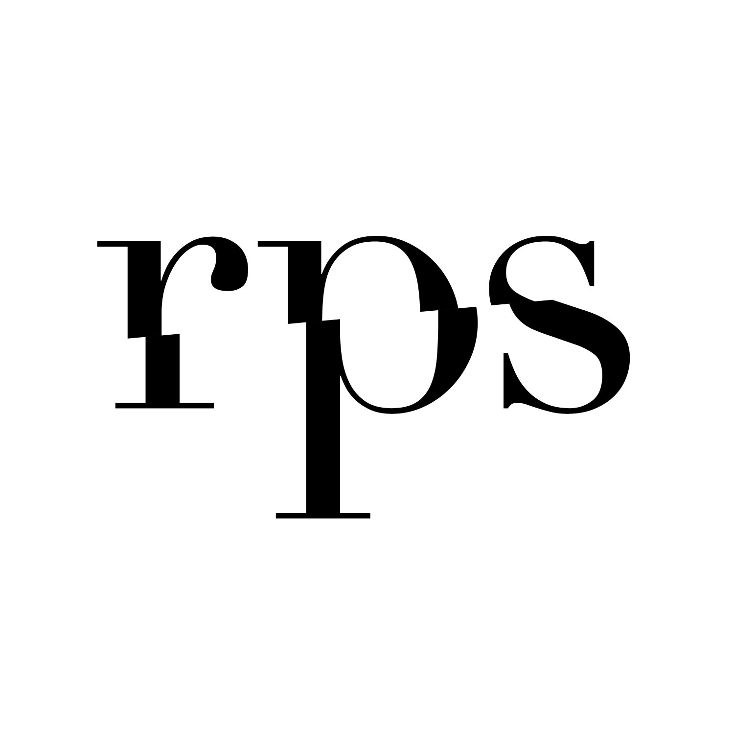
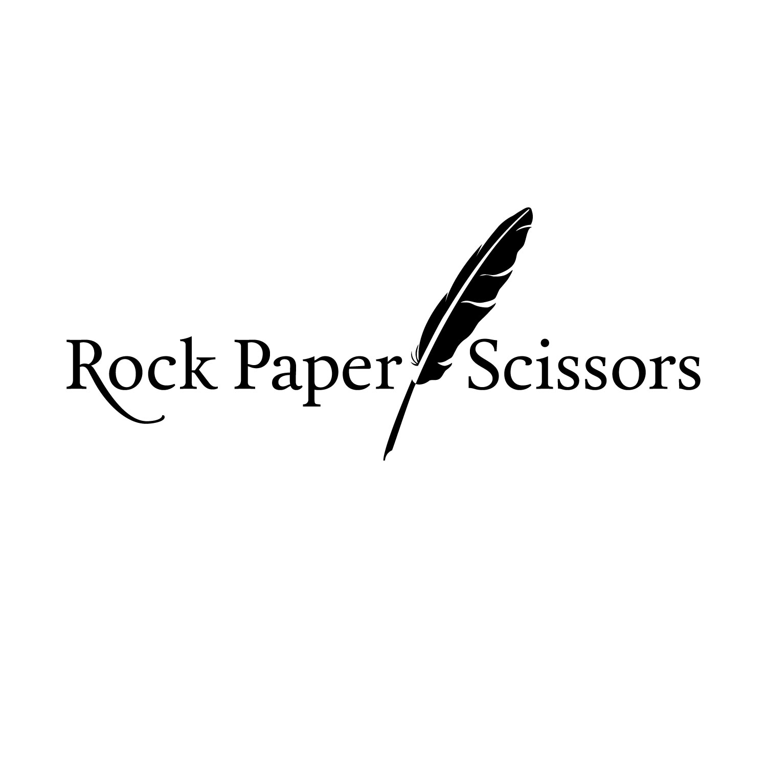
On the first day, we got assigned fake companies that we would be “working with” for the rest of the quarter. My company is called Rock Paper Scissors, and it is an office specialty store. From that information, we had to write a description of the company, including when and why it was founded, its target demographic, and how it stands out from its competition.
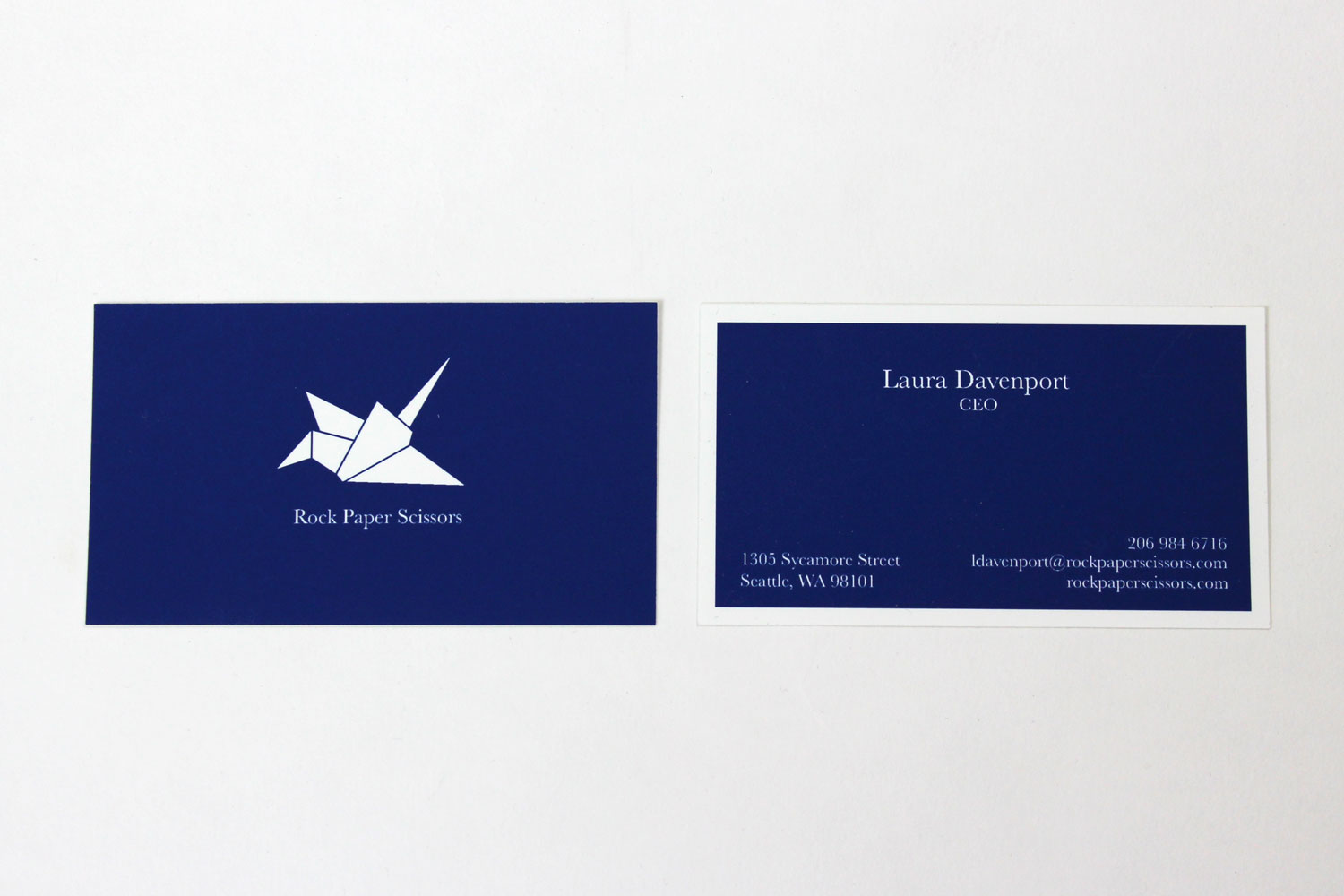
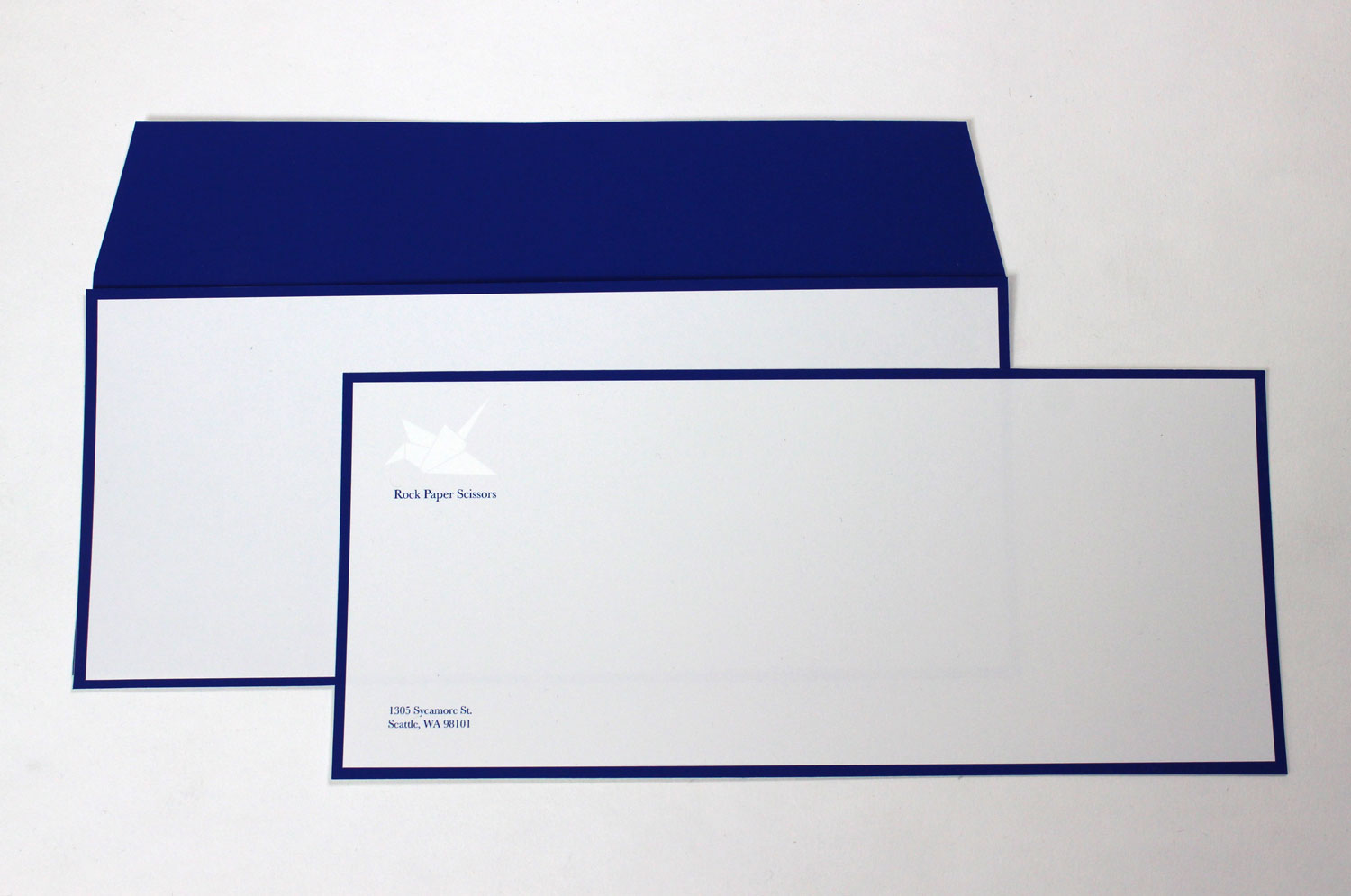
Rock Paper Scissors is a high-end office supply and stationery store catering to those who want their office products to be more thoughtfully designed than Office Max or Staples fare. Over the course of the quarter, I designed six logos for them in the following categories: pictorial, typographic, combination, and abstract. For each project, we drew over fifty sketches, narrowed the ideas down to three with the help of our professor, polished them using Illustrator, and then chose one or two to present to the class for critique. For all six logos, we worked only in black and white, and at the end we chose our best logo to develop into a whole brand using full color.
I go into detail on the process in this blog post, but here are the logos I produced:
Pictorial Logos
Typographic Logo
Combination Logo
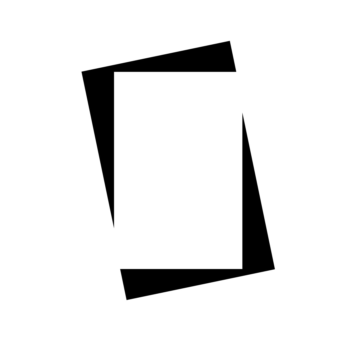
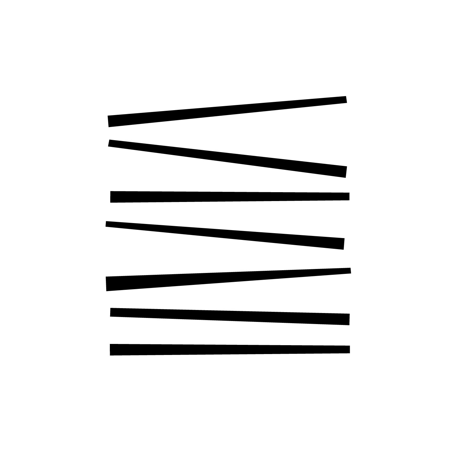
Abstract Logos
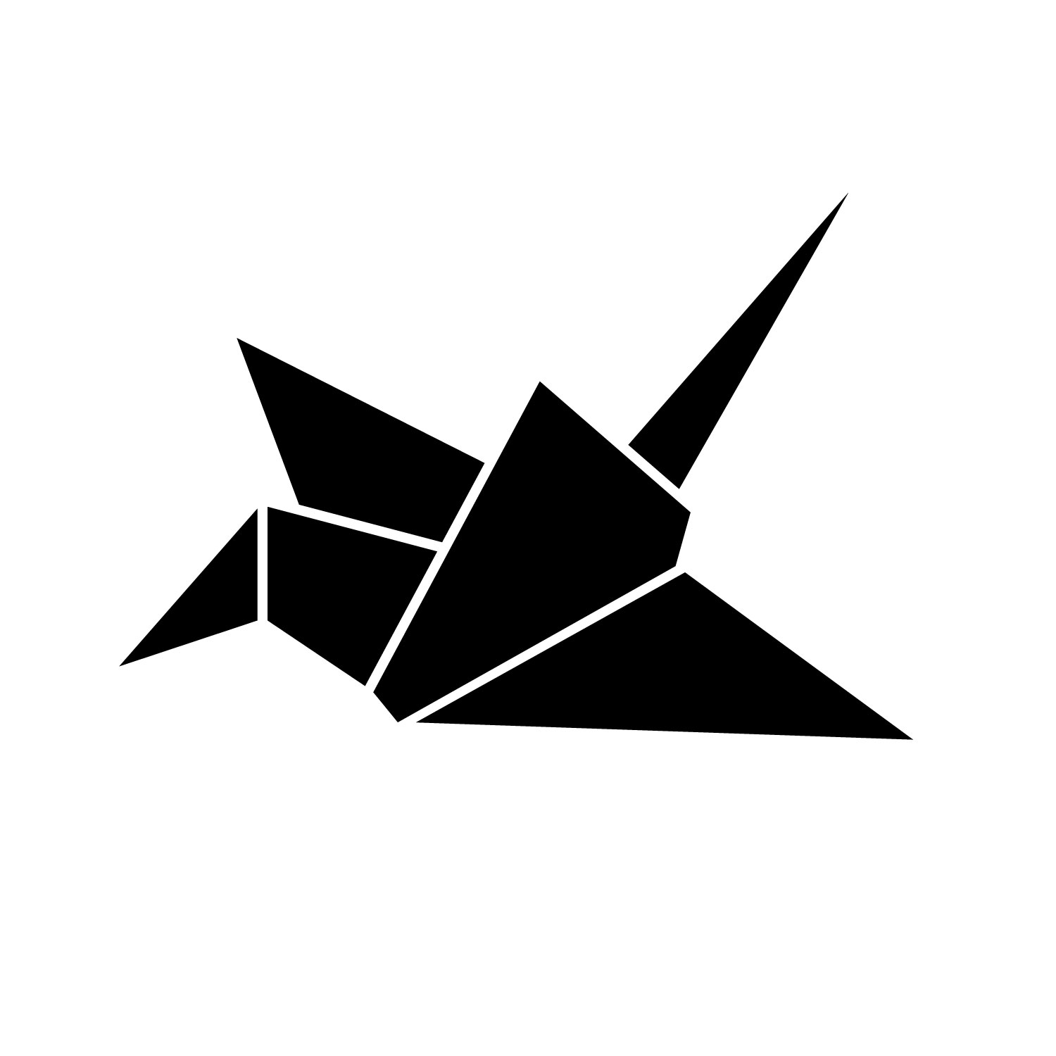
Identity Package
I chose my paper crane logo to develop into an identity system consisting of a letterhead, envelope, and business cards.
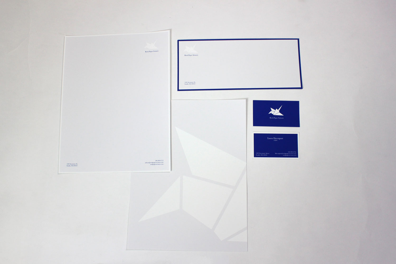
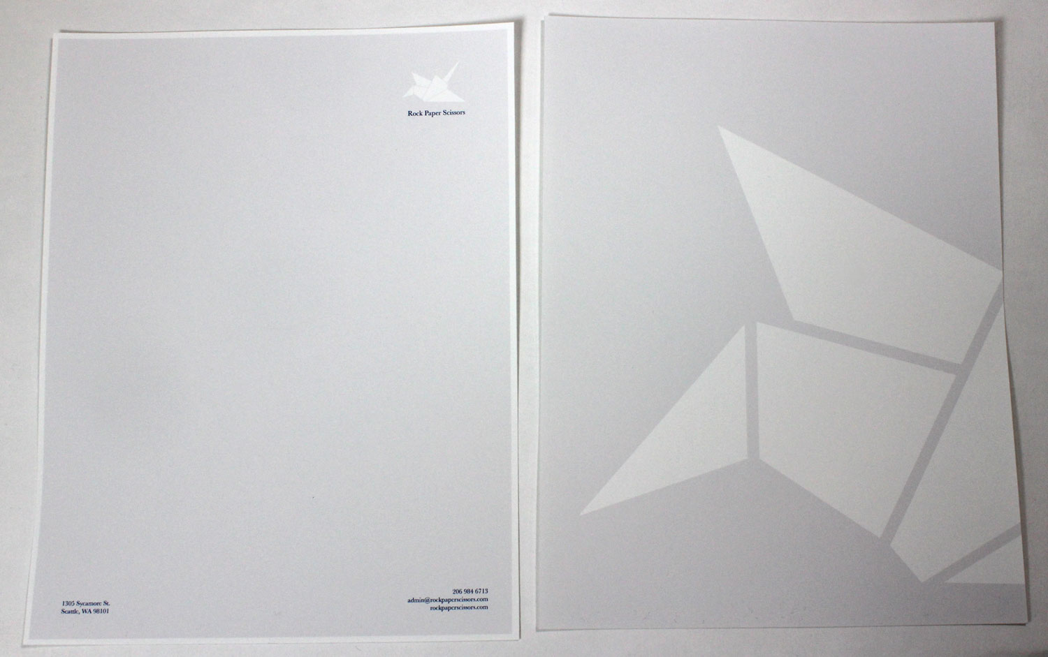
![]()
Typography II
This class is what I assumed Typography I would be. We learned how to set type in real-world scenarios, dealing with leading, alignment, rag, kerning, and paragraph breaks, and we made a fun poster on an assigned typeface towards the end of the quarter.
Typographic Exercises
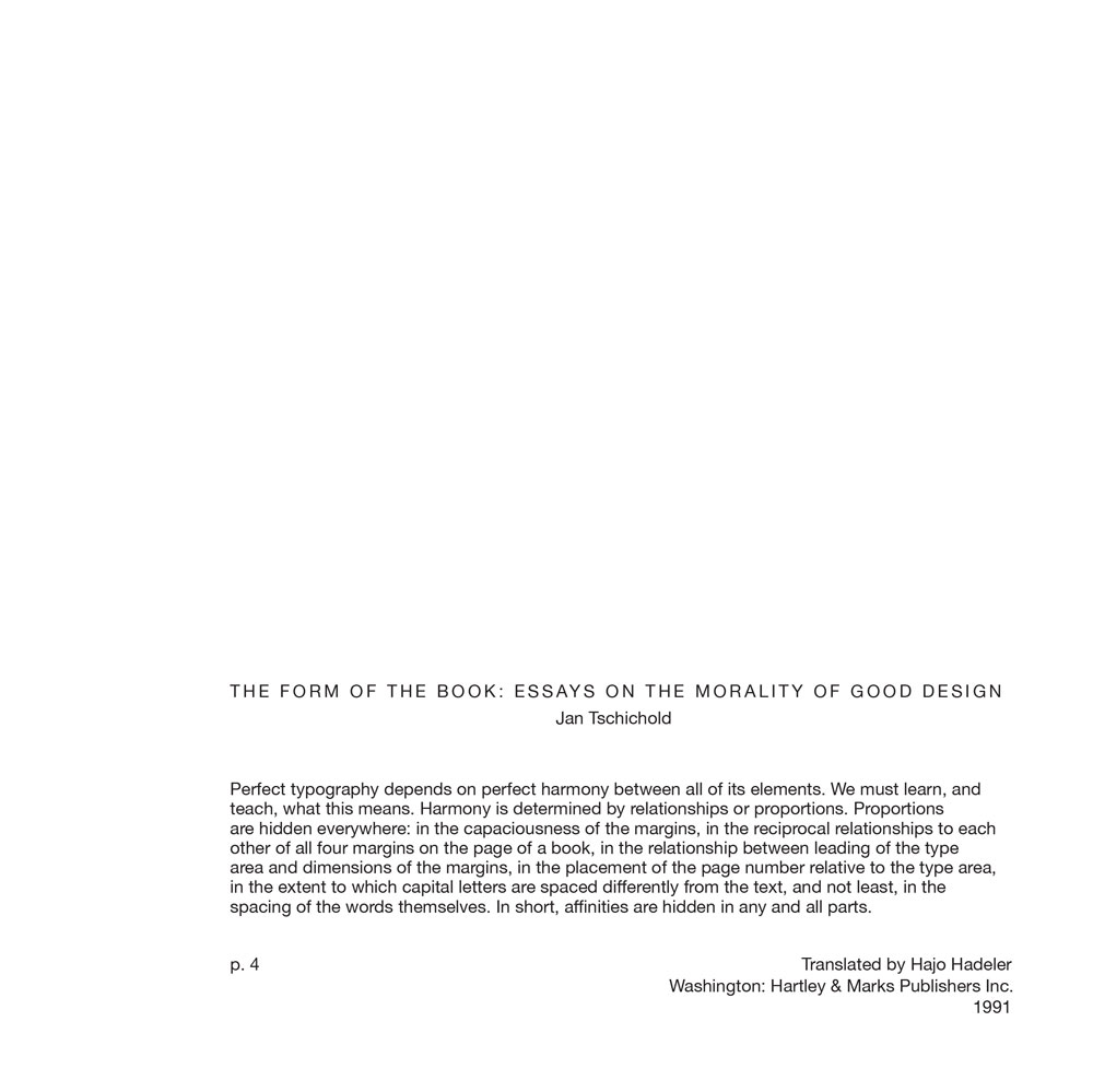
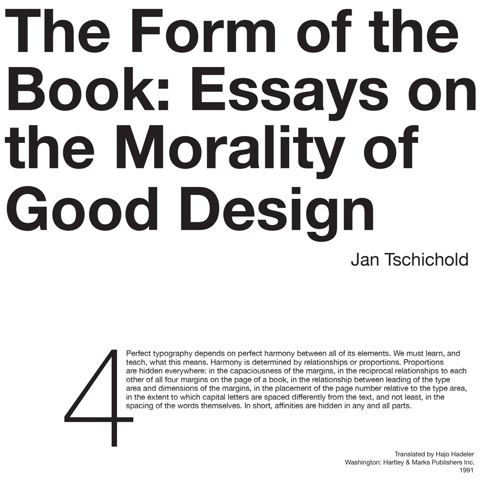
The first several weeks of the quarter were spent doing typographic exercises on things like leading, kerning, rags, and paragraph breaks, which were super boring but very educational. Then we put that knowledge to the test by designing six compositions with given type. Our professor gave us an excerpt from a book along with its author, title of the book, and publication information and we had to take that text and make compositions. The only rule was that we could not do anything wild to the excerpt (it had to be either Garamond or Helvetica, 10pt, and extremely legible), and our designs had to grow more complex with each composition. Here are my six, starting from the most simple:
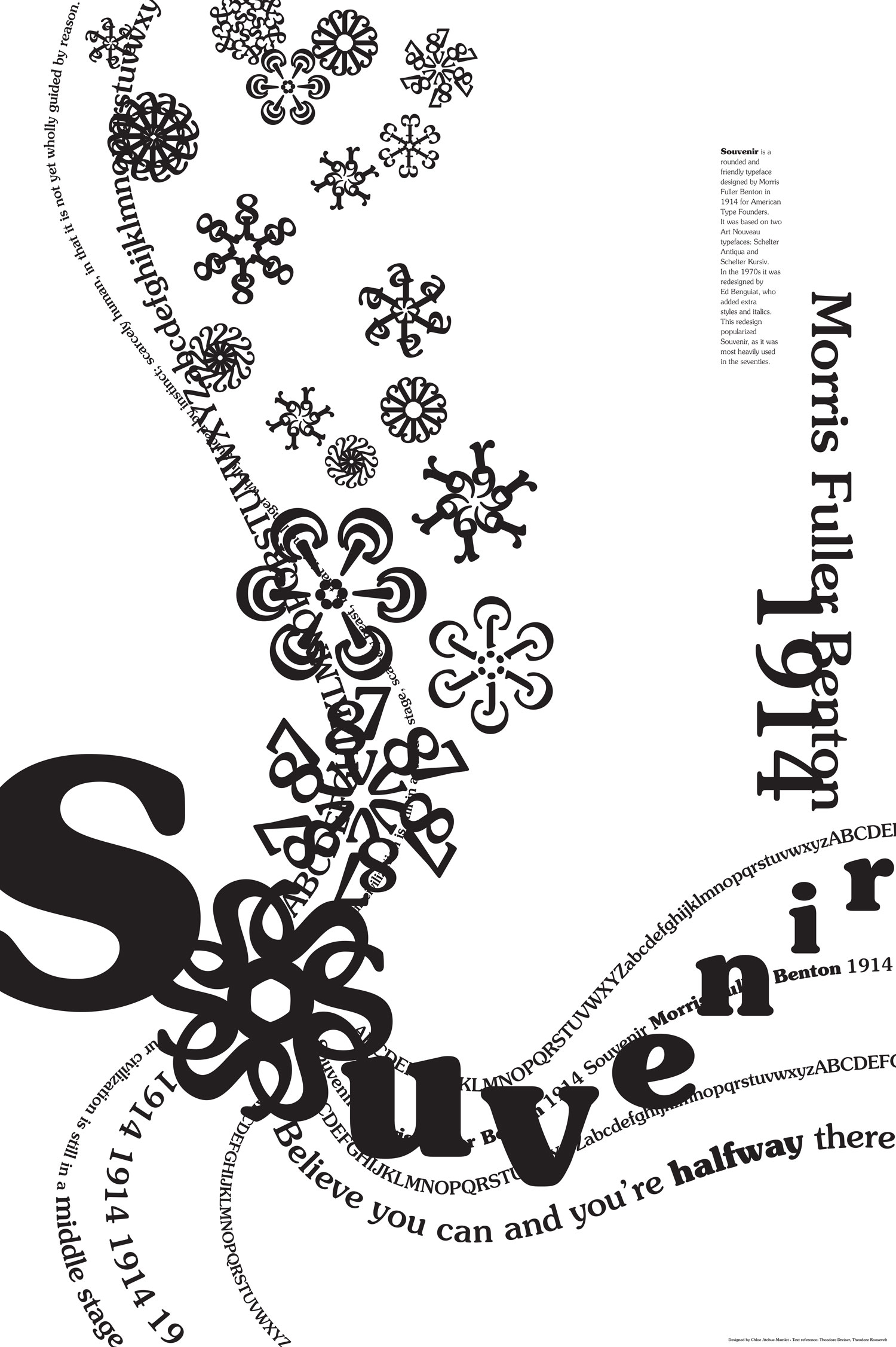
Souvenir Poster
Most of the class was spent making posters of assigned typefaces. I designed a 20” x 30” poster showcasing the history and aesthetic of Souvenir, created in 1914 by Morris Fuller Benton. It was a long and arduous process, but I really enjoyed it. We started out creating typographic studies using our typeface and quotations from the time it was designed, and continued with the explorations until we had a good idea for a poster. The rest was polishing. I wrote extensively about the process in my case study for the project.
Intermediate Photography
This is the second of two black and white photography classes graphic design majors have to take. While last quarter’s class focused on breadth, this class focused on depth: we had only three projects, each spanning several weeks.
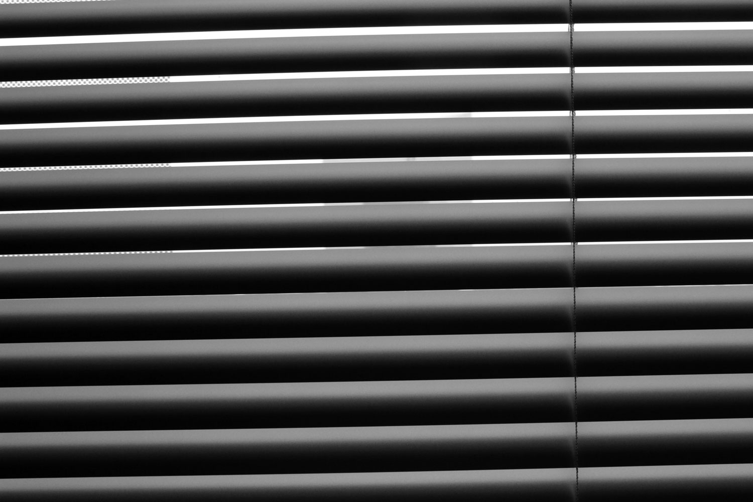
Light as Subject
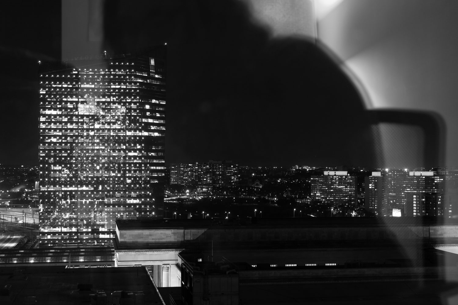
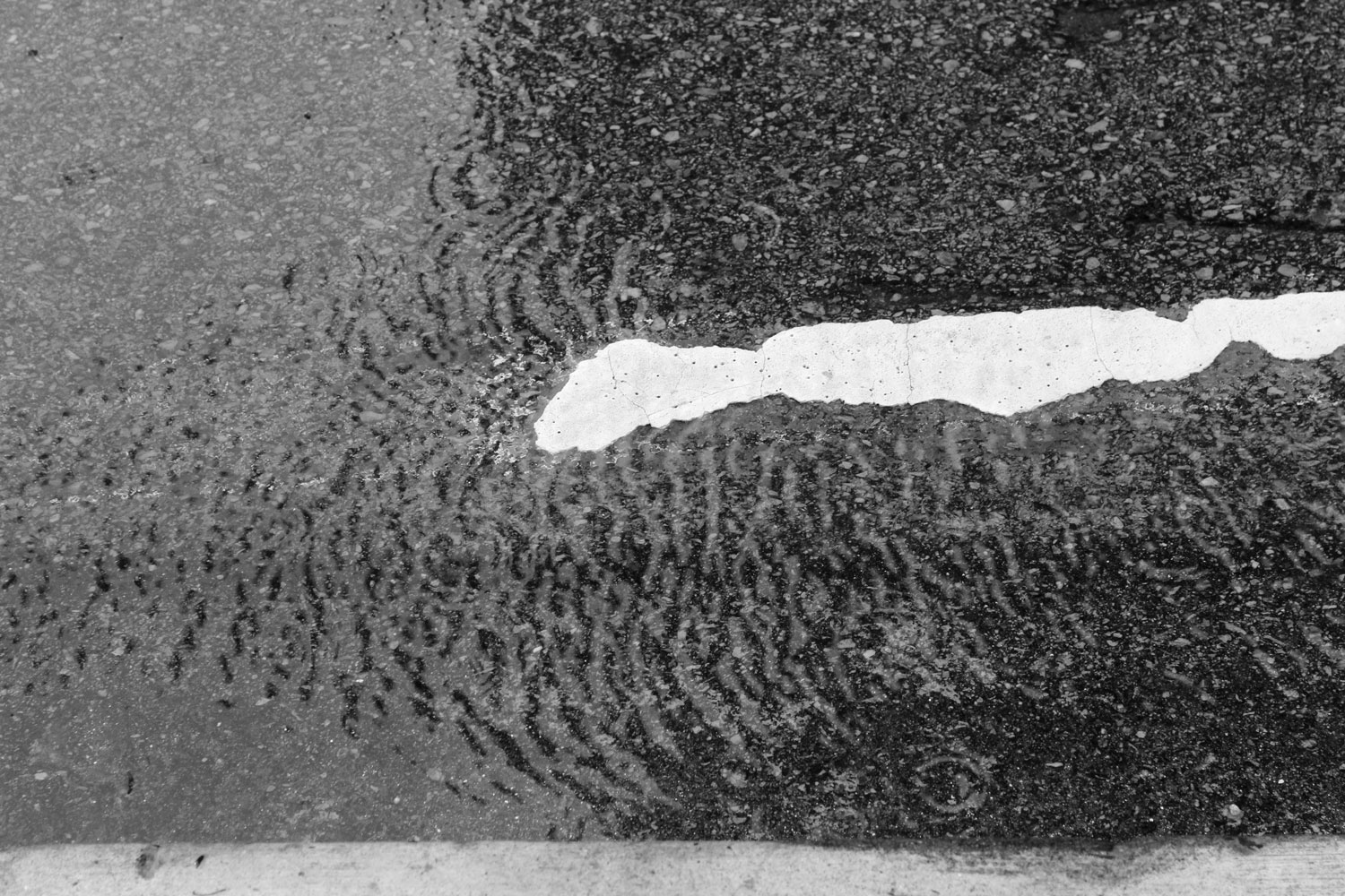
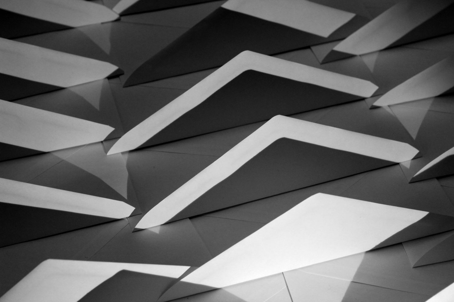
The goal of this project was to create imagery that is transformed by light. The point is to make light itself—the nature of illumination, or the visual effects caused by it—the primary subject of the photograph. The viewer should get the point that the images are about light, more so than about the people, places, and things also depicted.
Time Revealed
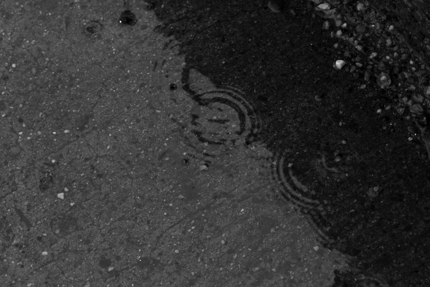
The passage of time is revealed in all motion. The goal for this project was to explore time through motion and use the shutter speed to control the effect of freezing motion and describing motion.
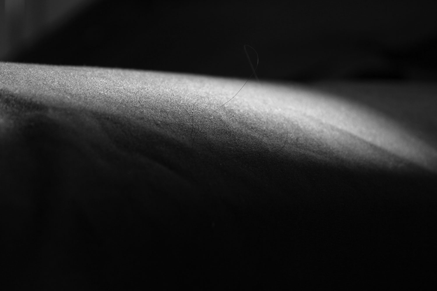
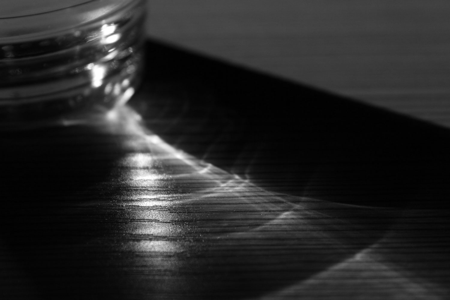
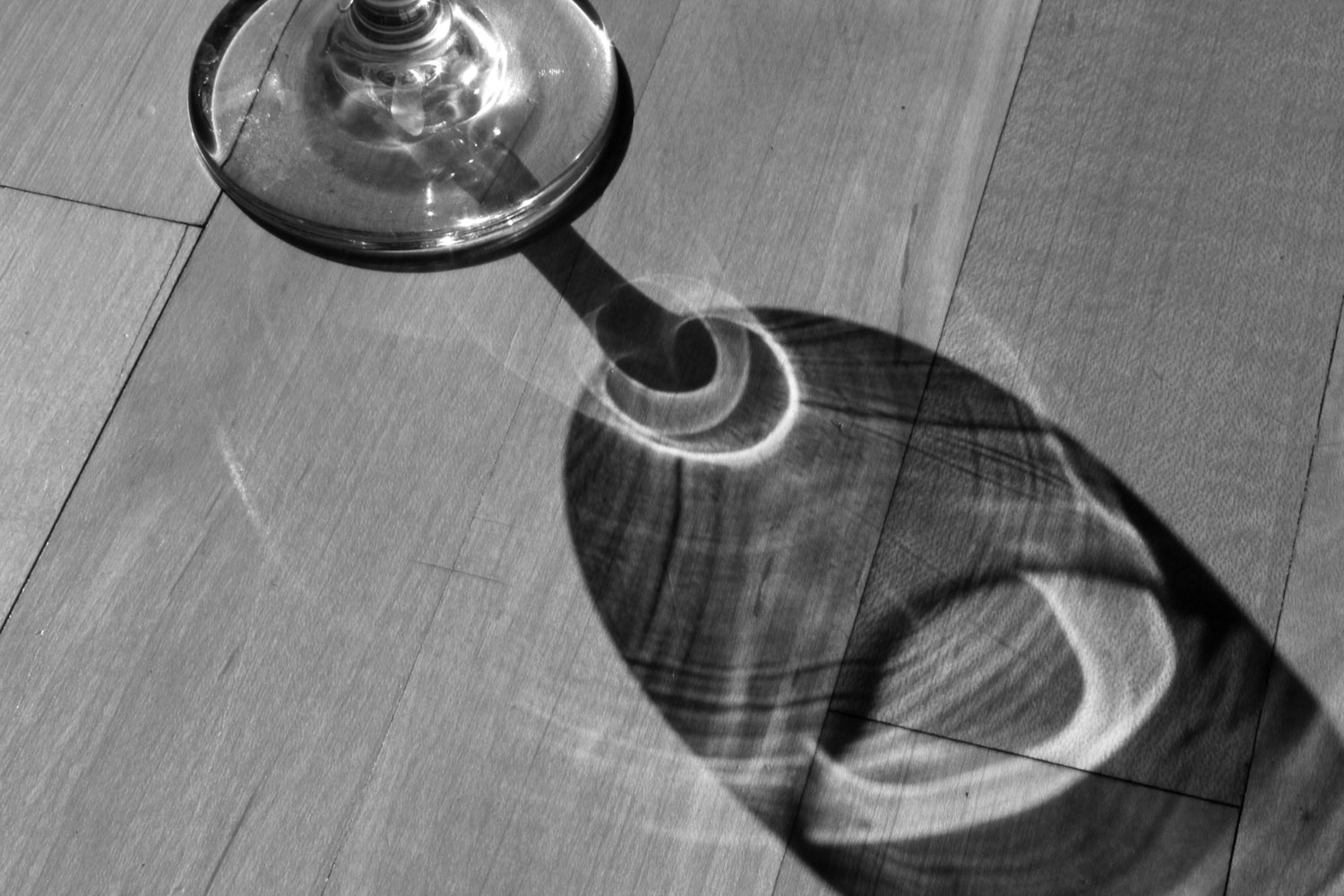
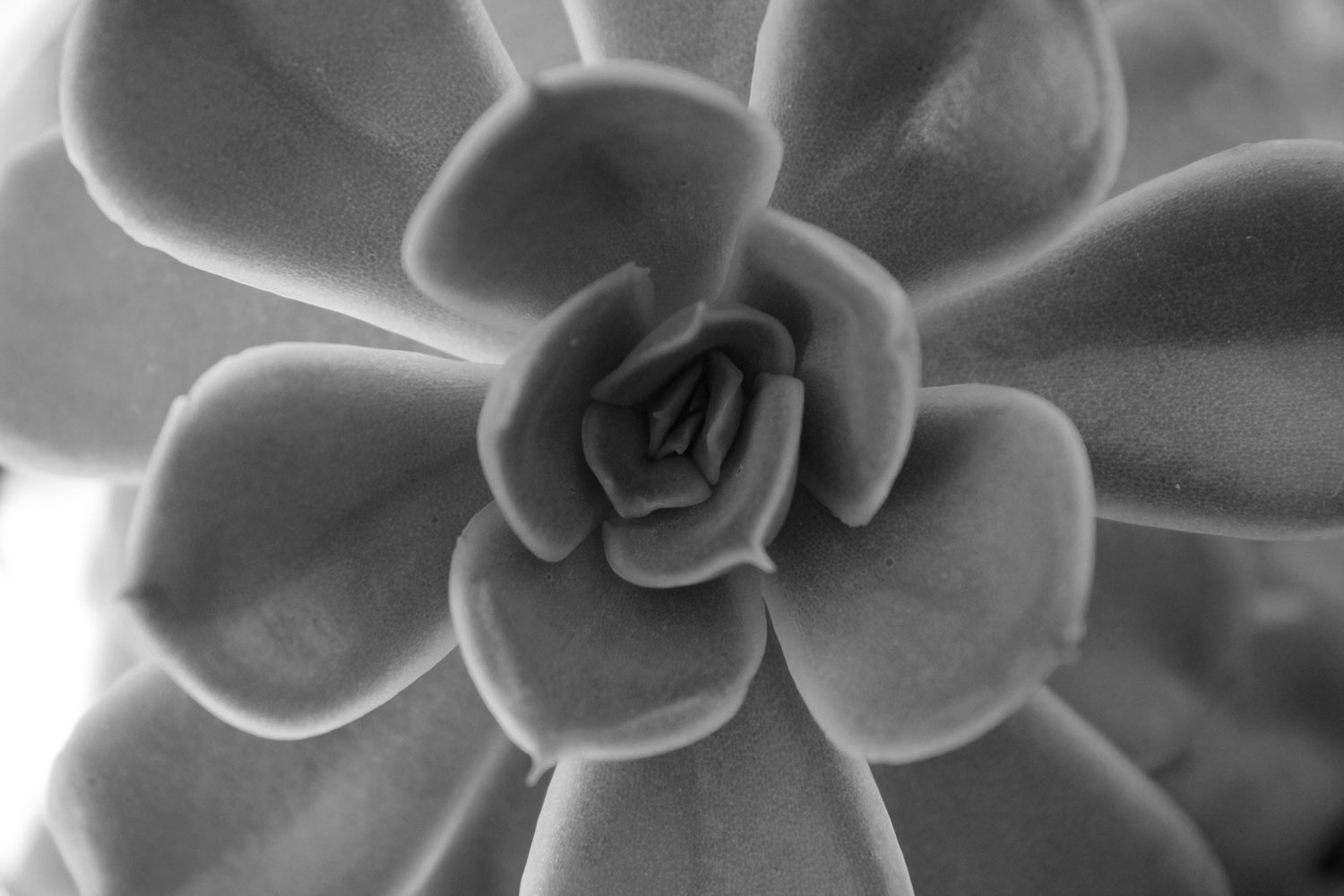
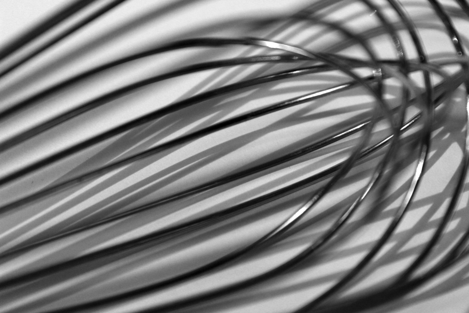
Independent Project
For my independent project, I decided to photograph intimate and transformative portraits of everyday objects. I am drawn to things we see all the time but do not pay attention to, and I wanted to establish a new way of looking at these objects. I aimed to show each object in a different context or from a different vantage point than how we normally it.
Art History: Ancient to Medieval
This class was pretty boring, to be honest. It spanned about 3 thousand years, which is insane! The thing is though, painting hadn’t yet been invented for much of that time, so the first half of this class was about architecture, which I’m just not interested in. “Architecture” is actually kind of a generous word for what we were studying, because most of the buildings we looked at were mud huts and tombs. They all kind of blended together. Things picked up a little once we got into Ancient Greece and Rome, though. And this class ended my art history requirement!
Physics: How Things Work
Hmmm, one of these classes is not like the other…. At Drexel, everyone in every college must take a natural science. Because I like math, I thought a physics class would be most enjoyable for me. It was okay, but mostly I’m glad I got through it. I really liked everything to do with mechanics, but once we got into electricity I was pretty lost.
Conclusion
This quarter was really fun for me. It was the first quarter where I felt like I was taking real design classes where we were actually making real things instead of just doing exercises (which are important but not nearly as fun!). I attribute most of this feeling to my experience in my logo design course. It was really game-changing for me, both in terms of growing my skills and changing the way I thought about design in general. I had an amazing professor who was hard on us and really pushed everyone to do their absolute best. As I’ve continued on in my design education, I’ve realized that I learn the most and gain the most valuable experiences from the professors that really push me. It was an amazing class, and I feel like I really grew as a designer because of it.