An Overview of the Fourth Quarter of My Second Year at Design School
I had a pretty good spring quarter, so I was super excited to start summer quarter! This was my first summer actually in school/working instead of lazing around and traveling, so that was kind of a bummer, but I had heard that summer quarter tends to be more relaxed than the others and I was looking forward to that. Boy was that rumor wrong!
Though I was taking mostly required classes for my major, none of them was a core design class (what Drexel calls Visual Communications). I took Screenprint I, Web Graphics II, Design on Site, History of Modern Design, and Multimedia Performance.
Screenprint I
I was really nervous for this class because I tend not to enjoy fine arts classes and I had heard that it required a lot of outside work that you’d have to go to the print studio to do (obviously all of my classes require work outside of class, but usually I can do it at home or in the normal computer labs). However, this turned out to be my favorite class of the quarter by far!
We spent about three weeks learning the process of screen printing. For those who don’t know, it’s very similar to photography except that everything is positive instead of negative. Basically, you create a design on a mylar (which is just a thin, transparent material) in black. It can be printed from a computer, but you can also use black paint, ink, or construction paper. Everything that’s black will be filled in with ink when you print. Then, you coat your screen in emulsion, which is a light-sensitive chemical, and expose your design onto the screen using an exposure unit. The light will be blocked by the black areas of the design and won’t touch the emulsion, but the light will harden the emulsion that’s not blocked by your design. You wash the soft emulsion off in the sink while the hardened emulsion stays on your screen. Now, you have a screen covered in emulsion, but with clear areas showing your design. The ink will go through everywhere the screen is clear and will be blocked everywhere there’s emulsion. You then flood the screen with ink and use a squeegee to pull the ink across the paper. This prints one color, and you repeat this process for the number of colors you have. All of our projects required a minimum of five colors.
For each project, our professor gave us an inspiration word as a jumping off point. Additionally, we had to print an edition of fifteen prints, with the goal of turning in five good ones. When I first heard this I thought, “no way are two thirds of my prints going to be bad,” but it was at least that. Screen printing is really challenging!
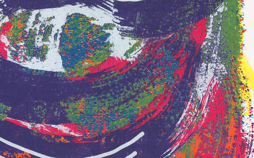
“Opacity”
Opacity is the amount you can see through an object. I decided to interpret this pretty literally and print a bunch of semi-transparent shapes in an abstract composition.
This was really hard for me to print, not only because it was my first print ever (and screen printing is a lot harder than it seems!), but because of the design itself. My design was mostly flat areas of color, and the process can be pretty unforgiving with those because every little mistake becomes very apparent.
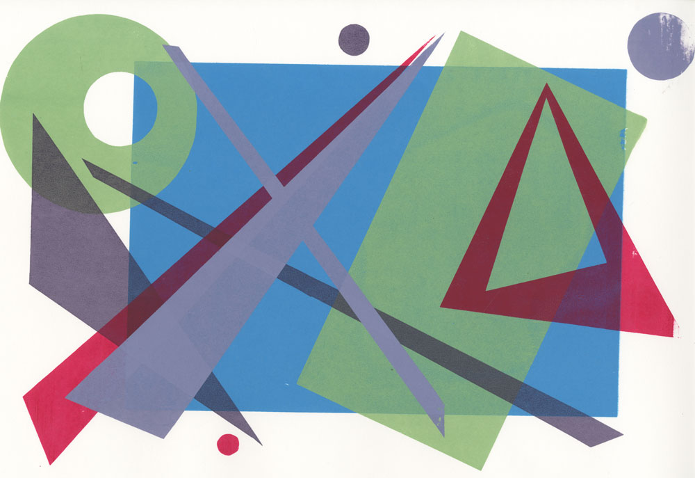
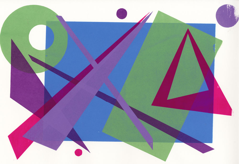
I’m pretty proud of this project (though you can definitely see printing errors), however I wish I had mixed the colors with a little more care. In my head, I imagined them looking something like this:
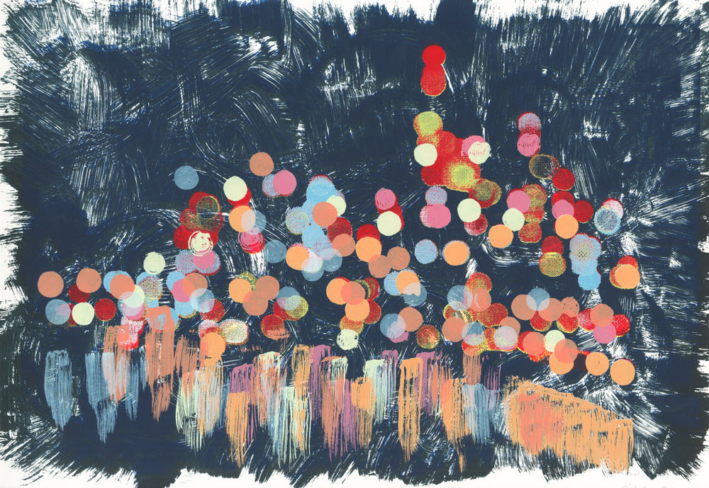
“Luminous”
Our second word was “luminous,” meaning emitting light. We were encouraged to find inspiration from a photo, employ half-tone dots, and use various textures. I was really inspired by coastal cities at night, as I’ve always loved the way the city lights reflect off the water. I came across the following photo using the bokeh technique, and I instantly fell in love.

Rather than simply printing the photo, I wanted to add a painterly effect so I did mostly everything by hand. I painted swirls for the sky and exposed the mylar for two different times to get two textures out of the same design. I then did two layers of halftone dots from the photo, but all the other layers were hand-drawn and painted.
I’m pretty proud of this project, and all the textures were much more forgiving when it came to seeing printing errors. It turned out much more abstract that I had envisioned, but I still really like it. The one thing my professor said in critique, and I agree with her, is that the composition feels unbalanced because the right side is so empty. I should’ve added dots over there as well.
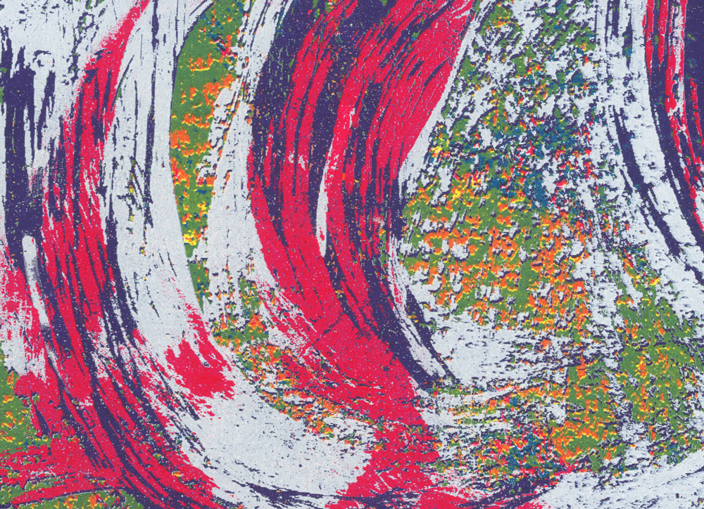
“Delirium”
The word for our final project was “delirium,” meaning a disturbed state of mind that is characterized by restlessness, incoherence, and often hallucinations. I decided to focus on the hallucinatory aspect of delirium and make something very abstract and trippy, for lack of a better word.
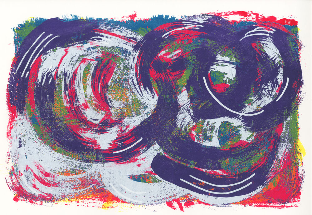
My last two prints could be easily reproduced by a painter, so for this one, I wanted to make something that could only be produced through screen printing, even though I used brush strokes to make the swirls and patterns. Part of this happened accidentally. I wanted to print purple, but because it was going directly over green I had to print white first in order to get a pure purple. So I printed white, and even though I didn’t move the screen at all before printing purple, the registration was about a millimeter off, causing this hallucinatory, granular effect. I absolutely loved it, and decided to print two layers for each mylar instead of one in order to purposefully recreate the effect.
Here are some close-ups of the off-registration effect that would make it nearly impossible for a painter to reproduce:
This was an amazing class, in part because I got to work with my hands and get a bit messy. It was particularly nice when contrasted with my web graphics class which required sitting in front of a screen for hours on end. I love sitting in front of a screen, but it was nice to step away from the computer and work with a different kind of screen (heh heh).
Web Graphics II
After my wonderful Web Graphics I class, I was excited for the next installment. The last class taught us basic HTML and CSS, and this class focused on responsive design. However like the first class, we used vanilla HTML and CSS, along with the framework Foundation. I had never used Foundation before (though I had used Bootstrap, which is pretty similar), so I enjoyed getting to know a new tool. However, I have pretty negative views of frameworks. I understand that they make life easier by speeding up the process of coding, but I just can’t stand to see my HTML cluttered up with presentation classes. That’s why I prefer Bourbon and Neat—they give you most of the same benefits as a framework like Foundation or Bootstrap without all the horrible classes mucking up your HTML. However, we had to use Foundation for this class, and I have to admit, my feelings towards it warmed a little when I saw how much time it saved me. I’m still conflicted though.
Most of the class was spent learning Foundation and working on various small projects. Though we did some design, most of the class focused on development (why they call it Web Graphics I’ll never know). We learned how to make responsive navigation bars with burger menus for small screens, off-canvas menus, and dropdown menus. We also earned how to embed custom Google maps using Javascript (which was definitely new to me and really cool!), CSS3 animations, and responsive forms with basic validation. We sort of touched some Javascript, though to be fair, Foundation did most of the work. Customizing the Google map took a fair amount of Javascript, and we also toggled between classes for animations.
Chester County Balloon Festival
For the first large project, we were given text and a couple images and had to design and build a site for the Chester County Balloon Festival. I’m not super proud of this site (it needs way, way more vertical space), but I think it’s okay. I did enjoy making the icons.
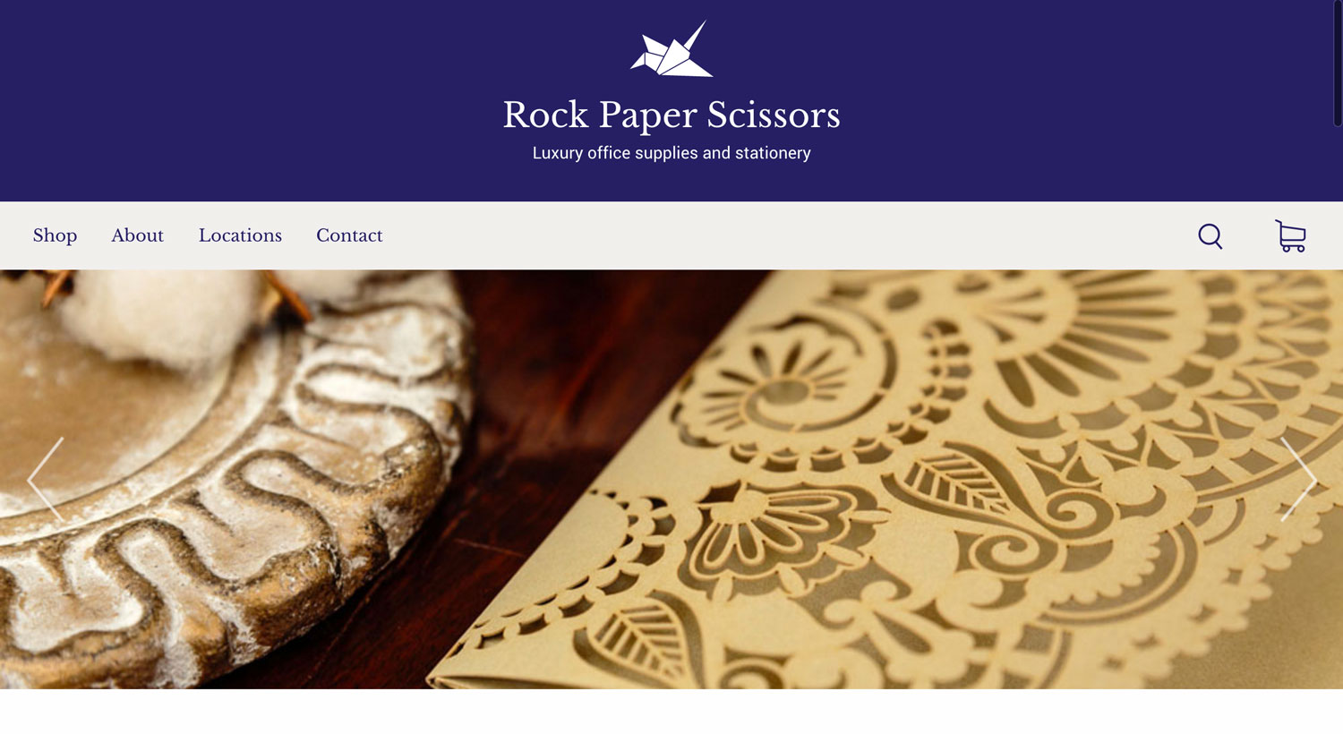
Rock Paper Scissors
For our final project, we had to make a site for the fictional companies we designed identities for in Visual Communication II last winter. Mine was a luxury office supply and stationery store called Rock Paper Scissors. The requirements for the project were that 40% of the pictures had to be our own photography, there must be at least two instances of CSS3 animation, we had to have an animated burger menu, and we had to include a responsive video, Google map, and form.
To go with the identity I designed for Rock Paper Scissors in the winter, I wanted to create a beautifully elegant site that put the products they sell at the center of attention. I wanted to show both isolated products for sale as well as products outside of the retail context. I decided that the best way to show products in use would be through a featured product slider at the top of the home page.
See the walkthrough of the site in the portfolio piece
Design on Site
This was an amazingly fun class, and my only elective for the term. Once a week, we took a trip and visited a working design agency. We got to take a tour and ask the designers questions about their jobs. Some agencies were independent and others were in-house, and we got a good mixture of web and print.
We visited amazing places: M Booth and Crowdtap in NYC, Urban Outfitters headquarters, The Constitution Center, and Ex;it (just to name a few!). At the end of the term, we had to write a short paper about which places we liked, which we didn’t, and whether we could see ourselves working at any of these places or similar agencies.
Needless to say, I ate the whole thing up. It made me confront my feelings about the type of job I want to have when I graduate, though that’s still extremely vague. I see the benefits and downsides of both working in-house and working at an agency, as well as being part of a large design team or being part of a tiny one. I also haven’t decided which field I’d like to go into. I absolutely love web design, but my favorite class at Drexel so far was corporate identity design, and that’s what the designers I look up to do.
Clearly, I still have a lot of thinking to do.
History of Modern Design
I had such high hopes for this class. I mean, it sounds really interesting. Unfortunately, what I thought would be a class about graphic design history and learning about various movements was mostly a class about furniture and architecture. I just don’t find those at all interesting.
It was a writing-intensive course, so we had to complete reading responses every week and write three papers throughout the term. I did enjoy writing the last paper, which was on a product of our choice designed after 1975. I chose the Amazon Kindle because it was the first commercially-successful e-reader and had a profound impact on our culture. It was really fun to research for and write.
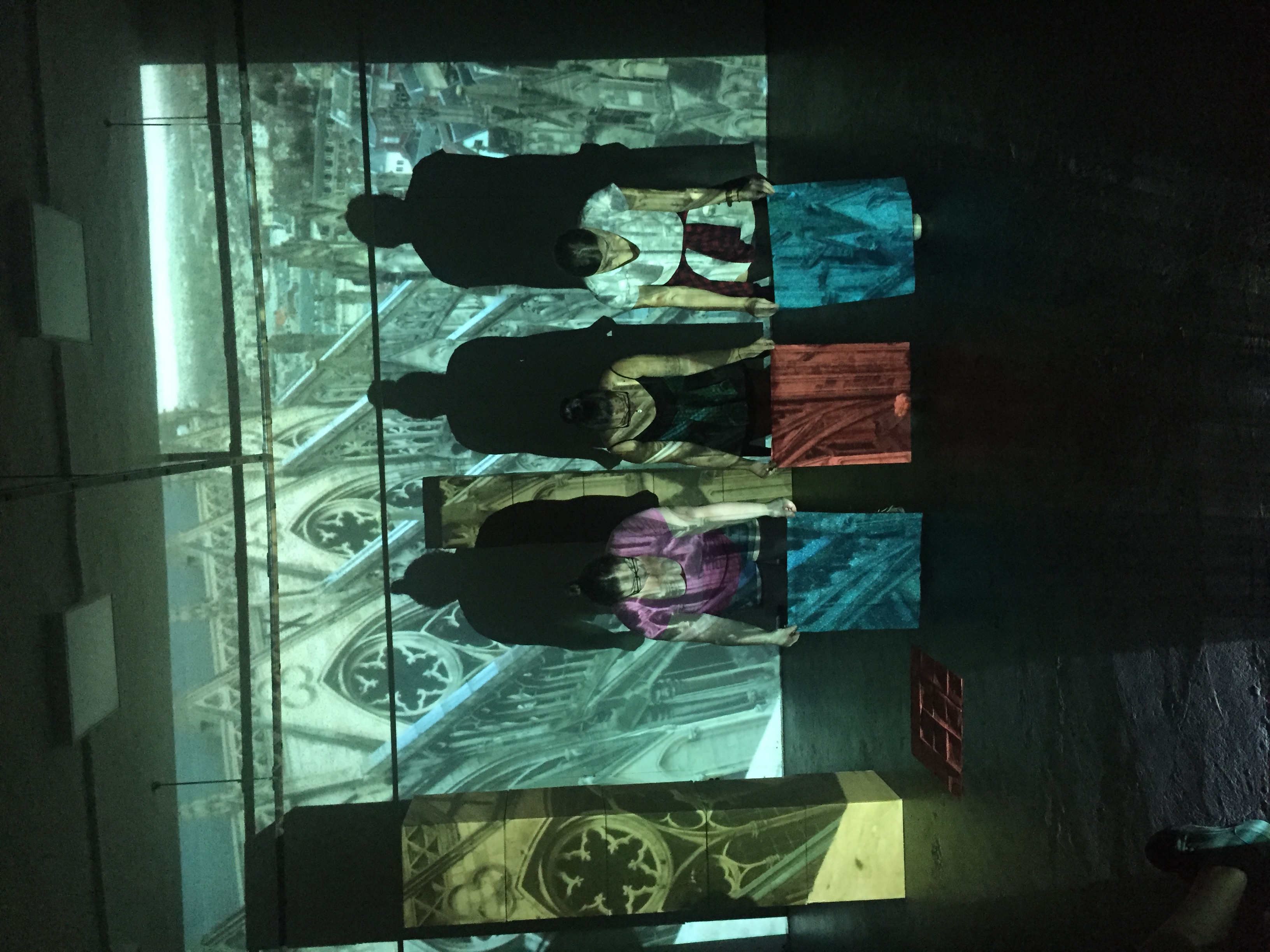
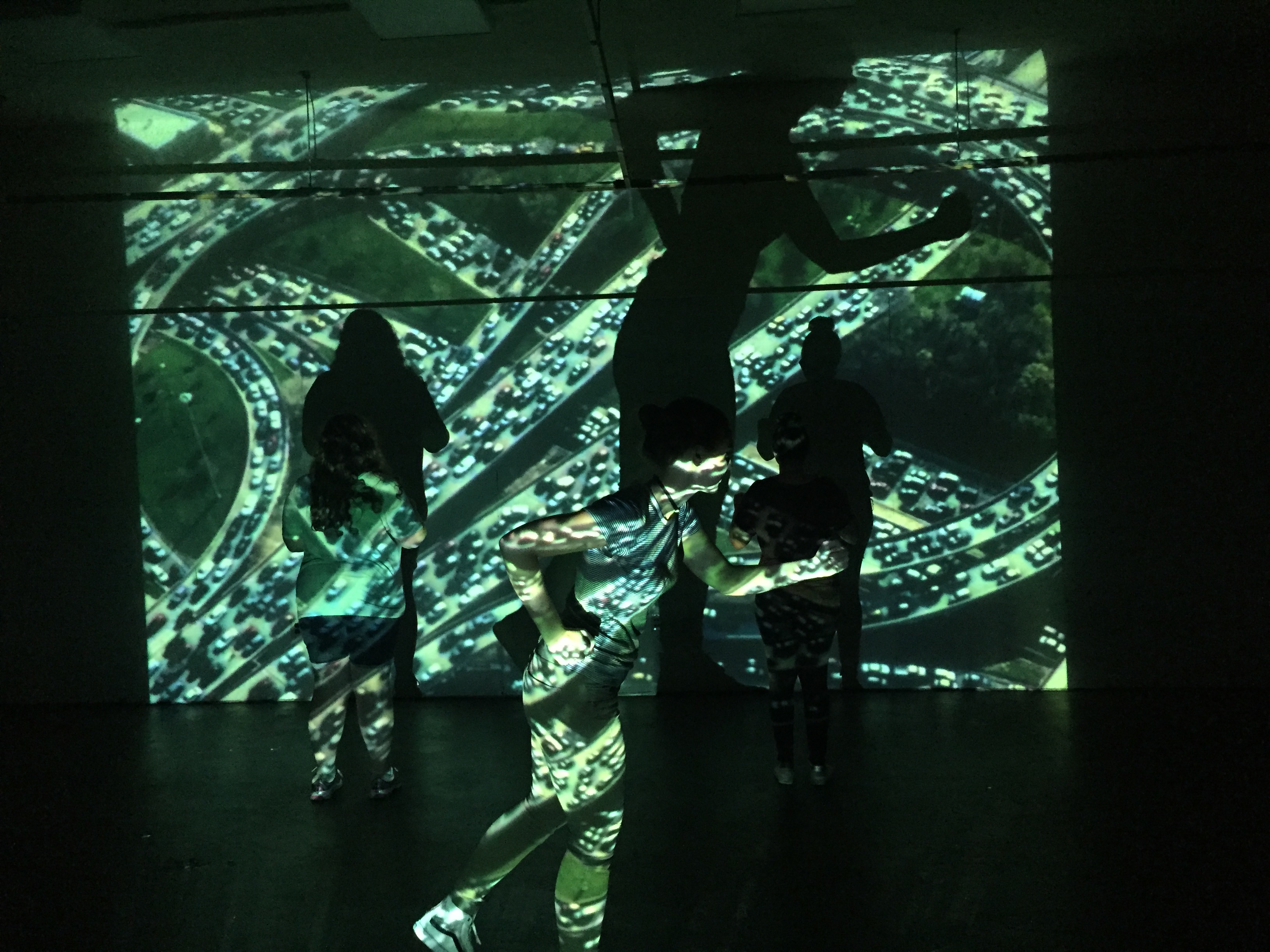
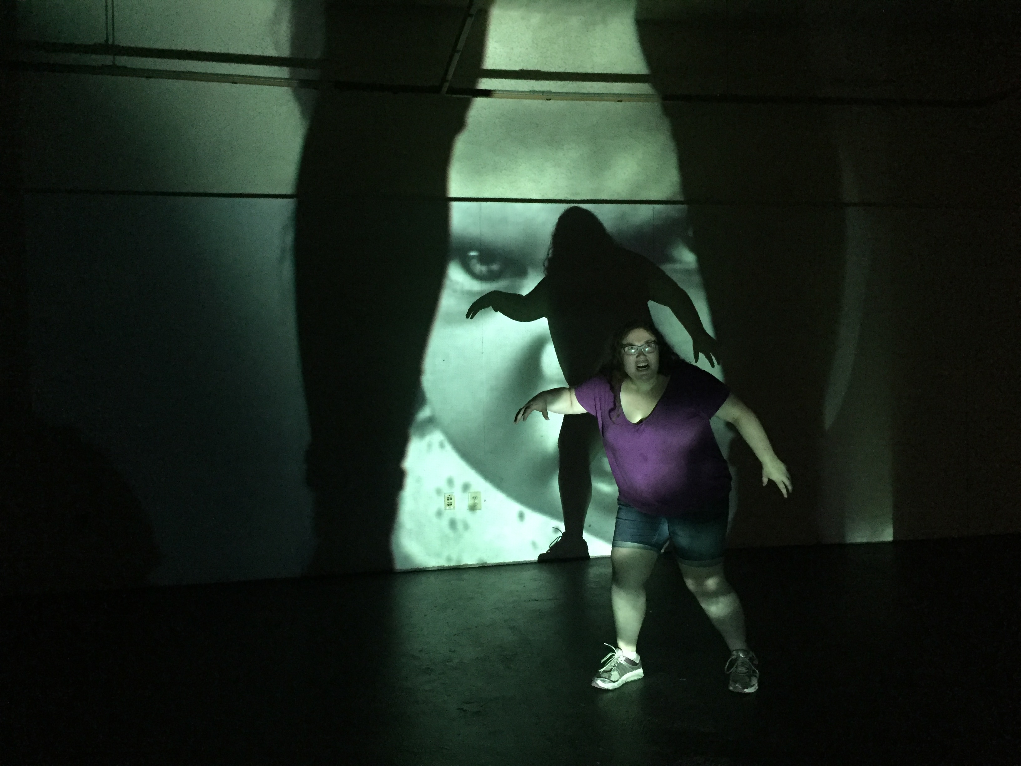
Multimedia Performance
For some reason, graphic design majors are required to chose from Multimedia: Performance, Multimedia: Space, and Multimedia: Materials. Because of my singing and acting background, I chose the performance class. It was, without a doubt, the weirdest class I’ve ever taken.
Because it was multimedia performance, we had to use images, sound, projected language, and movement to compose into a performance. The professor called it “4-D design.” Most of the time, our performances involved standing in front of the projector so the projection appeared on our bodies. One performance was a 10-minute sound piece where the audience had their eyes closed and we had to surround them with sound. Another performance was an interpretation of time. One time, we had to go into a small museum, make observations about it, and perform an interpretation of what we saw there. My favorite performance was on a topic of our choice, and my group chose “horror.” I think we just wanted to scare the crap out of our classmates (it worked, by the way).
Conclusion
This quarter was really, really challenging. Not so much because the classes themselves were hard, but because they all took up a ton of time. Each assignment for Web II took at least 6 hours (and we often really only had a day to do them), and each Screenprint project took me about 30 hours. This was the first quarter where I felt like I had to really focus on time management, which I guess means I’ve been lucky for all the other terms.
Still, through all the stress and worrying about whether I’d finish in time, I loved it.