An Overview of the Third Quarter of My Second Year at Design School
I was really excited for this quarter because I was taking only classes that I was actually interested in taking. No art history, no random requirements. It was wonderful.
Visual Communications III (Publication Design)
This is the third class in a series of six Visual Communications classes at the core of Drexel’s graphic design curriculum. Much like Visual Communications II, where we tackled corporate identity design, there was really only one project for this class.
We had to create a magazine on a topic of our choice. We needed to design the cover, table of contents, and at least one feature story (which had to be at least two spreads). I was really excited for this class because it was taught by one of my favorite professors, and publication design is something that I had never really attempted. So I decided to make Invest, a magazine about personal finance and career development for people in their 20s and 30s.
It turned out to be extremely challenging for me.
A huge part of the class was image-making. The magazine, of course, had to have images, and we had to create all of them ourselves. I personal finance magazine probably wouldn’t have many photographs, and I’m just not much of an illustrator, so this aspect of the class was really hard for me.
The other significant part of the project was managing a large body of text. This, I loved. We hadn’t really gotten to typesetting multiple paragraphs in Typography yet, so it was an exciting challenge.
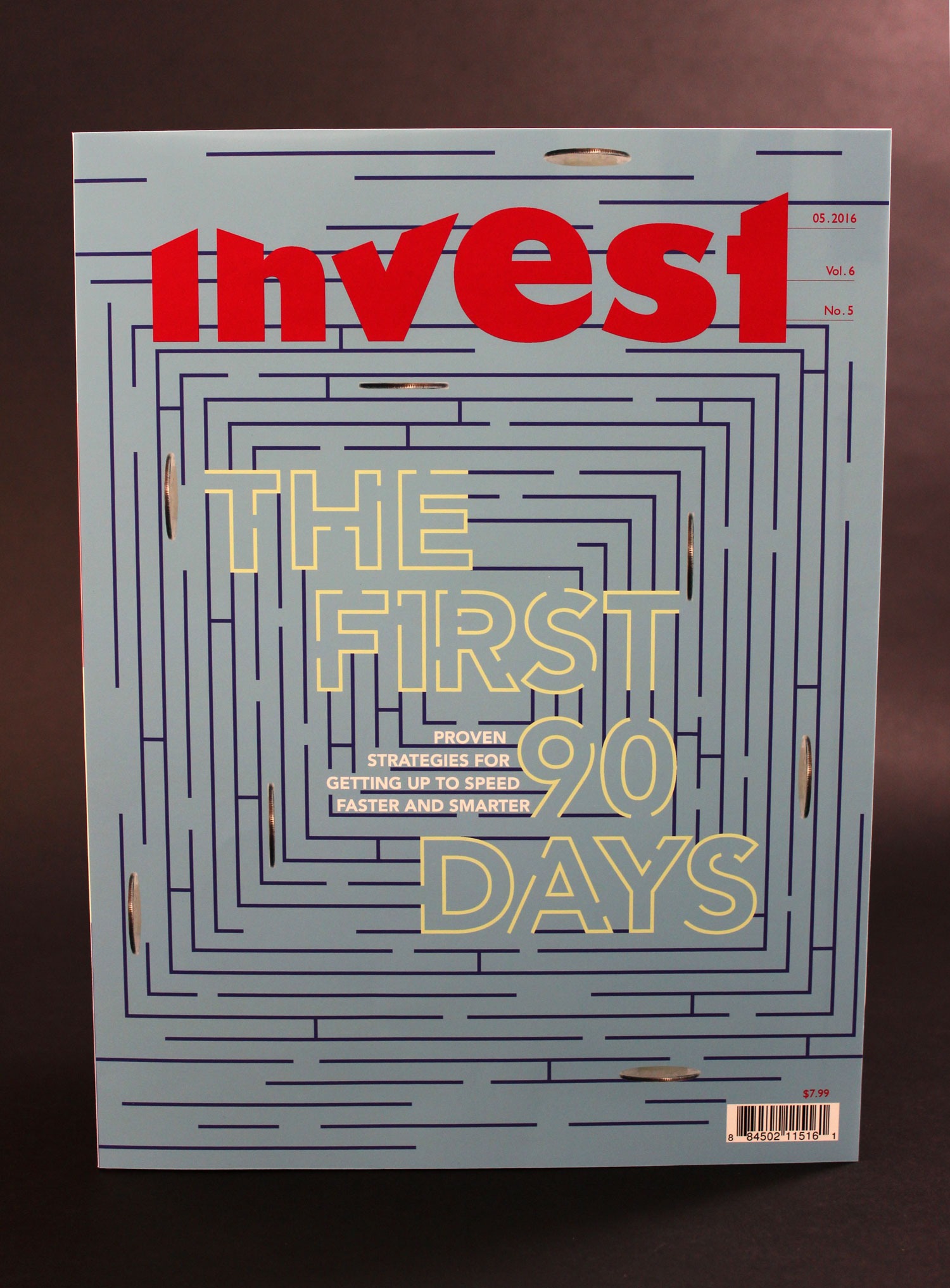
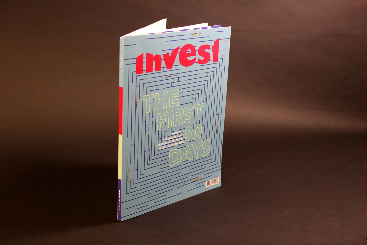
Below is the cover. The masthead reflects a graph of the ups and downs of the market, and the date, issue number, and volume number all look like numbers with decimals. The feature story is about the fact that the first 90 days in a new job often make or break your experience there, so I wanted to show a maze to represent the challenge of navigating through a new experience, full of roadblocks and setbacks.
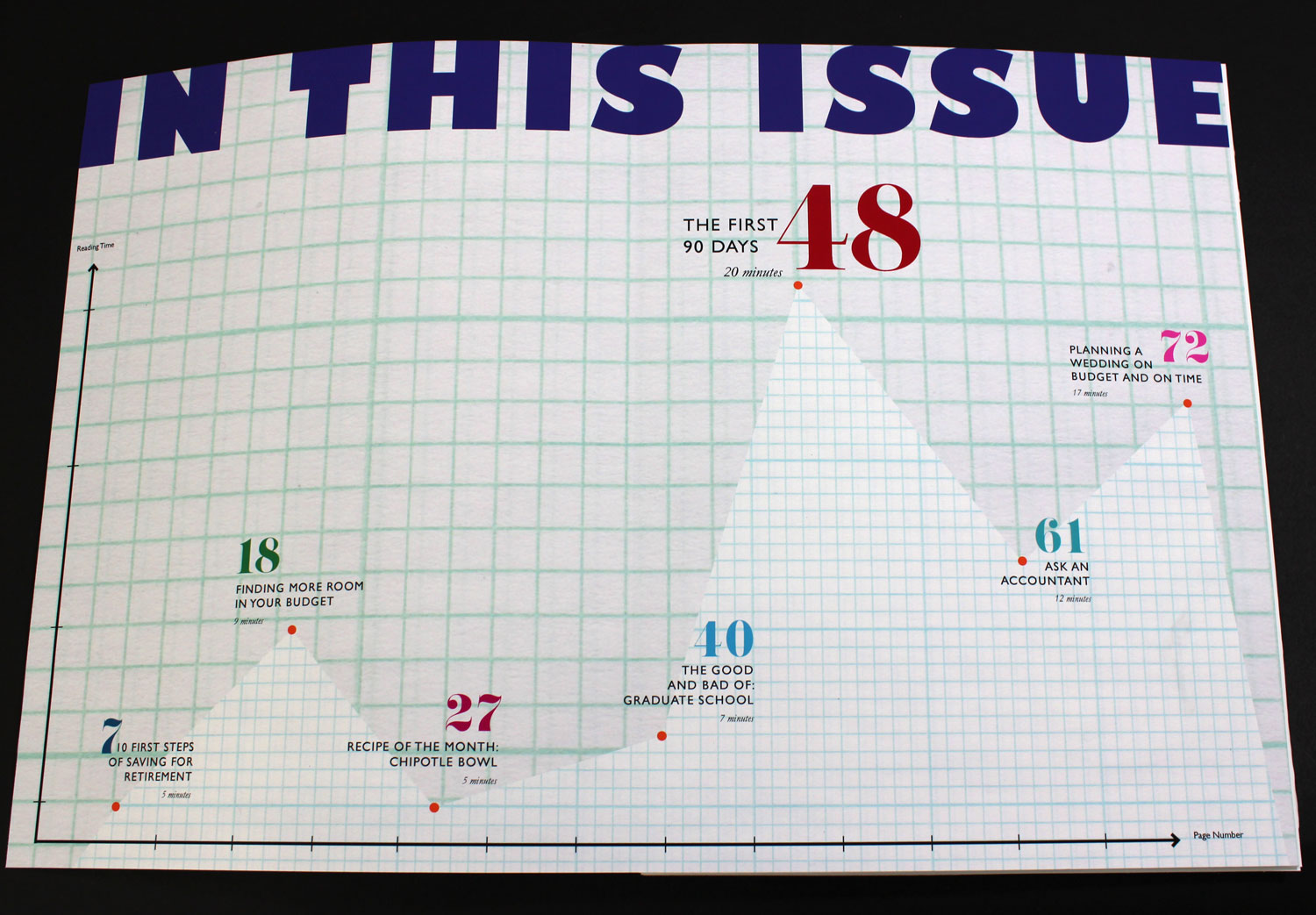
Because this is primarily a financial magazine, I wanted to include as many references to charts and numbers as I could, so I turned the table of contents into a large graph. The x-axis is page number and the y-axis is reading time so readers can select articles based on how much time they have to read them. Each square on the graph paper corresponds to one page and 30 seconds of reading time.
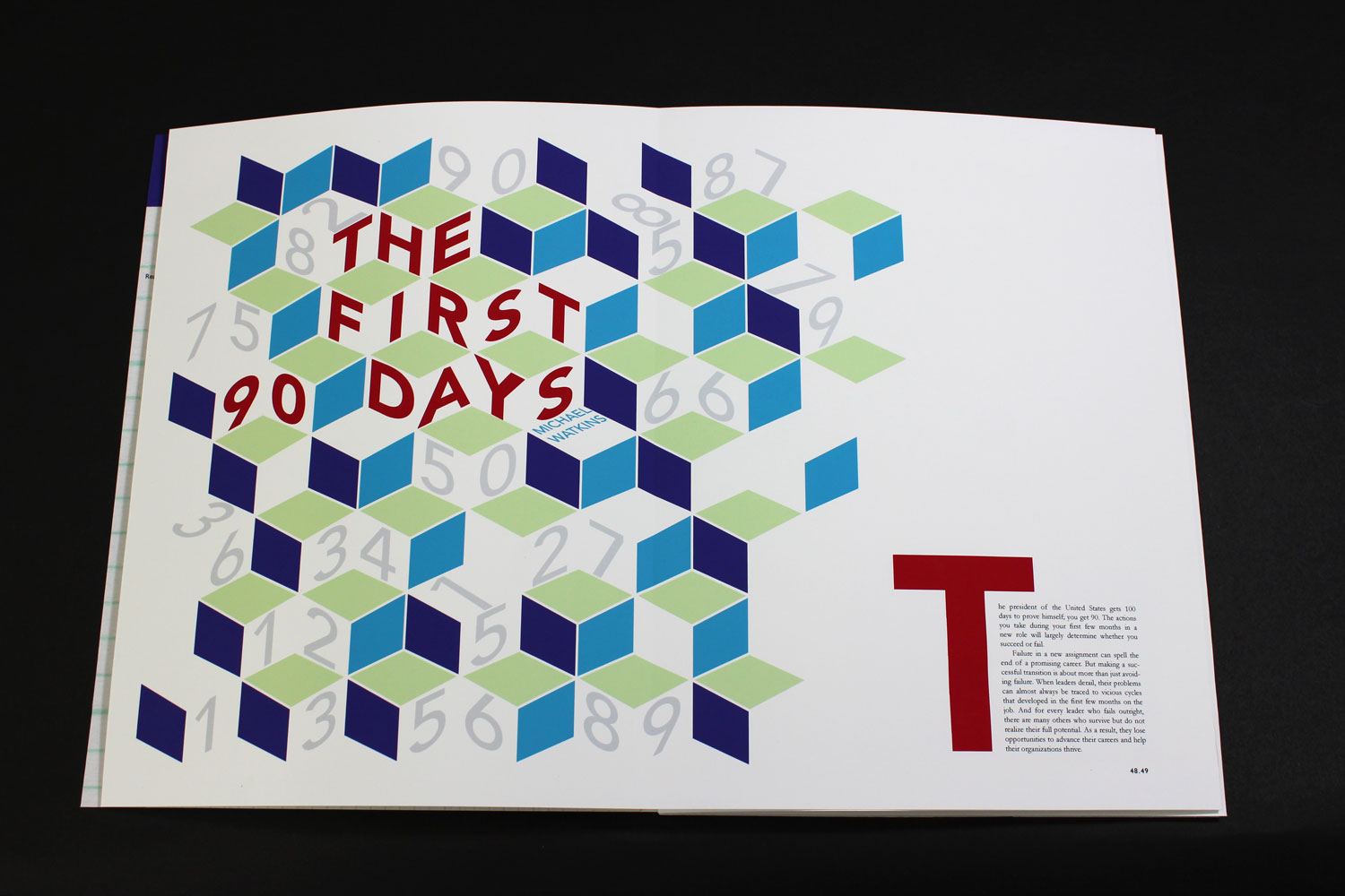
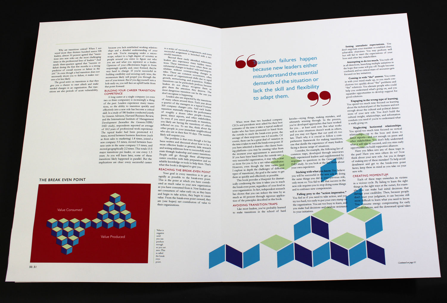
The first spread of the feature story features an illustration and the first paragraph of the article. I wanted to illustrate a structure to represent a person’s career: built with many dead-ends and plenty of opportunities to misstep.
The second spread houses the bulk of the text and a small chart illustrating a point the author makes. The structure of the text is reminiscent of a bar graph, and the parallel lines created by the justified type naturally fit with a magazine full of charts and graphs. I also wanted to incorporate the block structure from the previous spread into this one, so I arranged them to be falling into place at the bottom of the right page.
Ultimately, I’m relatively proud of my final magazine, but not over-the-moon about it. What I can say, however, is that I tried my very best. I asked my professor for feedback on what I could’ve done differently during the design process, and she said I needed to experiment more. She said that if I allowed myself to be freer in my initial experimentation before settling on an idea, I would produce great work. That makes sense, and it’s a change I intend to make.
Web Graphics I
This was a fun, but kind of unnecessary class. I learned HTML and CSS years ago, and through the creation of this site, have learned Jekyll and a templating language, Sass/SCSS, and how to use Git. I wasn’t super excited at the prospect of taking a basic HTML and CSS class (in fact, I’ll even have to take another one when I start classes for my minor in Interactive Digital Media).
Because we were using vanilla HTML and CSS, I had to copy and paste the header for each site onto each page and manually change the links, which was pretty annoying. And I also hated not having variables when writing CSS, but that’s just how it goes.
Throughout the class, I made three websites.
The Chicago Cubs
We made the first website with very basic HTML and CSS about a week into the class. It could be on a topic of our choice, so I picked the Cubs, my favorite baseball team. It’s a simple site, and completely unresponsive, so it only looks good on desktop.
Portfolio Site
Making a portfolio site was the final project for the class. Because this wasn’t a class in responsive design, it just had to look good at 1200 px. However, since I had prior experience with responsive design, I made my site responsive.
This was kind of a fun project even though I obviously already had a portfolio site (this one!). This site definitely portrays me as a digital designer and has a very flat aesthetic, so I wanted to switch things up for this project. I thought it would be interesting to design the site as if I were primarily a print designer and have everything look kind of tactile. The requirements were that we include a logo and a form, and I really like how it turned out.
Hogwarts Site
Because I already knew HTML and CSS, I finished my portfolio site with about a month left in the class. I had to do another project for the rest of the time, and my professor encouraged me to do something fun. Of course, I made a website for Hogwarts as if it were a real school that existed today.
I designed the logo, shield, and house badges, as well as coded the actual site. It’s fully responsive, and I used some JQuery, which I hadn’t really had much experience with.
I wanted to incorporate as many little details from the books as possible and make a really content-rich site. Below the slider showing recent events at the school, there is a disclaimer that pictures will not move on Muggle computers. The About page has the school motto, history, and song, and the Admissions page states that applications are neither necessary nor accepted. There is a Visit Us page that simply returns an error saying, “Accio web page! Error: not accessible from Muggle computer,” because Muggles can’t actually visit Hogwarts. On the Faculty and Staff page, the Defense Against the Dark Arts professor has “TBA” written next to it, because everyone knows Hogwarts can’t keep a DADA professor for more than a year.
Production
This was a relatively boring, but definitely necessary class. It taught us InDesign, as well as what happens after you complete a design. We learned about the printing process, various folds and formats for brochures, and color management. It was a lot of measuring and making mockups. I’m glad I learned this stuff—it just wasn’t particularly fun to learn.
Peer Reader in Context
This was a pretty cool class. It was the training class to become a Drexel peer reader at the writing center, and I took it at the recommendation of another professor.
Basically, we read a lot of educational theory and essays. It wasn’t the most captivating material, but the in-class discussions were really interesting. I also wrote a final essay on my identity as a thinker and writer, and how it’s changed over time. I put a ton of work into it, and I’m really proud of it.
Conclusion
This was also a hard quarter for me. I don’t really have other thoughts except that one. It was mostly about making myself keep going, and I think sometimes that’s just how college is. Even when you’re doing something you love.