An Overview of the First Quarter of My Second Year at Design School
I was so excited to start this school year. Last year, most of my classes were outside my major. Having a foundation year to learn the basics of design before you get into the specifics of your chosen field is pretty typical of art or design school. This year however, I dove into graphic design! Three out of five of my classes were in the graphic design department, and the other two were art classes of some sort.
Visual Communication I
The bulk of Drexel’s graphic design curriculum is made up of six classes called Visual Communication. Students take them in sequence over the course of three years, and it’s where they learn most of the graphic design skills like logo design, poster design, and packaging design. Each class focuses on one specific area. Visual Communication I focuses on the conceptual work of graphic design.
This class is somewhat similar to Design I from last year in that they both focus on abstract black and white compositions, but Visual Communication is a little more specialized. On the first day, my professor kept saying that we were learning a new language—how to communicate abstract concepts visually.
This class would also place a heavy focus on craft, as we were producing these compositions by hand using nothing but black pens and gouache on bristol paper.
Line and Dot Series
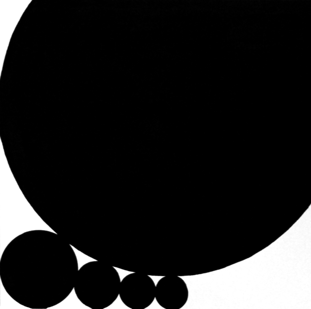
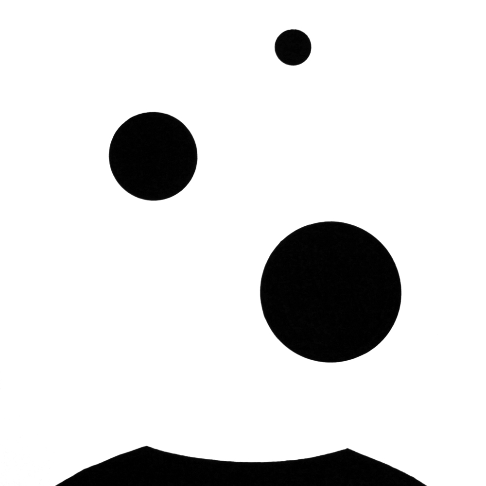
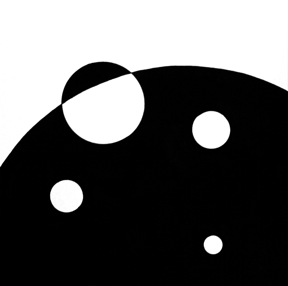
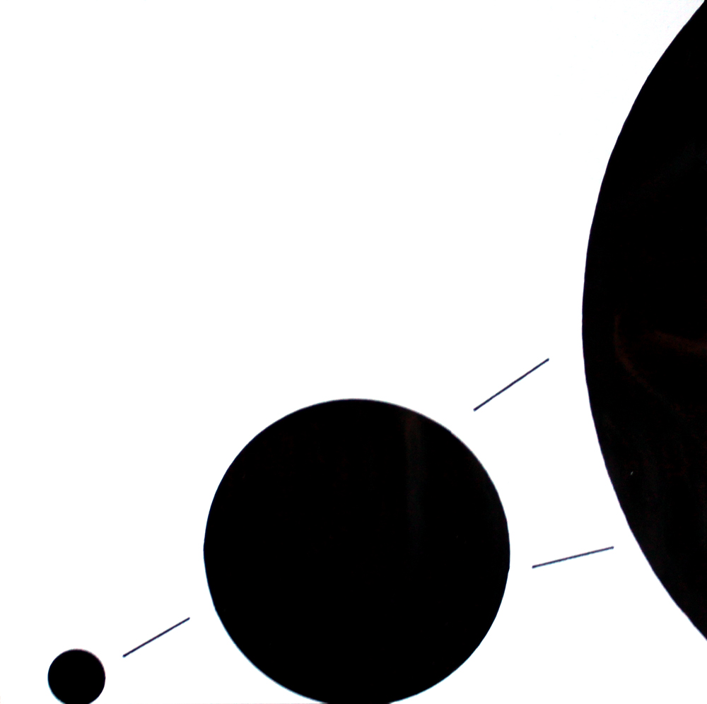
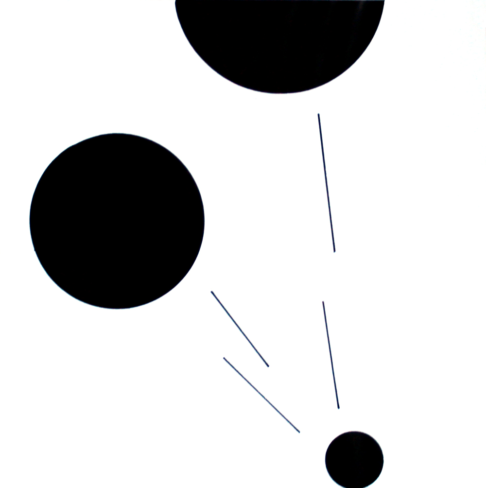
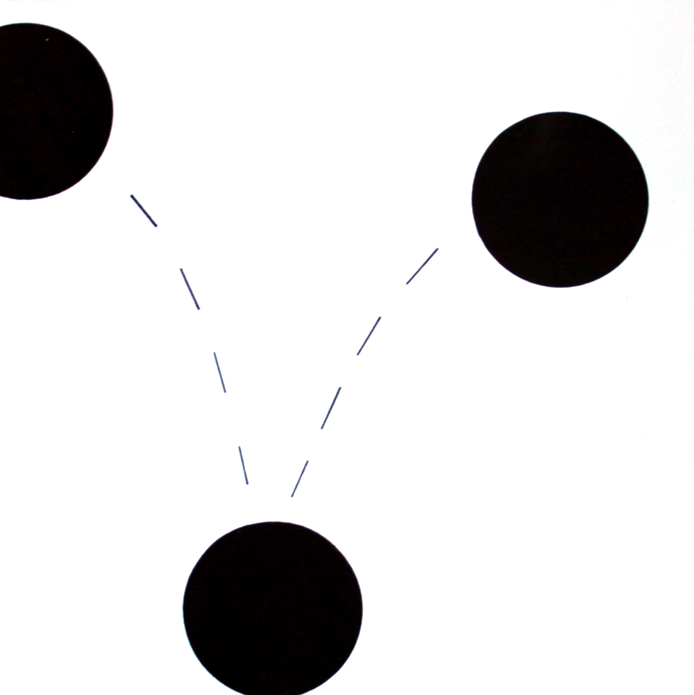
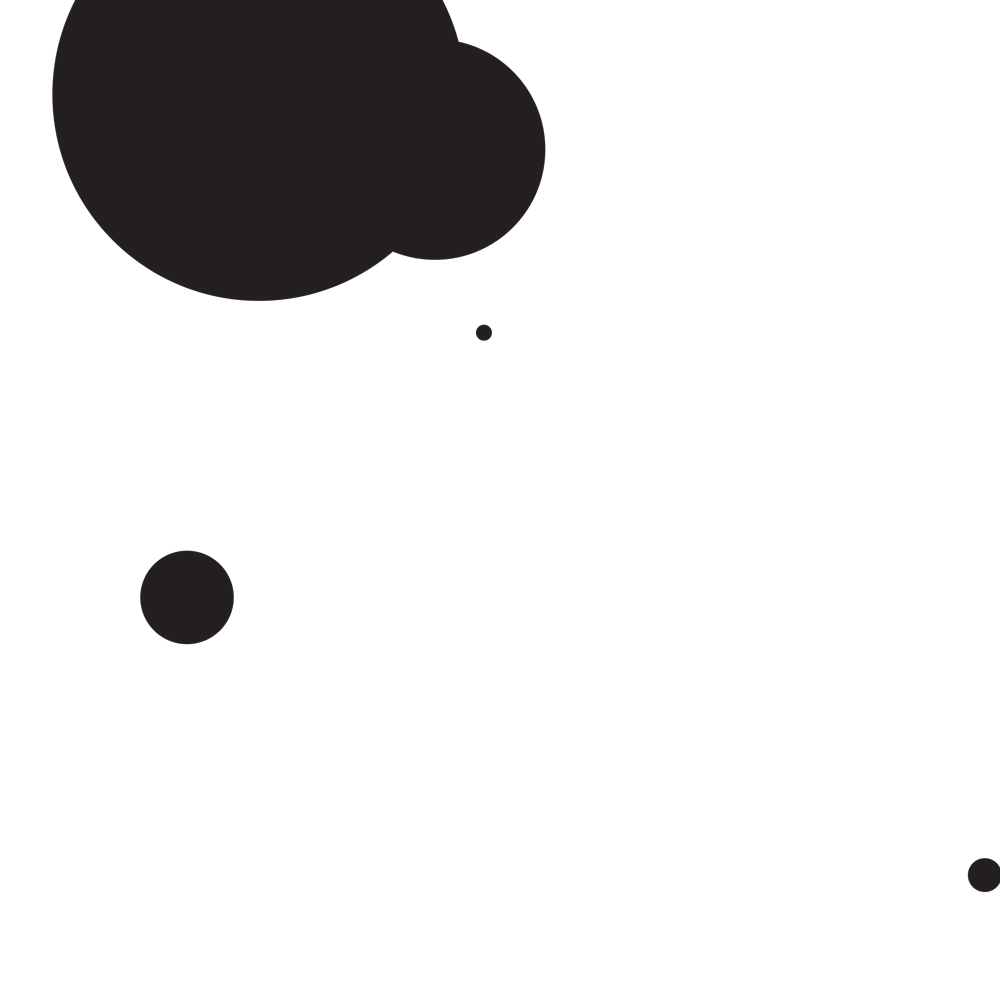
This was a series of twelve compositions and one twenty-second gif animation portraying concepts using just black and white dots and lines. We got a list of words, including “misanthropic”, “lively”, and “rebuke”, and had to communicate those words abstractly. First, we used black and white dots only, and we had to use exactly five. I depicted “heavy”, “choke”, erupt”, and “emerge”.
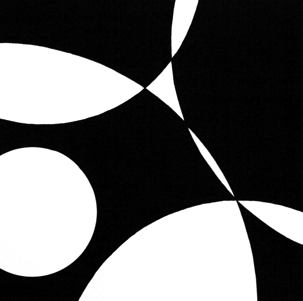
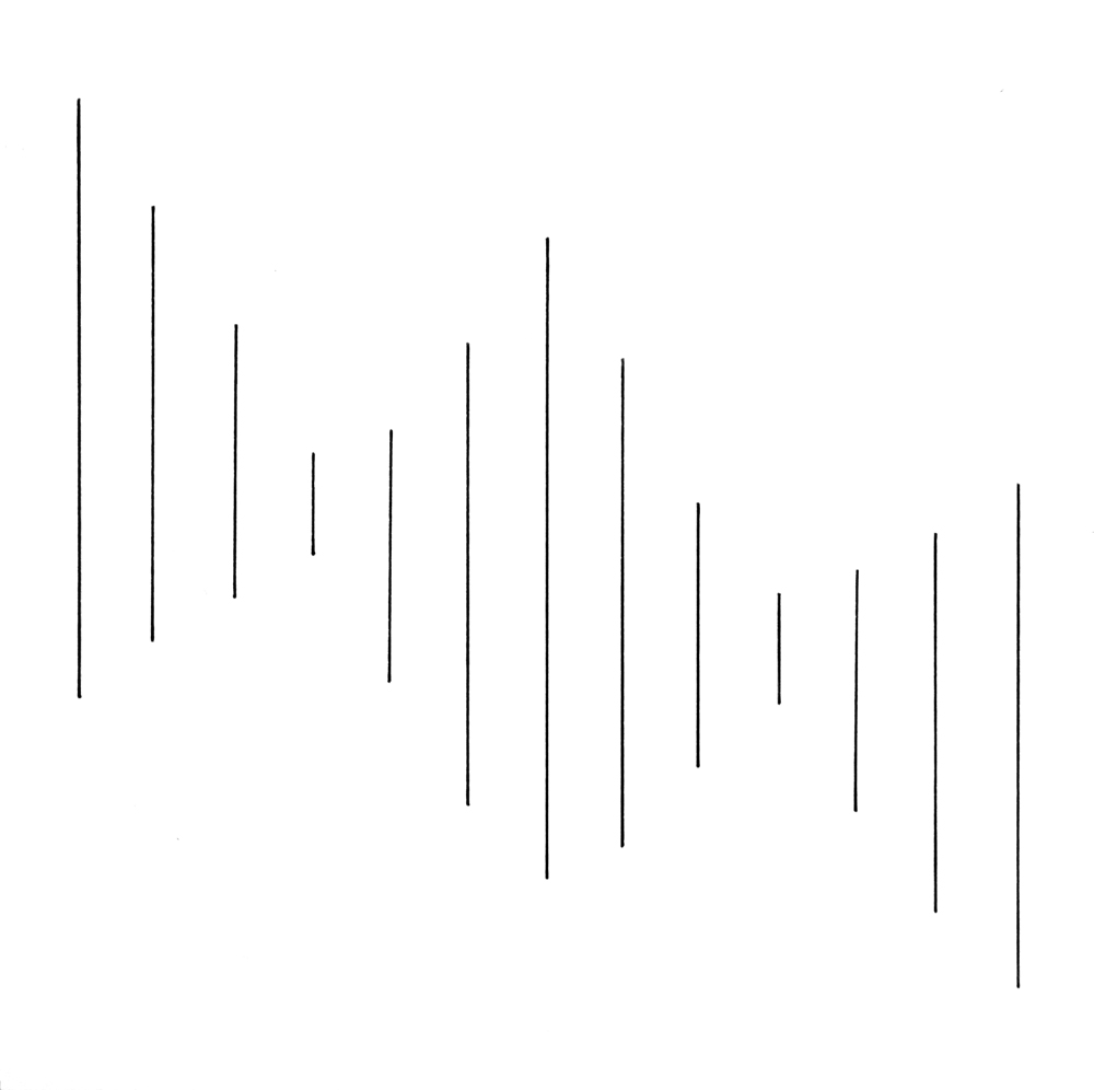
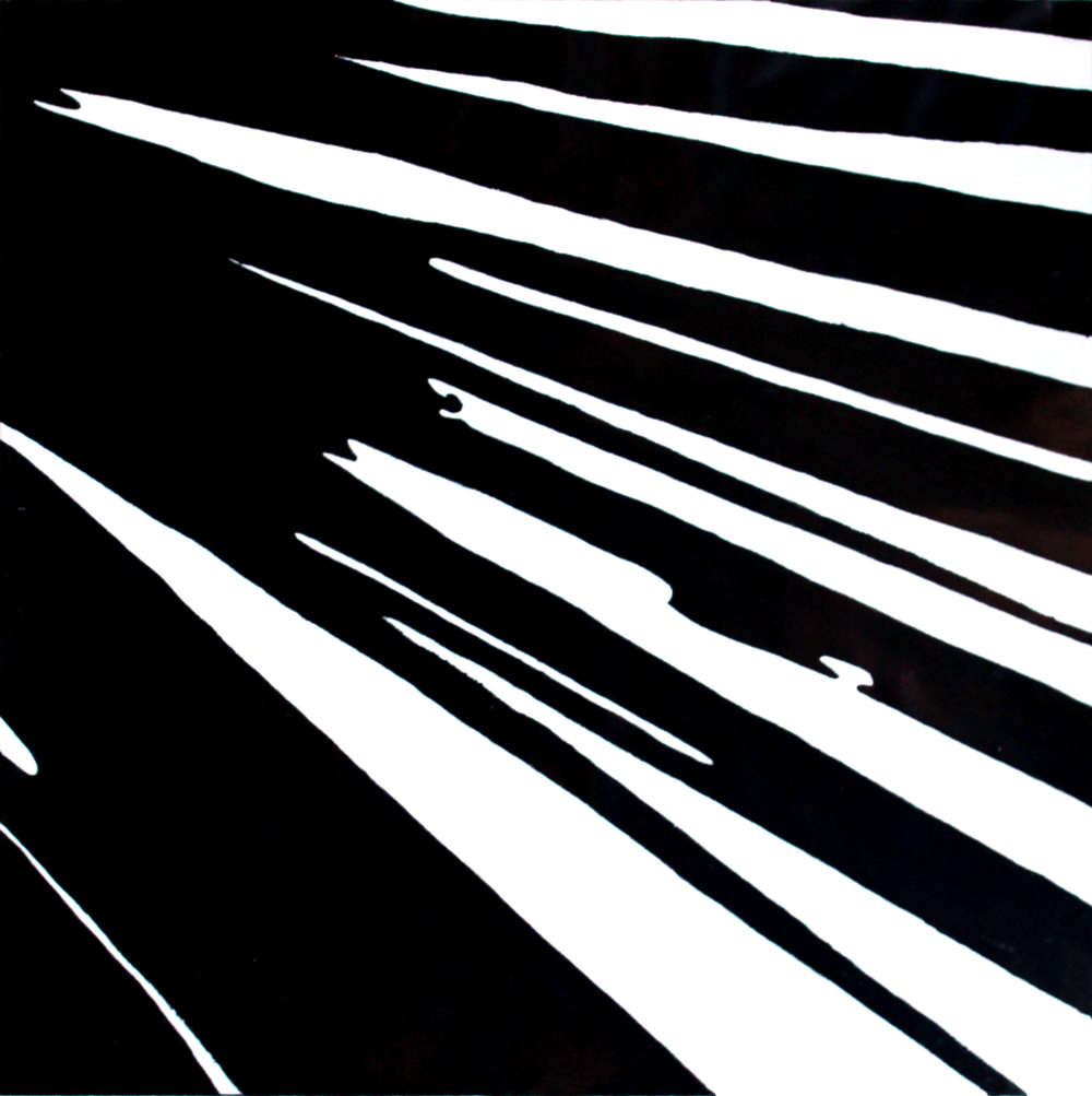
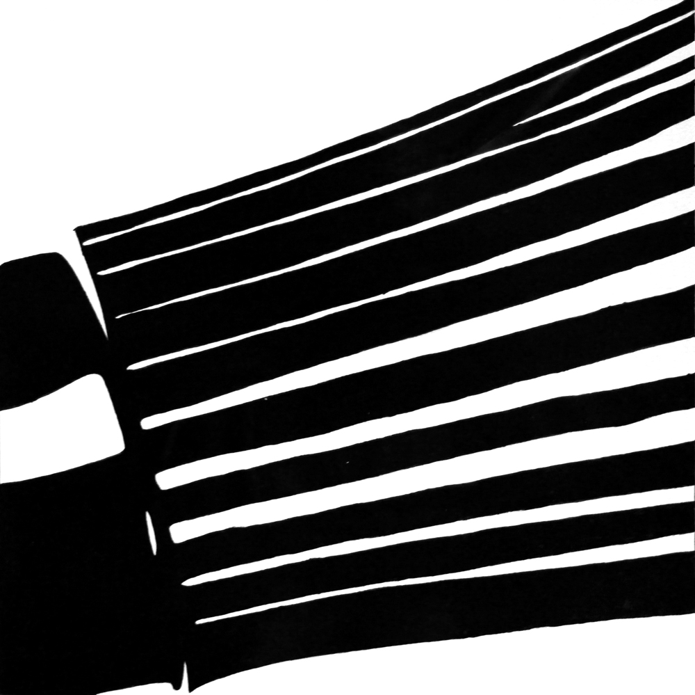
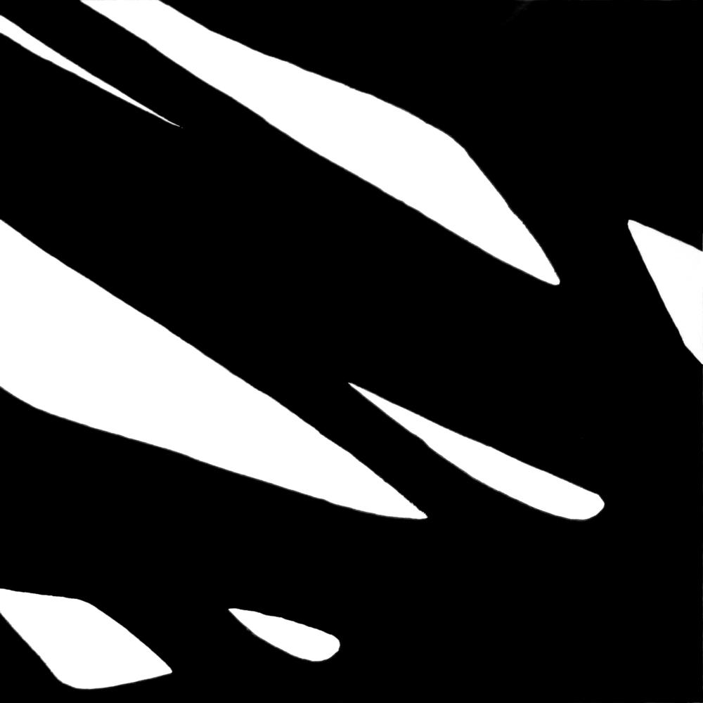
Next, we had to use lines only, but each line could be as thick as we wanted. I portrayed “acclivity”, “cadence”, “decelerate”, and “forlorn”.
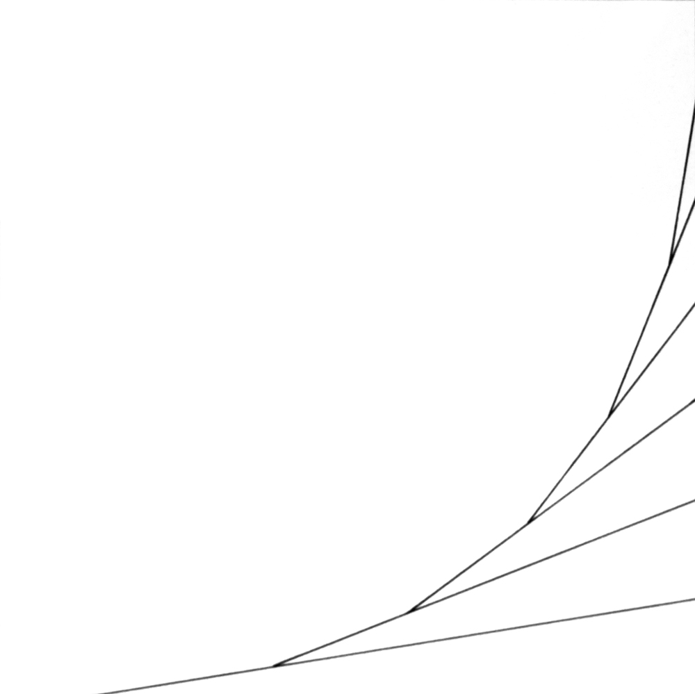
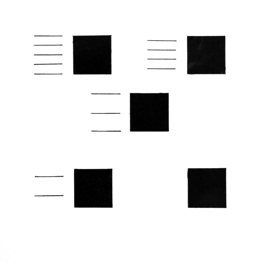
We then got to use lines and dots and could choose our own words. We had to use at least three lines and at least three dots. I thought using lines and dots together would be easier, but it was actually much more difficult for me. I did “grow”, “attack”, “bounce”, and “protrude”.
For the last project in the dot and line series, we selected a dot and line composition from the previous project and made a twenty second gif animation. We were supposed to use Photoshop to make the animation, but I grew frustrated with it and decided to teach myself After Effects (a program actually meant to make animations) instead. I really enjoyed the process.
I chose my “grow” composition to reimagine as an animation. Because my composition showed an object growing through time, I attempted to capture the essence of the composition in the animation rather than a direct translation.
Object Series
For the first project in the object series, we created four compositions showing different vantage points of a single object. I decided to use a whisk because I was attracted to its curved form.
For this project, I took many pictures of my whisk from various angles and vantage points and blew out the contrast in Photoshop. I then selected my four compositions and used the lightboard to trace them onto the bristol paper.
My goal was to abstract the whisk beyond recognition and focus on the forms and composition. I also wanted to create a series where each composition felt unique, but still part of a system.
The next project introduced the element of type. We had to choose a single character of either Helvetica or Garamond to include with our object in two compositions. I chose to use Garamond because the variation in stroke and the curved serifs complemented my linear object. I really focused on treating the character like an abstract form instead of a letter with inherent meaning.
In this project, I also experimented with stippling to preserve the gritty texture of the original photographs of the whisk.
For the last project in the object series, we had to use multiple views of our object along with multiple characters. The characters could form a word, but they did not have to be legible. We created two compositions for this project.
I focused on emphasizing the type and using a wider view of my whisk. Again, I used Garamond for the type and experimented with stippling.
Architecture Series
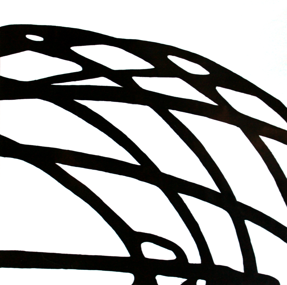
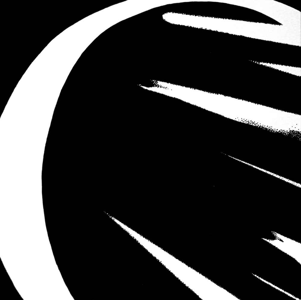
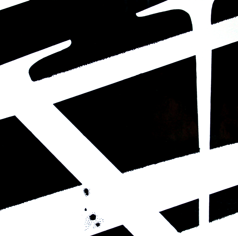
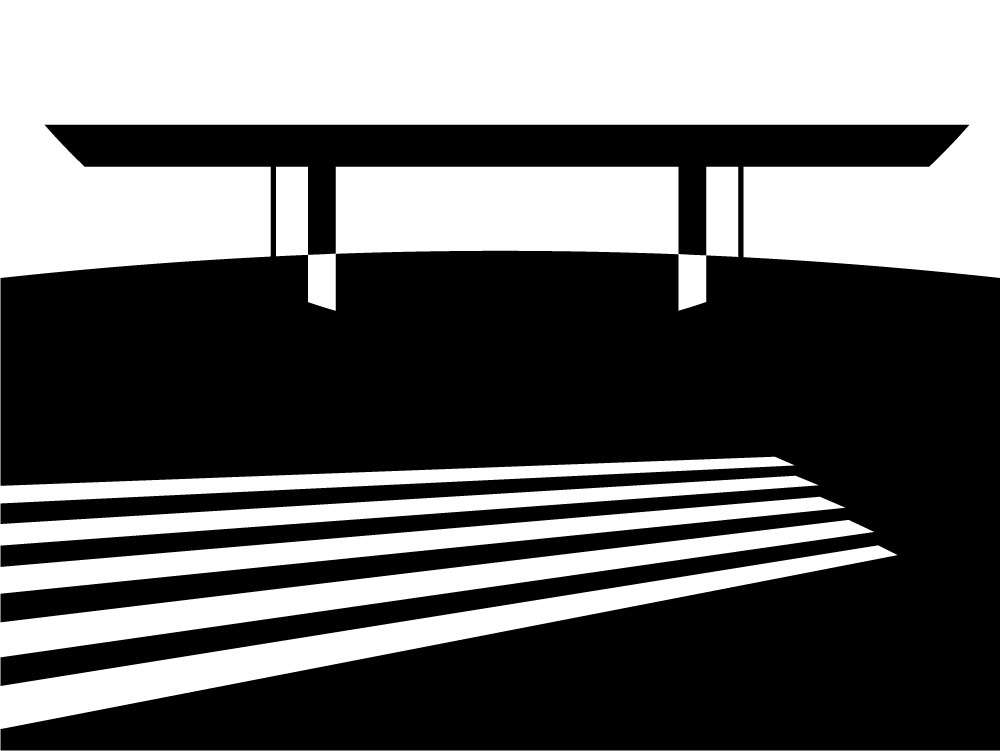
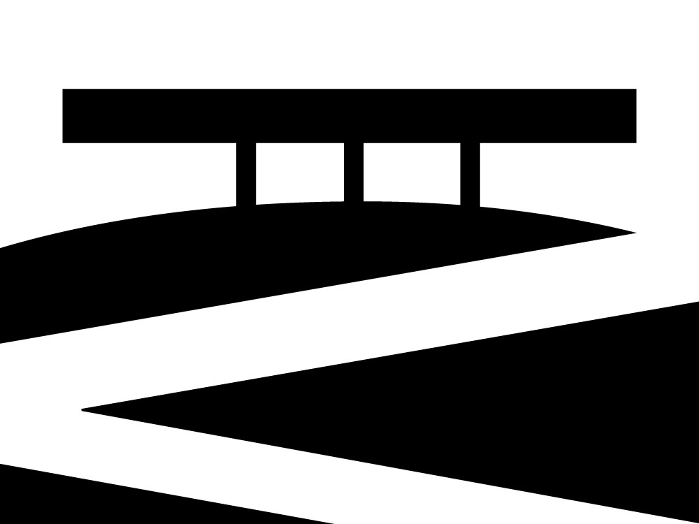
For the last series in the class, we had two 18”x24” poster projects inspired by the work of an assigned architect. I got Ludwig Mies van der Rohe, a German-American architect whose personal motto is “less is more.” I selected his Neue Nationalgalerie in Berlin as inspiration for my posters.
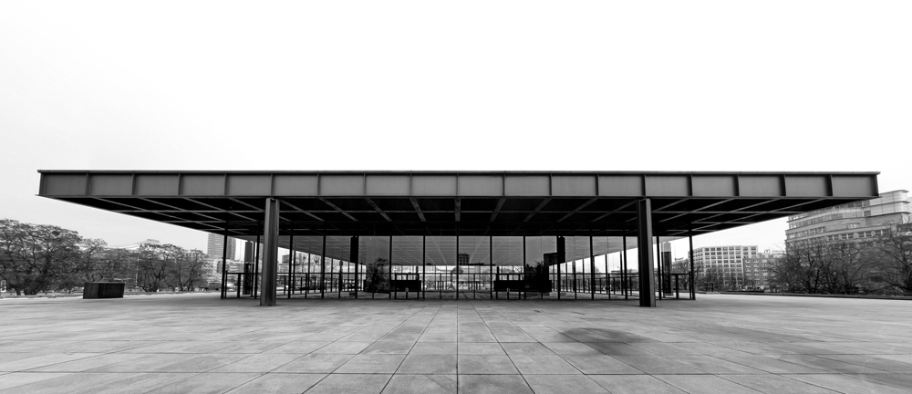
For the first poster, we could use only line and dot. We had to use at least one of each, and there was a maximum of ten each. Because Mies doesn’t incorporate any curves into his work, I was worried about including circles. In most of my sketches, I had one circle sneakily included as a light fixture or the base of a column. Later however, I realized I didn’t want to shy away from that challenge and decided to make the ground a large circle. Additionally, the ends of the columns and the roof imply a second circle. I chose to focus on the strong horizontal gesture and squished feeling of the building.
The second poster is comprised of type. We could choose any word related to the architect or building and had to use each letter in that word exactly once. I chose “Mies,” my architect’s last name. Again, I interpreted the Neue Nationalgalerie and focused on its symmetry and the strong horizontal gesture of the building.
The final project for Visual Communication I was to put together a process book of all of the work we had done that quarter. My book contained each piece I had made, in addition to the sketches and thoughts behind the compositions. This was my first time making a process book, and I really enjoyed the reflection and self-critique it allowed me to do. This class is unique in that our only graded assignment was this process book, so we were encouraged to revise any of our work that wasn’t quite up to par before we turned in the book. I ended up redoing almost everything.
This class was absolutely one of my favorites this quarter. I learned so much about communicating complex ideas with simple visual elements, and I know focusing on craft to an extreme degree will carry over into the rest of my work, even though I’m (thankfully) done using gouache for the foreseeable future.
Typography I
I was so stoked for this class! Typography is a huge component of graphic design, and I felt I had learned as much about it as I could without taking a class, so I was excited to get a formal education in it. This class focused mainly on seeing type as shapes rather than letters with inherent meaning behind them.
Our professor was very into process, so all of our projects showed an expanded idea broken down into stages of development.
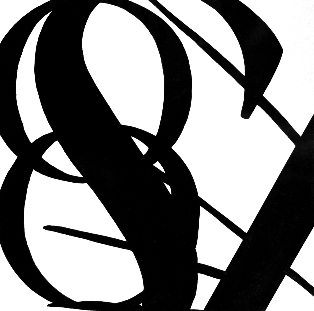
Type Combinations
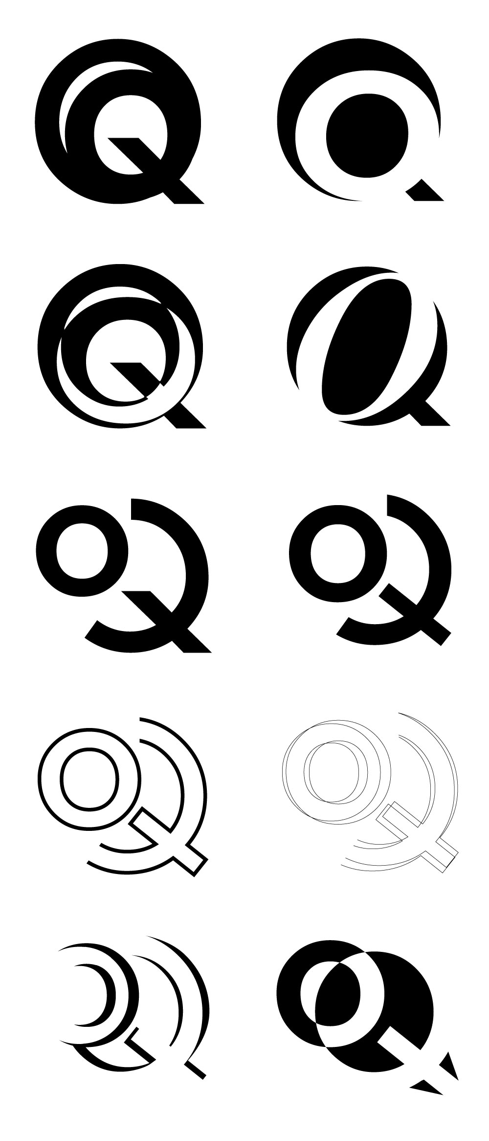
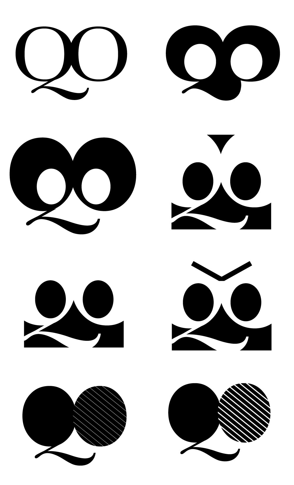
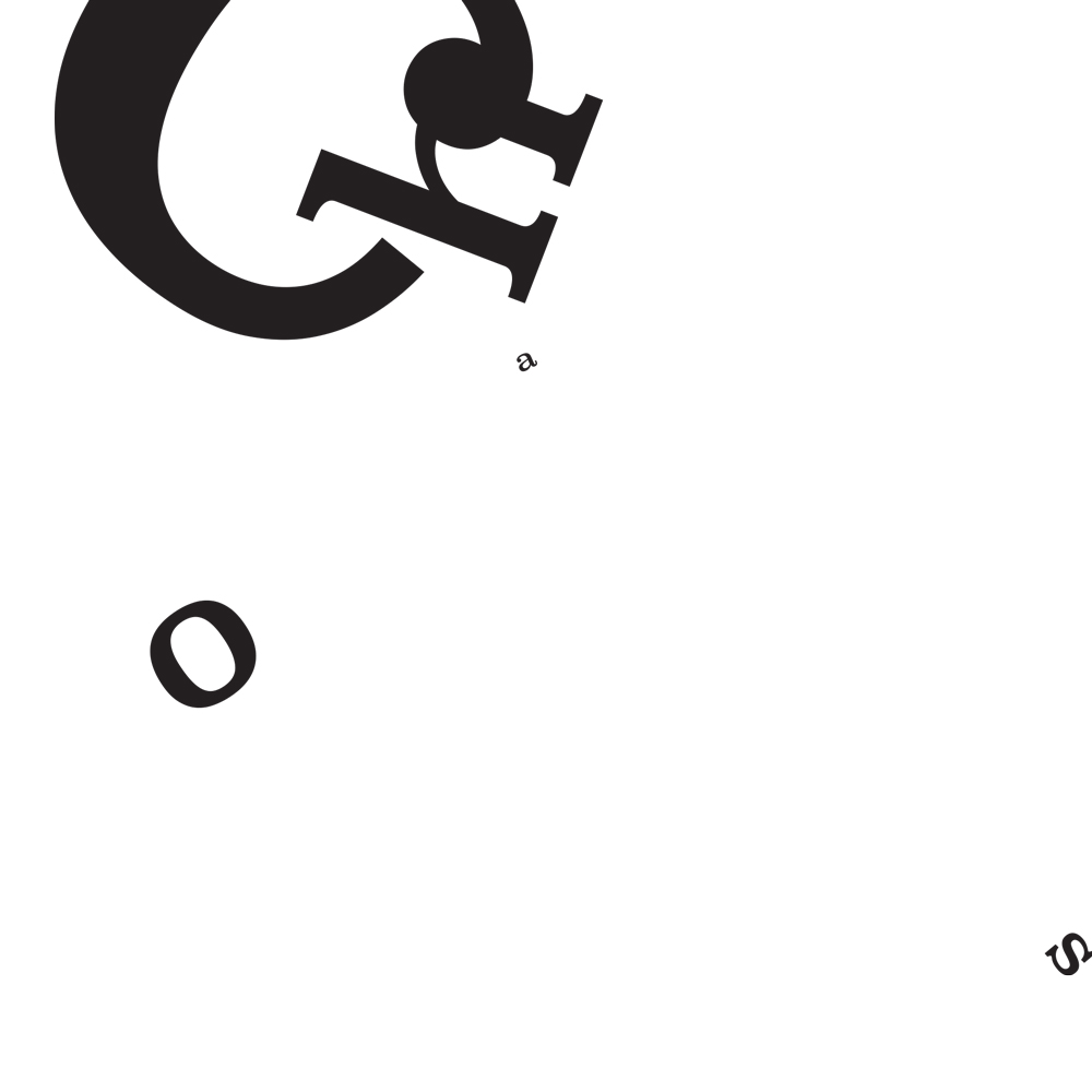
For our first project, we created two-letter typographic marks. For the first stage, we had to use Garamond, Baskerville, Bodoni, Clarendon, and Futura to make letter pairs highlighting either the letters’ similarities or differences. We then picked our favorites and continued to refine them until we got something that looked like it could be a logo. I made two out of Q and O: one more serious and the other whimsical.
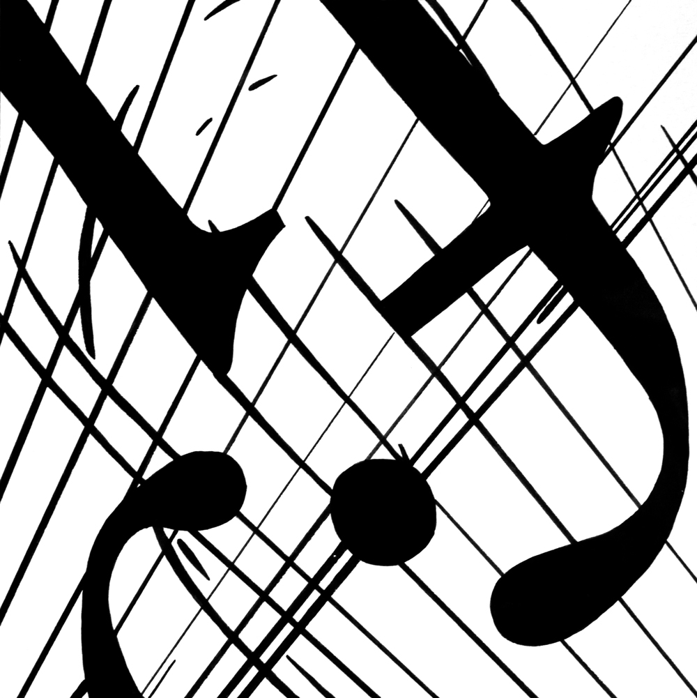
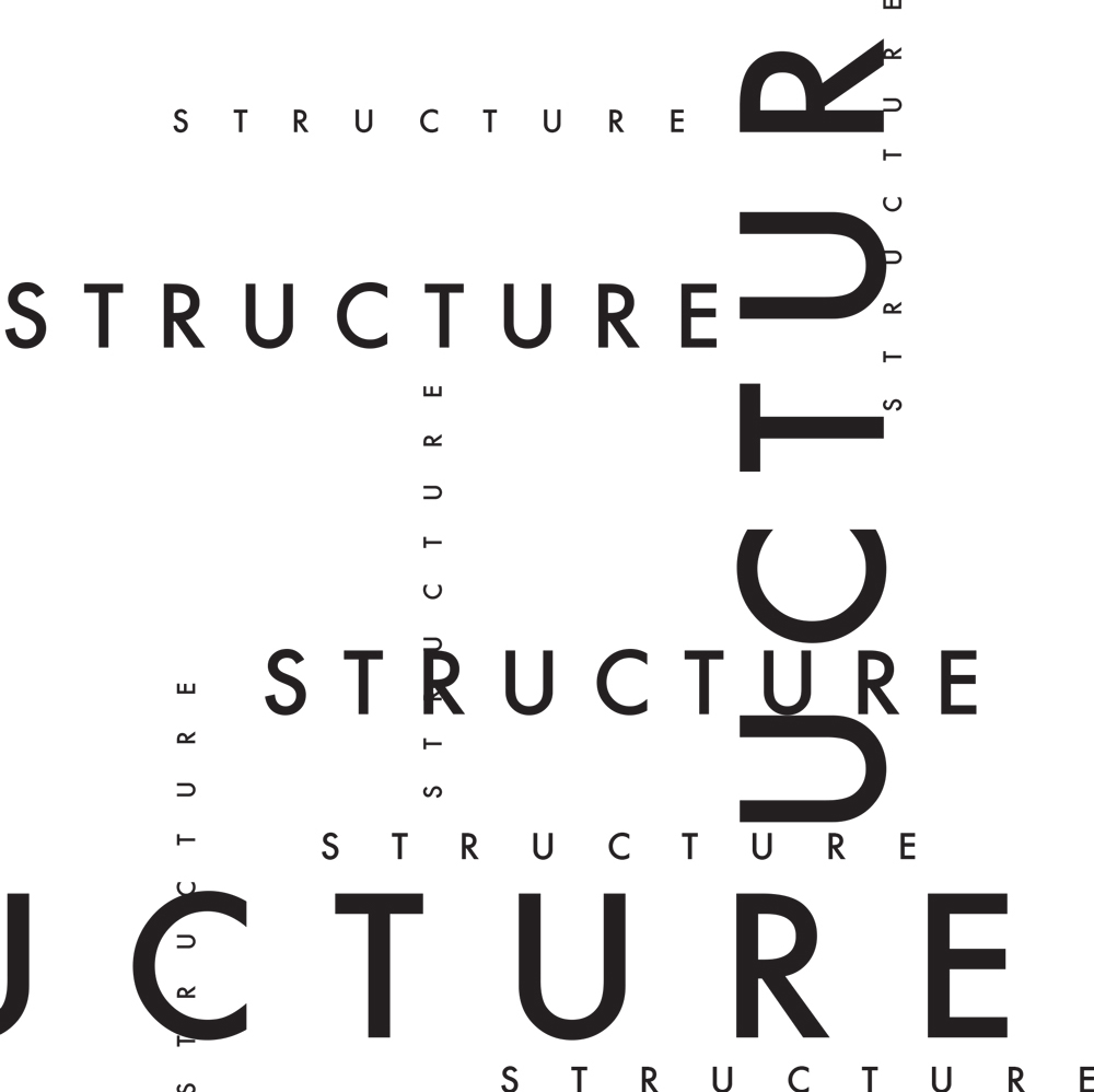
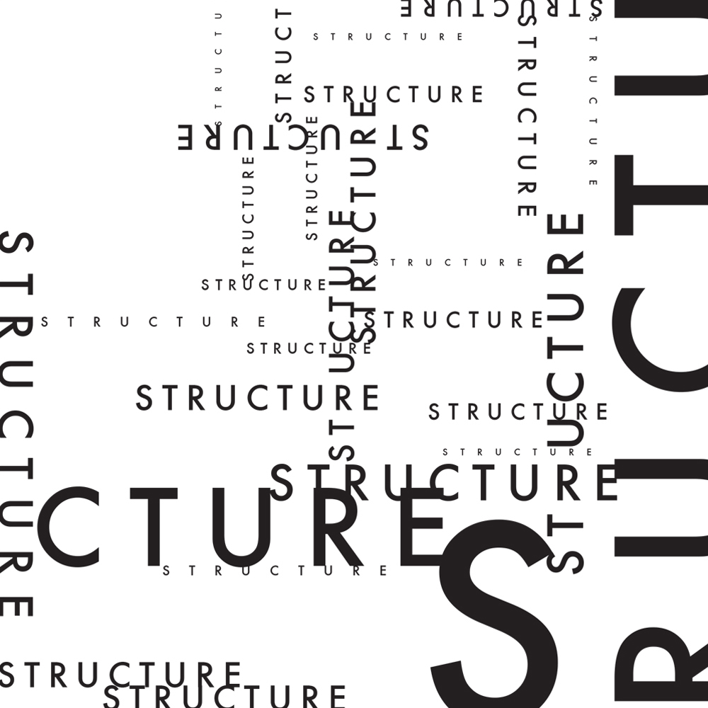
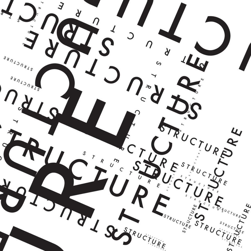
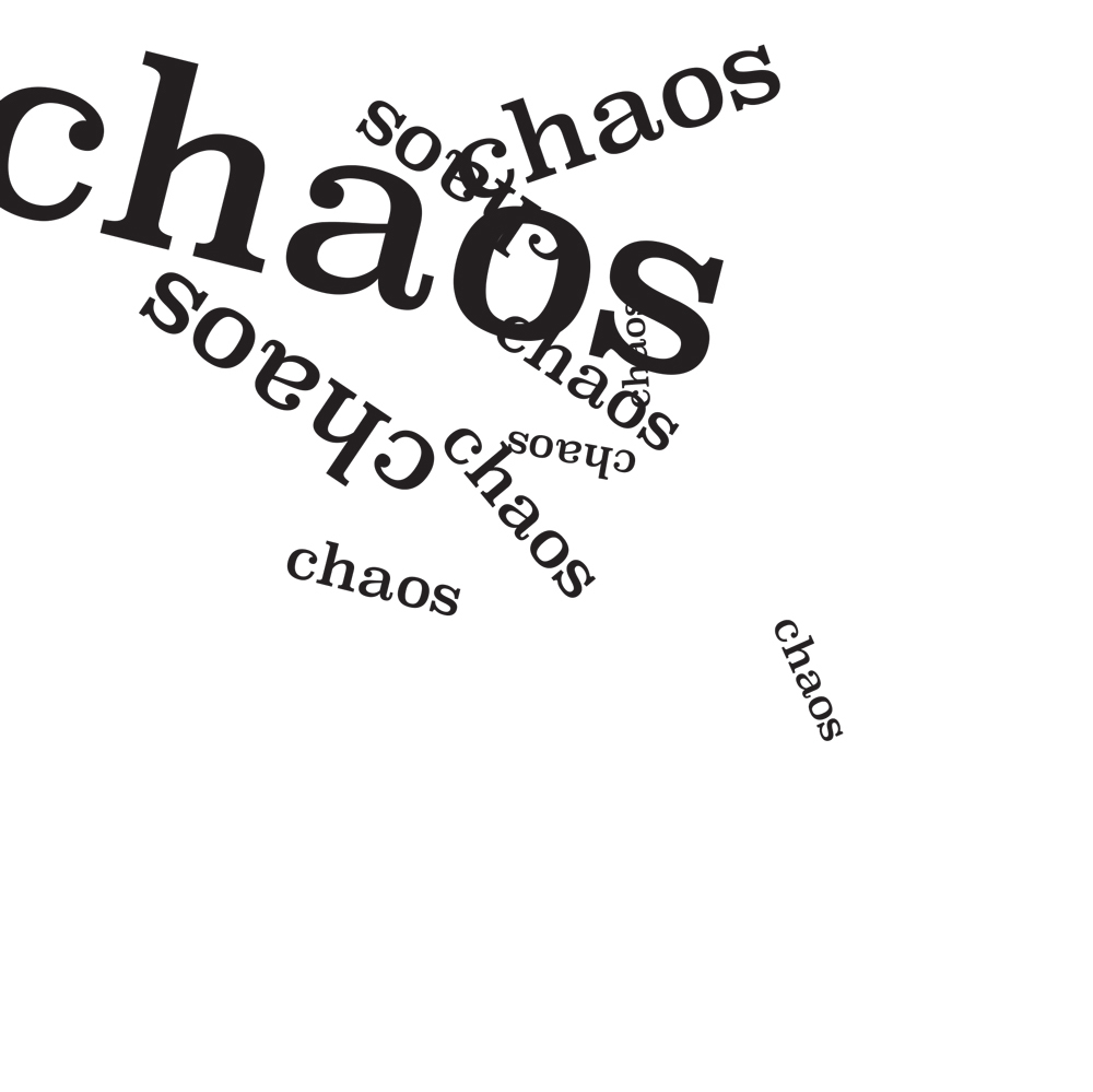
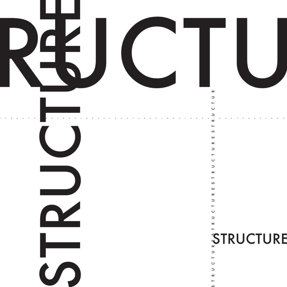
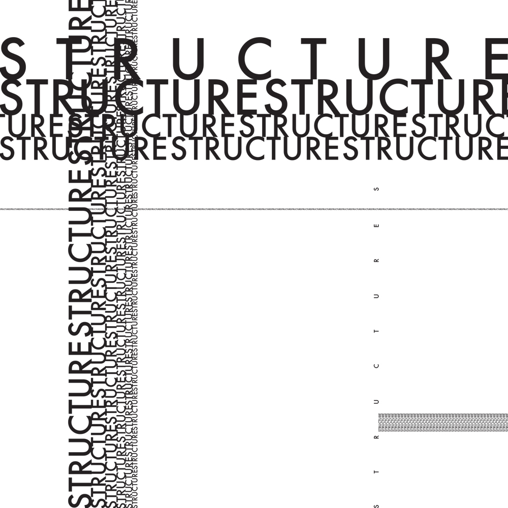
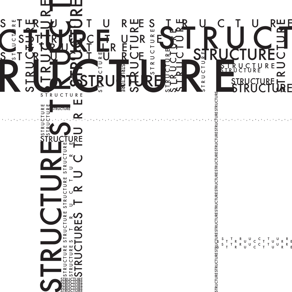
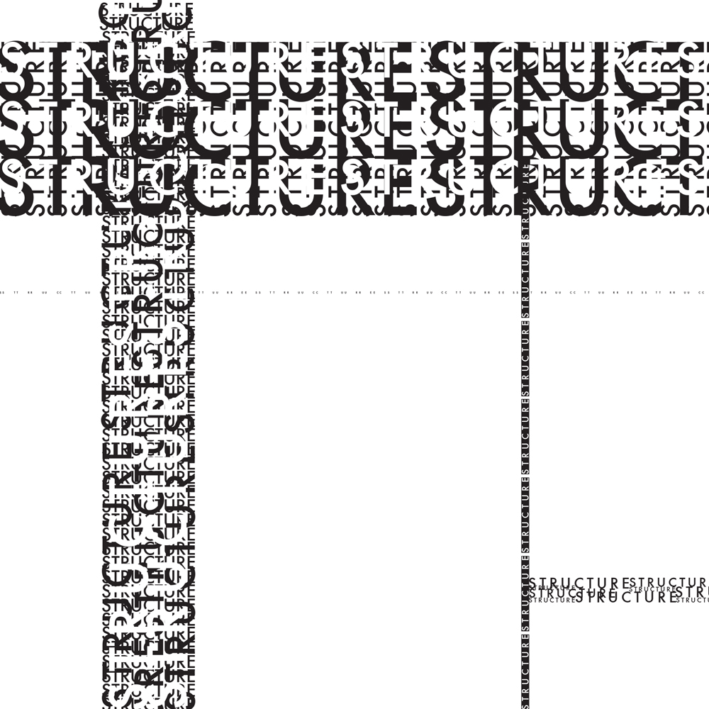
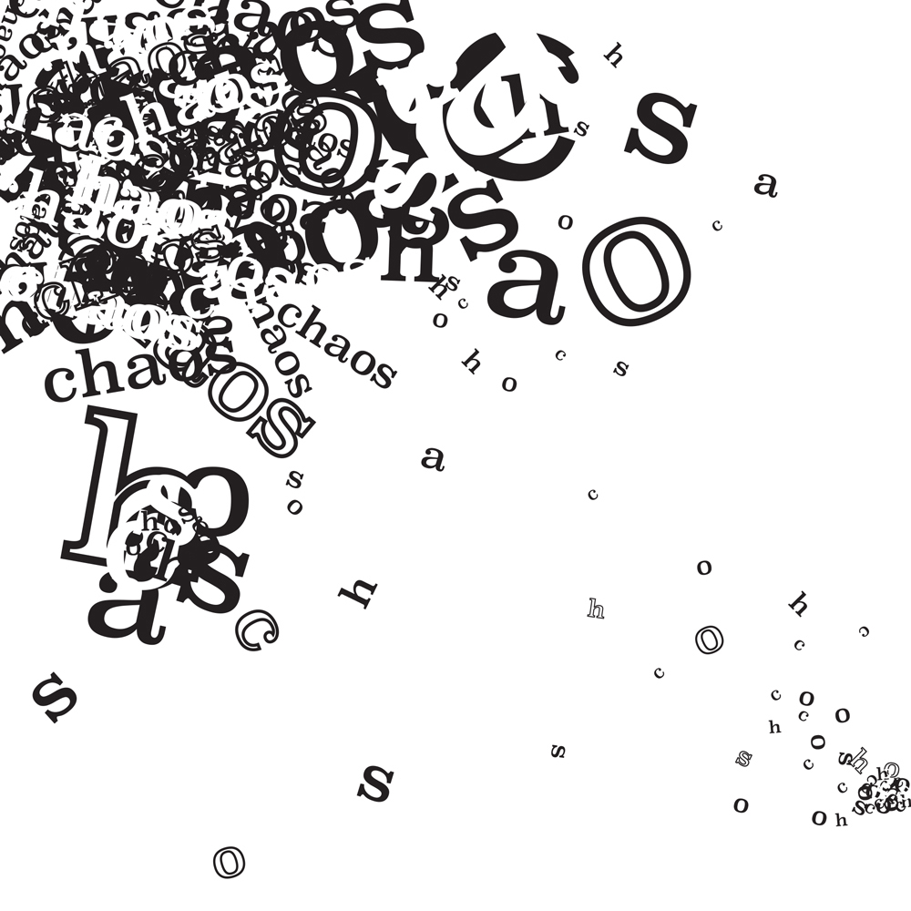
Structure and Chaos
The rest of the class focused on expressive typography compositions based around the ideas of structure and chaos.
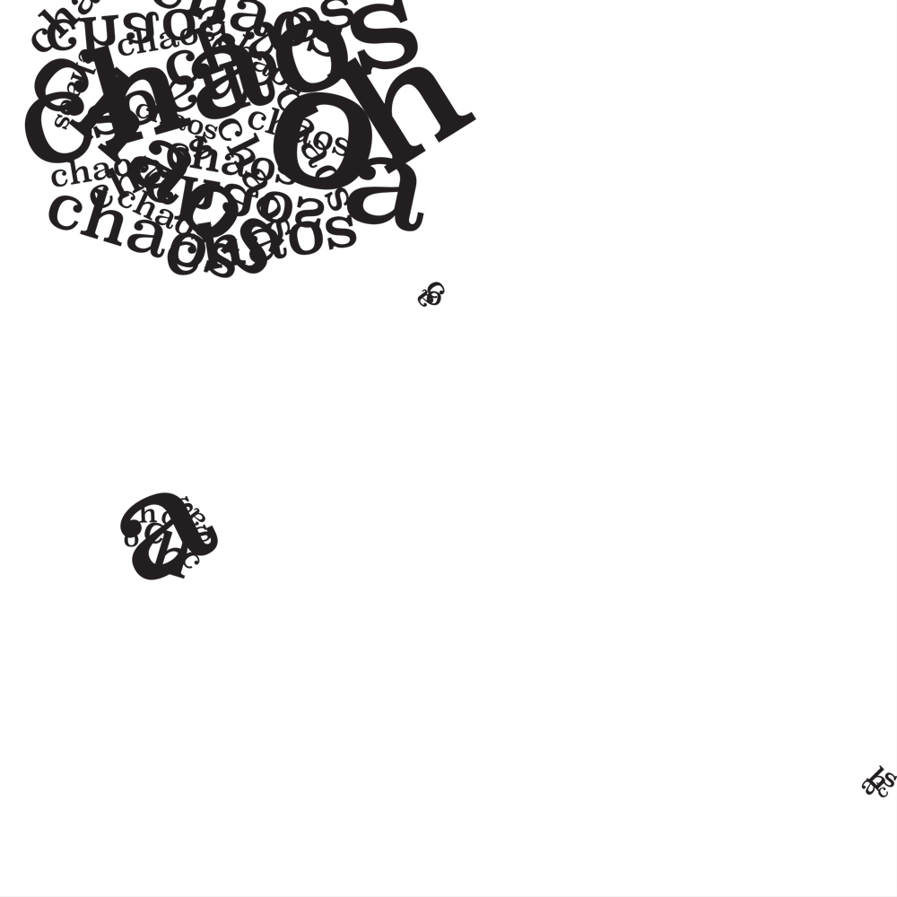
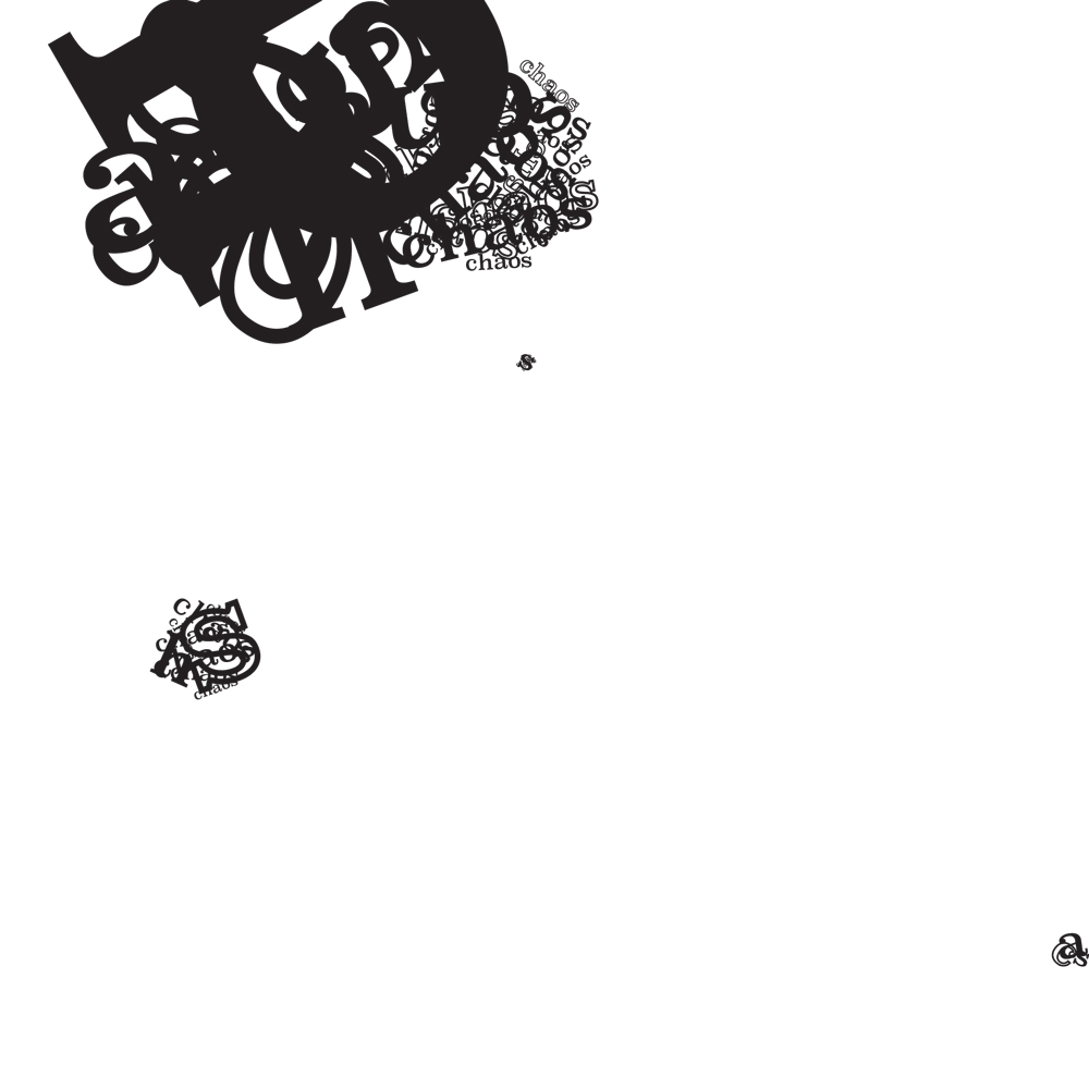
For the first project, we created three free-form compositions for structure and chaos each, using those words in the compositions. The first had to use ten words, and the other two had to use many more, but be based on that first composition. I absolutely loved this project.
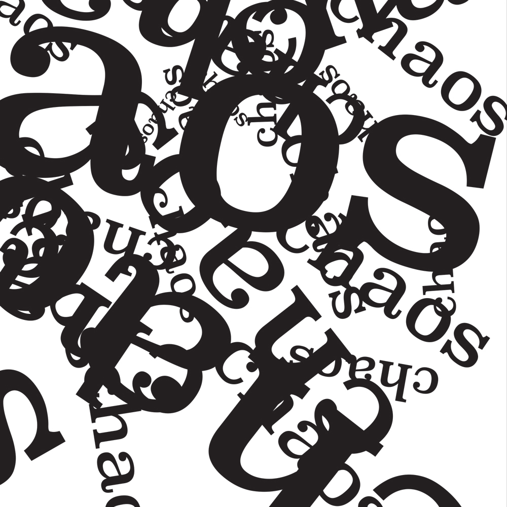
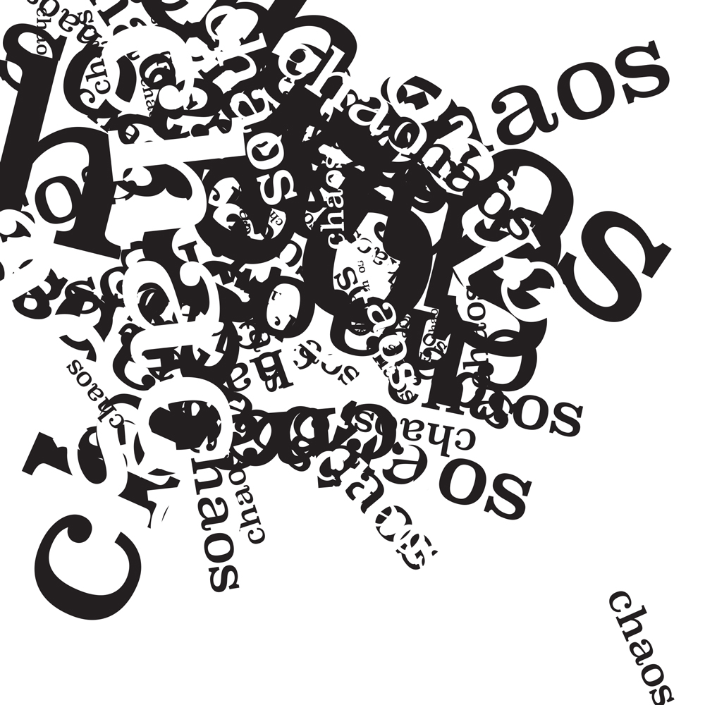
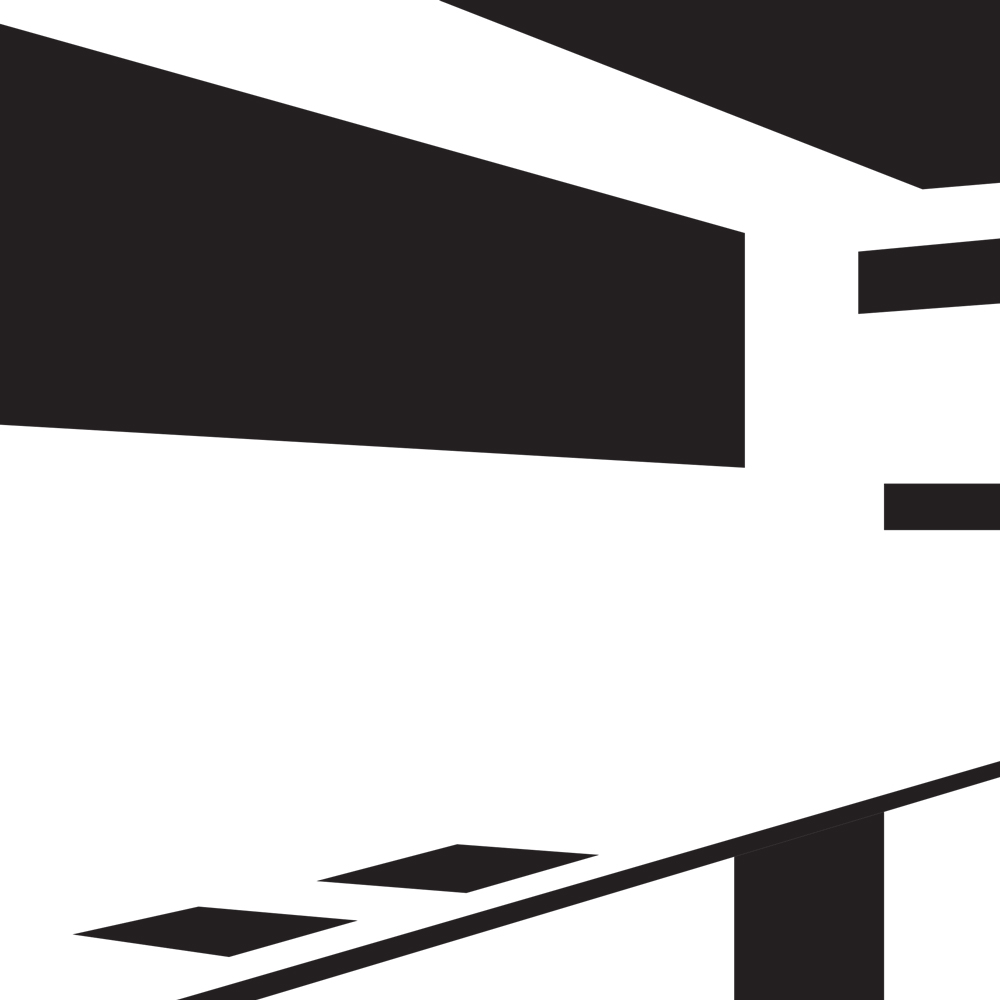
The second project was about adapting shape into type and creating interesting textures. We created line and dot compositions (line for structure, dot for chaos) and translated them into five compositions using type, increasing in complexity.
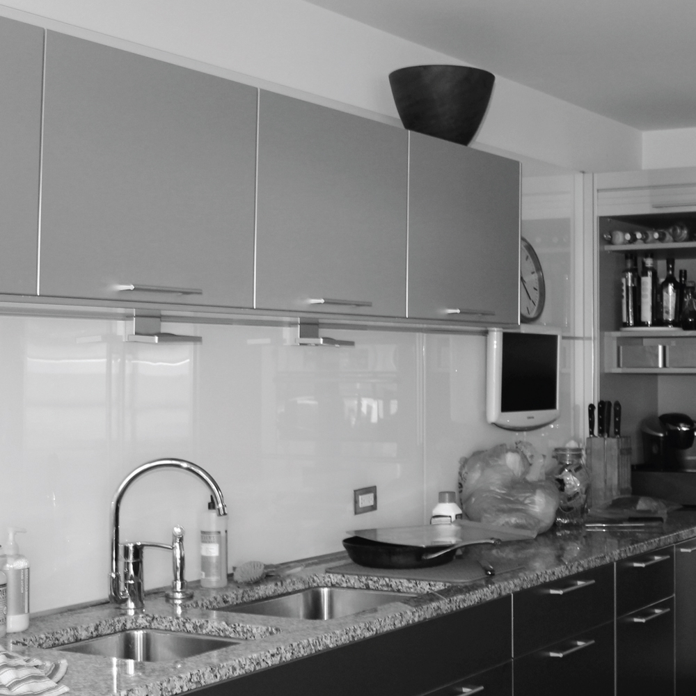
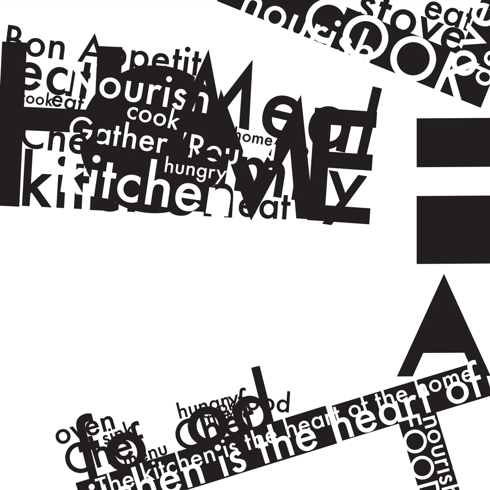
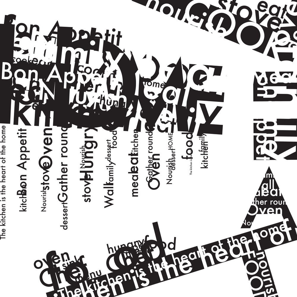
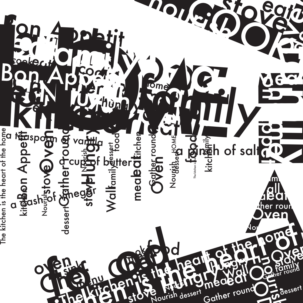
For the last project, we translated photos into a type composition. We took the photos ourselves, and they had to show either a structured system or a chaotic one. I took a picture of my mom’s kitchen. We then translated the photos into black and white compositions using simple shapes, and adapted those into type compositions. We could use any words we wanted this time, but they had to be related to the photo. In the end, I had three type compositions.
This class certainly wasn’t what I was expecting. I was surprised to focus so much on typographic compositions as opposed to learning about typography and placing type into more real-world scenarios. Still, the compositions were fun to produce and I definitely got more comfortable working with type.
Computer Imaging II
This is the second class in a series of three technical classes in the Adobe software. The first taught us Illustrator, and this one taught us Photoshop. On the first day, our professor emphasized that he wasn’t so much teaching us Photoshop as he was teaching us how to be comfortable learning how to use the software on our own. He’d show us the basics, and it’s up to us to do the rest.
We started off with a ton of lectures and exercises meant to familiarize us with Photoshop and digital imaging. We learned about color modes, file formats, and Photoshop tools. We’d get a short demonstration in clipping paths and masks, and then the homework was to mask objects out of their backgrounds. The second half of the class was comprised of photo-heavy projects. We had to take all of the photos for the projects ourselves, and it was as much an exercise in photography as it was in Photoshop.
Type and Image
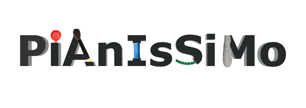
For the first project, we drew words out of a hat and had to depict them using 3D type and images. I got “pianissimo,” meaning very quiet or soft. I absolutely hated this project because it was finicky and time-consuming.
Robot
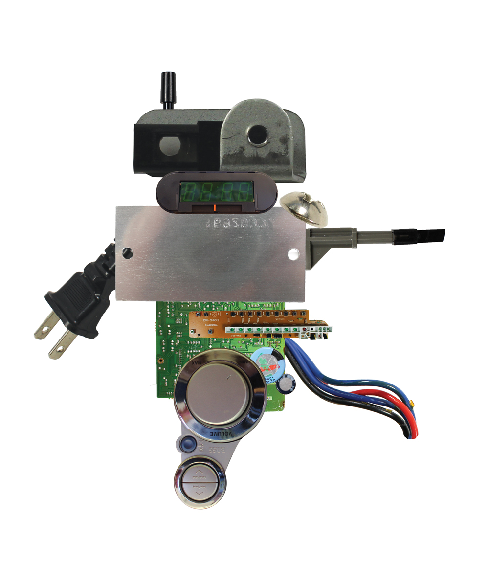
Our professor told us to take apart an old mechanical object and photograph its parts, but we didn’t know what we’d use the photos for. Eventually, we found out that we were going to take the photos into Photoshop and turn the machine parts into a robot. I took apart an alarm clock and stereo tuner.
Self Portrait
The goal of this self portrait was to make a Photoshop collage of ourselves consisting of objects and textures that are meaningful to us. The hair is made up of scanned pages from my old diary and favorite books, the facial highlights are paintings I’ve done, and the glasses are my favorite shirt. This is one of my favorite projects of the year even though it is yet another self portrait.
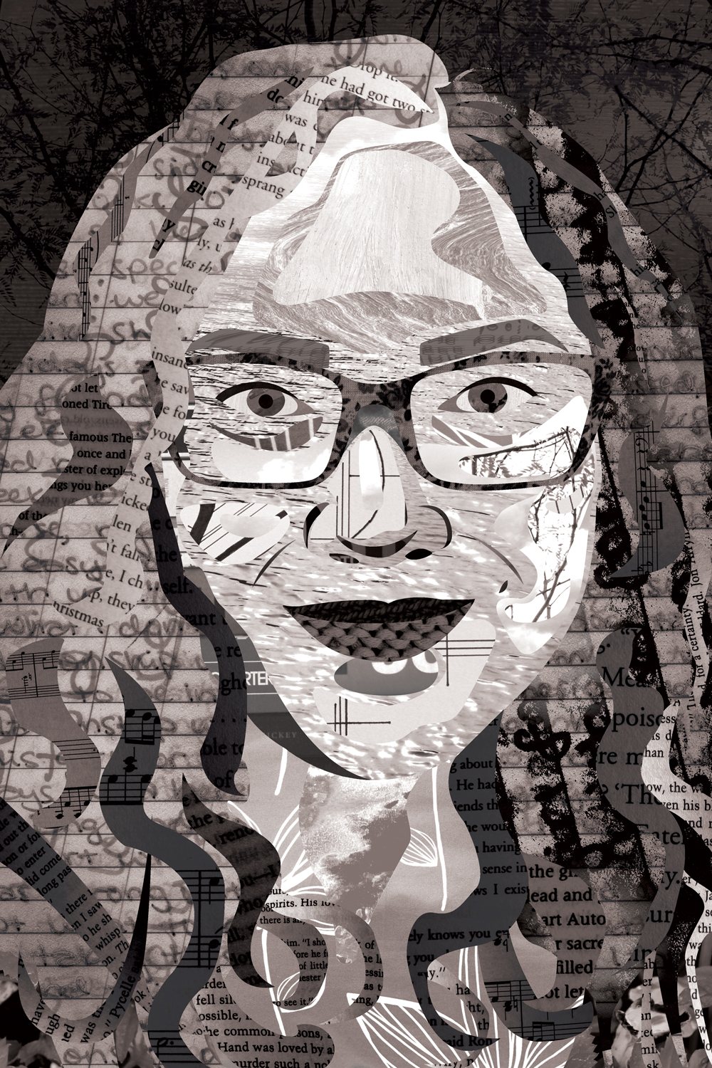
See the project in my portfolio
Overall, this class was really great. I learned a lot, my workflow in Photoshop got significantly more efficient, and I got to create interesting projects.
Photography I
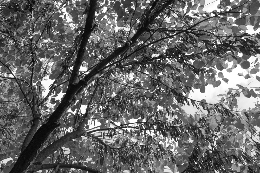
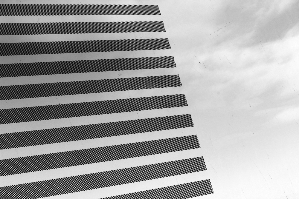
This black and white digital photography course was all about learning the basics and starting to explore. In the very first class we went over how to properly expose a photo by adjusting shutter speed, aperture, and ISO, and I was completely overwhelmed. But we took at least 100 photos each week, and eventually properly exposing a photo became second nature to me.
Each assignment consisted of taking 100 photos, narrowing them down to 25 favorites, and then picking five favorites out of those to edit and submit for critique.
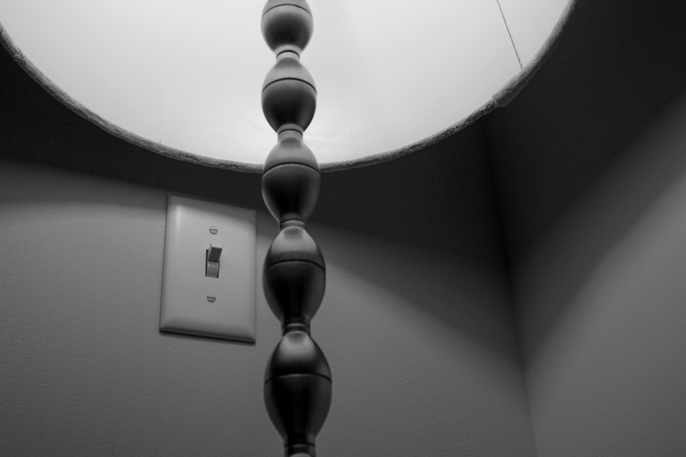
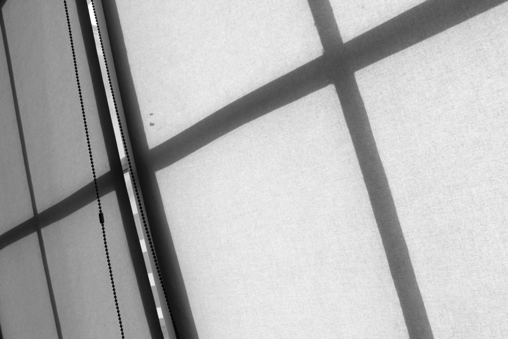
Positive and Negative Space
Our first project was capturing photos showing an interesting relationship between positive and negative space. These photos were supposed to transcend subject, so what the photo looked like was much more important than the thing I was taking a picture of.
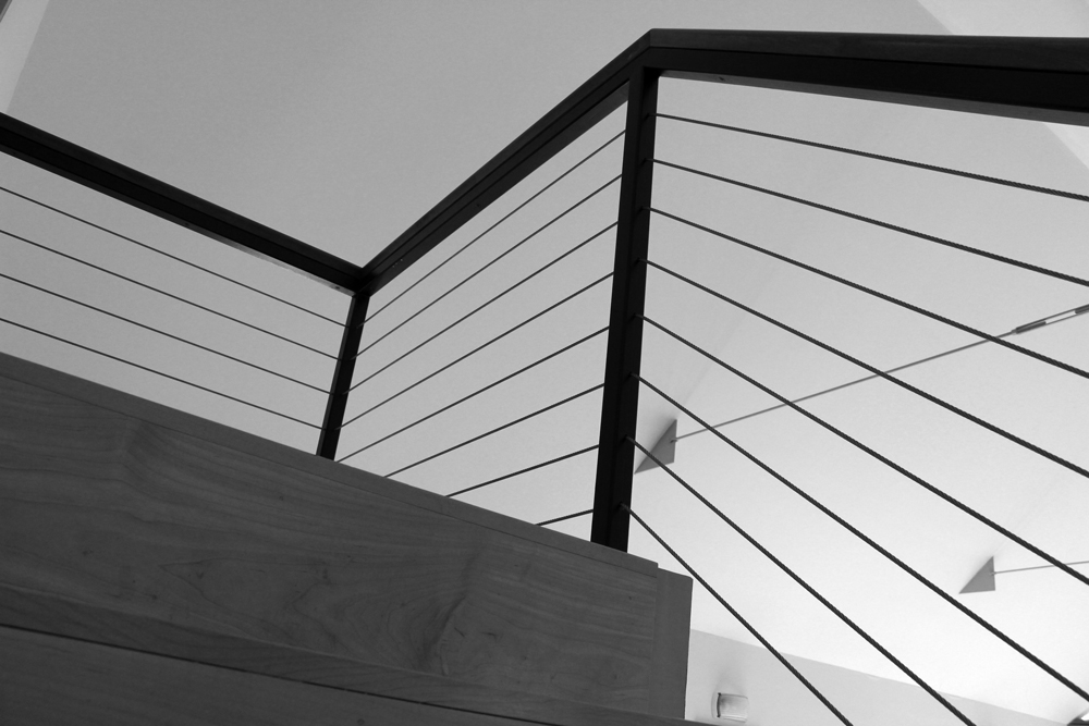
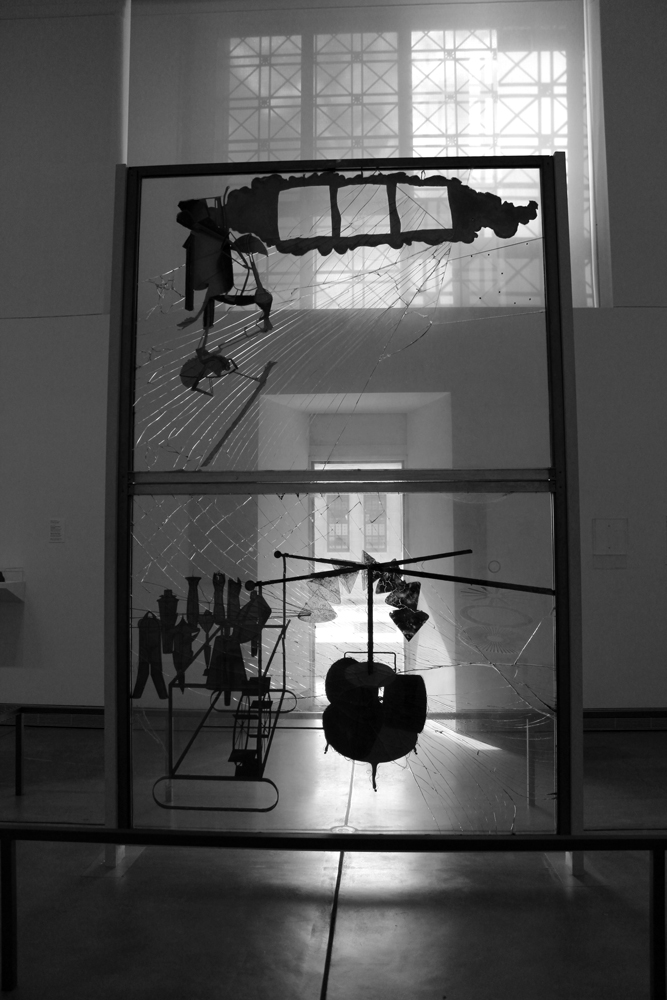
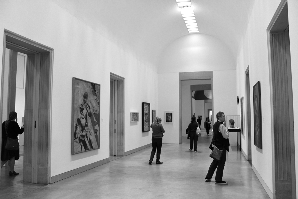
Volume, Space, and Scale
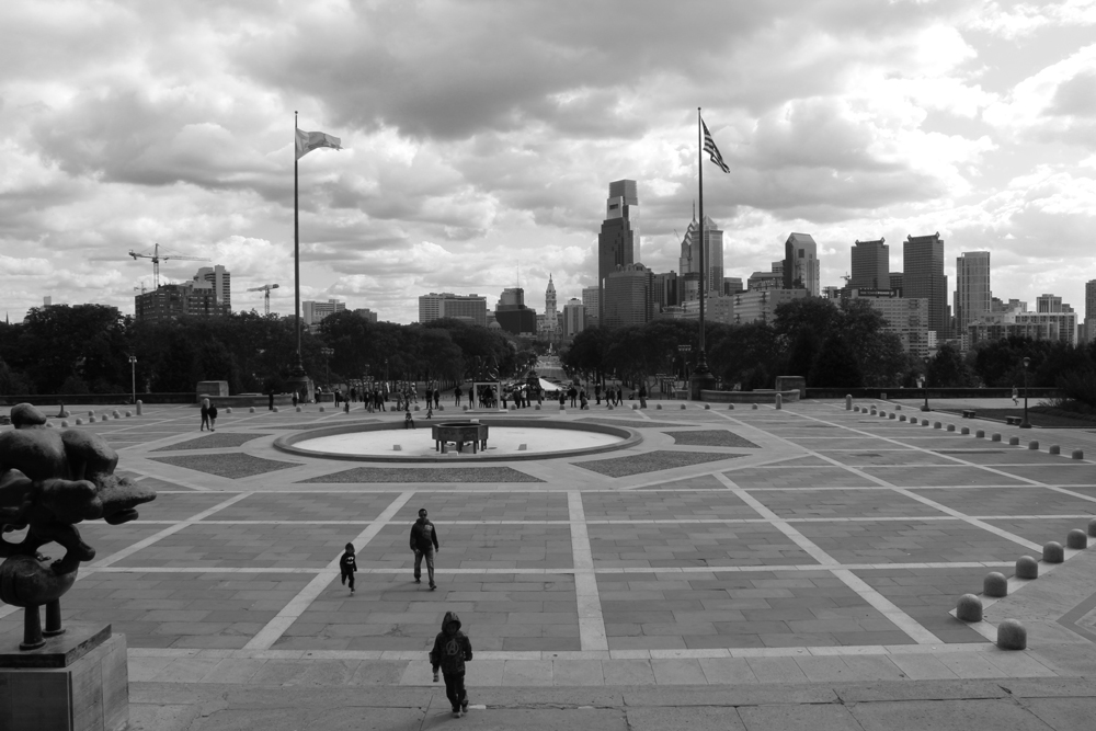
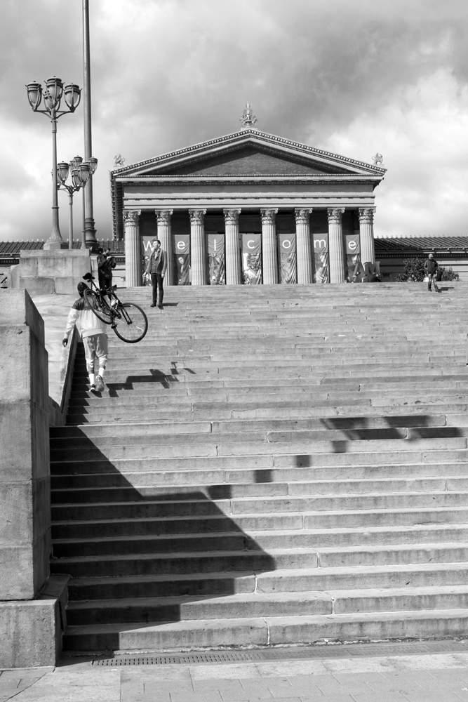
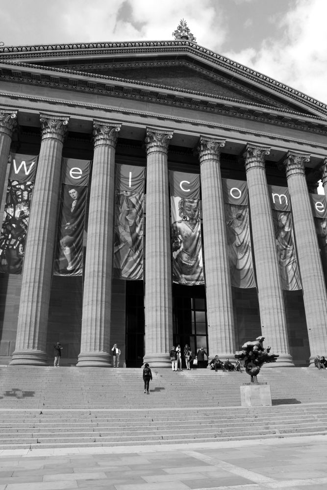
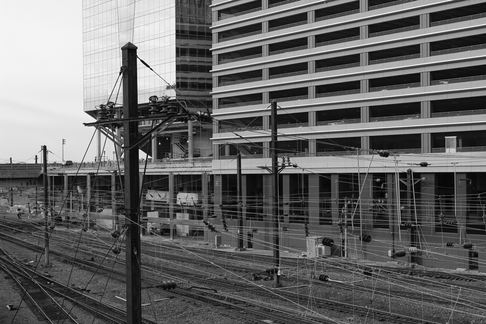
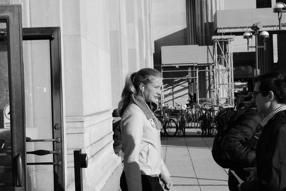
For the second project, all 100 of our photos had to be taken in a large public building and show volume, space, or contrast of scale. I chose the Philadelphia Museum of Art because of its classical architecture and the fact that I could pretend to take photos of art while in fact taking photos of people.
Organic and Geometric Shapes
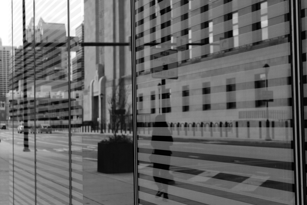
The aim of this project was to capture contrasting geometric and organic shapes in the same photo.
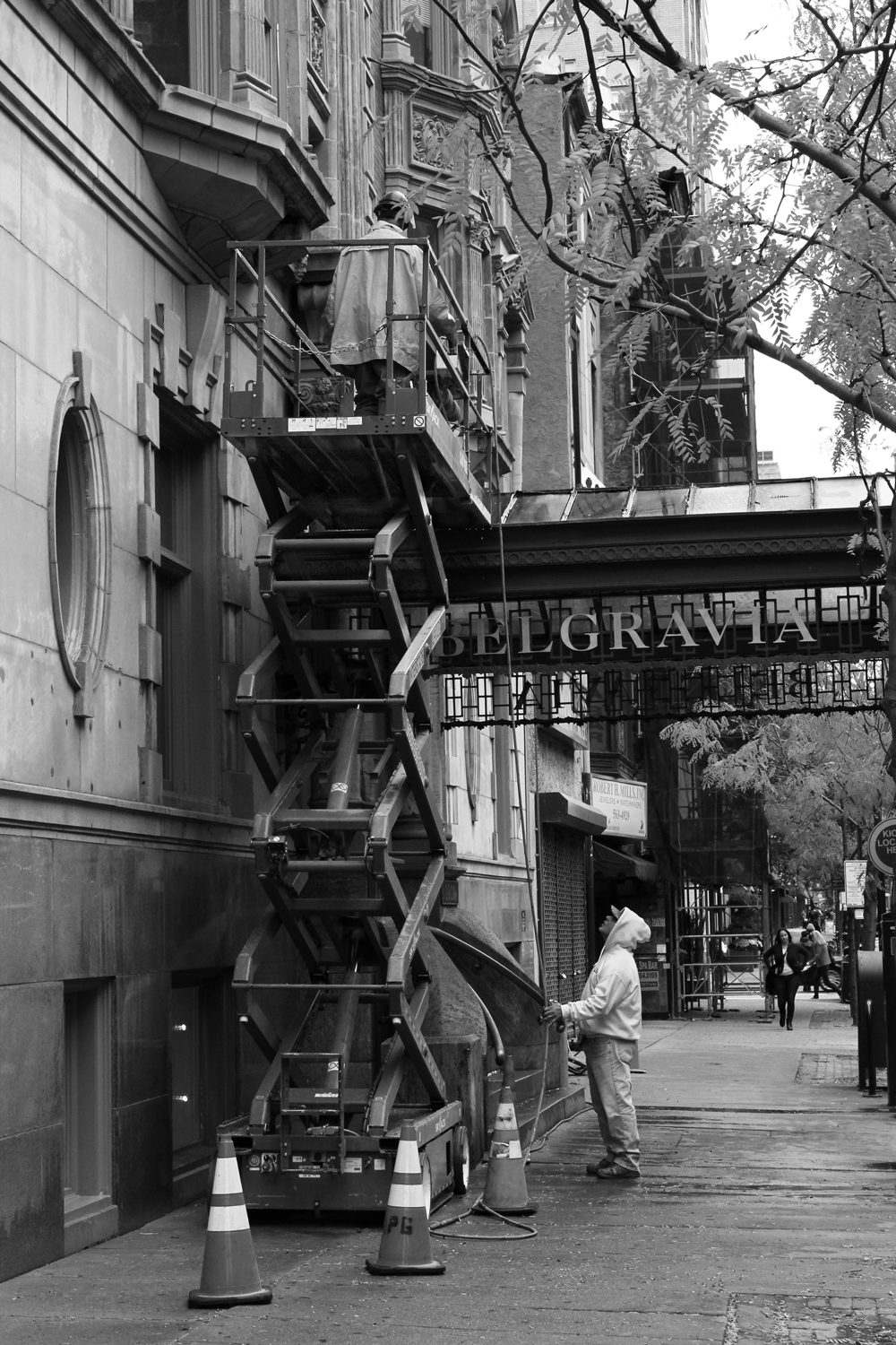
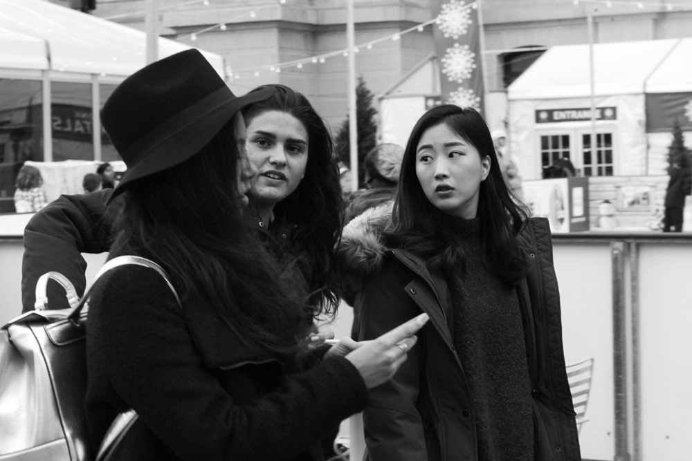
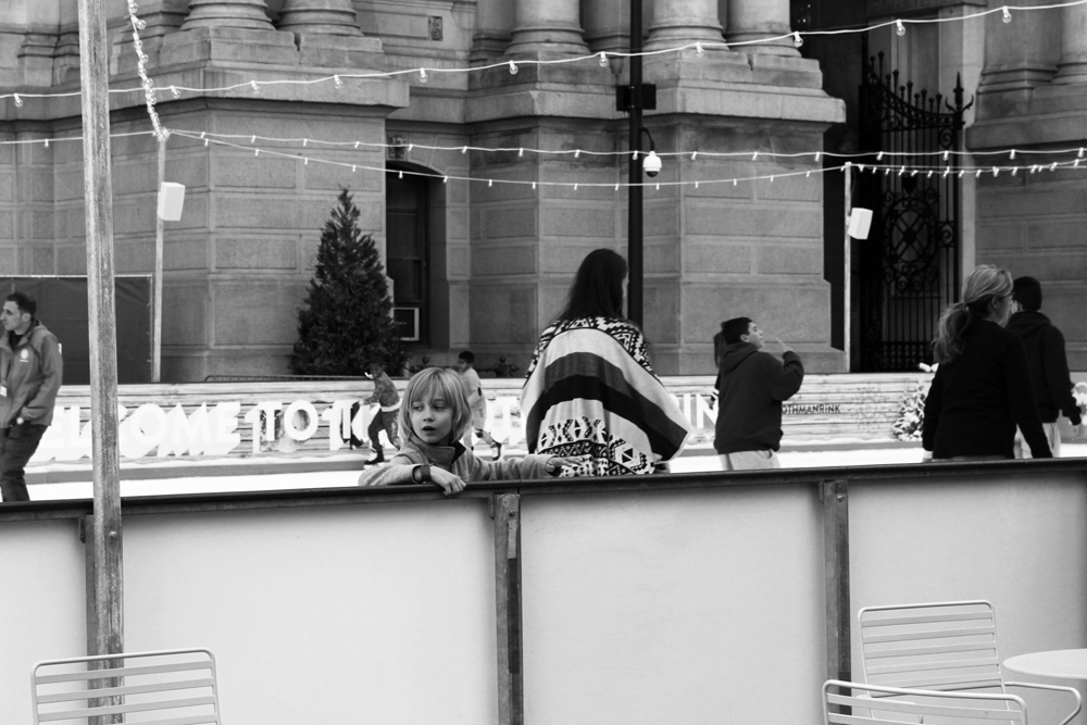
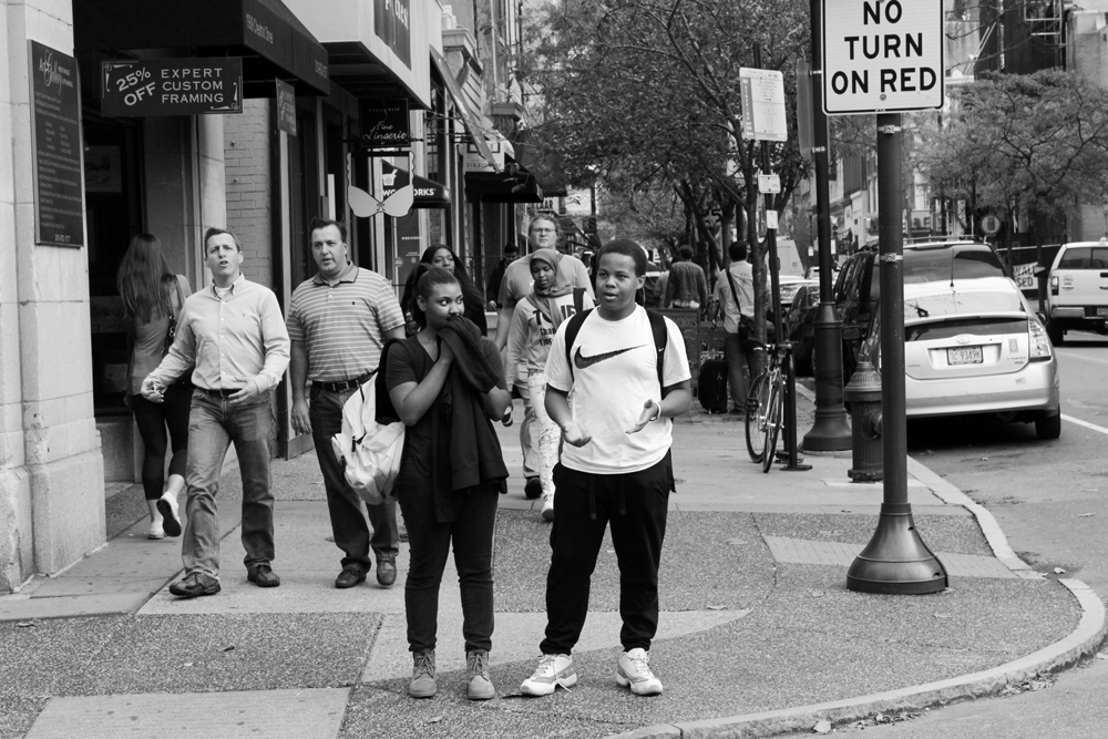
Street Photography
This one was particularly difficult for me. We had to take photos of strangers on the street, and I’m a pretty timid person. Because of this, I focused on the composition of each photo more than getting up in people’s faces.
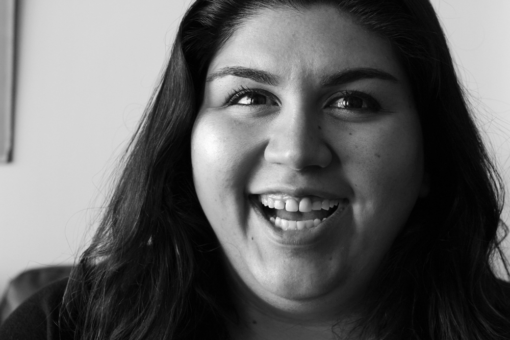
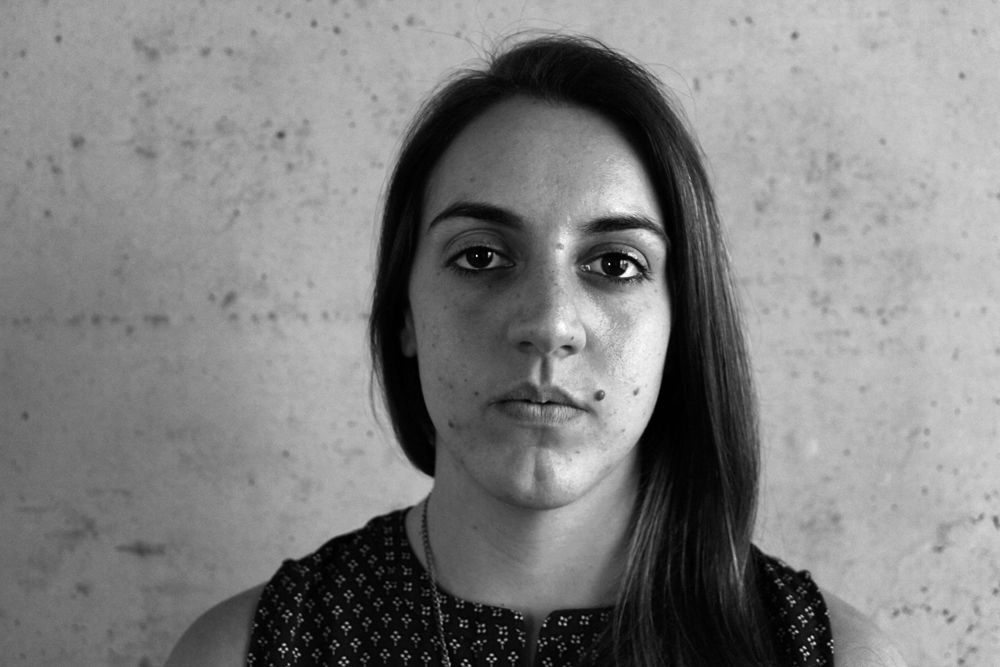
Portraits
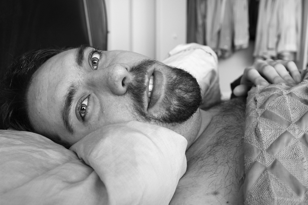
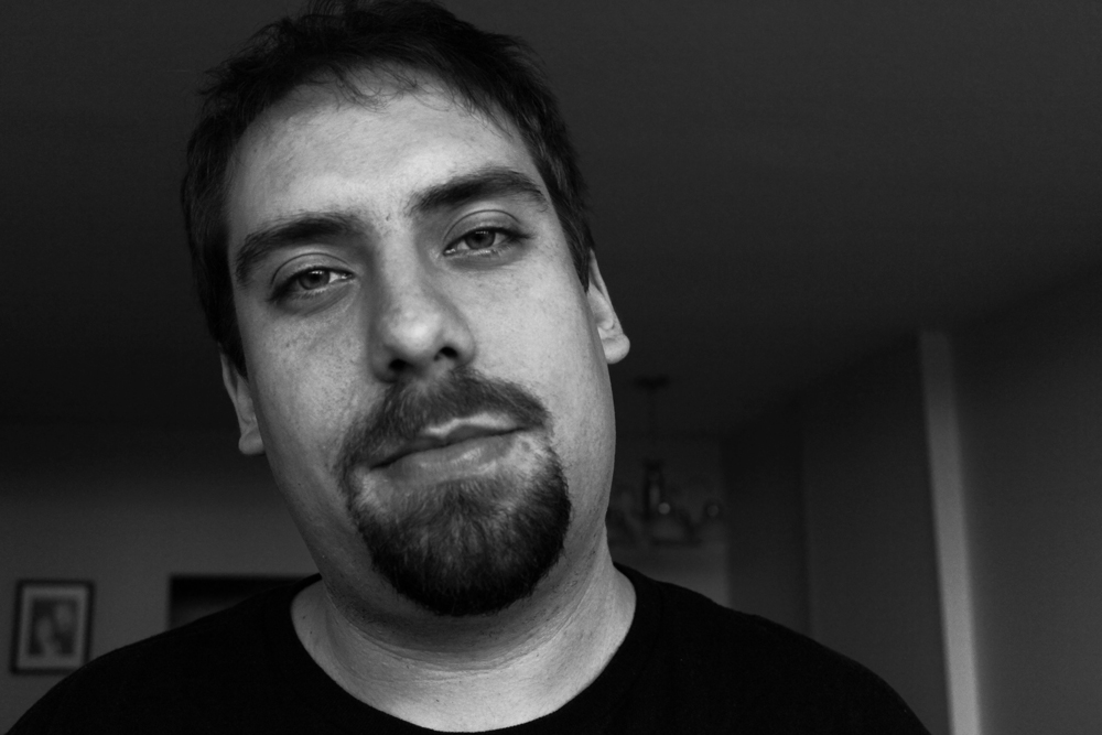
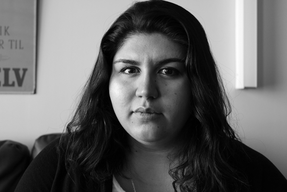
This project was to take portraits of people we knew. Unlike with street photography, it was with their permission and we could direct them into particular poses. I loved this one, and my subjects are my boyfriend and my two roommates.
This class was hard for me because I was working with a camera in a way I never had before, but I really enjoyed my shooting sessions each week. I’m looking forward to my intermediate photography class winter quarter.
Art History: High Renaissance to Modern
I had this class once each week for three hours, and boy did it feel like three hours. But the material was somewhat interesting, and I generally like art history. At Westphal, everyone needs to take three introductory art history classes, and now I’ve got one left.