An In-Depth Look at the Logo Design Process
In the winter quarter of my second year at design school, I took a logo design class. I was insanely nervous for this class because I knew logo design was hard and I didn’t think I’d be good at it and assumed I’d hate the class. Instead, it became my favorite class of the year.
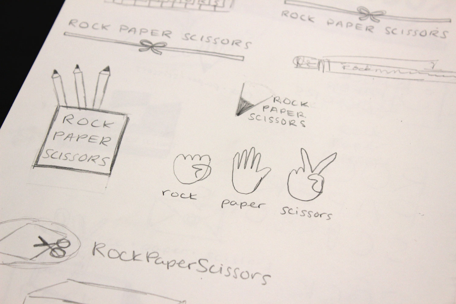
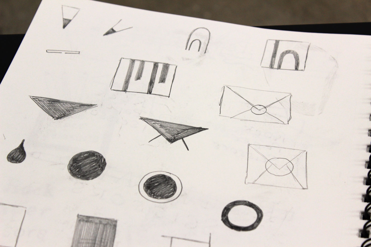
On the first day, it was explained to us that we would be designing four logos for a fictional company. We drew names out of a hat, and my slip of paper said “Rock Paper Scissors: specialty office supplies.” The four logos we’d design were: a pictorial logo (or icon), a typographic logo with our company’s initials, a logo that combined type with image, and an abstract logo. We would start each process with at least 50 sketches, then meet with our professor to narrow it down to three good ideas. We’d then turn those three ideas into polished logos, present them to the class for critique, and then select our best one to further refine, present to the class again, and turn in for a grade.
Design Brief
Our first step was to further define our company. Who is the target customer? Who is the competition? How does my company stand out from the competition? All of these questions are important to ask before embarking on a rebrand. I wrote the following brief on behalf of Rock Paper Scissors:
Rock Paper Scissors is a specialty office supply store that sells stationery, office supplies, and basic arts and crafts supplies. Included in their stationery offerings are beautifully designed cards and ready-to-go wedding invitations. They offer products in a variety of colors and styles and are known for their thoughtfully designed selection.
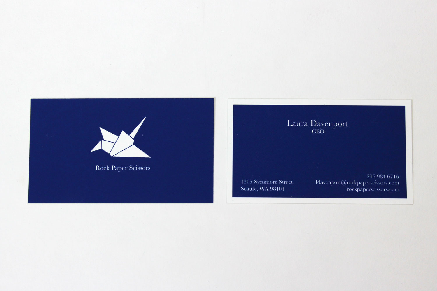
Rock Paper Scissors was founded by Laura Davenport, a product designer, in 2003 in Seattle, Washington. It started as a small store to sell the kind of products she was personally interested in designing and later began to expand as it grew more successful. Davenport created the first store because she was frustrated with the offerings of office supply stores with regard to quality and design. She created Rock Paper Scissors to fill the hole in the market for slightly higher-end office supplies. Each retail location features products designed by Davenport and likeminded designers.
Being an office supply store, Rock Paper Scissors’s main competition is Staples and Office Depot. But Rock Paper Scissors sells products that are more thoughtfully designed than its competitors’ and that are of a higher quality, meant to last. Rock Paper Scissors is not a big-box store, and one wouldn’t go there to purchase a printer, office chair, or desk. Instead, Rock Paper Scissors specializes in beautiful stationery and pens, high-quality office supplies in a variety of colors, and basic arts and crafts supplies such as scrapbooking papers, adult coloring books, and nice markers.
Headquartered in Seattle Washington, Rock Paper Scissors has ten retail locations—all in metropolitan areas and mostly concentrated on the two coasts. There are stores in Seattle, Portland, San Francisco, Palo Alto, Los Angeles, Denver, Chicago, Philadelphia, New York City, and Providence, RI. The next location to open will be in Washington DC. Rock Paper Scissors has 312 employees and tends to attract bright, young workers who care about aesthetics.
Rock Paper Scissors’s target customer is female, 25-60, has a college degree, and makes at least $80K/year. This customer values design and quality, preferring Target to Walmart, Crate and Barrel to IKEA, and Whole Foods to other grocery stores. The public comes in contact with Rock Paper Scissors through its storefronts as well as its large online store with a wider selection. For advertising, Rock Paper Scissors relies on word of mouth, digital ads, and print campaigns in local cities.
Rock Paper Scissors wants to communicate sophistication, thoughtful design, and an emphasis on quality. It also wants to communicate a touch of fun and whimsy, but not at the expense of elegance and refined professionalism.
Pictorial Logo
First up was the pictorial logo. It should represent the entire company in a simple image that anyone should be able to draw. My professor was also really fond of combining two ideas into one image, which had me really nervous. I think coming up with the ideas for these was the hardest part of the entire process.
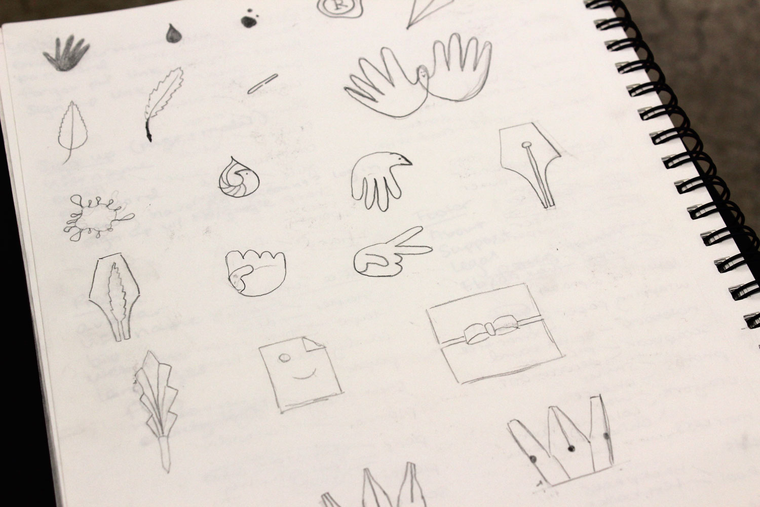
Here are the narrowed-down ideas:
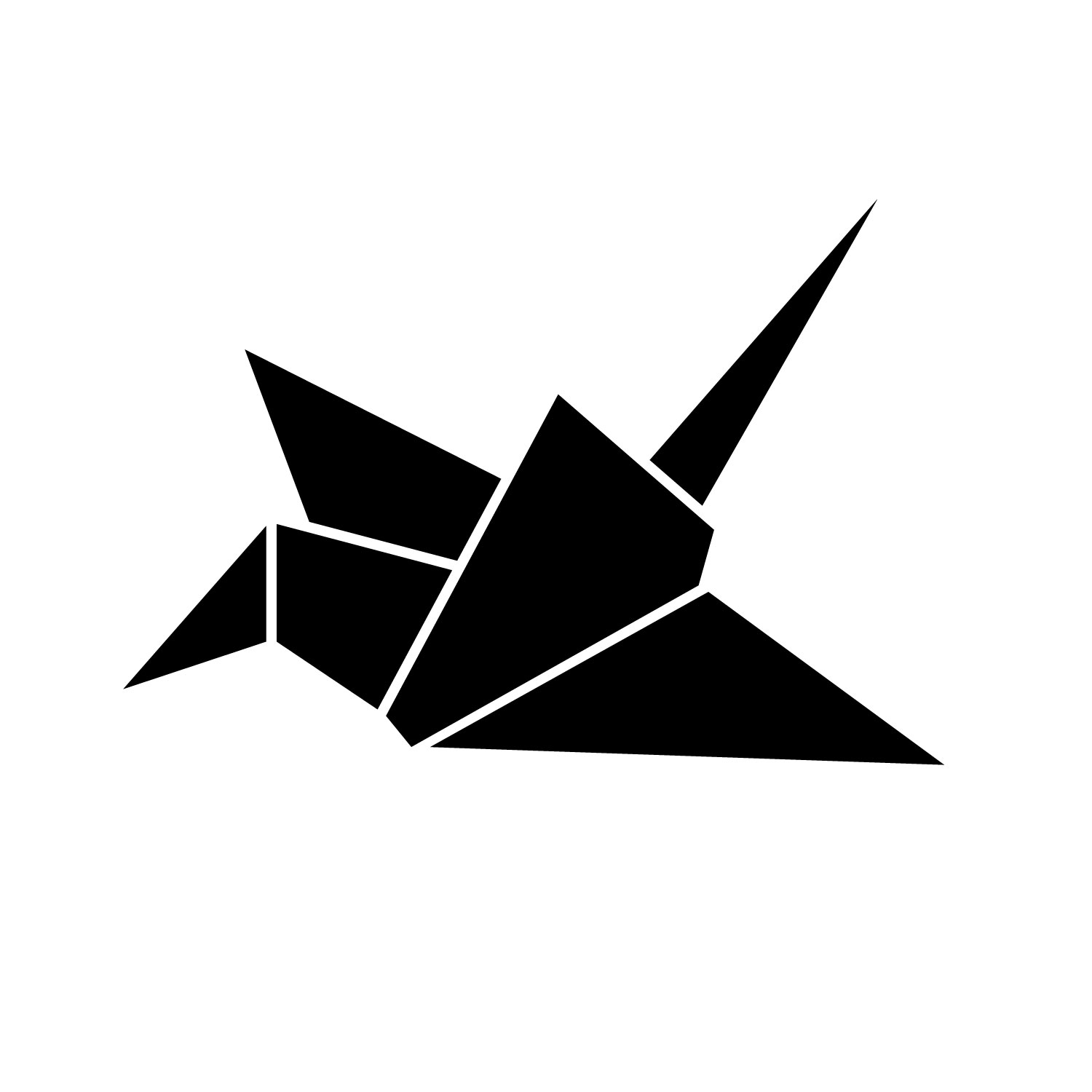
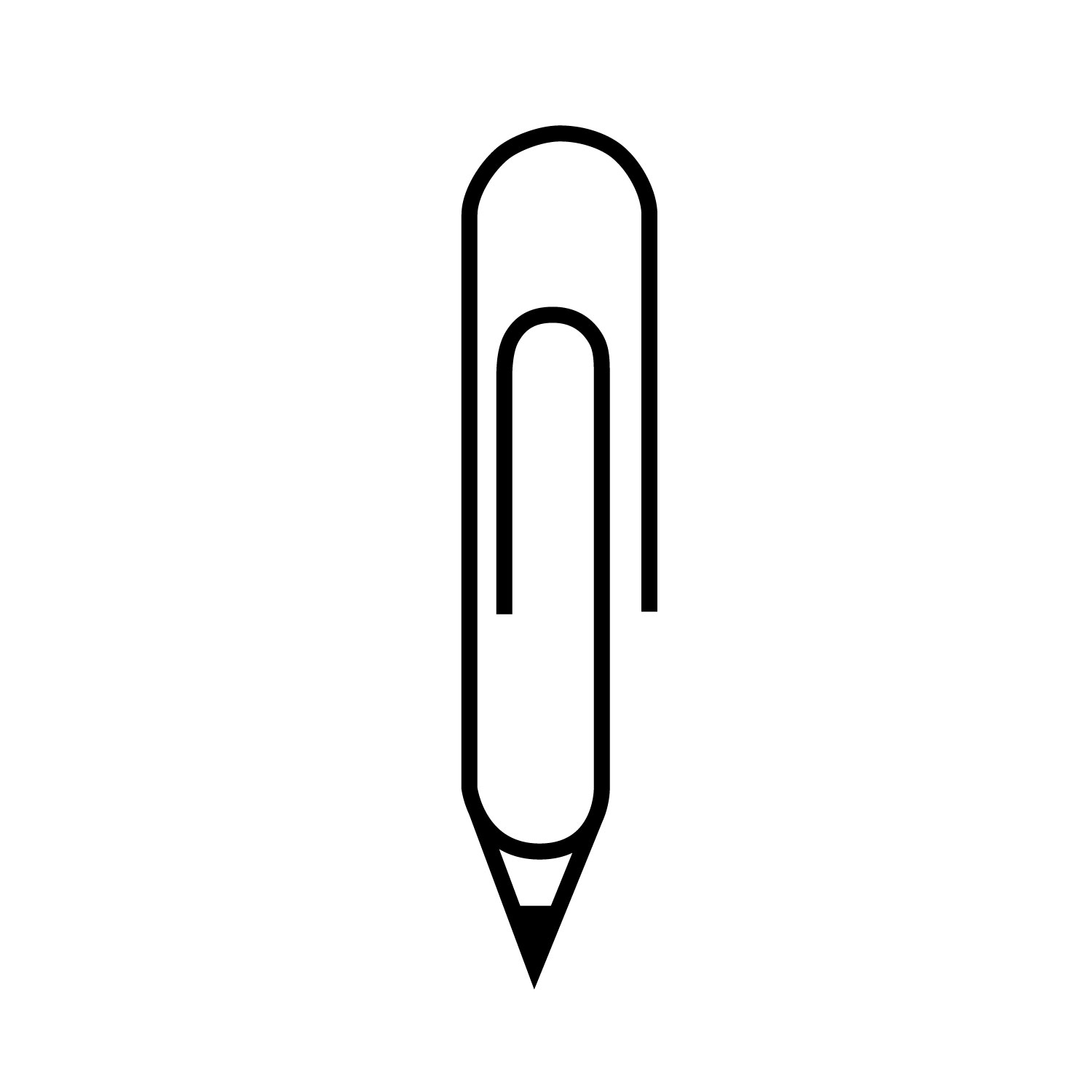
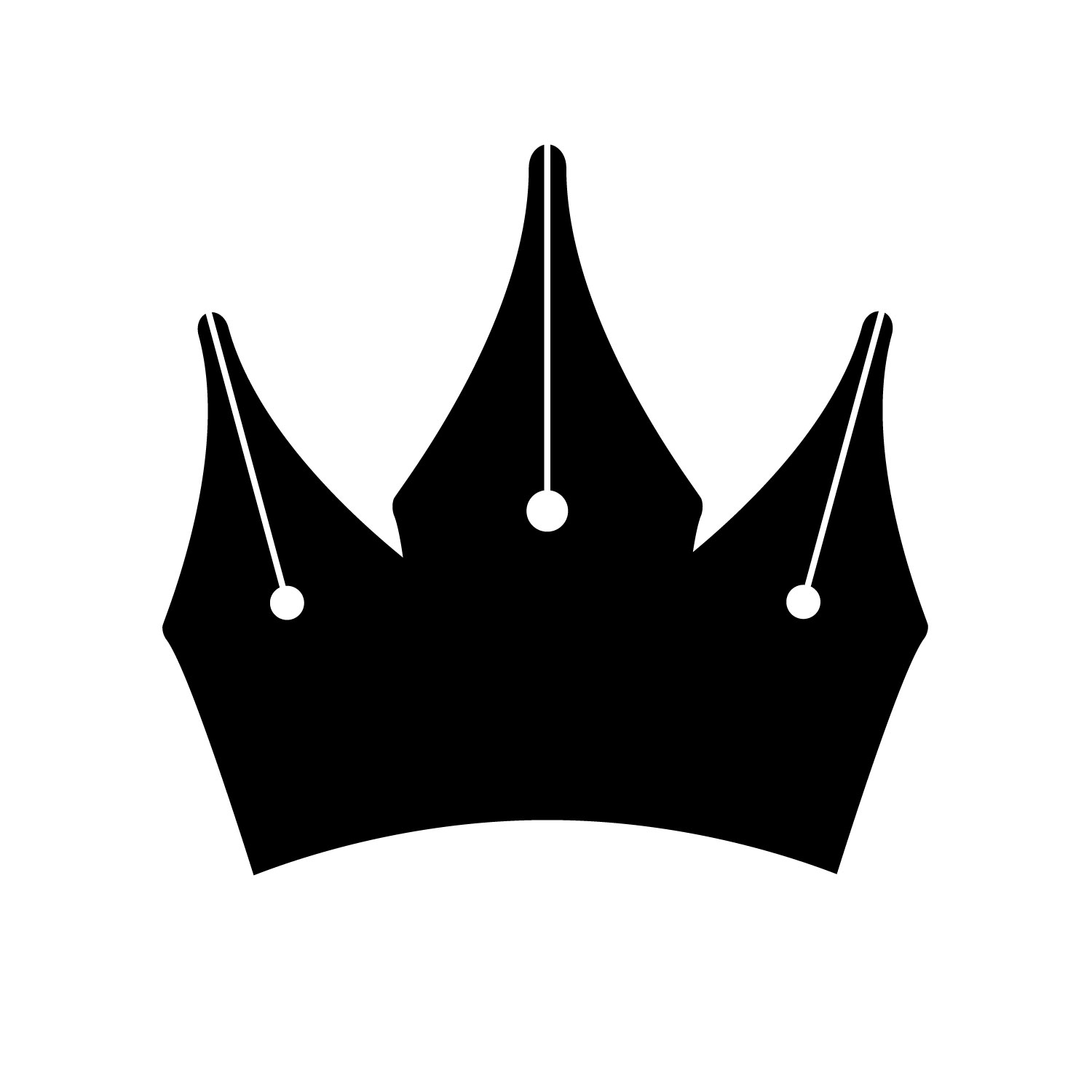
My personal favorites were the origami crane and the crown made out of pen nibs, which to me emphasizes stationery and excellent quality. However, my professor was concerned that a lot of people wouldn’t recognize the pen nibs and only see the crown. She also really liked the paperclip pencil, so I turned in the crane and the pencil to be graded.
Typographic Logo
For the typographic logo, we could only use the initials of our company. This felt weird to me because Rock Paper Scissors has three words, and I feel like using initials is much more natural when there is only one word in the company’s name. This logo was also really hard to design.
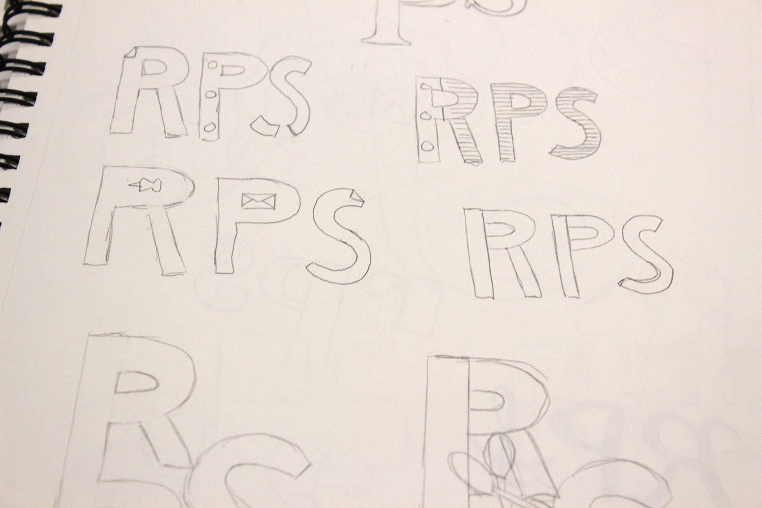
Here are the narrowed-down ideas:
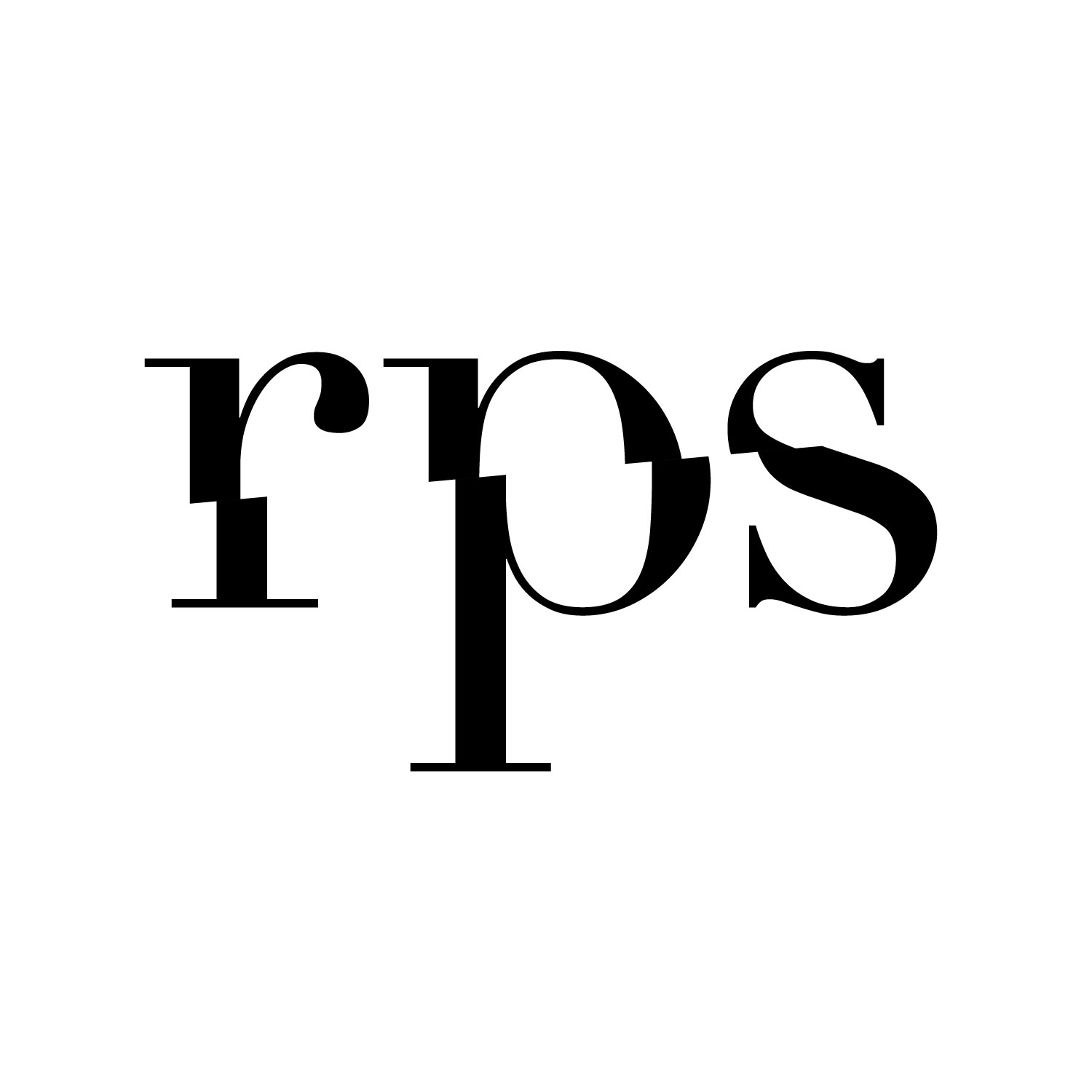

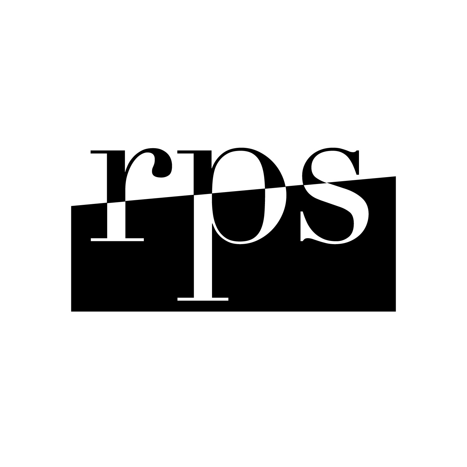
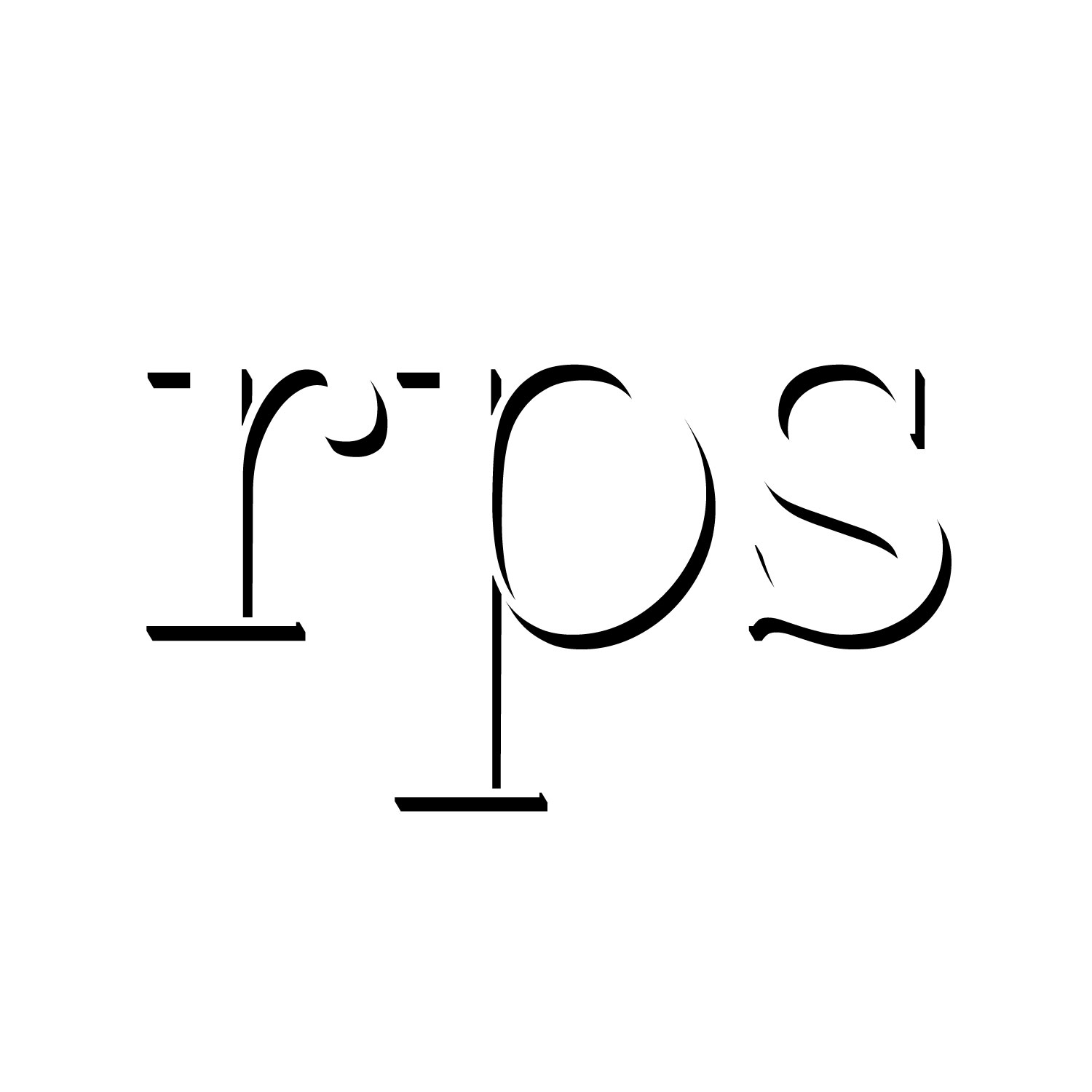
The first three were all riffing off the idea of scissors cutting apart the letters “rps,” while the last one played with the idea of paper cutouts. In the end, I chose the first one to turn in to be graded.
Combination Logo
For this logo, we had to spell out the entire name of the company and make the text work together with an image. My professor stressed that a successful combination logo cannot be split up: it won’t look complete with just the image or just the text.
Here are the narrowed-down ideas:
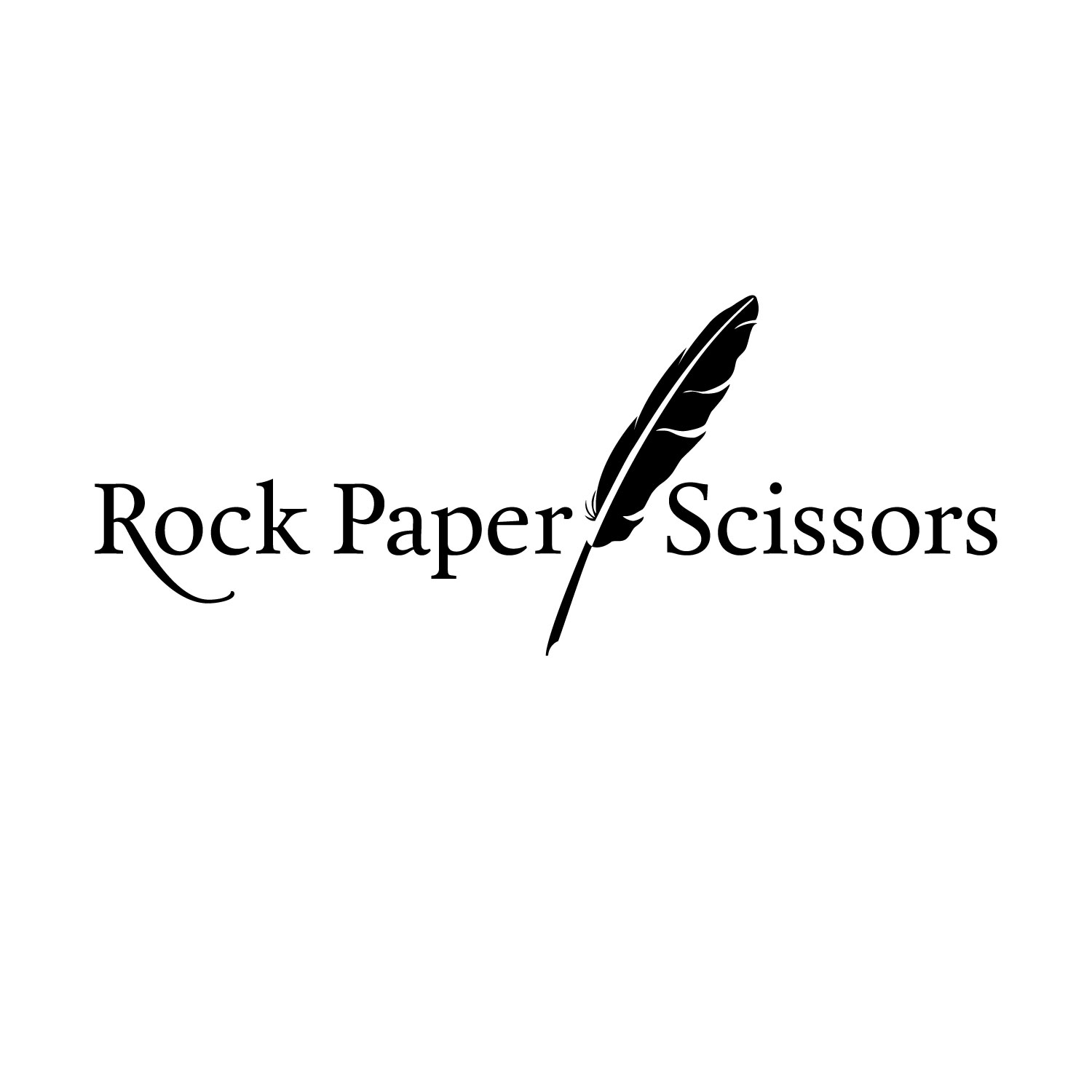
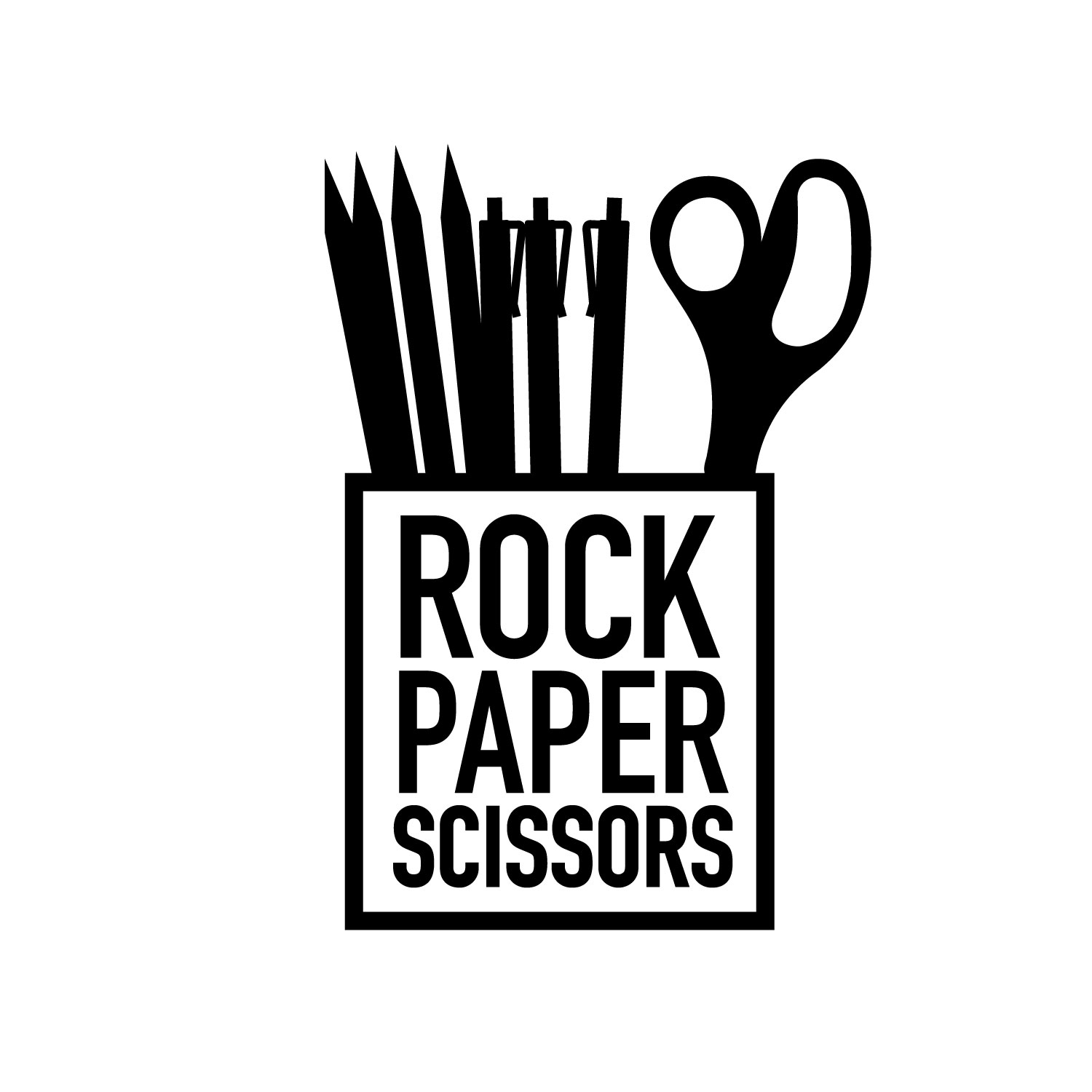
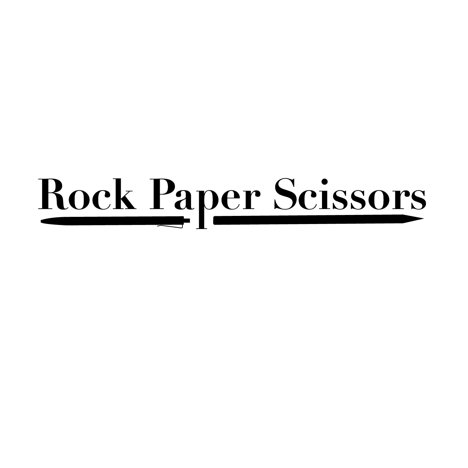
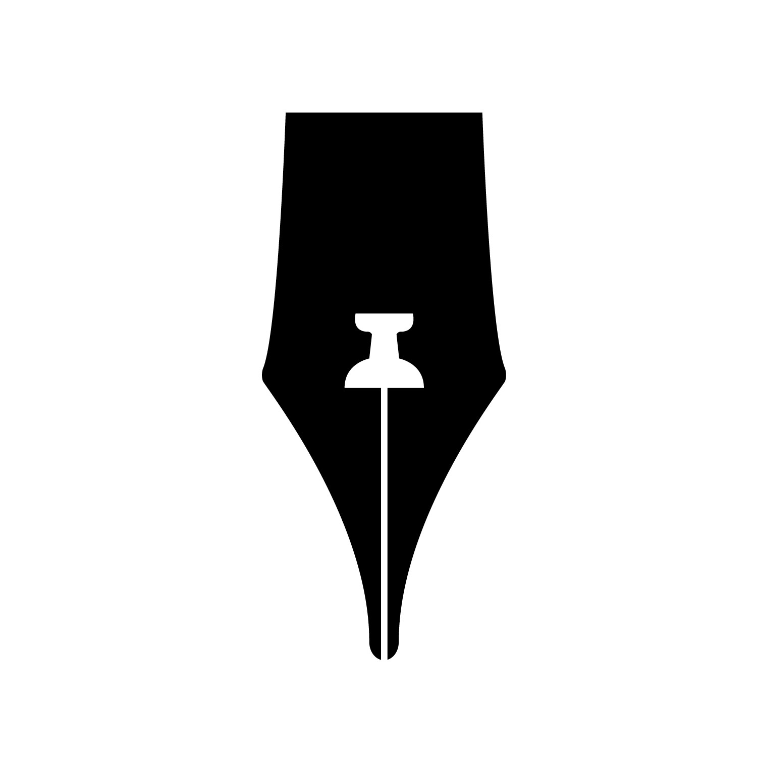
My favorite was the cup of office supplies, but it’s not nearly as elegant as Rock Paper Scissors’s logo needs to be. Ultimately, I chose the one with the quill pen to turn in to be graded. The combination logo was probably the most difficult for me, and it resulted in my least-favorite logo of the four that I created for this class.
Abstract Logo
I was pretty excited for this one. A good abstract logo, like Nike’s or Chase Bank’s, is an image that doesn’t look like anything recognizable but still represents the company well. To me, this was a very fun challenge. I played with paper and sketched it from various angles and in various contexts.
Here are the narrowed-down ideas:
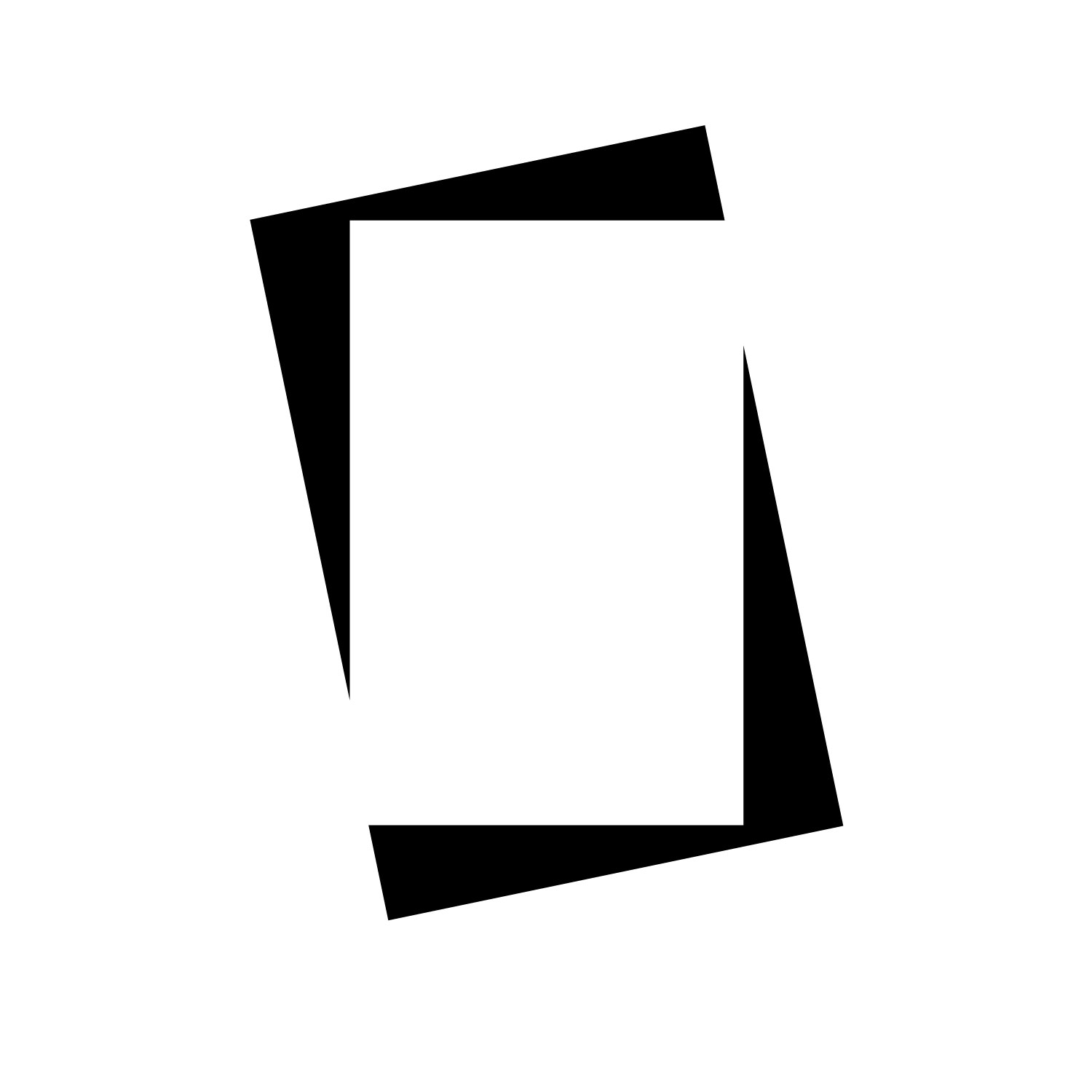
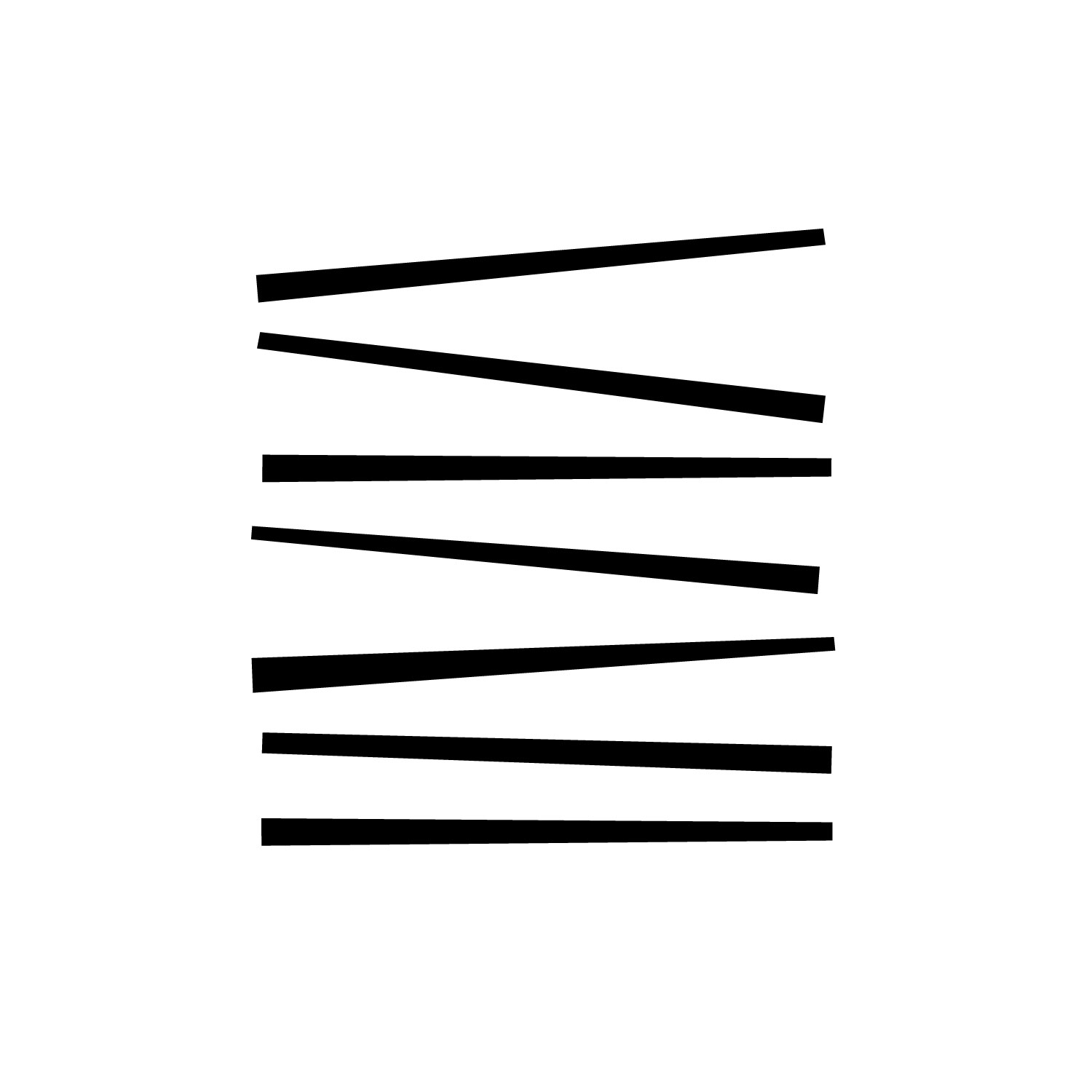
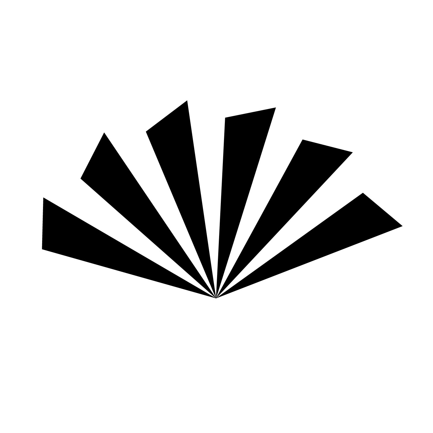
My favorite was the last one, the paper fan, but it doesn’t really represent an office supply and stationery store. Instead, I chose the first two to turn in: the two sheets of paper and the lines representing a stack of paper viewed from the side.
Choosing a Logo
In the end, I turned in six logos: two pictorial, one typographic, one combination, and two abstract.
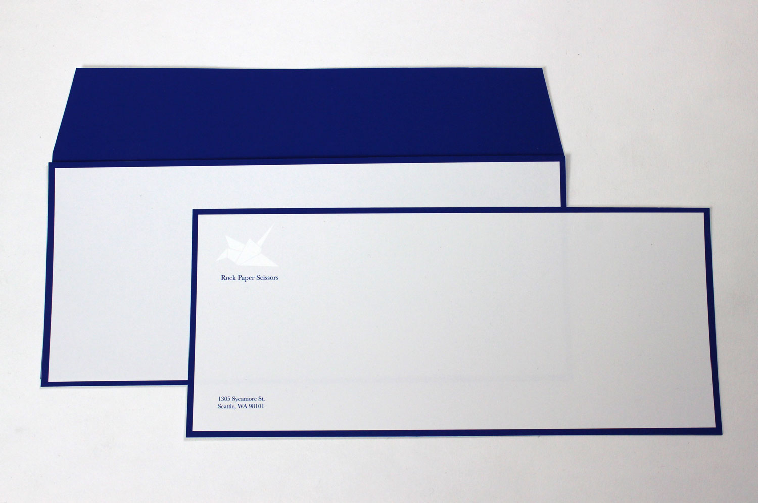
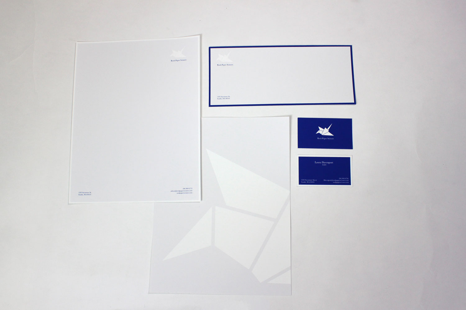
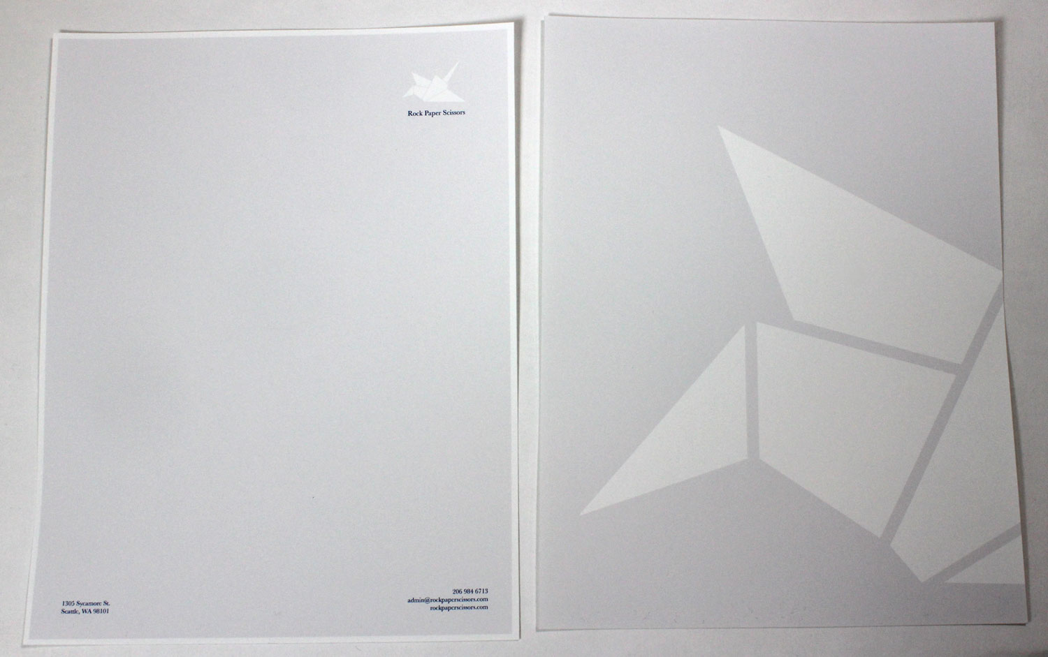
We had to select one of the logos we turned in to use to create an entire corporate identity package: a letterhead, an envelope, and business cards. I chose the paper crane because it is elegant, modern, instantly recognizable, and represents creativity, craft, and the process of making.
The identity package needed to be subtle and elegant, so I chose a color scheme of cream, white, and royal blue.
![]()