An Overview of My Second Quarter at Design School
Because I transferred to Drexel from another quarter-system school, I went into this knowing that winter quarter would be awful. It just always is, no matter which classes you’re taking. Looking back, this does not look like a heavy workload (and it certainly doesn’t compare to my spring quarter!), but I definitely felt stressed most of the time. It was a really hard quarter for me, but I pulled through in the end.
Design II
This is Drexel’s color theory class that all design students take their first year right after Design I, the black and white composition class. I was really looking forward to color theory because I love color, but it’s always mystified me a little. I can find colors that look great together, but there’s no sense of purpose when I select colors for a design project. I was excited to learn more about color and how to use it.
Unfortunately, this class was more about mixing paint than it was about learning how to use color well. We learned how to make colors, but not really what to do with them once the paint was mixed.
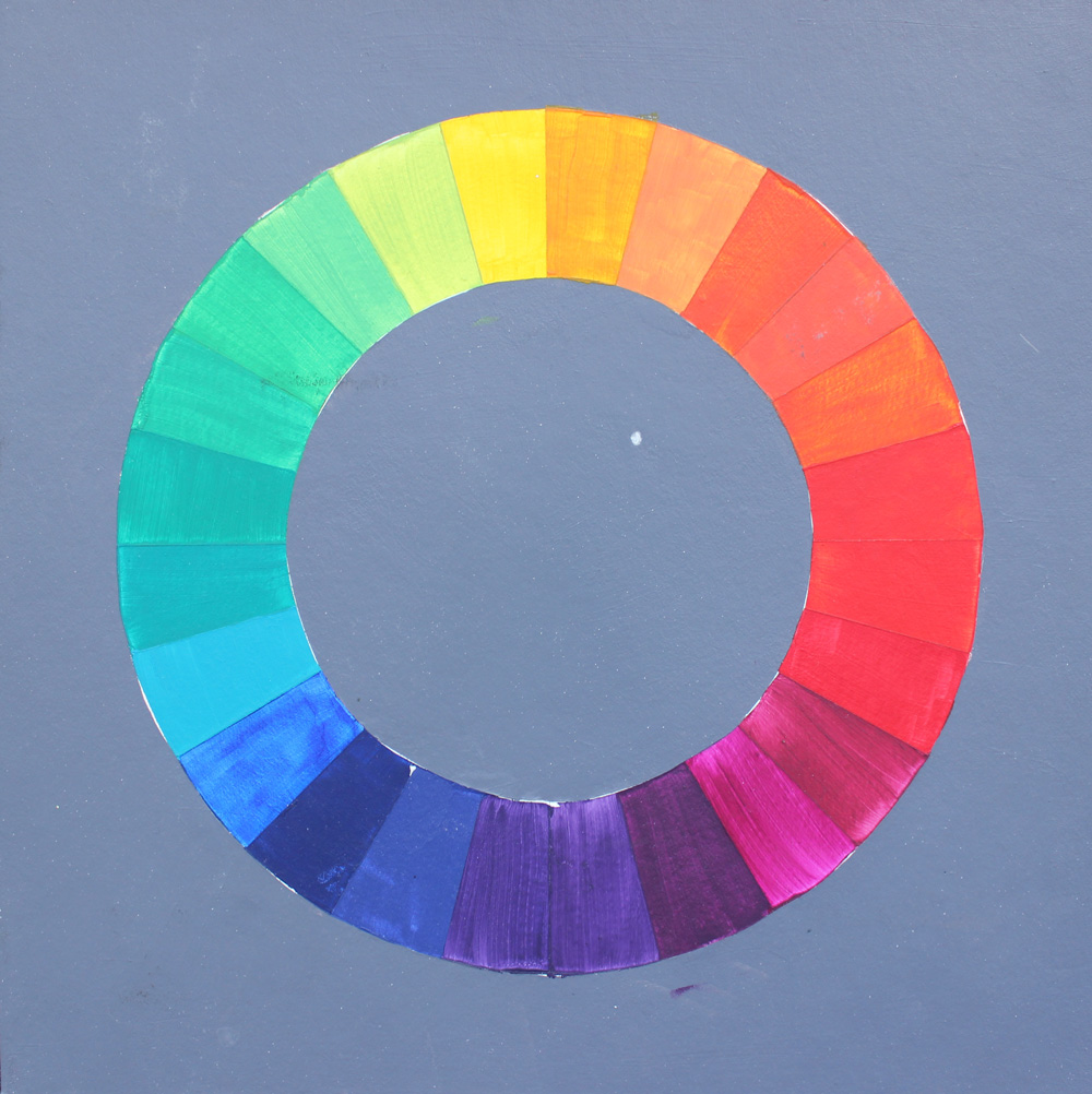
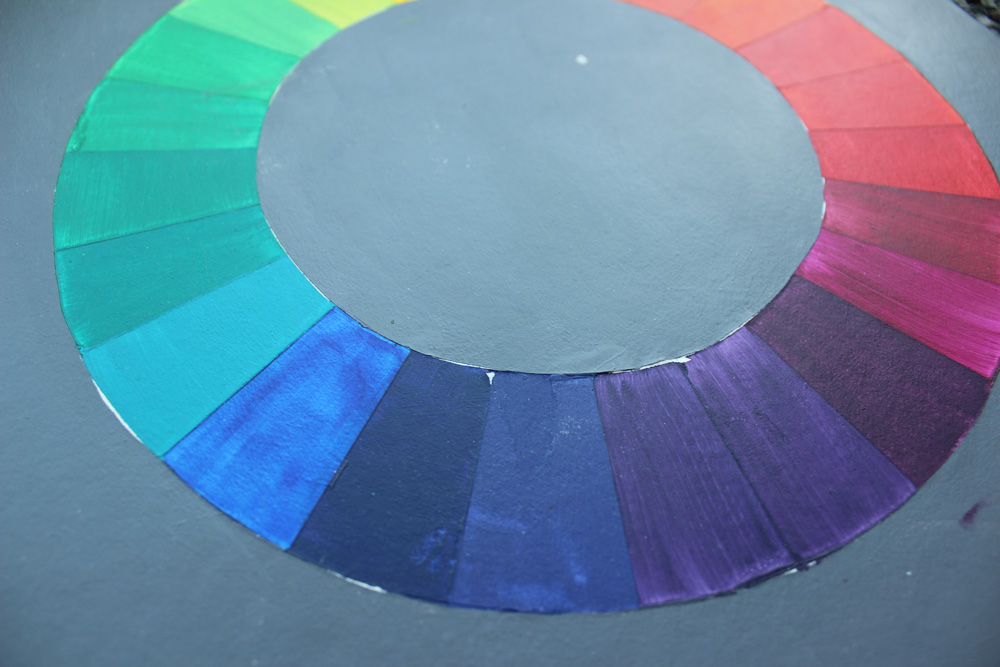
The Color Wheel
The first major project was to make an accurate 24-hue color wheel. We had all purchased color-aid paper, and our wheels had to match those hues exactly. This was a really hard project for me because I had never worked with colored paint (my swatches were never opaque), and ultimately I had to re-do it. The first wheel took about 8 hours and the second took about 12. Both were exhausting and boring to make, but I understand the purpose of the exercise.
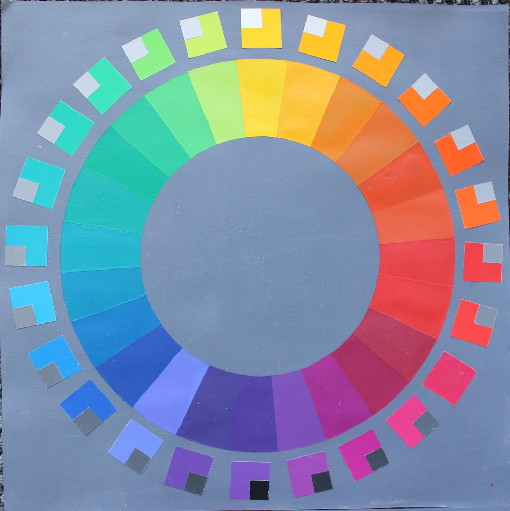
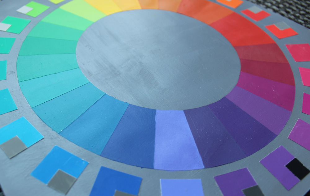
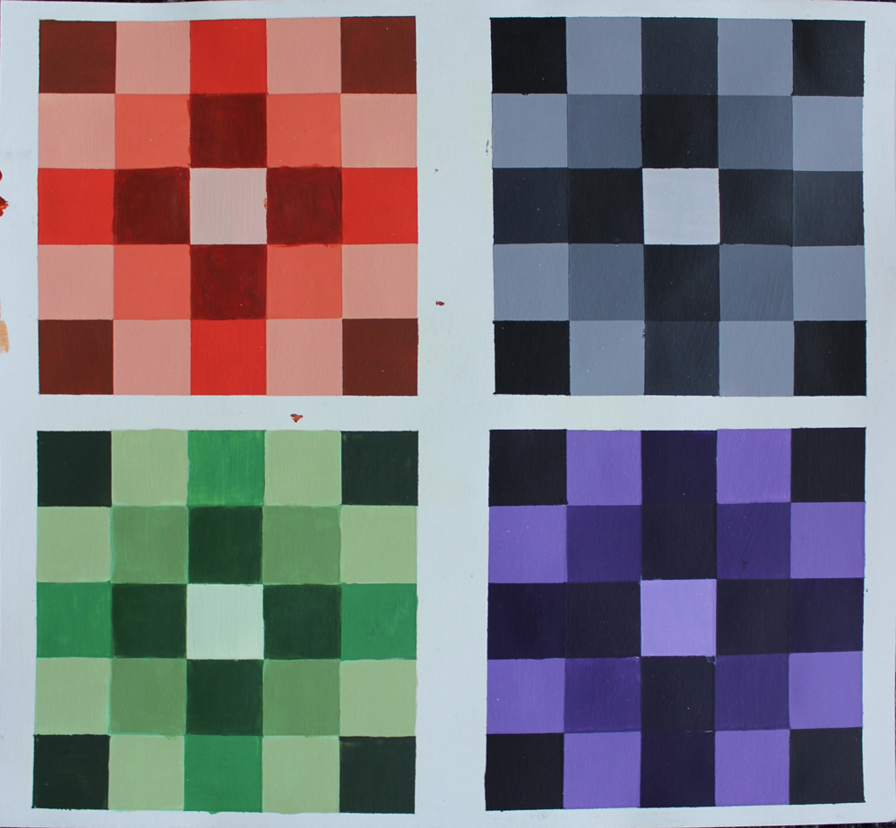
Scales
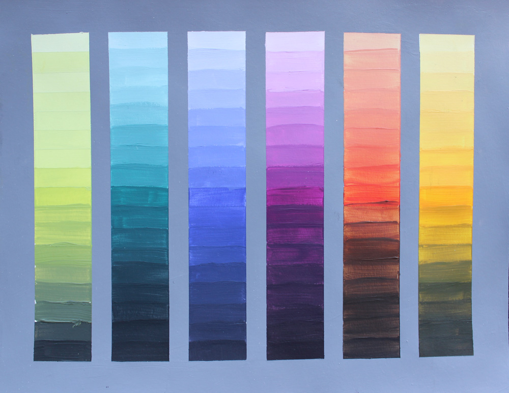
Scales are par for the course in a class like this. We did value scales, complementary scales, and experimental, “what happens when I mix these colors together?” scales.
This first scale was one of our very first assignments, and it was to test our paints. We had to buy multiple pigments of red, yellow, and blue, so we needed to know what differentiated Cobalt Blue from Phthalocyanine Blue.
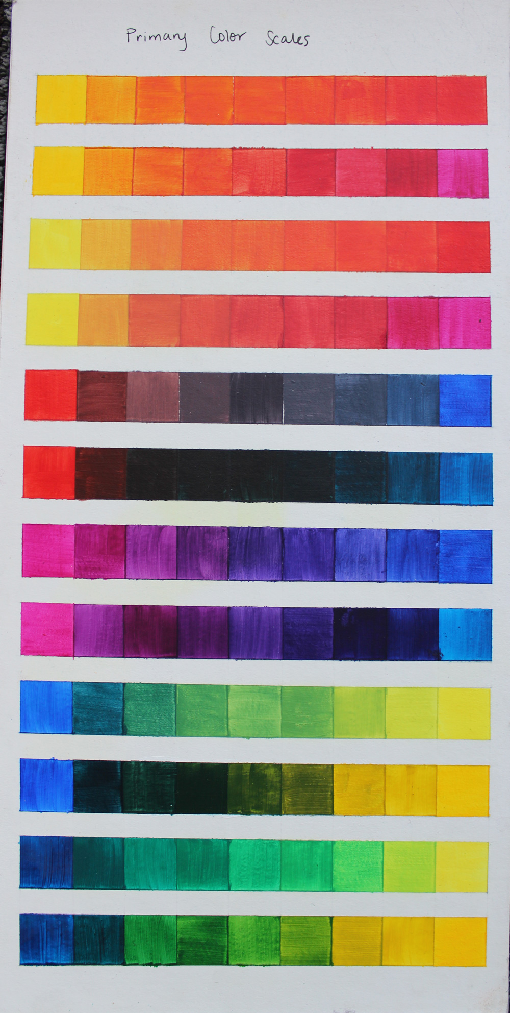
It was really hard for me to get opaque swatches, which cost me a letter grade or two for each assignment.
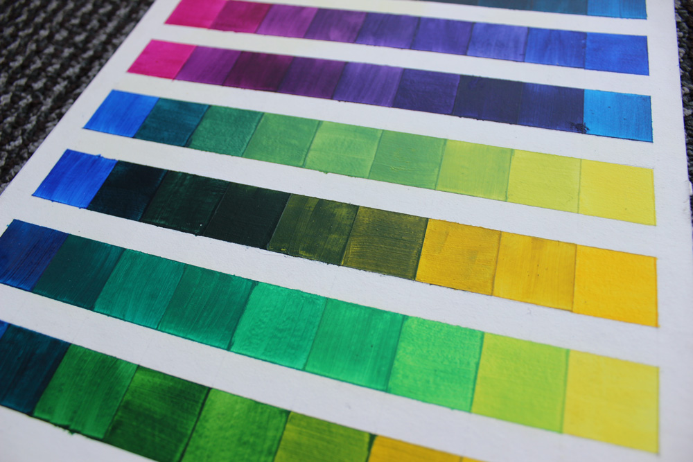
We made lots of value scales using tertiary colors:
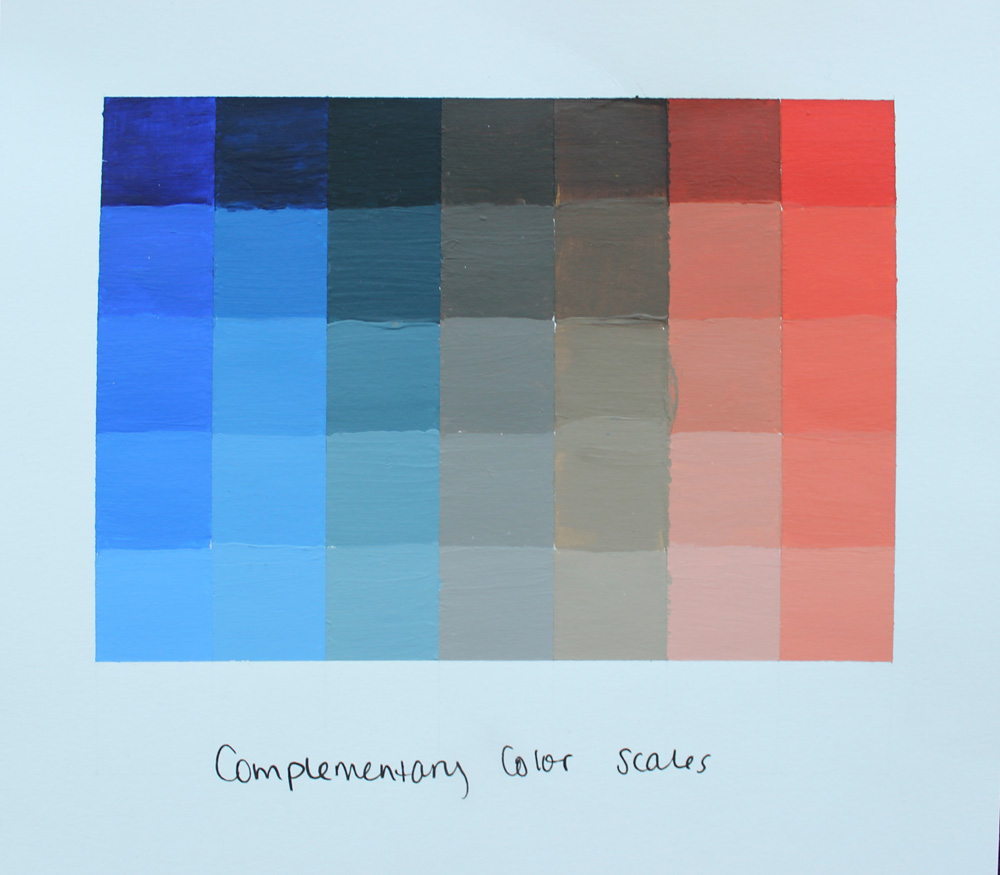
And we made several complementary scales, where you mix two complementary colors together to get a neutral:
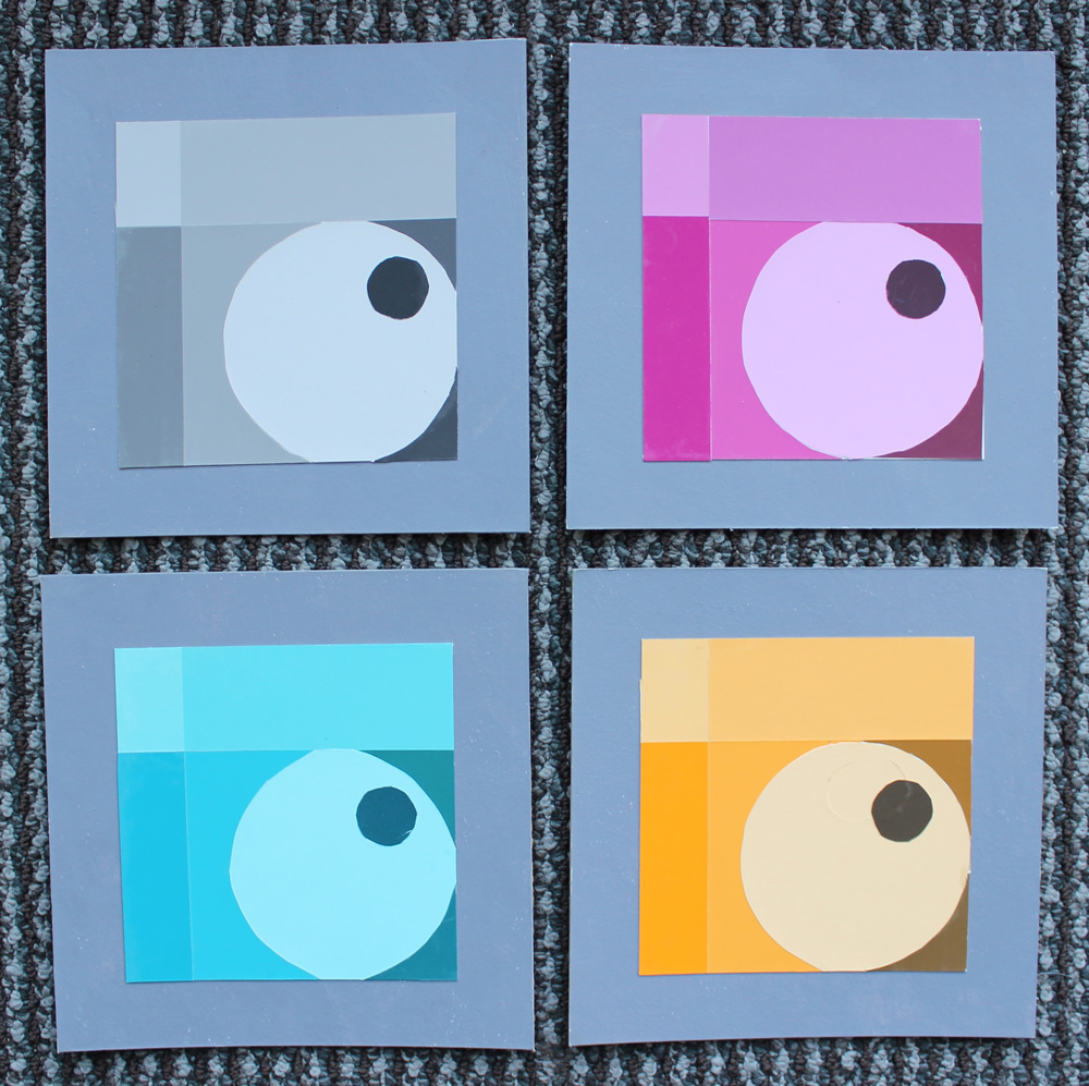
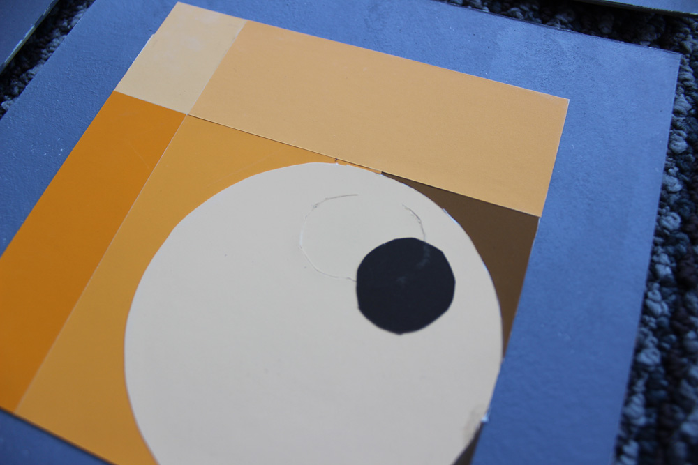
Same Design, Different Colors
I thought this class would be mostly replicating the same design multiple times with different color schemes, but we only did it twice: once in paint, and once using color-aid paper to make a collage.
The collage was fun to design but challenging to physically make because everything had to be inlaid, which I had never done before. This means that instead of sticking the paper on in multiple layers, it all has to lie smooth in one layer. To accomplish this, you have to cut several pieces at the same time so they fit perfectly together.
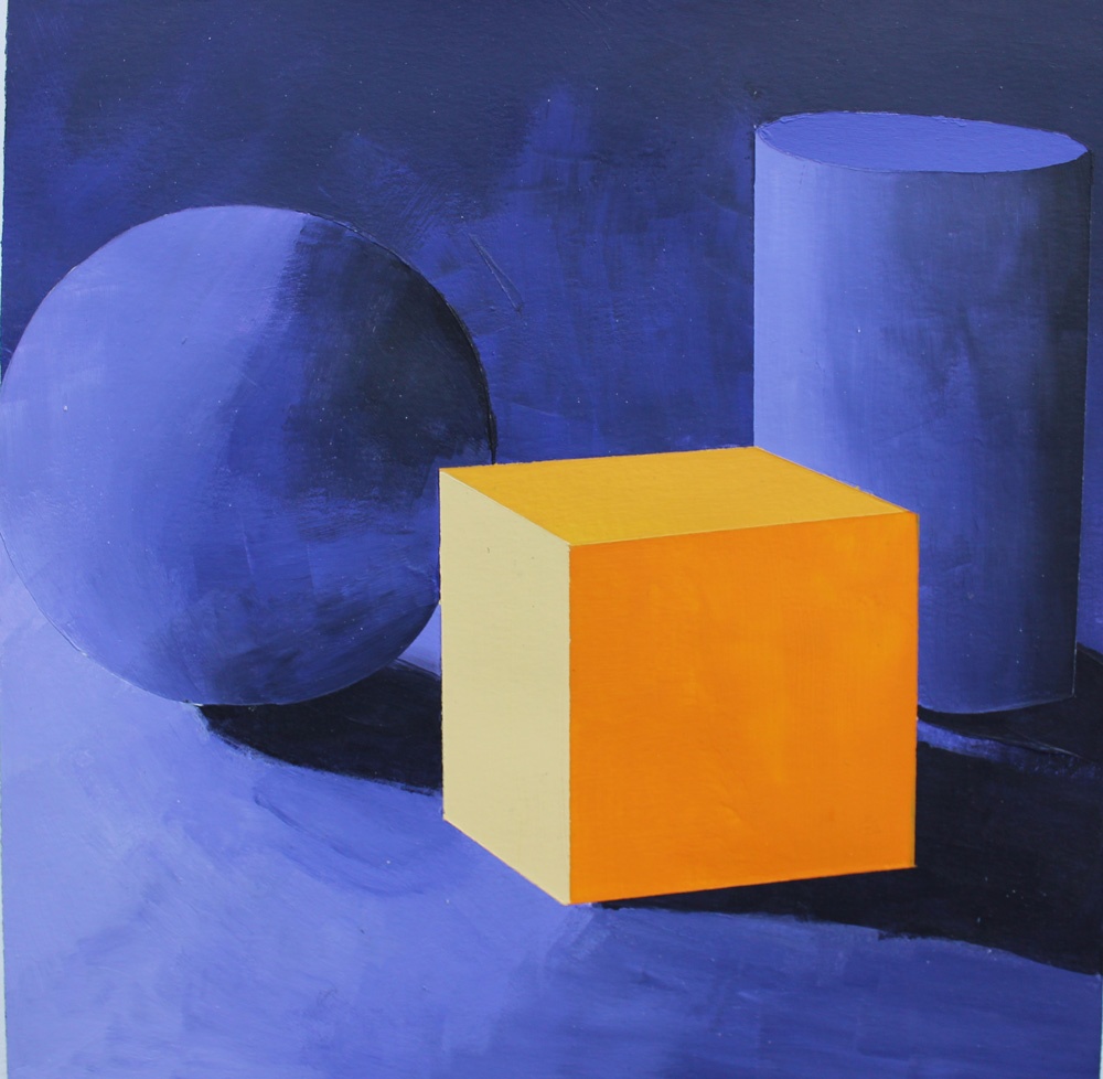
Complementary Still Life
My favorite project to complete was this still life, where we were given a black and white photo and had to paint it using complementary colors. I remember that I pulled an all-nighter for this and it took ages, but I loved doing it.
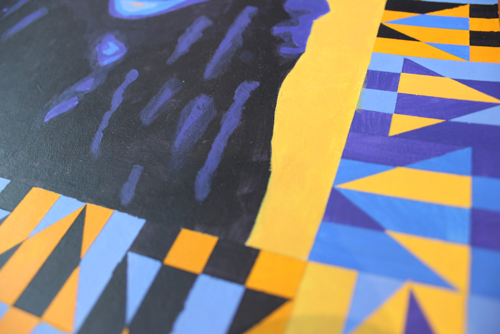
Self Portrait
For our final, we did self portraits. We had to use three hues (but multiple values of those hues), and we had to include a pattern around the border of the frame.
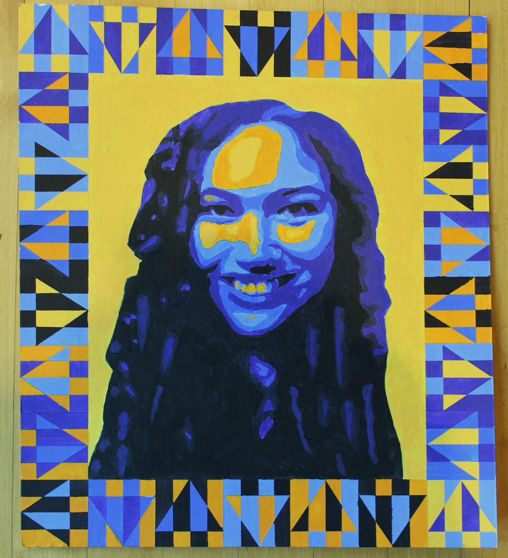
Overall, I feel like I became a better painter in this class, but not a better designer. I don’t think it’s bad to work on fine art skills, but it isn’t what I was expecting from a design class, so I was a little disappointed.
History and Analysis of Product Design
At the time, I was deciding between majoring in graphic design and product design. Because of this, I took an introductory product design class to help me decide.
Redesigning A Bottle of Lotion
Our only real assignment for this class was the final, which was to redesign a product of our choice as if we were a specific designer that was assigned to us. I got Eva Zeisel, queen of organic forms and ceramic beauty. I studied her work, did a lot of sketches, and decided that a desposable bottle of lotion would be the perfect thing to redesign. As a ceramic designer, she would never make anything meant to be used and tossed, so my challenge was to make re-fillable a bottle of lotion that someone would want to keep on their bathroom counter for years.
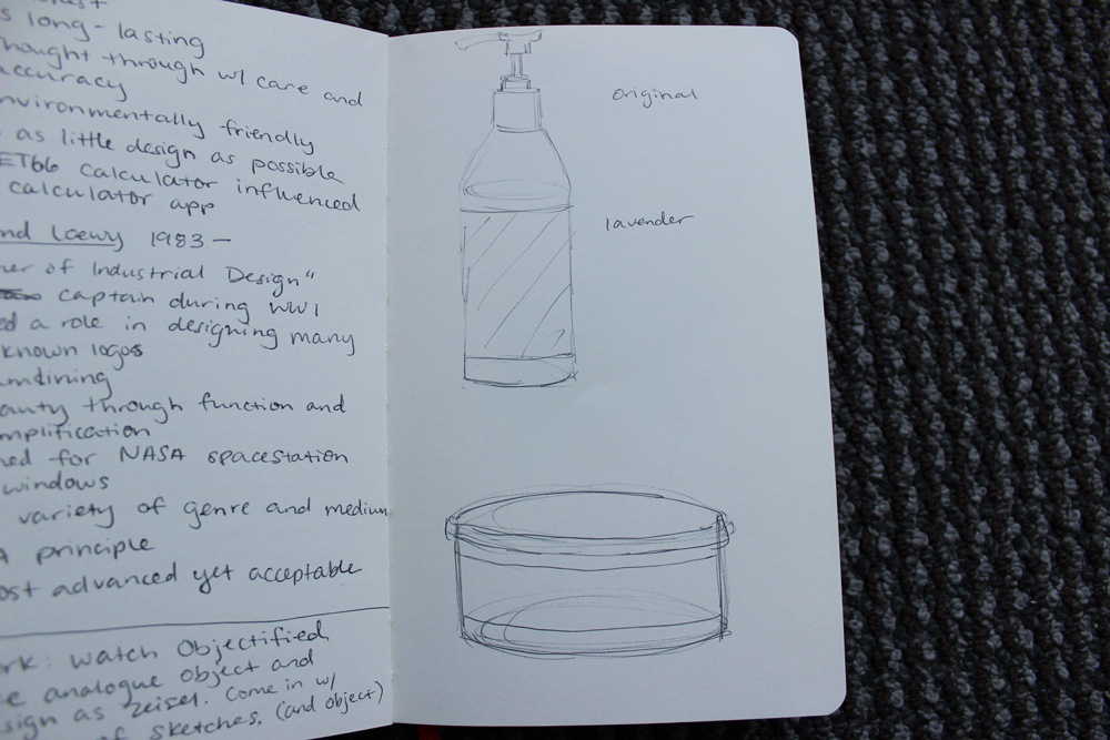
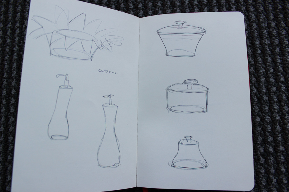
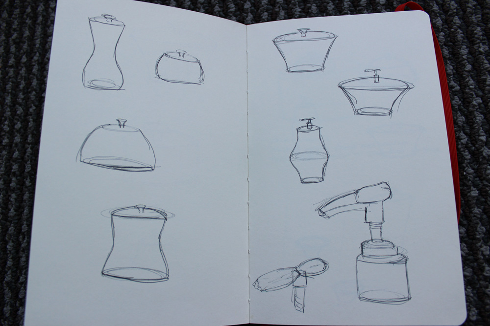
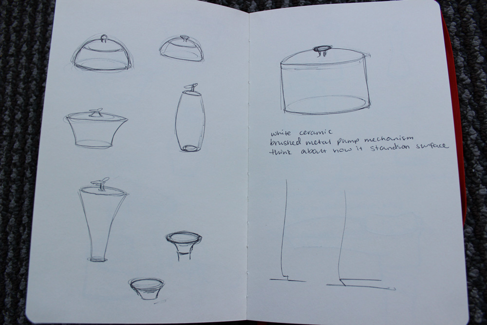
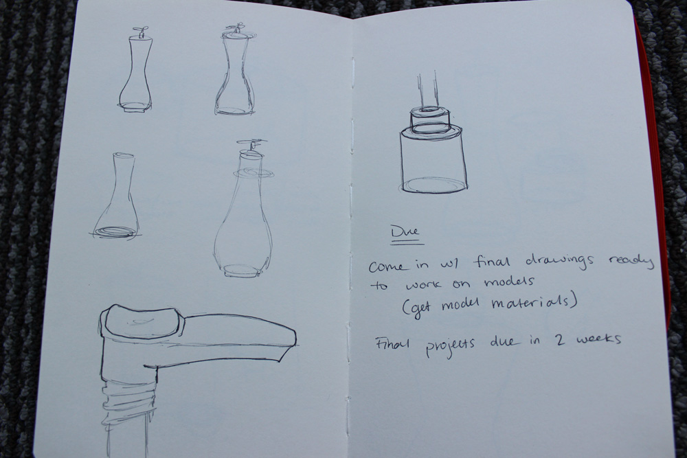
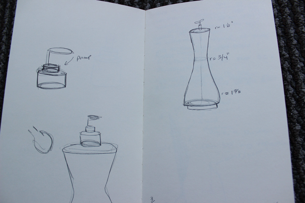
After completing a lot of sketches, we had to build a three-dimensional model of our product out of foam or cardboard. I was obviously influenced by Zeisel’s love for organic forms, and I decided to make the pump shaped like a leaf, as Zeisel was also heavily influenced by nature. The final product would be white ceramic with a brushed metal pump.
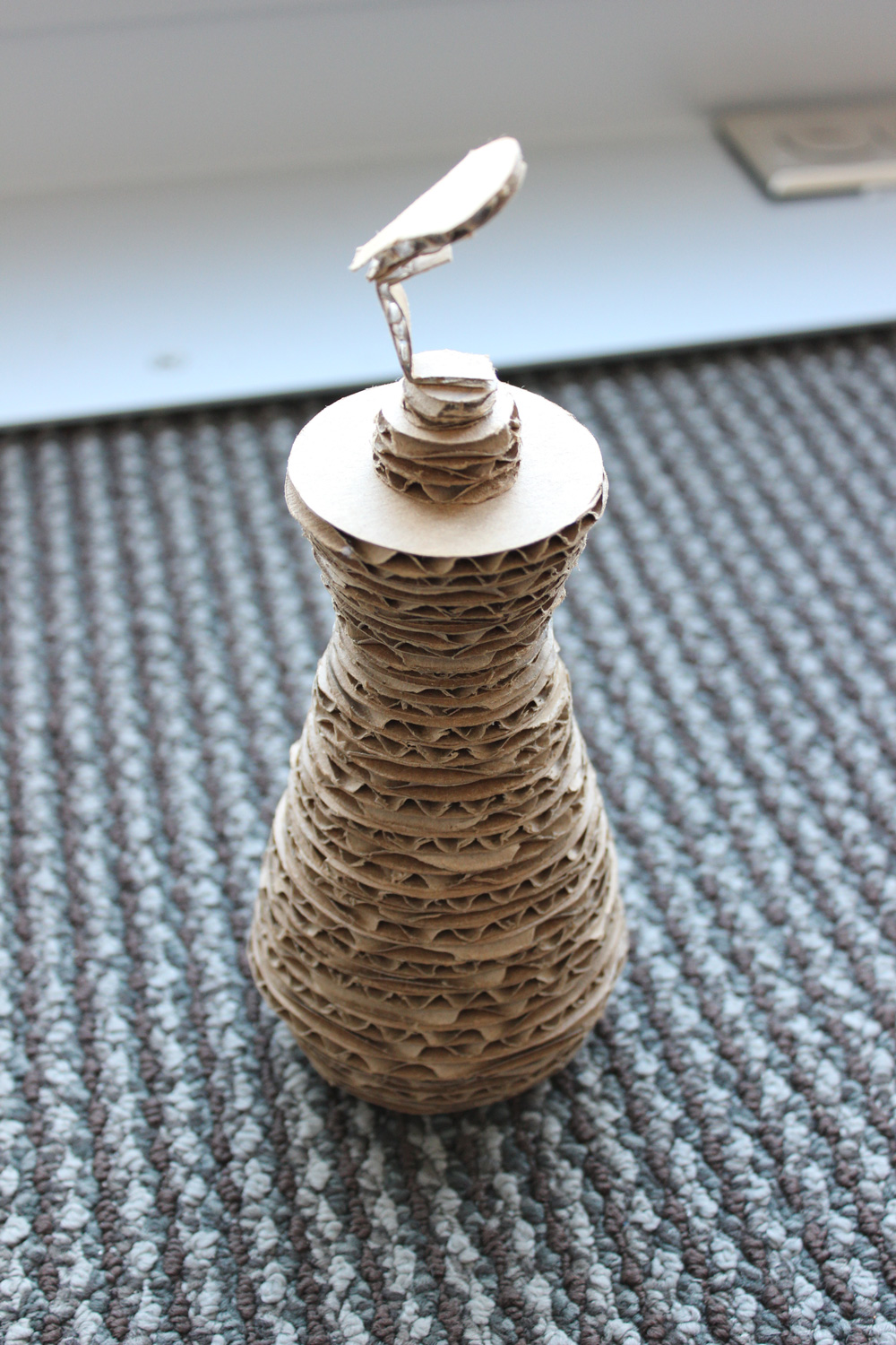
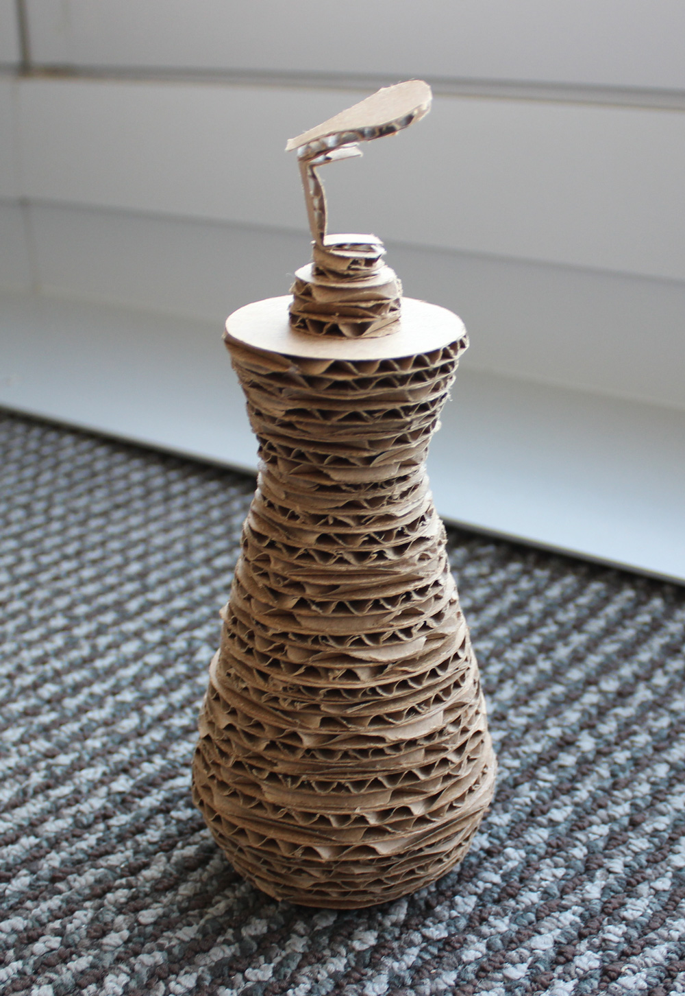
I absolutely loved this class, and like usual, I wanted more from it. I learned so much about a different area of design, and I loved thinking in this new way. Ultimately I chose not to major in product design because I have a hard time visualizing three-dimensional space, but I really loved learning more about it and trying it out.
Art History: Early to Late Modern
This was the first art history class I had ever taken, and I loved it. I attribute that solely to my amazing professor who taught with such enthusiasm that I simply had no choice but to love modern art as well. I had never been interested in art history until taking this class, but I thoroughly enjoyed it.
For our final, we had to compare and contrast two pieces found at the Philadelphia Museum of Art: Constantin Brancusi’s sculpture Bird in Space (1924) and Aaron Douglas’s painting Birds in Flight (1927). In my paper, I argue that both artists show the complex relationship between the organic and the mechanical in a world forever altered by industrialization.
Non-Design Classes
Composition and Rhetoric II
This class is the second English class that all Drexel freshman need to take. We focused on nonfiction writing, and even though I was peeved I had to take the class, I had fun. I liked my professor and my classmates, and the assignments were interesting.
The Drexel Experience
This class was pretty much the same as it was last quarter.