An Overview of My Third Quarter at Design School
Design III
This is the three-dimensional design class that every Drexel freshman design student takes after Design I (composition) and Design II (color theory). Unfortunately I don’t have very good photos of these projects since they took up a lot of space in my apartment and I had to throw them out before I got my nice camera.
Relief
For our first project, we slowly grew accustomed to thinking in three dimensions by making a relief based on architectural photos. We built the reliefs out of white museum board, and I remember really having a tough time getting everything to line up.
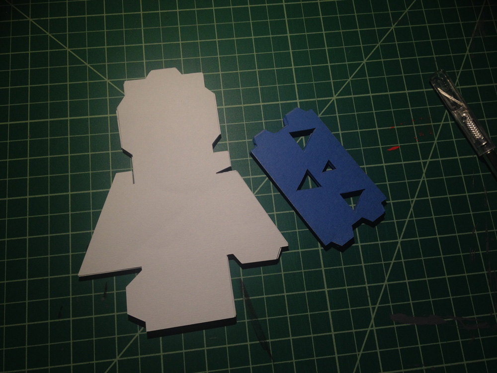
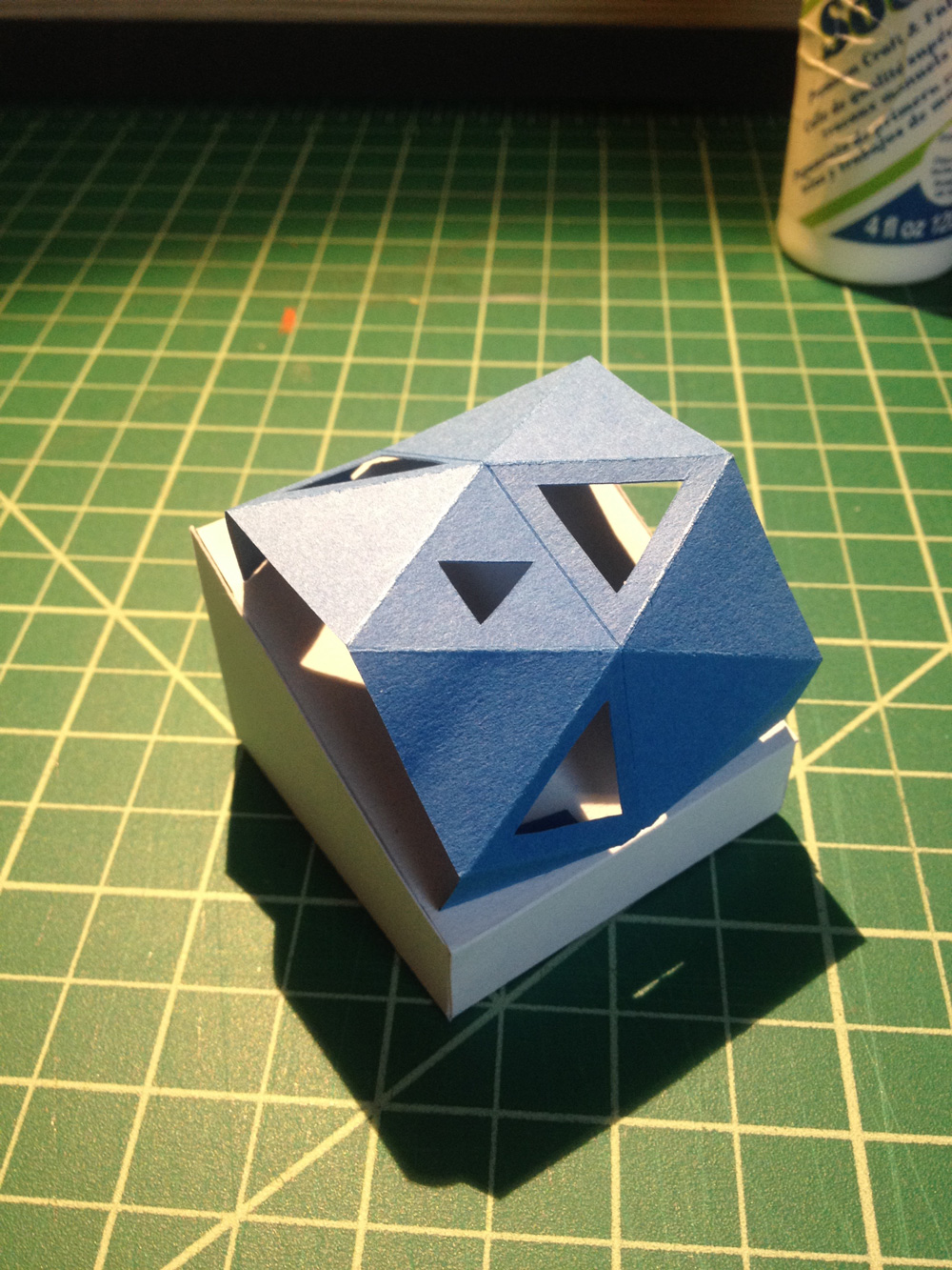
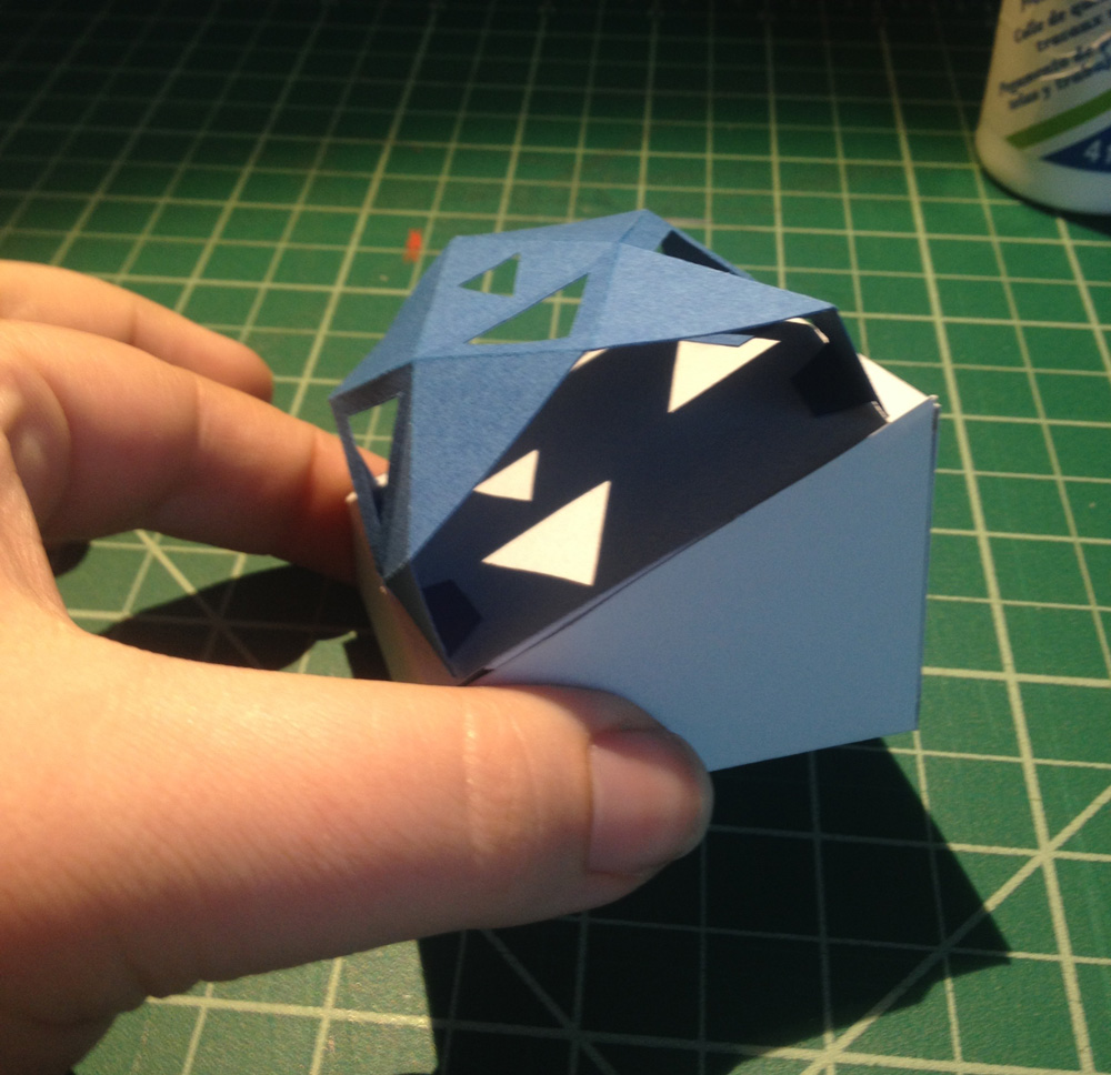
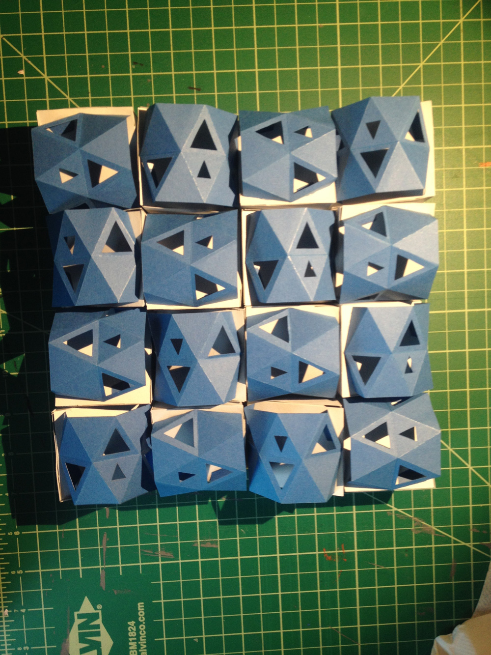
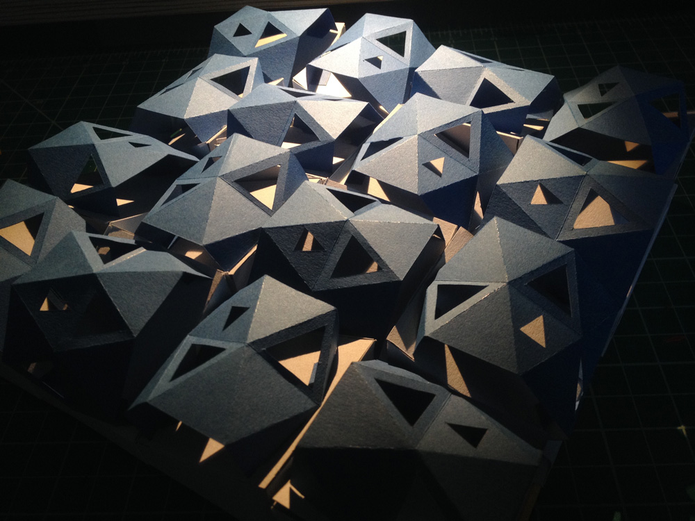
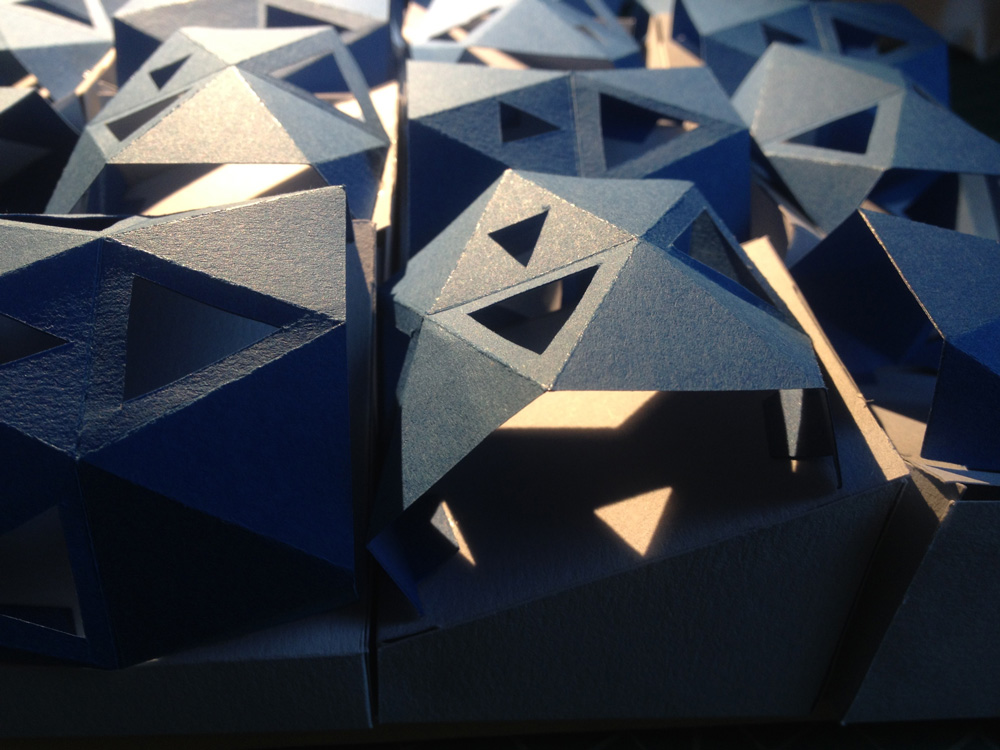
Boxes
Our second project was to create sixteen identical boxes out of paper and glue them into a 4 x 4 grid. The boxes couldn’t just be cubes; they had to be intricate. I decided to make a two-layered box that would create interesting shadows in the light.
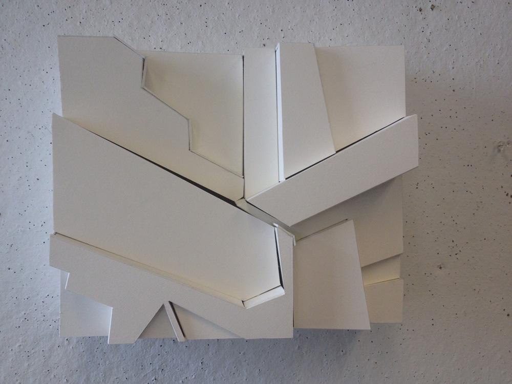
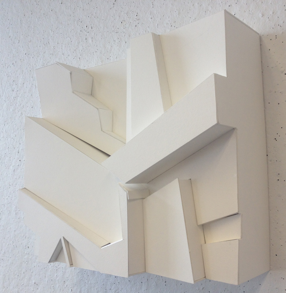
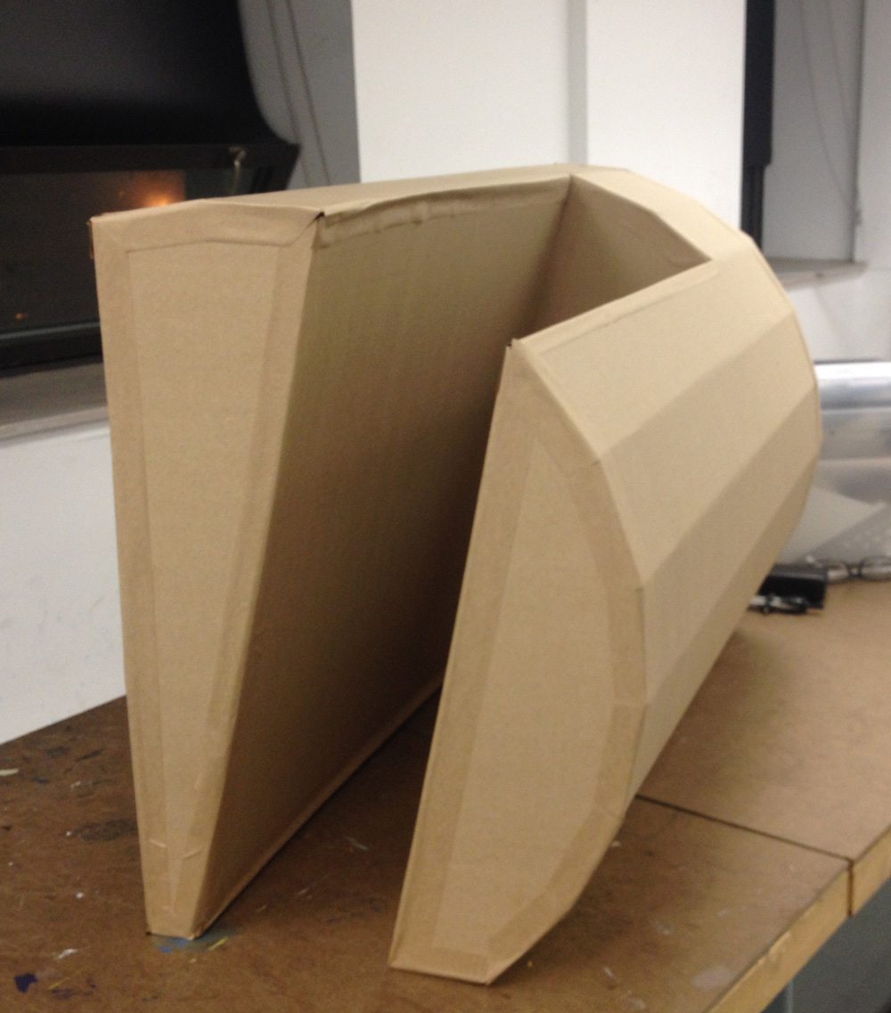
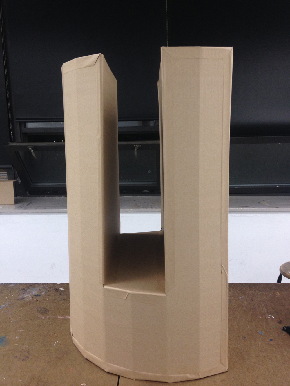
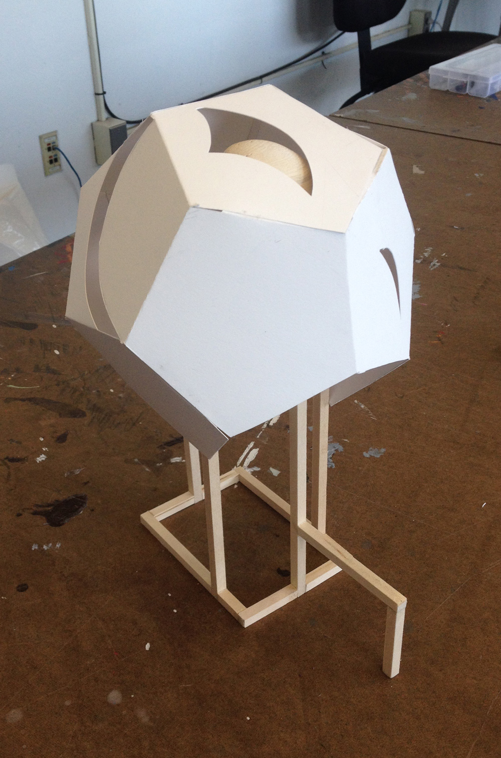
Negative Volume
For the third project, we had to create a sculpture of a negative space out of cardboard. I chose the space created by the open window in our classroom. The hardest part about this project was how big it was (almost three feet long) and learning how to create beveled joints with tape.
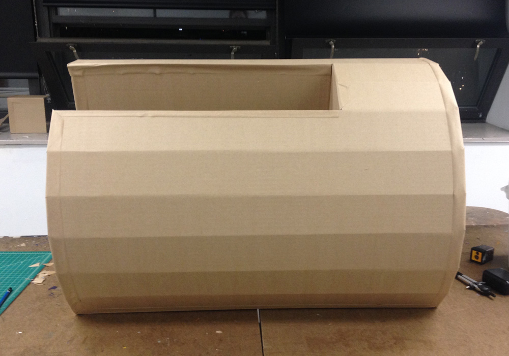
Creating that faceted curve on the front was also rather difficult; I had to make sure both side pieces were cut to match the facets, and I had to score the cardboard and bend it on the scored side, which you normally don’t do.
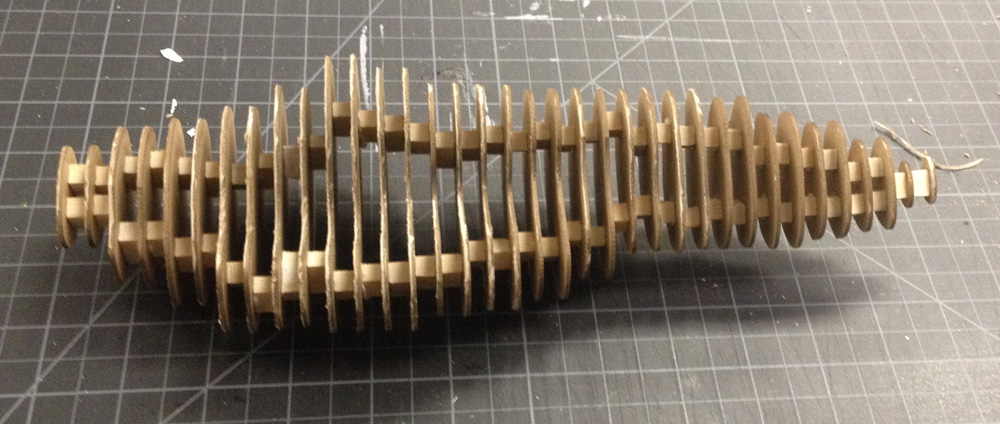
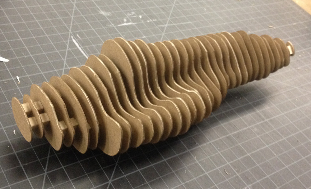
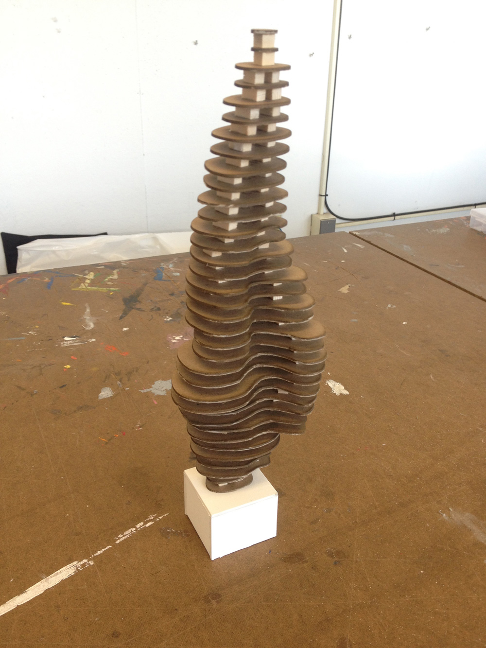
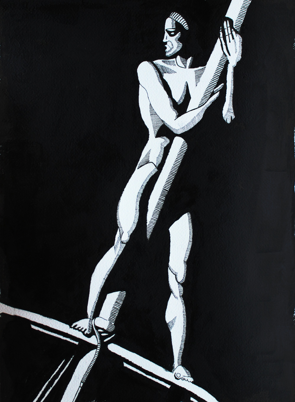
Serial Planes
This project was fun because there were several stages, and I used the lasercutter for the first time. First, we filled balloons with plaster and formed little sculptures as the plaster set. When we took the balloons off, we were left with unique organic forms. We then had to approximate that form using a series of twenty flat planes that we would then glue together.
First, I made a prototype of the sculpture using bristol paper to make sure that the planes approximated the form accurately.
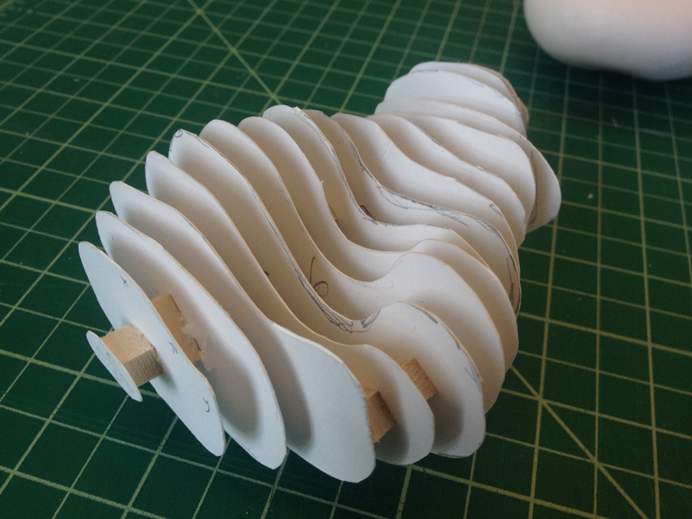
Once I was satisfied with the bristol prototype, I lasercut the planes out of board (I forget which kind!). This was my first time using a lasercutter, and it was much more complicated than I thought it would be. When the lasercutter was done, I glued the cut pieces together with 1/4” wooden dowels between each one to space it out a little.
Another part of the project was deciding how the sculpture should be displayed. We had to make a platform out of white museum board that was custom to the sculpture and complemented it. I decided standing mine up vertically would be the most elegant solution.
Final
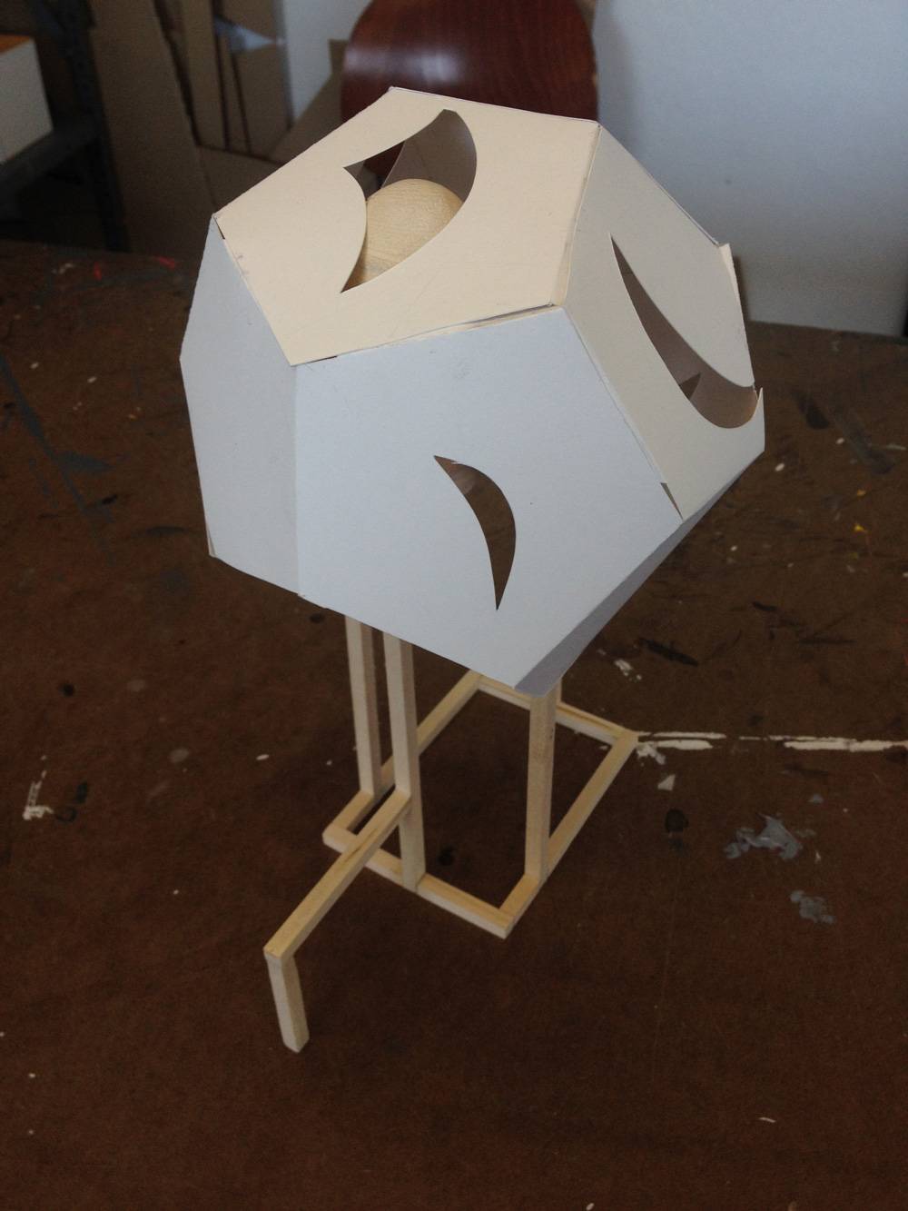
For our final project, we were each a given random object we had never seen before and told to build a support structure that would showcase it. I had to make a structure for a seashell, and there were specific height and width requirements. I thought it would be interesting to only show part of the shell because when you find a shell in the sand, you often only see part of it. I also wanted to reference the natural pattern on the shell in the structure, so I cut windows out of the bristol that mimicked it. I’m not too happy with the way it turned out, but I was so rushed at the end of the quarter and I did my best.
Despite having an excellent professor, this class was really difficult for me, and it’s ultimately the reason I chose not to major in product design. Each project took forever for me to complete because it’s so hard for me to conceptualize three-dimensional space. I learned a lot about sculpture and craftsmanship, which I’m grateful for and find extremely valuable, but the work was just so hard.
Computer Imaging I
This was by far my favorite class this quarter. I knew going into it that it was technical course where we’d learn Adobe Illustrator. Because I’ve been working with Illustrator for years, I expected to be bored and not really learn anything. To my surprise, I was learning things about the program by the second week!
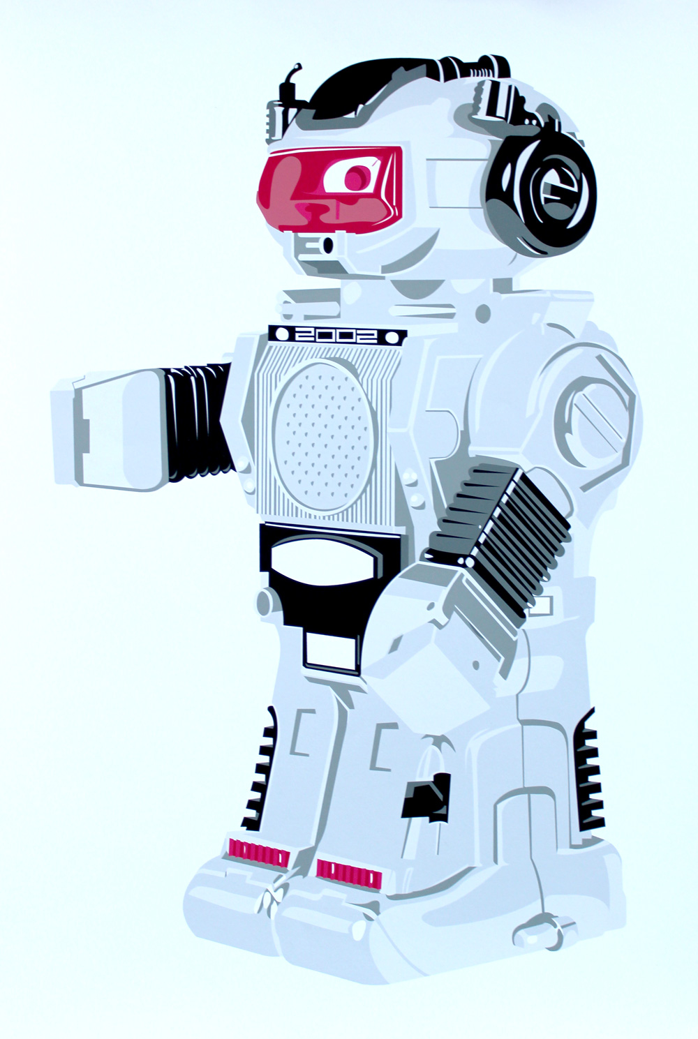
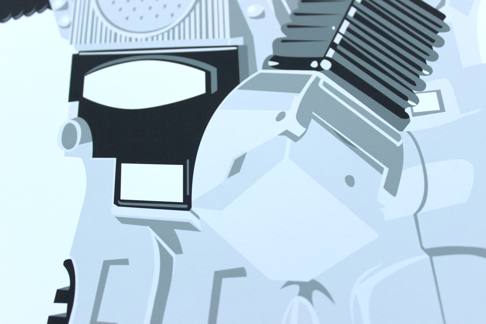
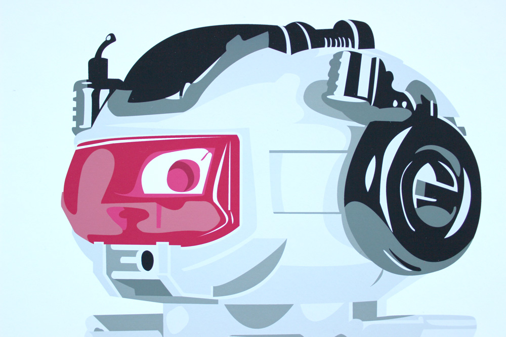
Robot
Because this was an Illustrator course, we did a lot of vectorizing images. The first large project was taking a photo of a toy robot and producing a vector illustration of it without using gradients or transparent shapes. I ultimately had to do this twice because my first try was not nearly detailed enough. Here is my final:
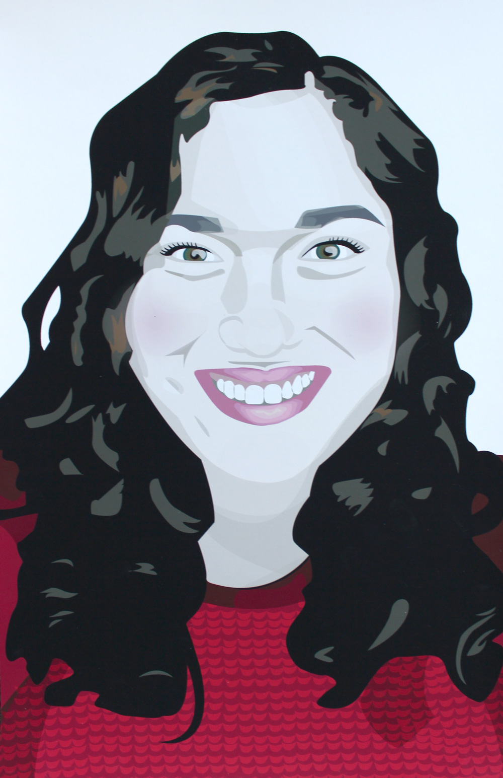
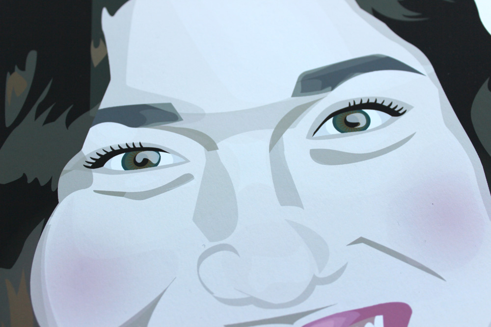
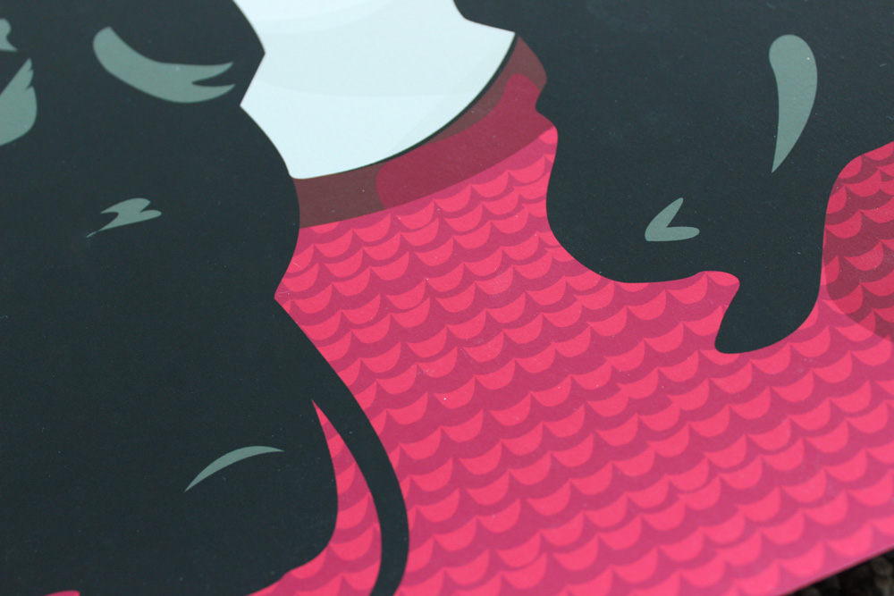
Self Portrait
The second large project we had to do was a self portrait. With this project, we got a lot more creative freedom than we did with the robot project, and we were allowed to use gradients and transparent shapes.
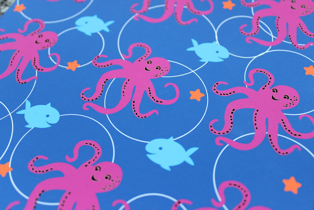
Stationery
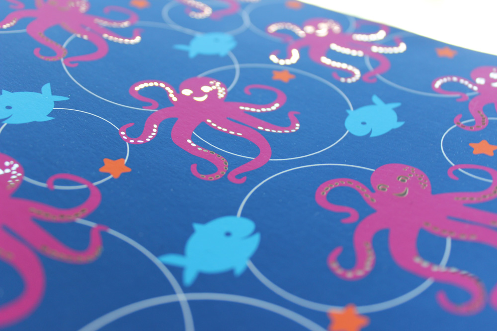
For this project, we had to do four pattern-based illustrations that would look great together on a set of stationery. I chose an aquatic theme and wanted to make mine both whimsical and sophisticated.
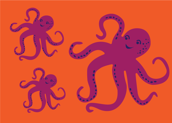
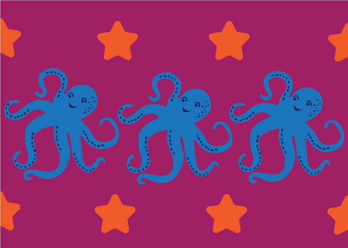
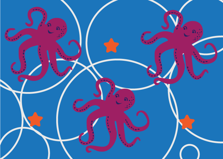
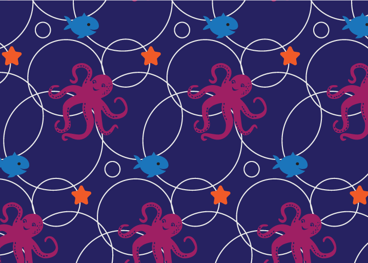
We then had to lasercut one aspect of the piece, and I chose the details on the octopi. This was my second time using the lasercutter, and I was slightly more adept than I was during my first time.
Travel Campaign
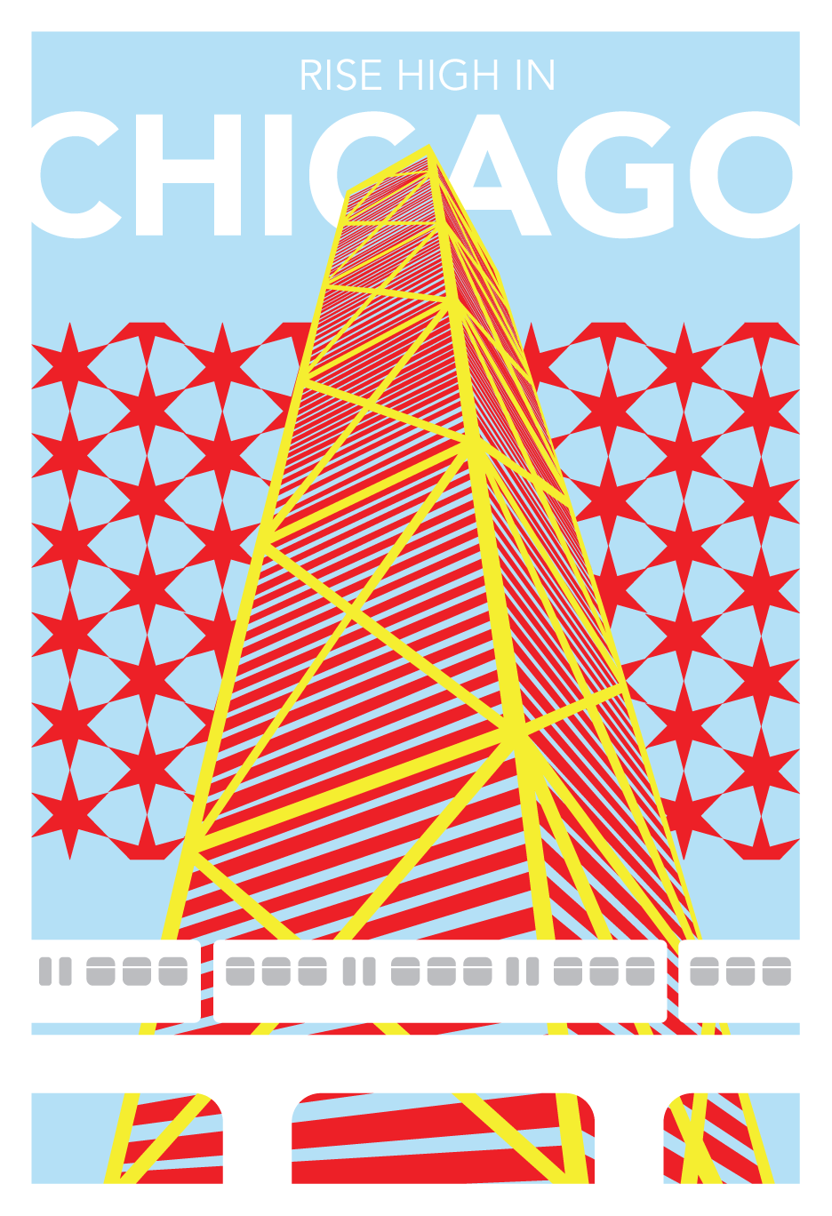
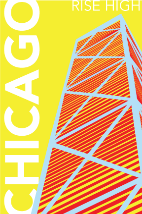
For our final, we had to design a travel campaign for a city of our choice, including a poster, postcard, and stamp. I chose Chicago, since it’s where I had last lived. The campaign also had to be heavily influenced by a randomly-assigned artist, and I got Roy Lichtenstein. In addition to the pattern use and primary colors Lichtenstein employs, I drew inspiration from the Chicago flag, which is a huge part of the city’s visual identity already. The elements I chose to illustrate are the John Hancock Center (as Chicago is known for skycrapers and had the world’s first skyscraper) and the elevated train, which gives the city a distinct look. The slogan I wrote was “Rise High,” which complements both the height of the Hancock center as well as the elevated train.

This was such a great class; I developed as a designer and became more adept at using Illustrator. I look forward to the fall when I’ll take Computer Imaging II!
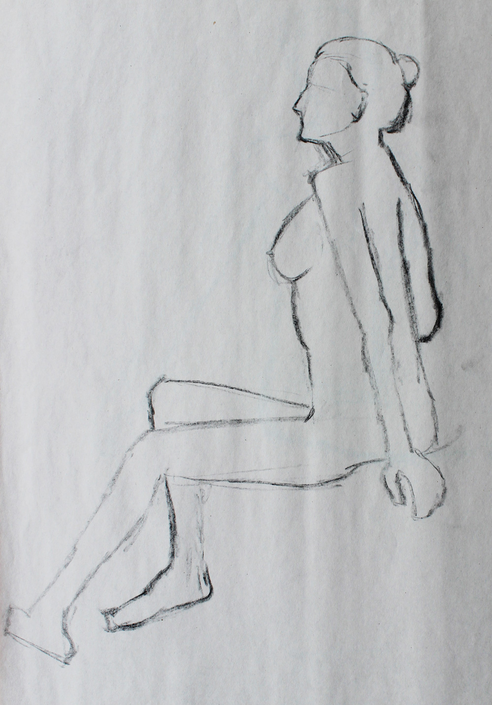
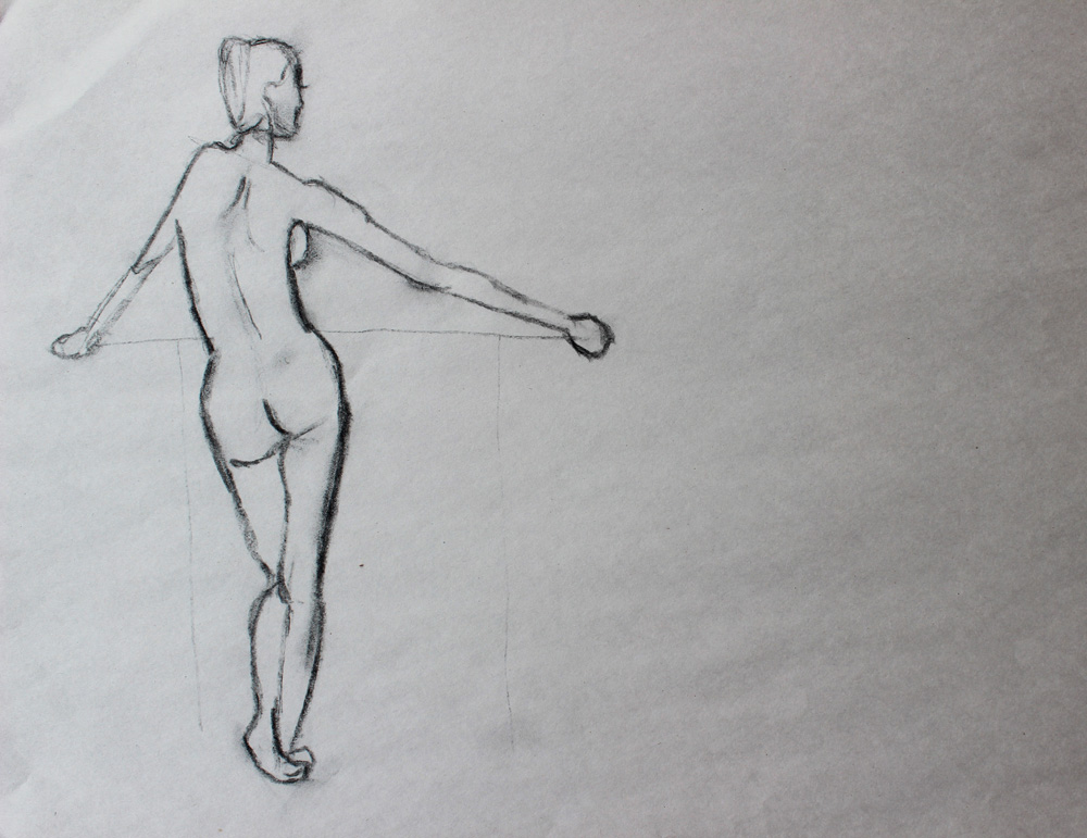
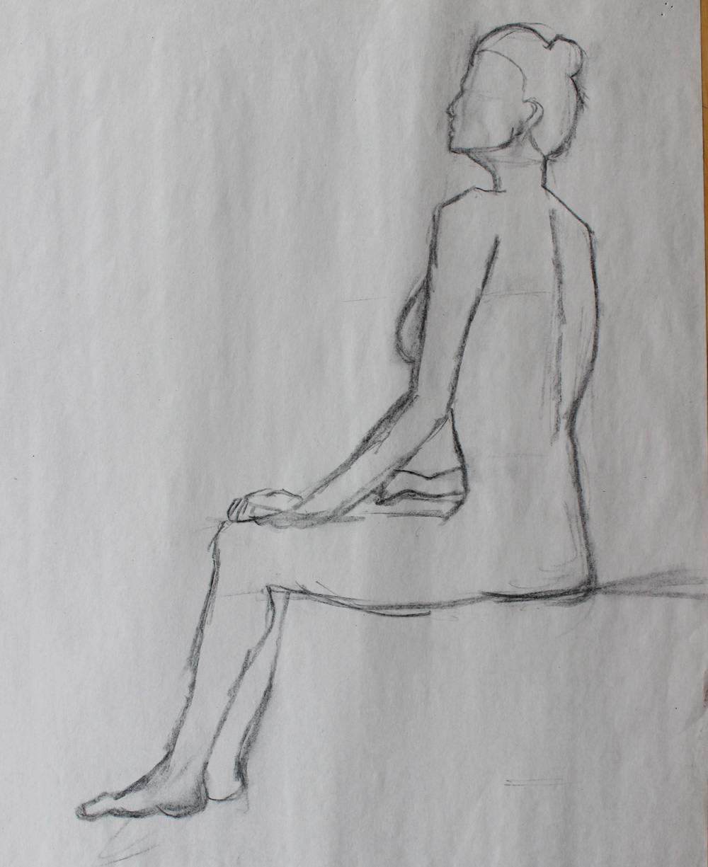
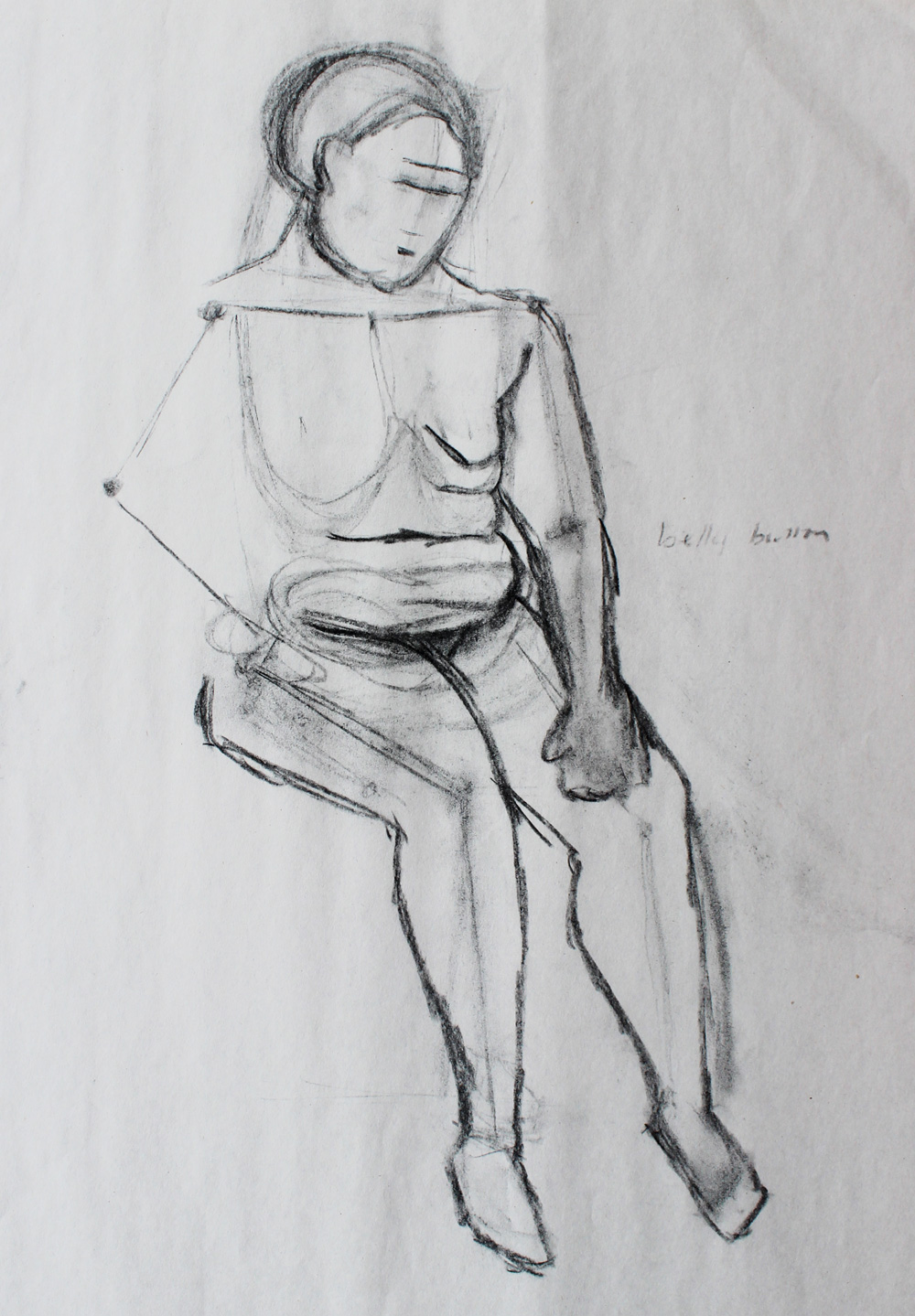
Figure Drawing I
Figure Drawing, like Introductory Drawing, was a hard class for me because I both hate and am bad at drawing.
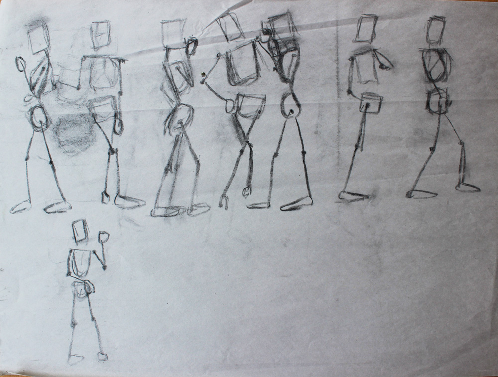
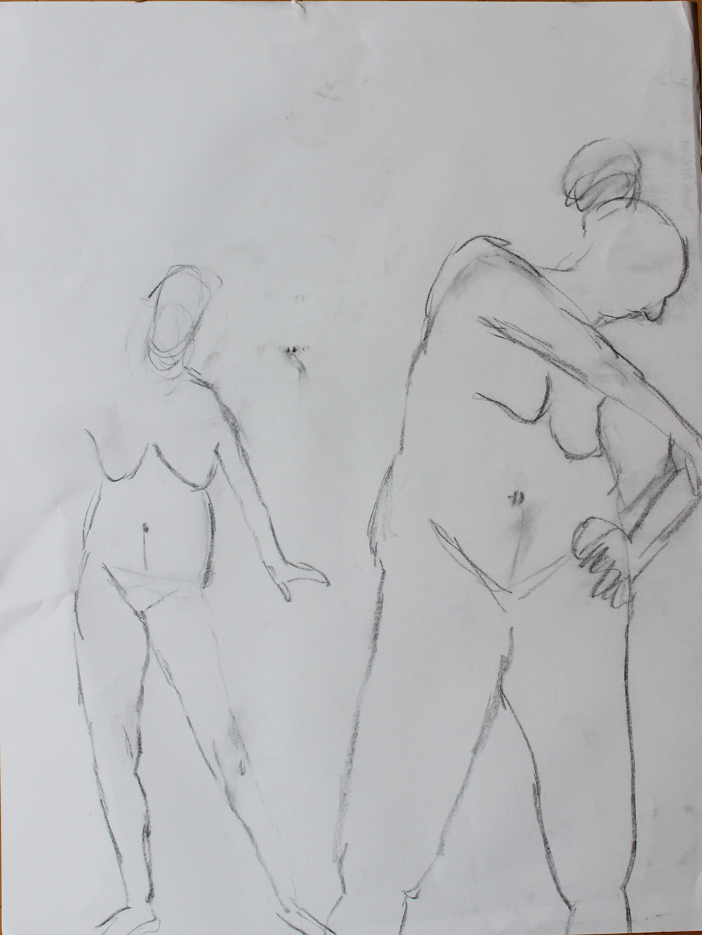
The first phase in our figure drawing education was gesture drawings of skeletons. The model would stand and pose for two minutes and we would just draw her bones.
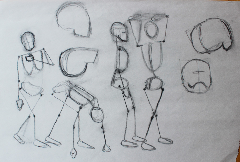
We then moved on to loose gesture drawings of the contours of her body, ignoring anything on the surface of the skin.
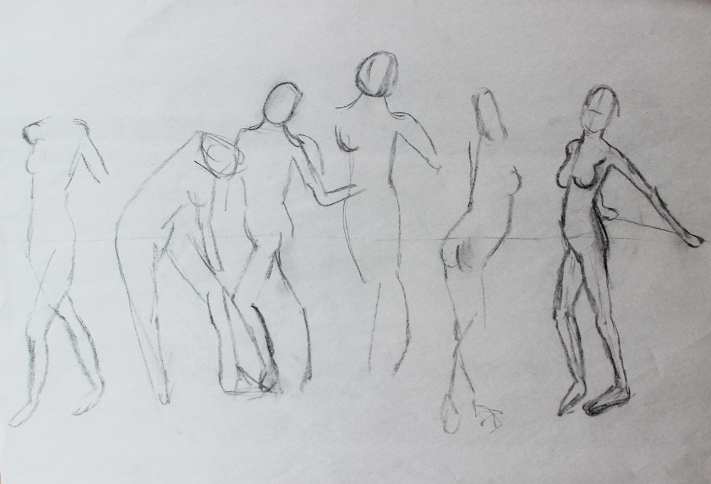
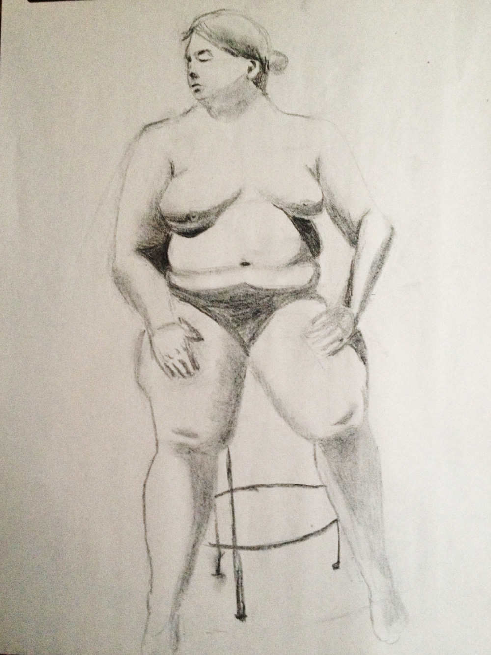
We then did longer poses of five and ten minutes, and at first I was pretty bad at being anatomically correct. I always drew the models with legs that were just too short.
But after a couple of weeks, I started to get a bit better. I slowly improved throughout the quarter.
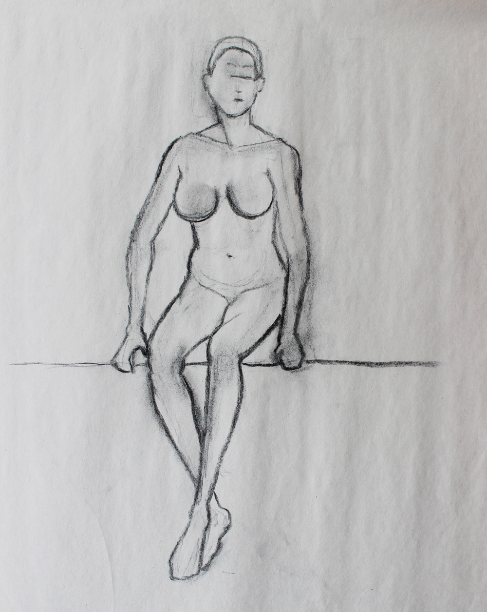
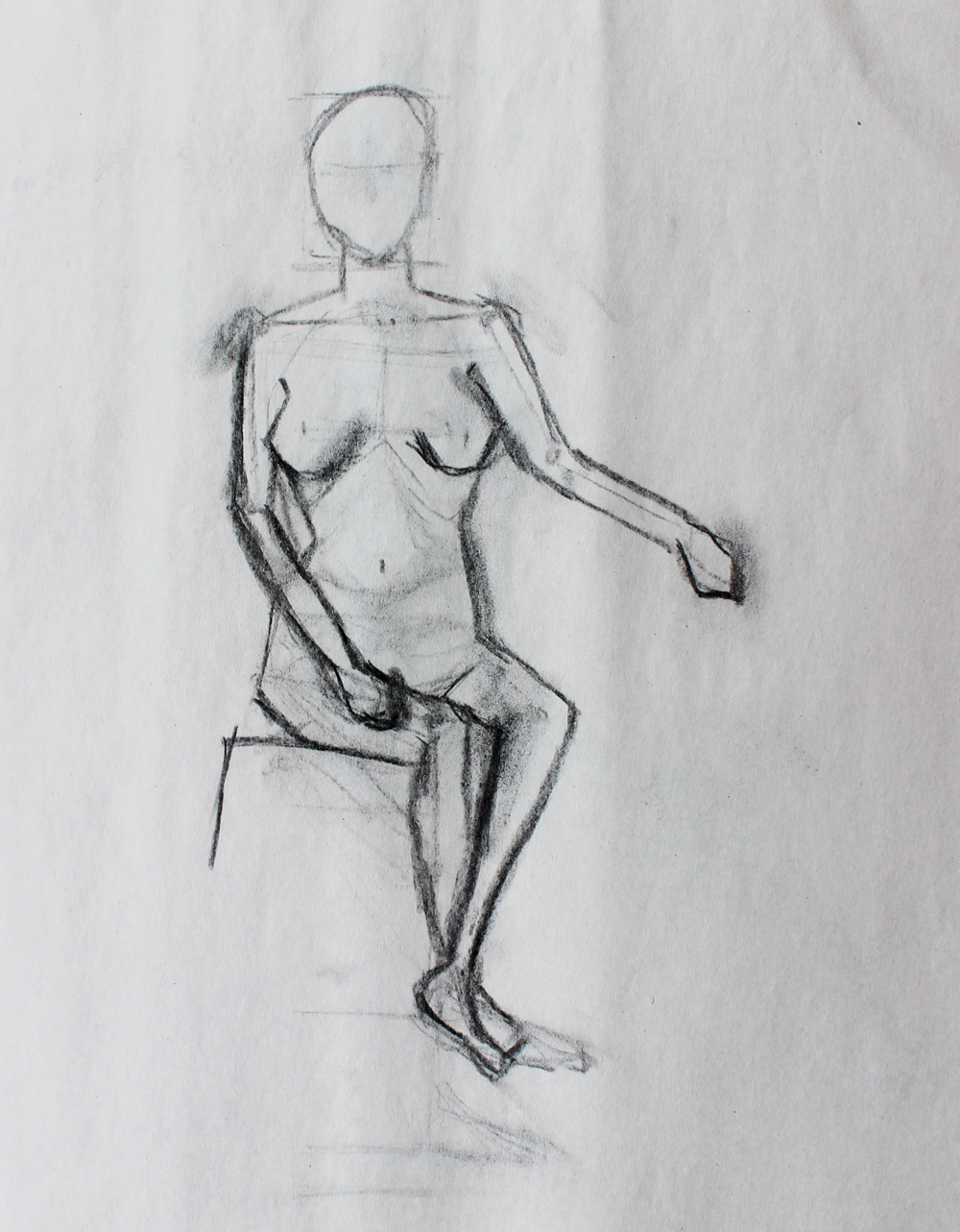
This unfinished one shows my process for the first half of the quarter. I’d draw the skeleton in lightly at first to get the actual pose, then I’d put the surface of the model in after. I like where this was going—I just wasn’t fast enough.
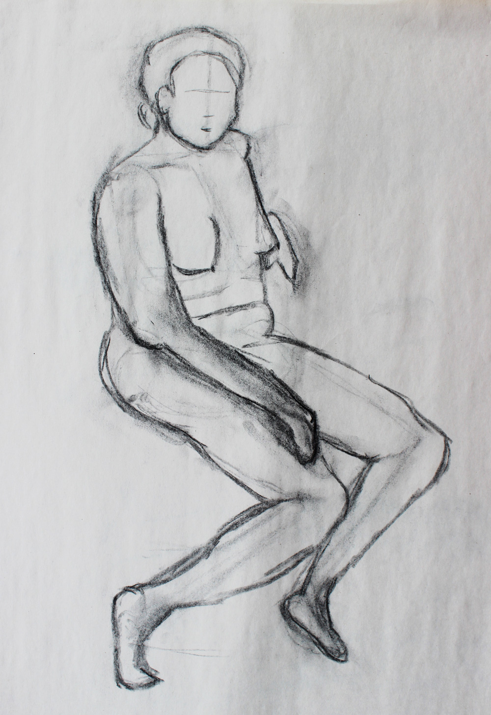
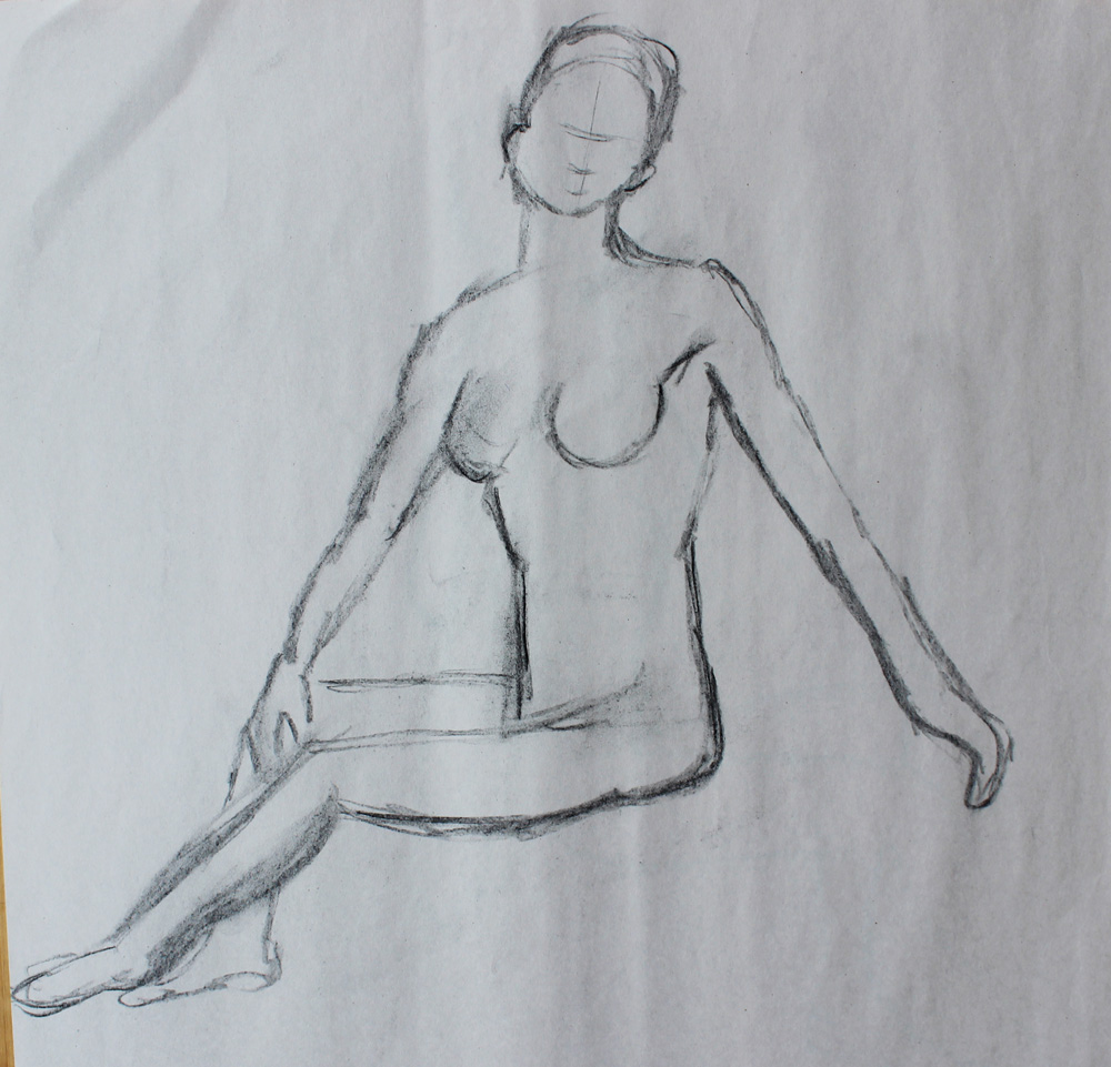
About half way through the quarter, we started shading and I lost my touch a bit. I’ve just always had trouble shading and I need a really long time to get it right.
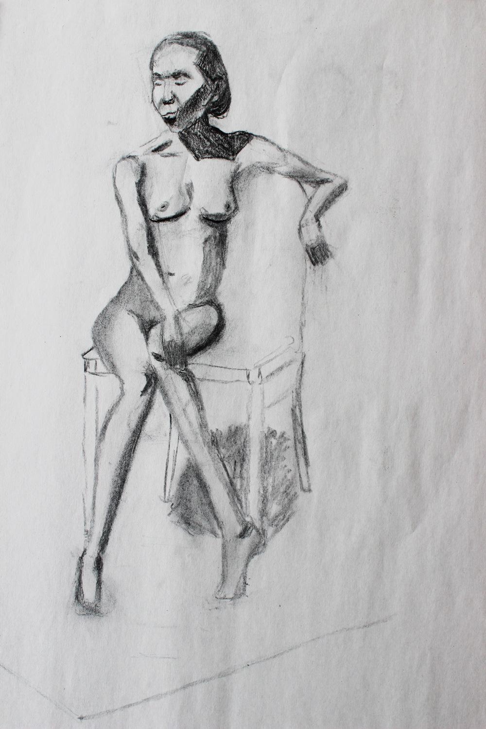
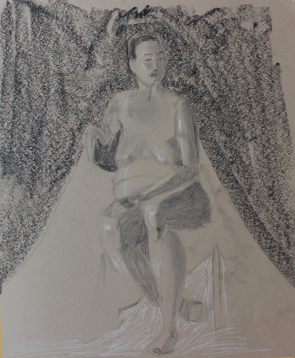
This is next piece is the only one I really like, and my professor actually wanted to keep it.
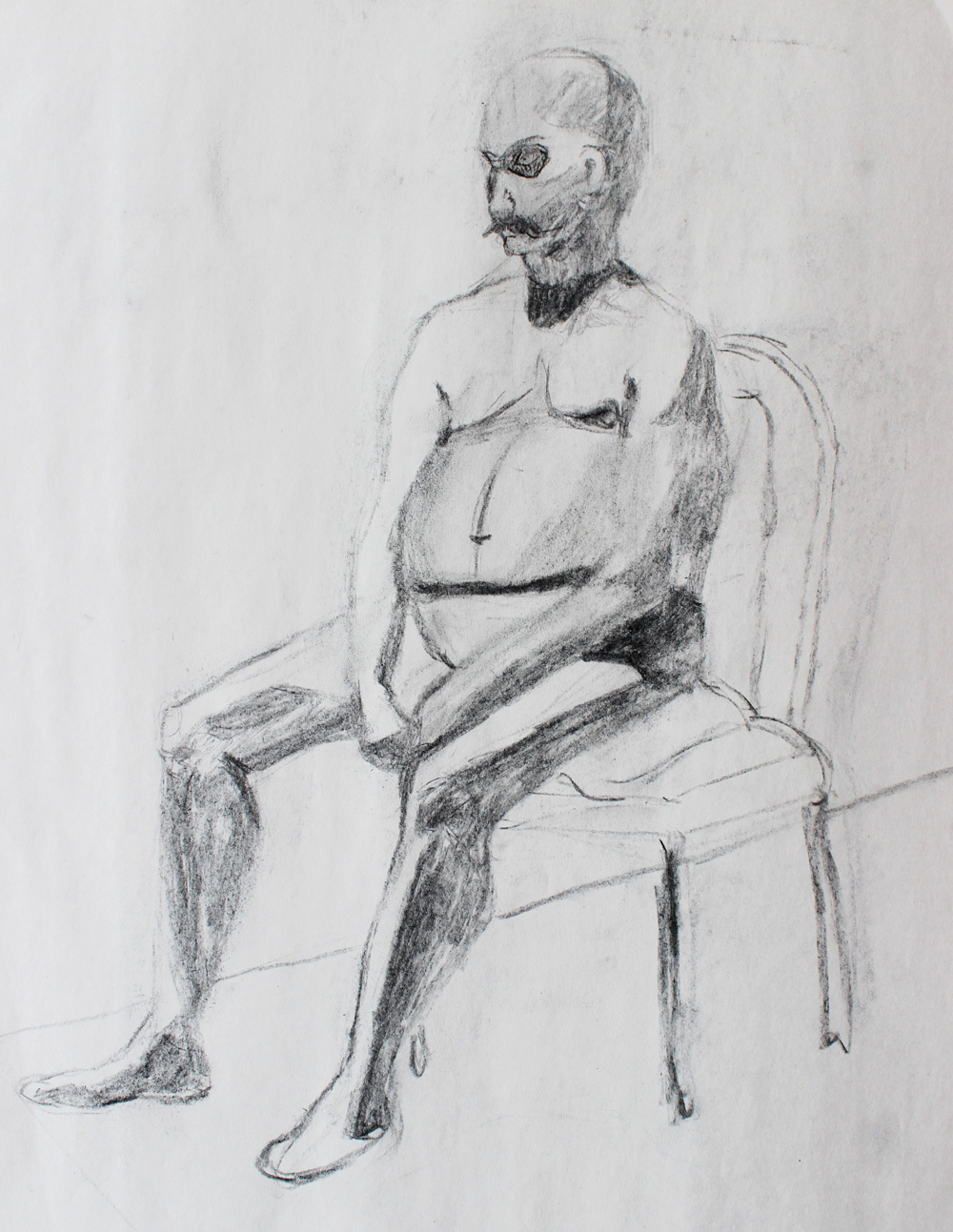
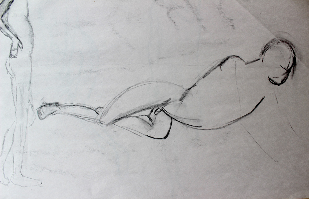
Towards the end of the quarter, we got a little more experimental. Instead of being perfectly accurate, we could be a little more stylistic and emotional.
I drew this on the very last day of class in a two minute pose, and it’s the most stylistic thing I’ve done for this class. I love where it was going, and I wish I could’ve finished.
The Final
For the final, we had to produce two pieces: a copy of another artist’s work and a piece in the style of that artist. I chose Rockwell Kent’s The Lookout. It’s like nothing I’ve ever done before, and I love his bold, graphic style.
Overall, it was nice to see my figure drawing improve as the quarter went along, but it was a bit of a painful process. When I don’t like doing work, it’s hard to make myself do it, and I definitely ran into that problem with this class.
Art History: High Renaissance to Modern
I debated whether or not I should even mention this class, but I think the point of recounting each quarter like this is to be honest about my experiences in school. I failed this course, and I failed because I stopped trying less than half way through. The first couple weeks were so easy and I realized I didn’t have to go to the lectures to get 100% on the quizzes. Because of this, I stopped going to the lectures. This class became my lowest priority, and I stopped showing up for the quizzes. I was too embarrassed to go speak to the professor, so I just sort of… let myself fail. Somewhat surprisingly, my advisor said this happens with Art History relatively frequently. Students don’t care about it, or think it’s easier than it is, and they just stop trying. Ultimately, I’ll have to take this class again (in addition to one more required Art History course), and I’ve definitely learned my lesson.
Non-Design Classes
Internship in Literary Publishing
This was an internship, but because it was run by a Drexel organization and I was paid in class credit, it’s listed as a class on my transcript. During spring quarter, I blogged two or three times each week for 5027mac, Drexel’s news and culture blog. I was also a reader for Painted Bride Quarterly, one of the nation’s oldest literary magazines. It was really nice to have a steady reason to write, and I genuinely enjoyed the work. It took a lot of work though, so I don’t when I can do it again in the future.
Civic Engagement
Every Drexel student must take Civic Engagement: our version of community service. We meet once per week to discuss what it means to volunteer and be a part of a community, and we volunteer for ten hours throughout the quarter for an organization of our choice. Because I love kids and tutoring, I worked with US Dream Academy.
Conclusion
Spring quarter was very difficult for me, and I was so relieved when it was over. Often, the quarter system feels like a long sprint. At the very end, I declared as a graphic design major, and I really look forward to starting the bulk of the curriculum next fall.