An Overview of My First Quarter at Design School
I promised myself that I would reflect on each quarter of design school as it happened, but I took a while to get this site up and running so I’m doing this 9 months after fall quarter ended. It’s not ideal, but it’ll work. Photographing all my work now was definitely more miserable than it would have been doing it as I went.
The first term of design school was tough, but I learned a lot. I took two studio classes: Design I, which was a black and white composition class, and Introductory Drawing, a black and white drawing class that gave everyone some basic skills. The other classes I took were not art- or design-related.
Design I
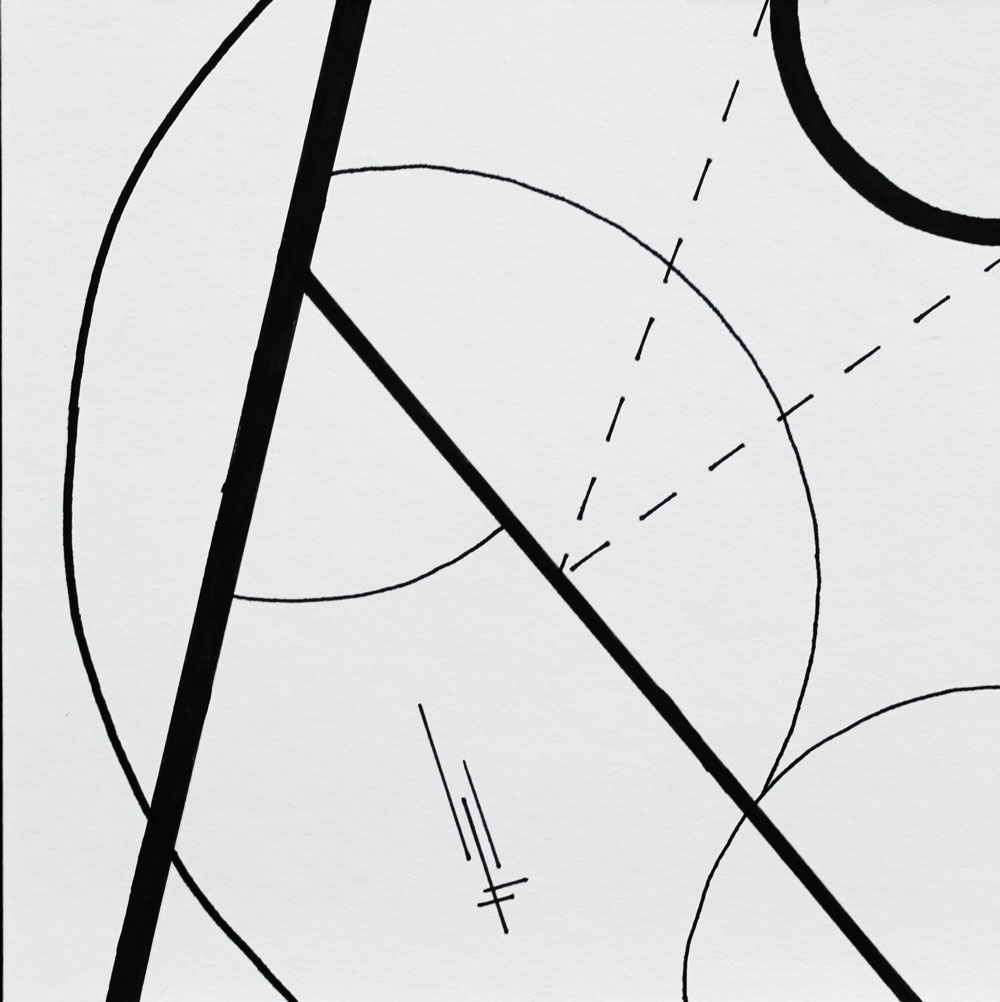
This is your typical black and white composition class that all design students in my college take their first year. This was a rough but amazing class. It met on Mondays and Wednesdays; each Monday we’d have a huge project due, and each Wednesday we’d have sketches for the next project due. Each project took about twelve hours.
We started with line and made our way through shape, form, space, and texture while learning about value, symmetry, composition, scale, proportion, weight, balance, unity, harmony, and Gestalt principles. I used a lot of paint that quarter.
Line
This was our first assignment. With black pen (I used a Sharpie, oops) we had to produce 8 compositions with various specifications on 6” x 6” board. The first had to be mostly rectilinear (straight) lines with curvilinear (not straight) accents, the second had to be the opposite, the third had to have dashed lines, etc.
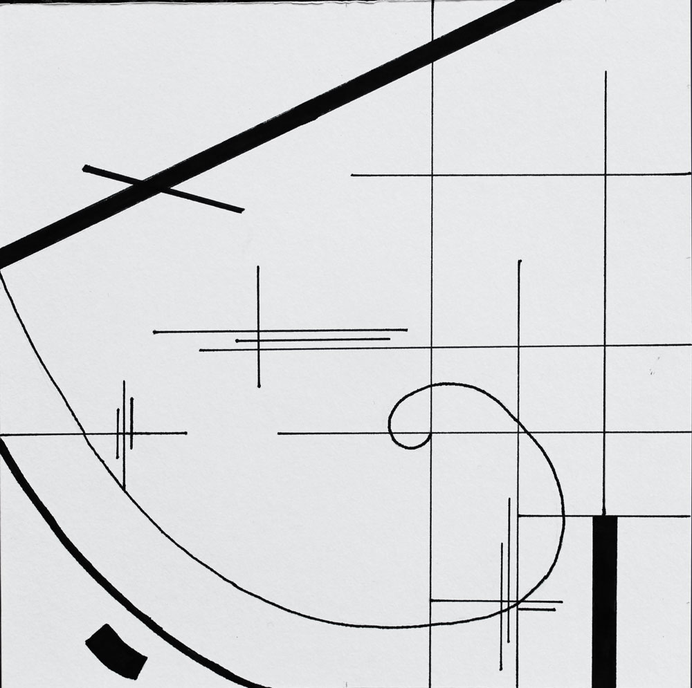

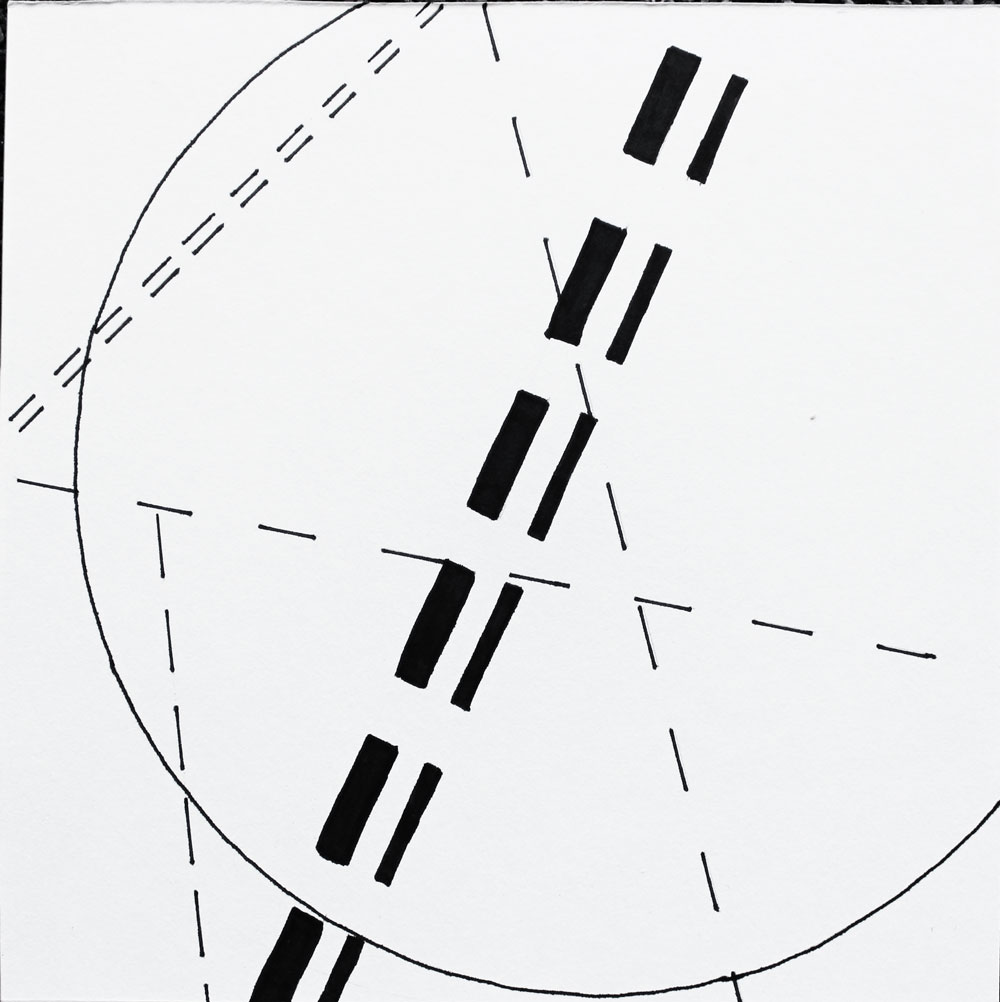
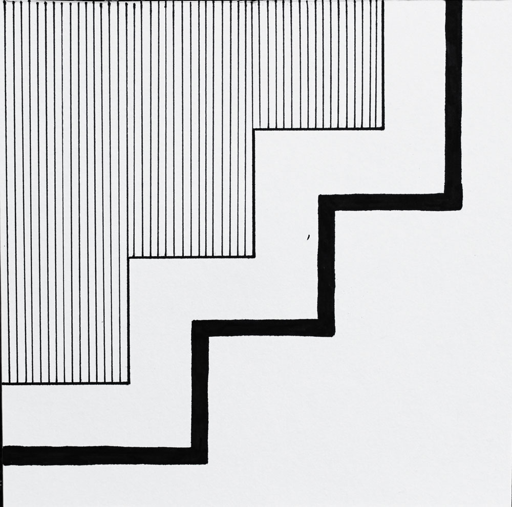
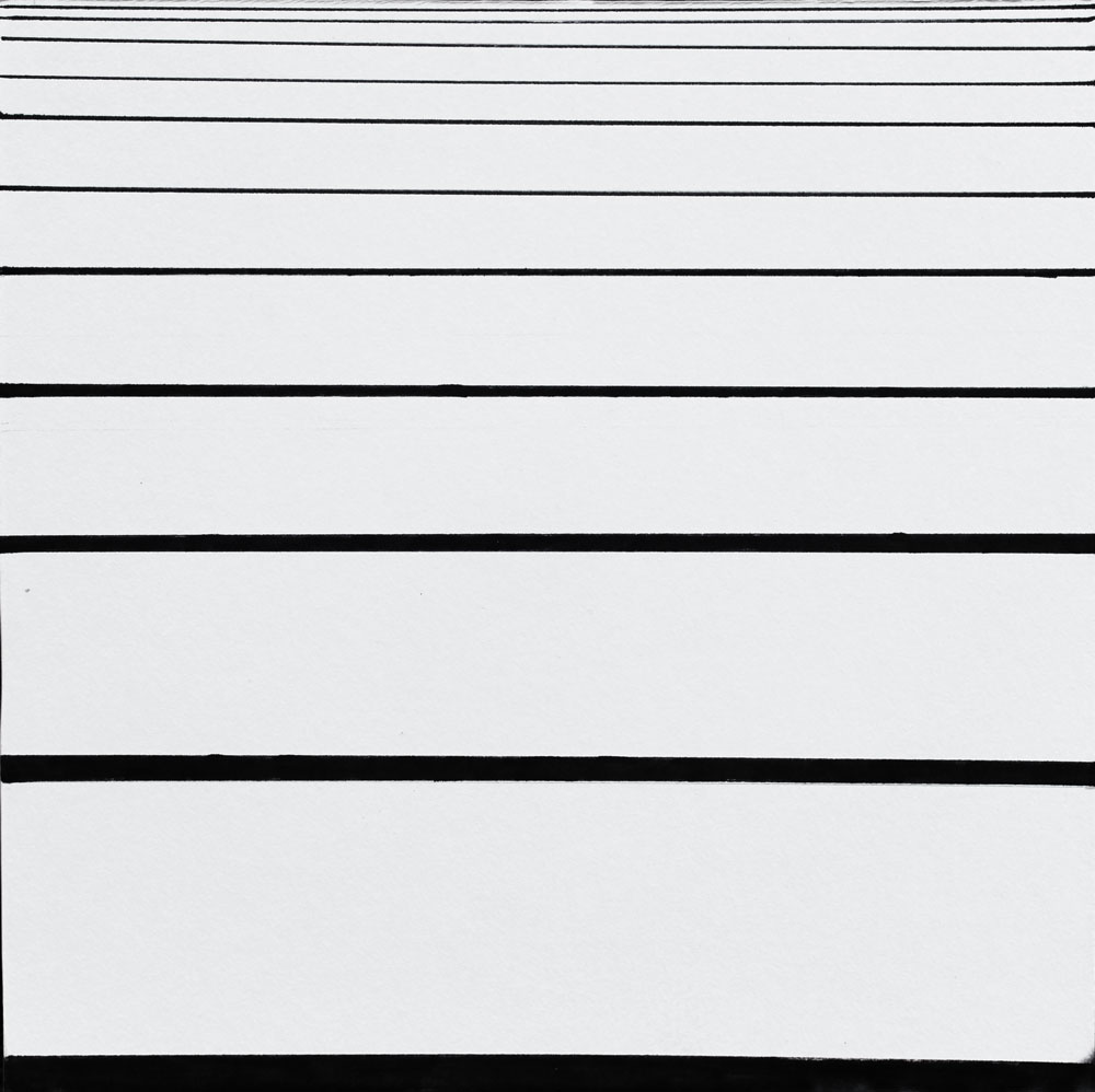
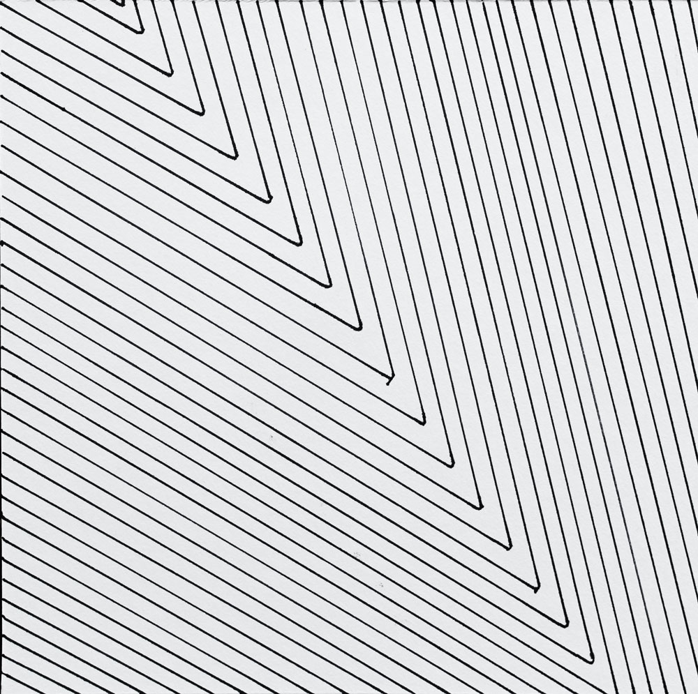
I think this was overall a very successful project (with some boards being better than others), but that my craftsmanship was not the greatest. This was before I had gotten a nice compass or any French curves, so all the curves are a little wonky. My favorite boards are rectilinear with curvilinear accents, line as form, and variety in thickness and spacing—the first three boards in the photo below. Unsurprisingly, these compositions that I view as most successful all have a variety of line weights.
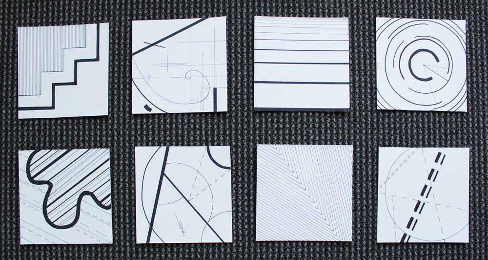
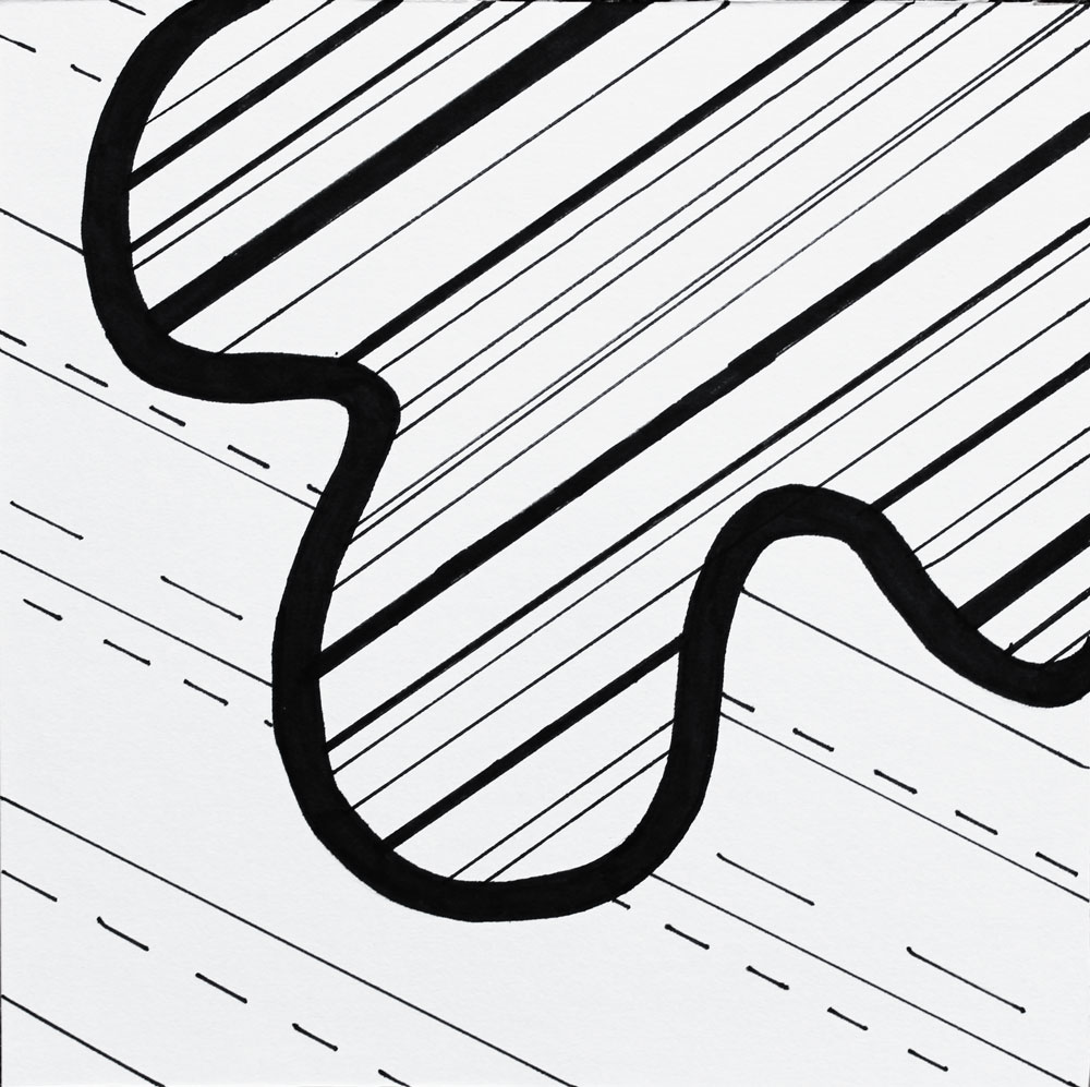
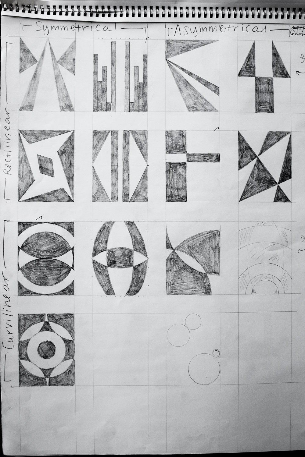
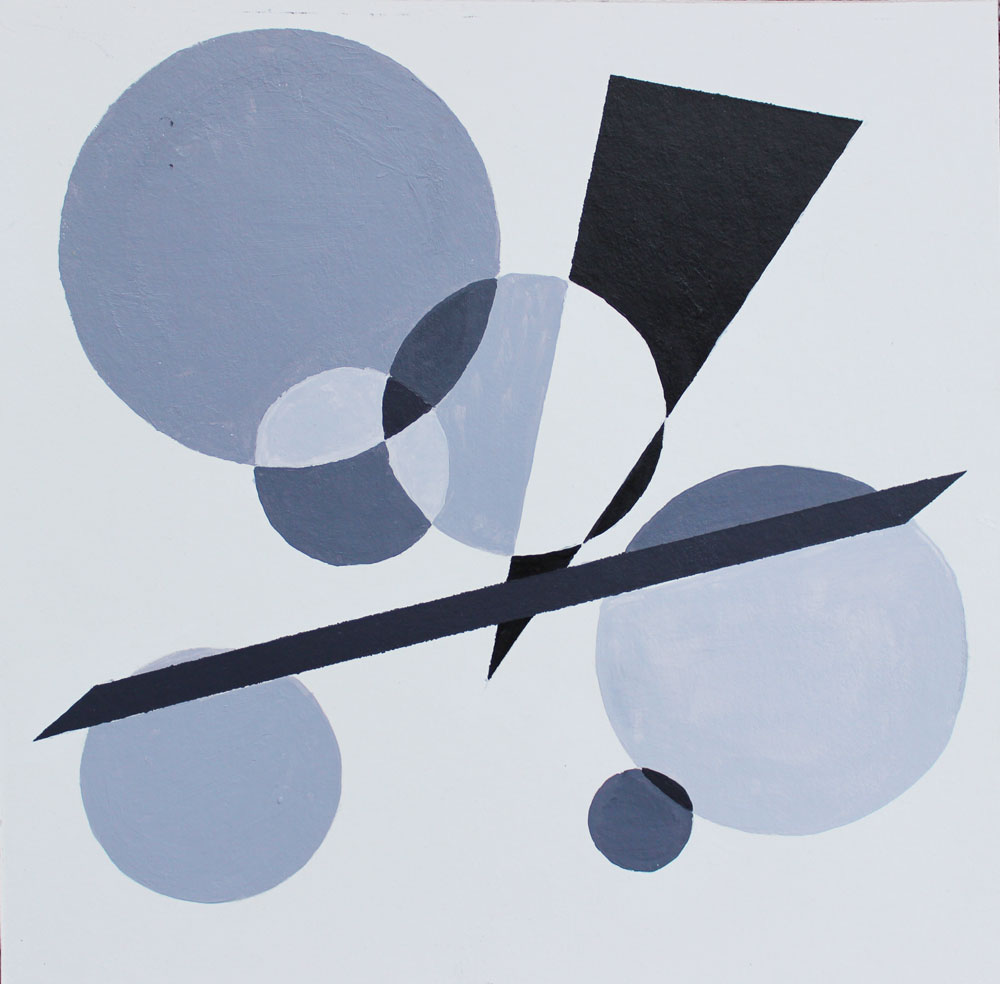
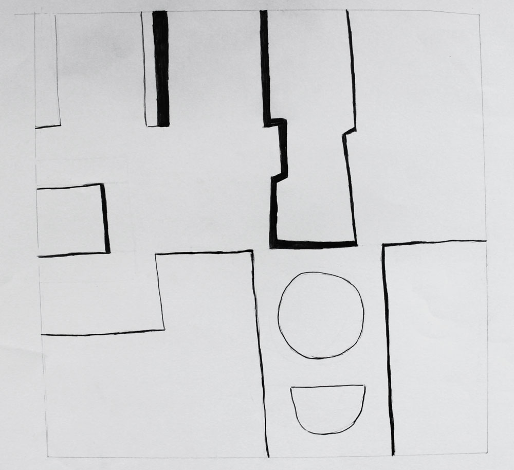
Figure-Ground Reversal
The first project we did using shapes was about figure-ground reversal. We had to produce four compositions: rectilinear symmetrical, rectilinear asymmetrical, curvilinear symmetrical, and curvilinear asymmetrical. This was the most fun project for me to complete.
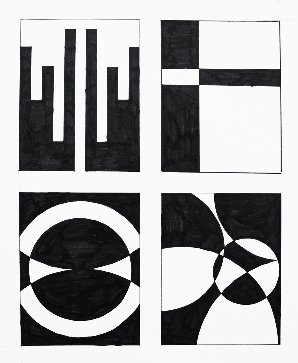
I’m really happy with the first three, but I think the bottom right is a little weak. This makes sense because in the sketching stage, I didn’t really come up with any good options for curvilinear asymmetrical:
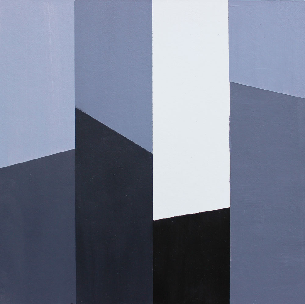
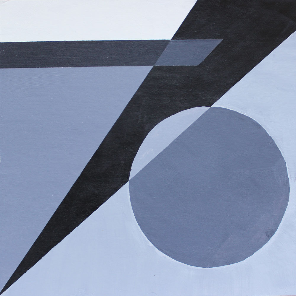
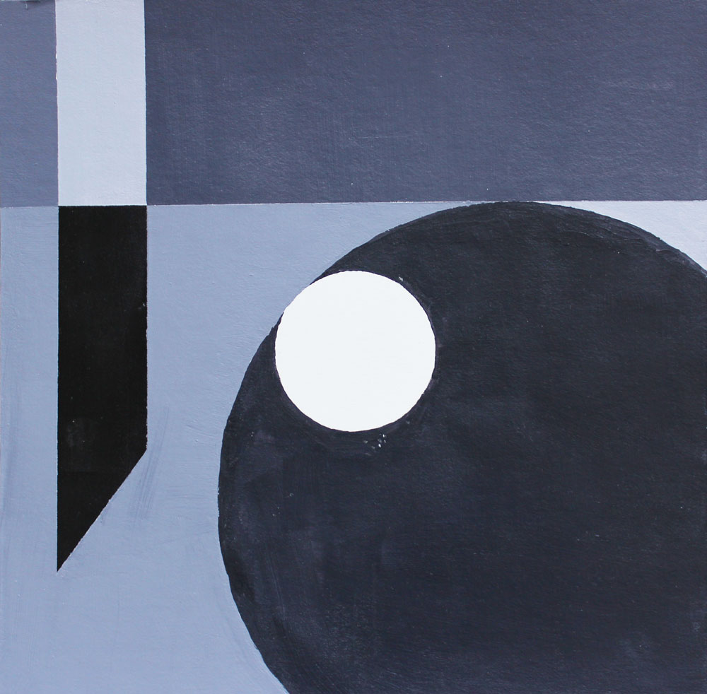
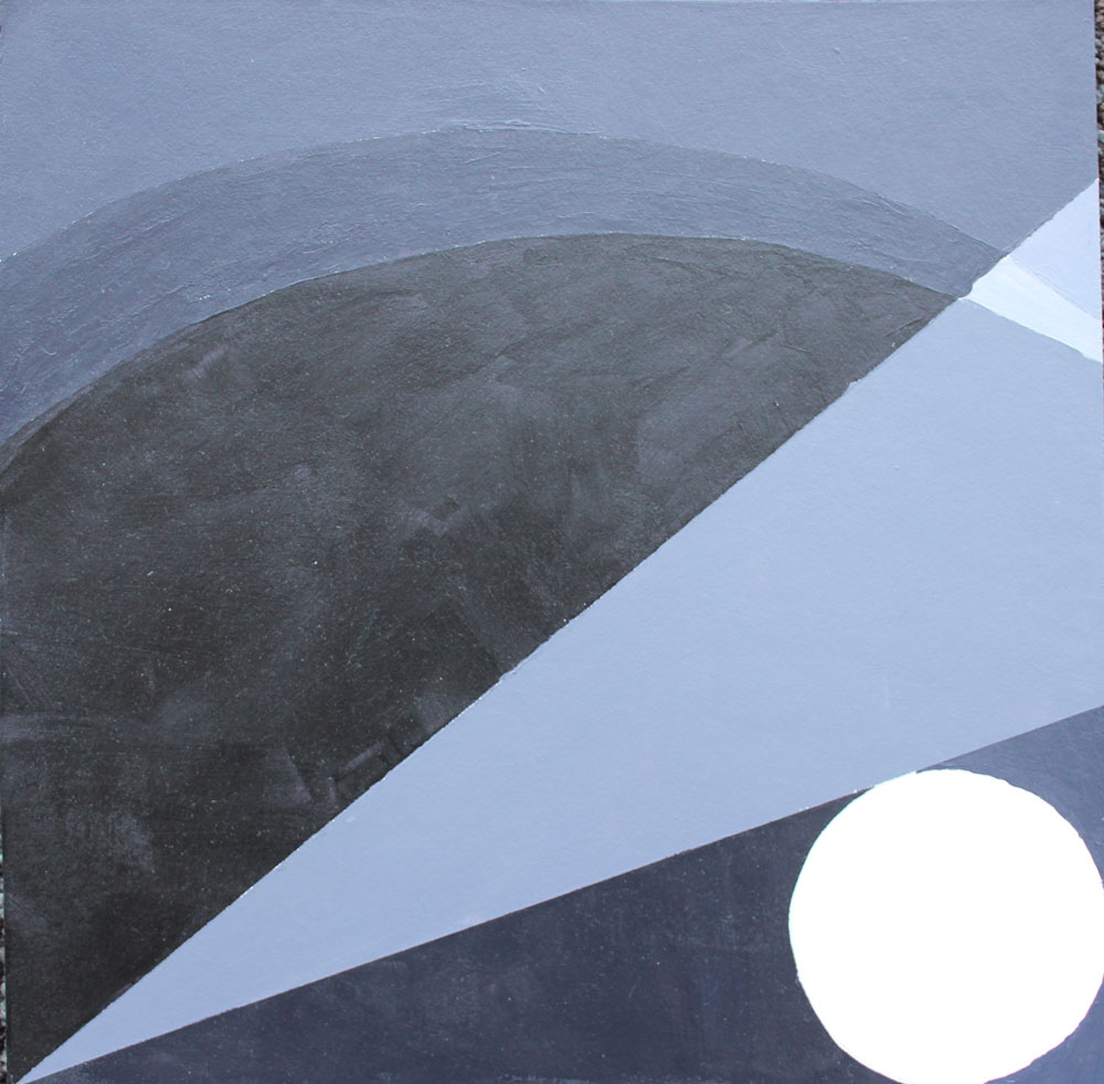
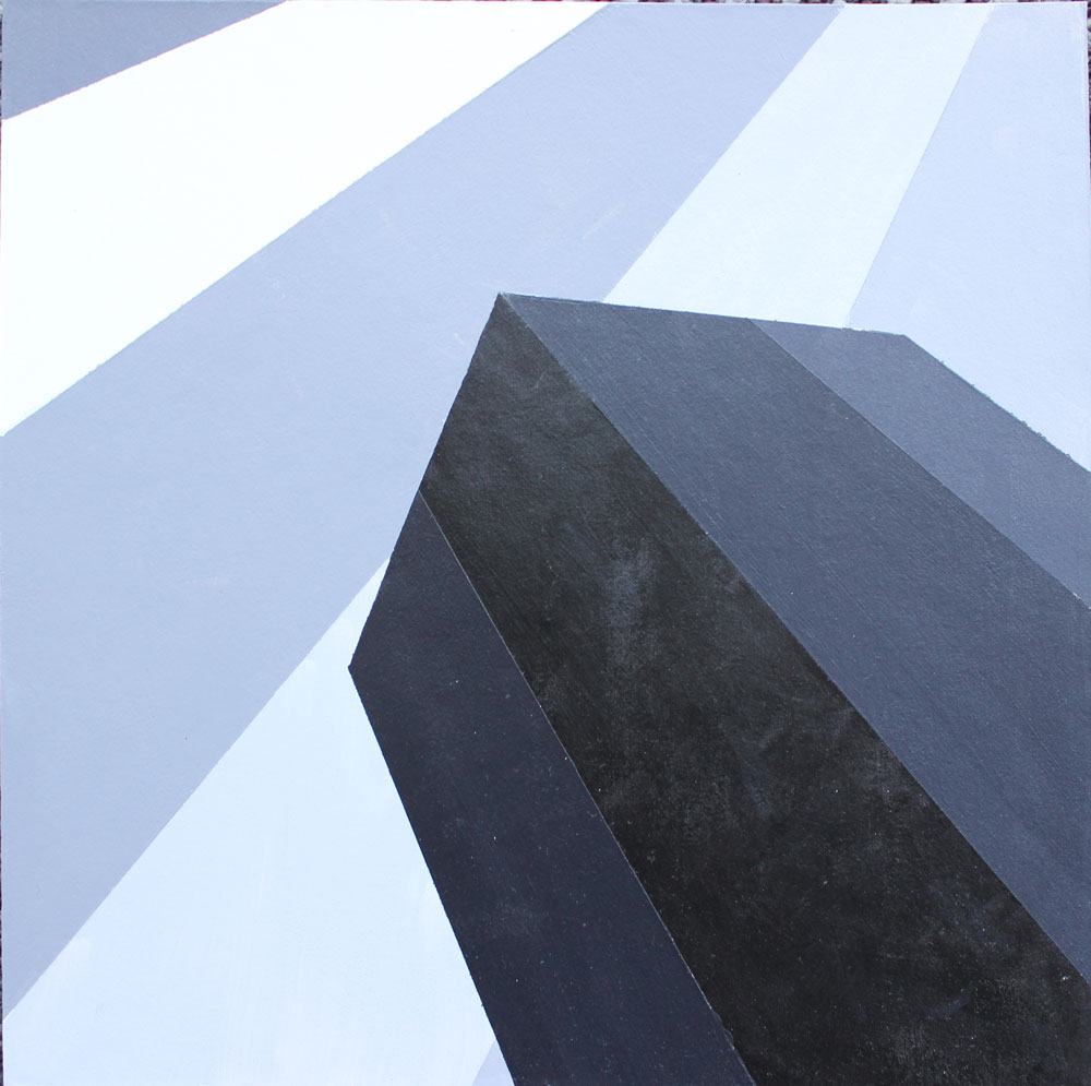
Space
Next, we started dealing with multiple values (we made a 9 value grayscale in class) and how two-dimensional shapes can create the illusion of space. We also started using paint.
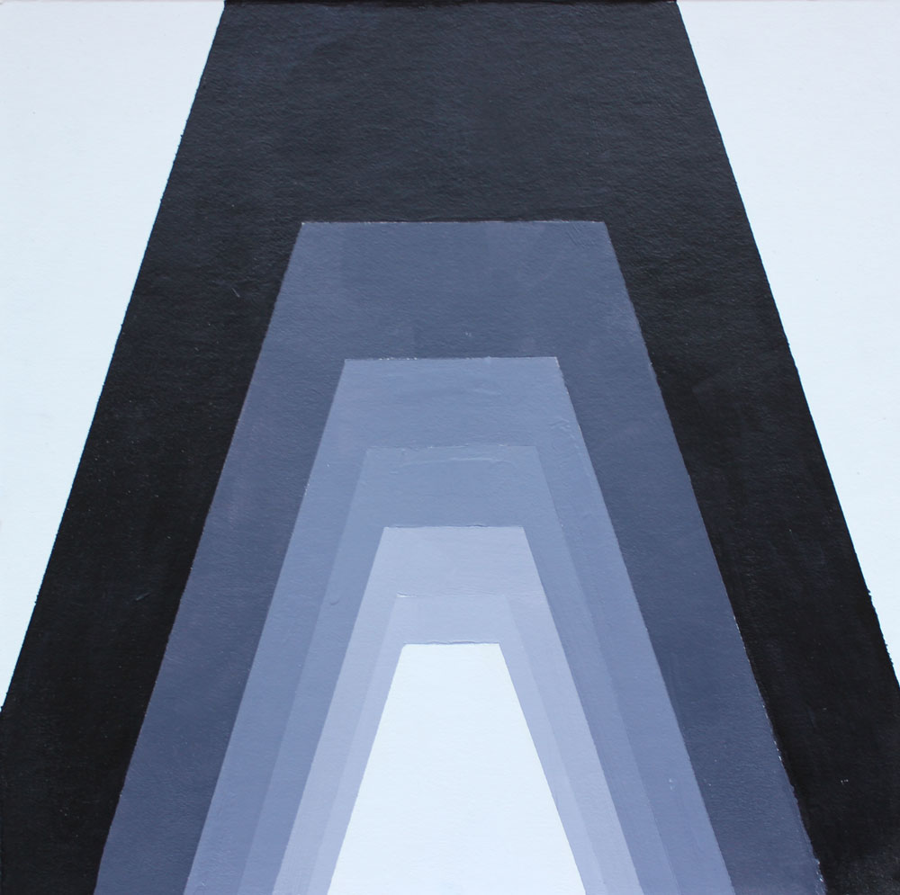
Mood
I loved this project. We had just learned about open and closed composition and how they can create different moods. Here, we had to produce 4 pieces on 8” x 8” board using specified compositional techniques to create certain moods.
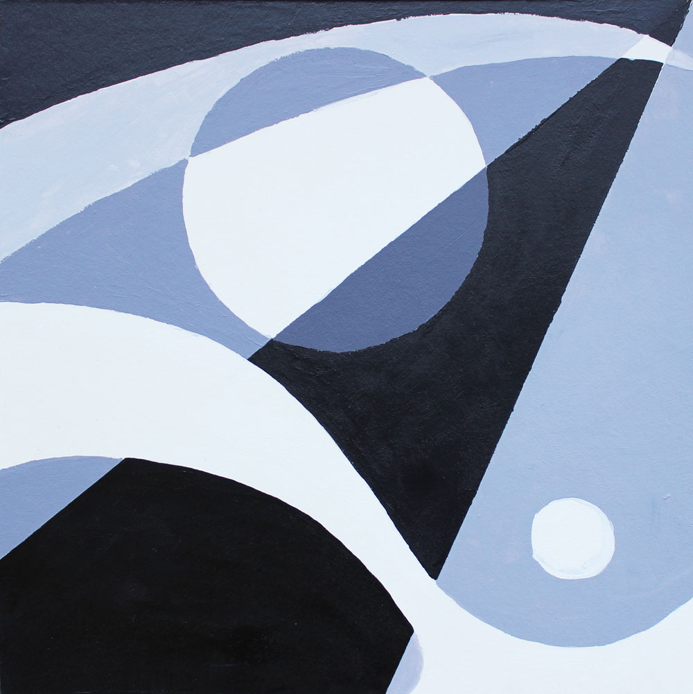
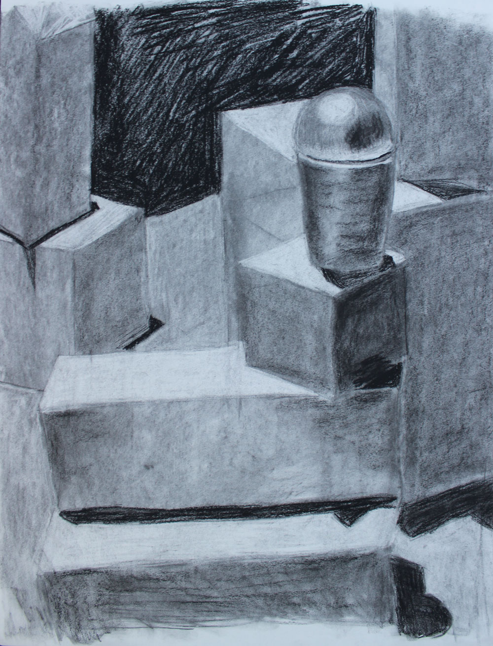
Abstraction of a Still Life
For the next project, our professor set up a still life in the center of the room and we had to sketch it realistically, then abstract it based on our sketch. We then painted the abstraction.
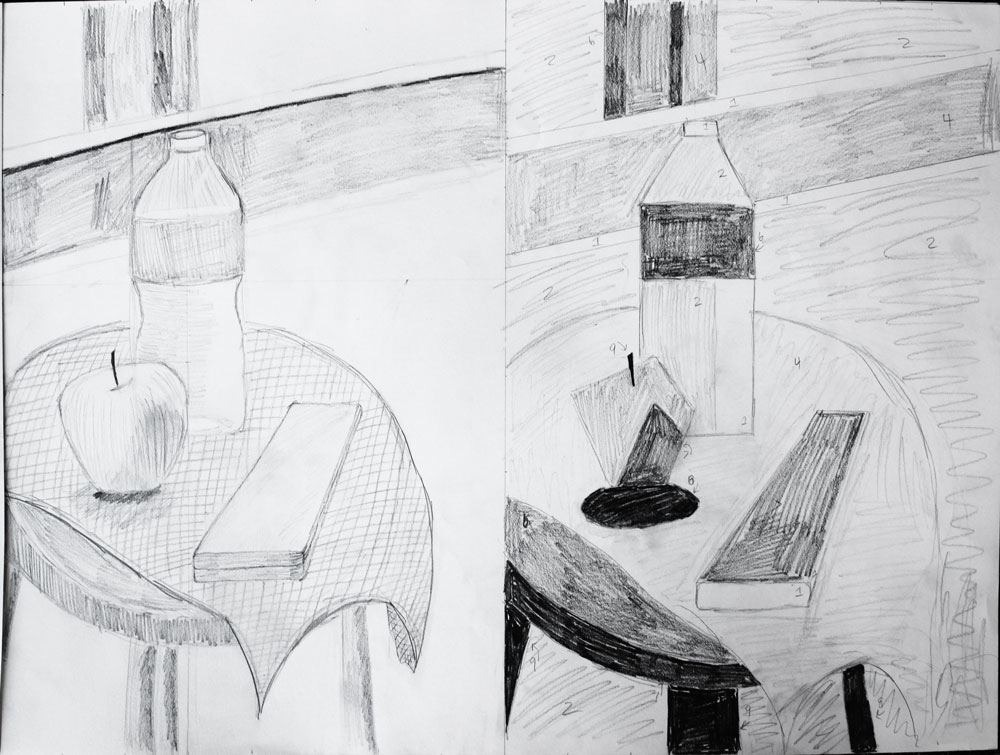
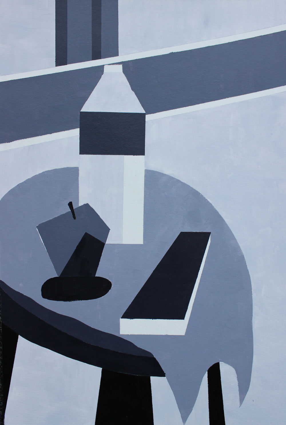
I feel like I didn’t get too much from this project. Apples and water bottles are simple enough shapes that abstracting them is really easy. I wonder if it would have been a better exercise to abstract something more difficult like a human face.
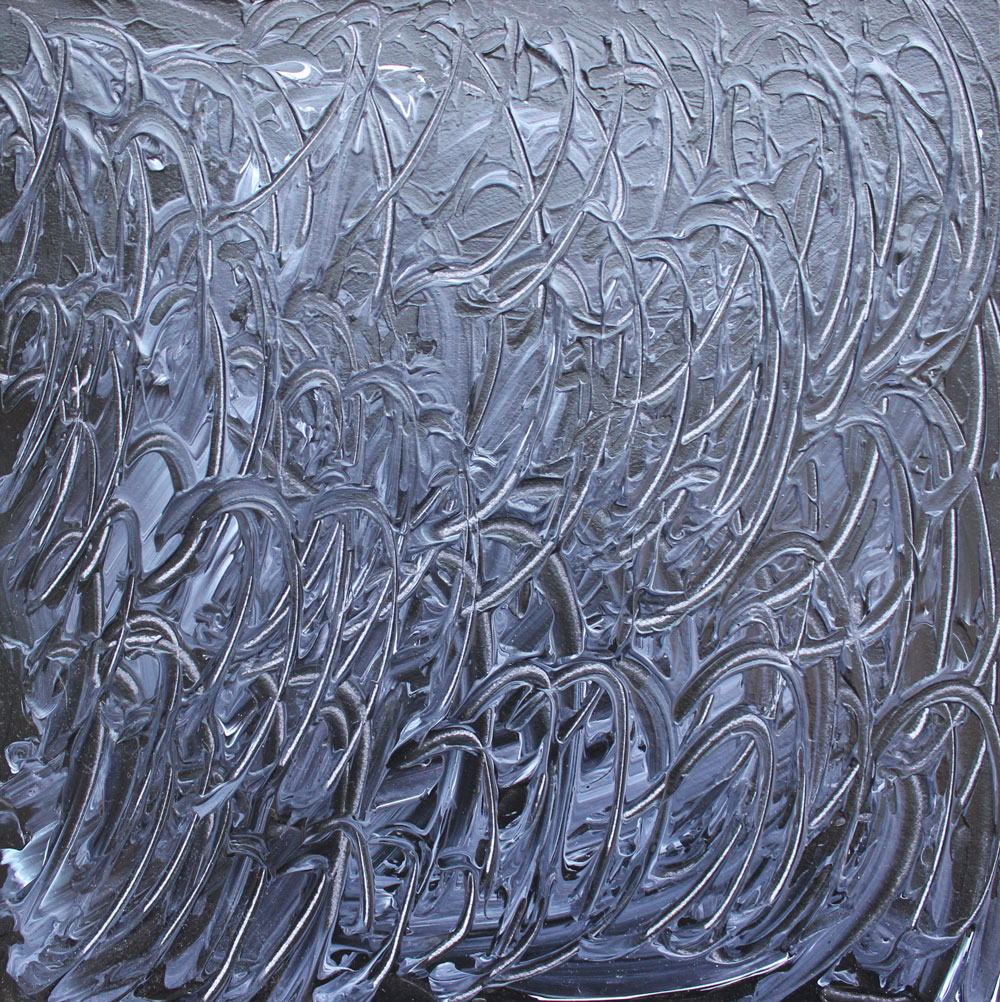
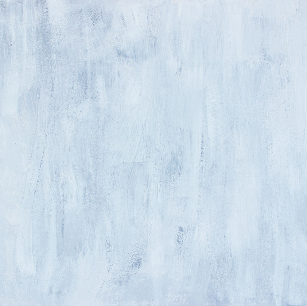
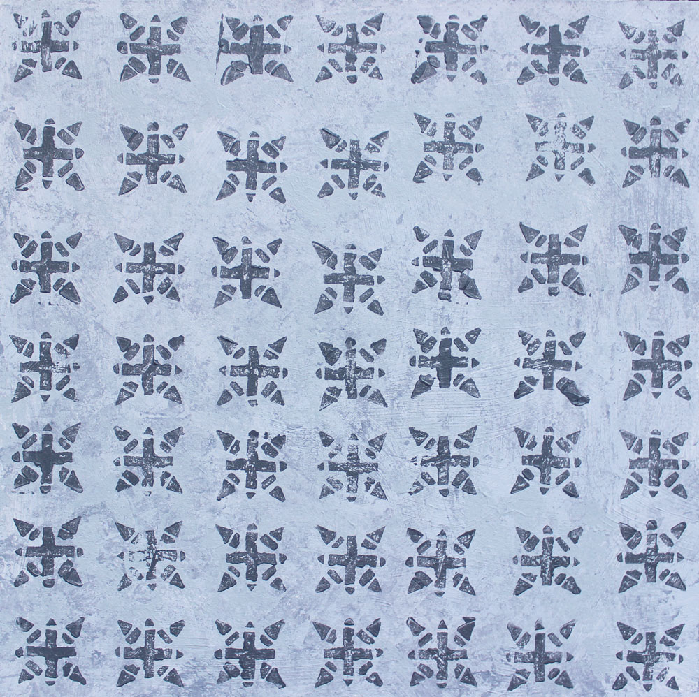
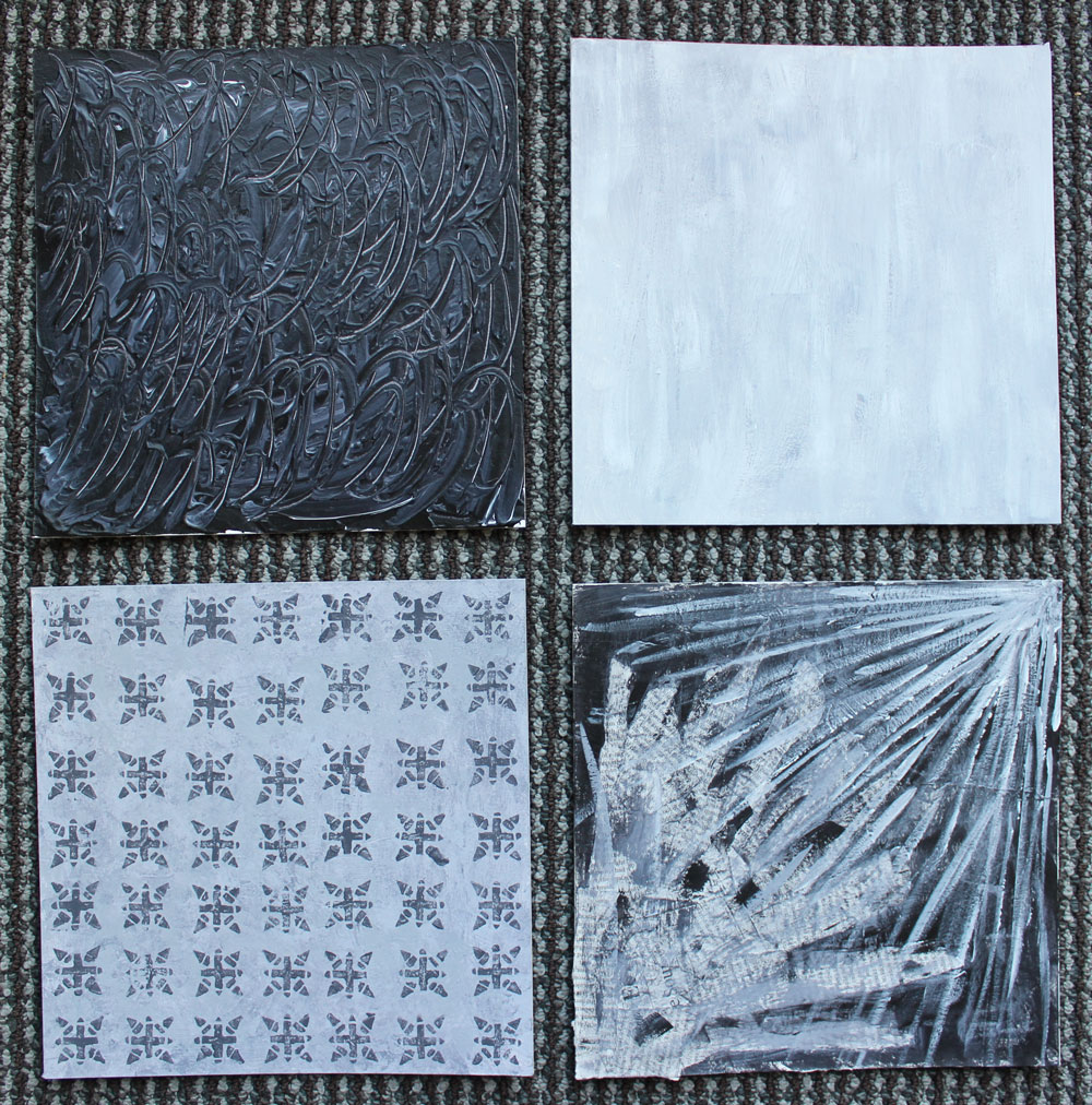
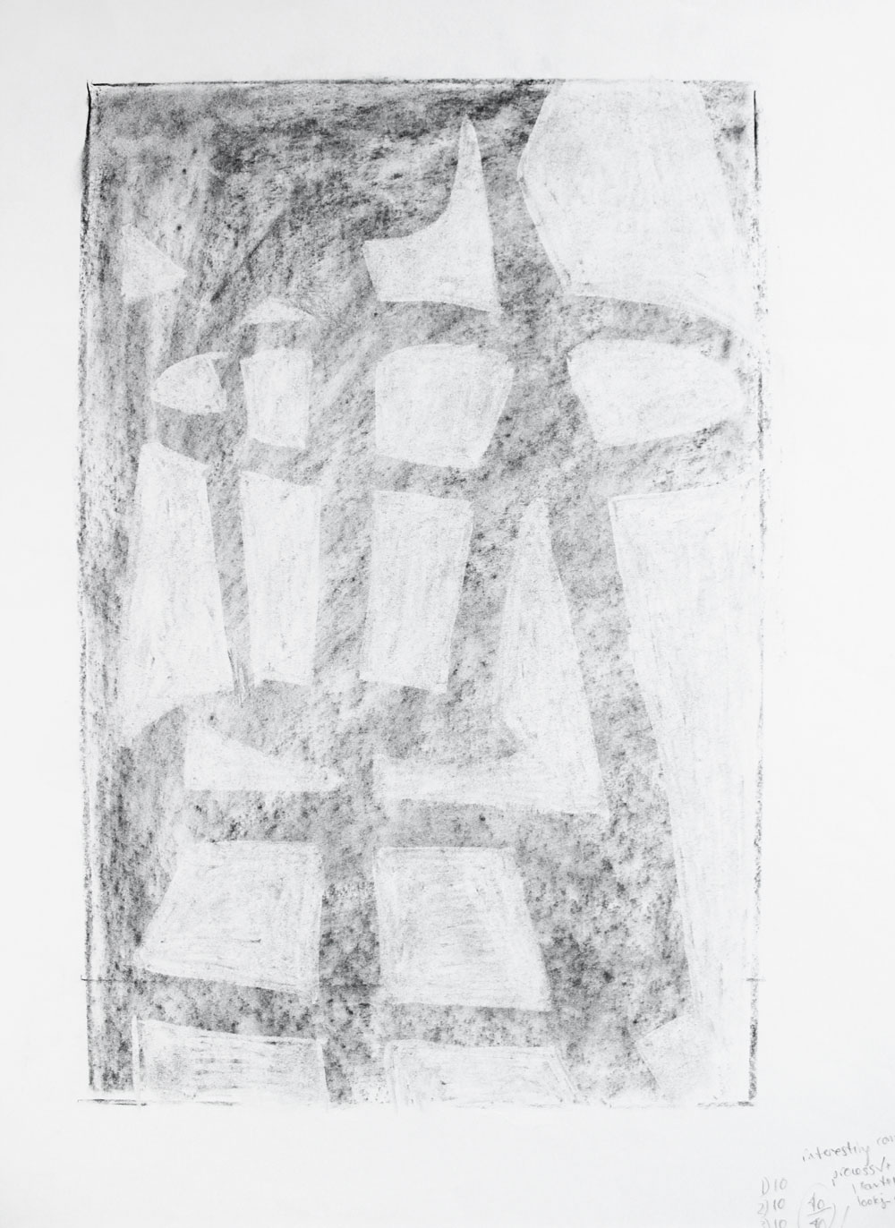
Texture
This was my favorite assignment because it was so experimental and open-ended. Our professor basically just told us to play with paint and see what we could do. We had to produce pieces that portrayed four different kinds of texture: tactile, visual, pattern, and collage. The pieces also had to look like they belonged together.
For my tactile board, I poured marbled black and white paint over the board, waited for it to get tacky, and scraped into it with a palette knife. I love how it turned out. It’s definitely fun to touch, and it’s incredibly glossy.
My visual texture board is meant to look like an unfinished cement floor that always looks dirty—even when it’s clean. Ultimately I don’t think that’s what it looks like, but I still really like it.
My pattern board was very fun to make; I carved a stamp of my own design out of a rubber eraser with my X-Acto knife, dipped it in paint, and went to town.
For the collage, I played with blending the tactile medium of newspaper in with the white paint.
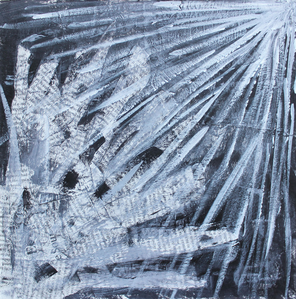
Together, there is a purposeful rhythm to the pieces. The tactile piece is very dark, the visual piece is very light, the pattern piece is in the middle of the spectrum, and the collage piece is both light and dark, on the two opposite ends of the spectrum.
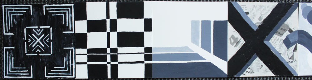
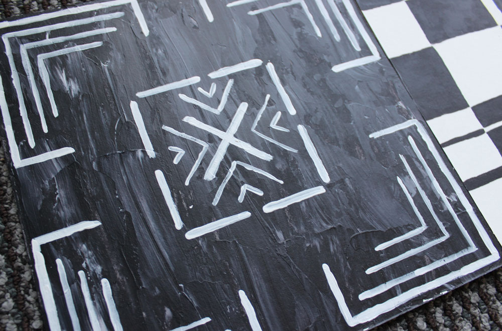
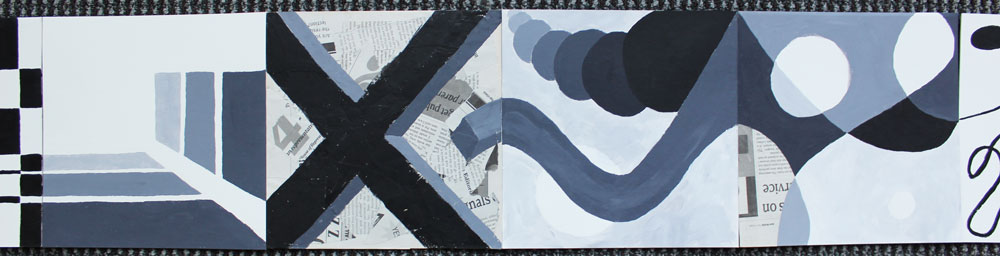
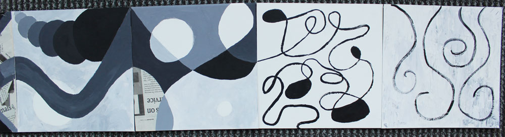
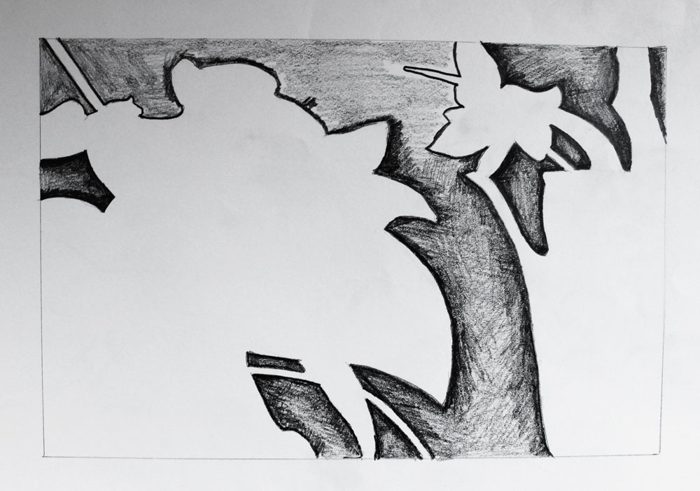
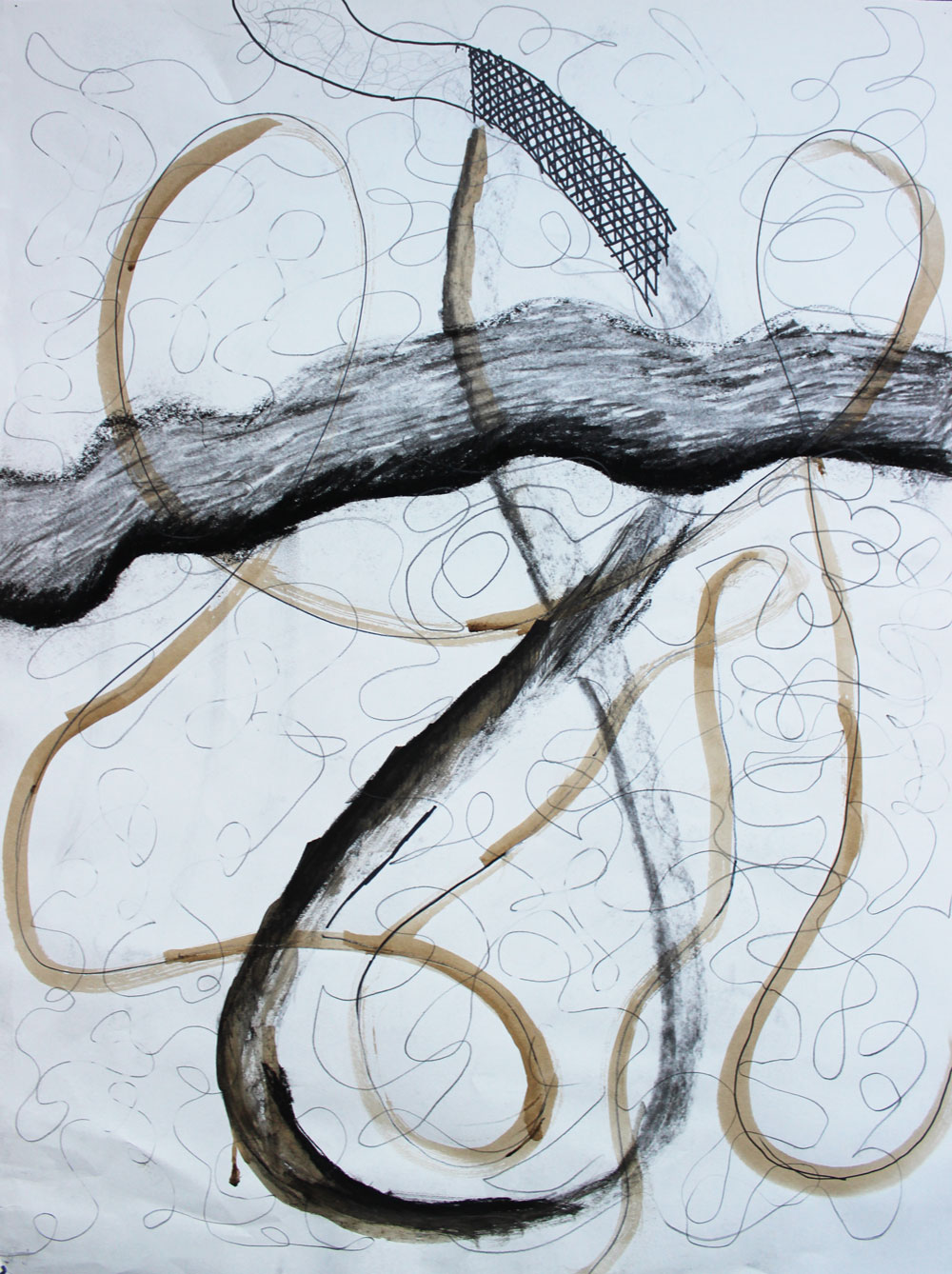
The Final
For our final, we had to compose eight 8” x 8” boards that went together in a series. We had to move from line to shape to form, then back to shape to line again, and we had to employ some sort of rhythm throughout the collection that tied everything together.
I decided to make my boards one continuous, connected piece instead of eight pieces meant to be viewed together. I also used contrast sparingly in the middle and more on the edges, as the first two boards and last two boards have the most contrast while the middle boards have the least.

This class was extremely challenging, and I definitely got burned out, but I learned and developed so much. Additionally, my communication skills have improved. Each week when a project was due, we had to stand up, hang our project on the wall, and present it to the class. We had to explain our thinking, say what we did and why, and accept critque from other students and the professor. My compositional eye is much stronger now, and I’ve developed a vocabulary with which to speak about design.
Introductory Drawing
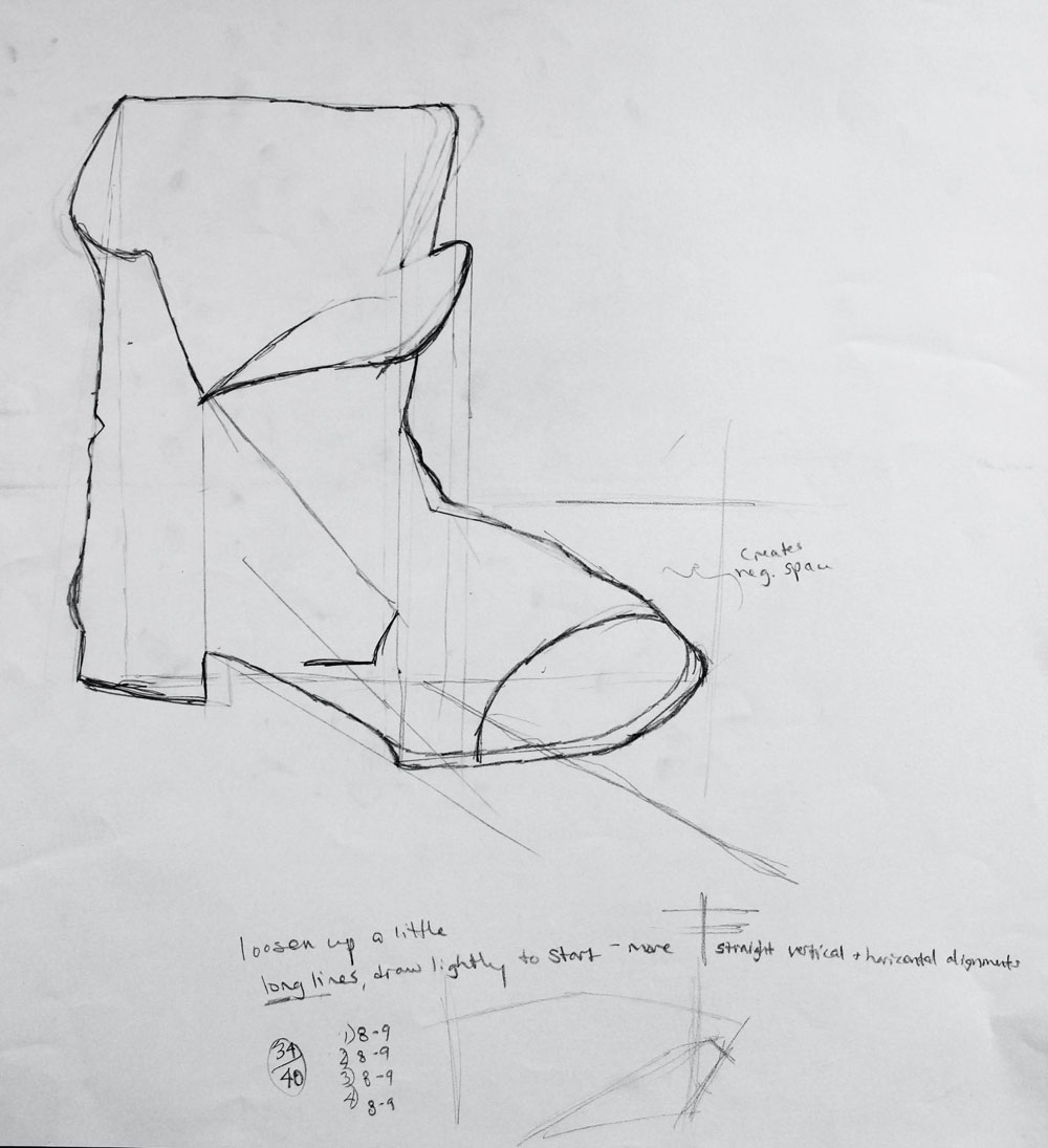
This class was tremendously difficult for me because I’m not a fine artist, and I certainly cannot draw. I admire those who can—I think it’s really cool and I wish I could do it too—but I can’t. However, mostly due to the skill of my professor and my own sheer determination, I did drastically improve my drawing skills in this class. As you can see from this attempt at a boot, they started off a bit rough.
In most drawing classes you do a lot of short gesture work, and this class was no exception. We started each class meeting with about five minutes of gesture drawing at 30 seconds per drawing. I hated it so much. Here are some chairs covered in fabric:
Mostly, the first half of the quarter was spent doing exercises to train us to see better.
For these, we had to draw the negative space between the objects instead of the objects themselves. This is a valuable exercise since we often see a flower and think, “I know what a flower looks like” and stop really seeing it when we draw. If we concentrate on negative space instead, we’re less likely to see forms we recognize and just focus on the actual shapes we observe.
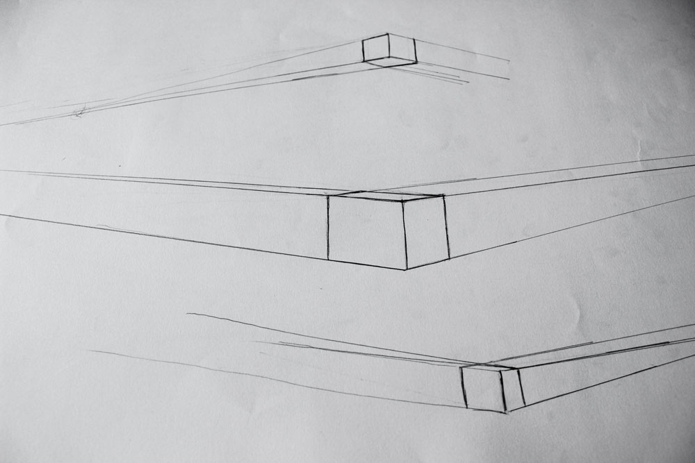
We also did a lot of perspective exercises like these to learn the mechanics of two-point perspective. I hated these so much. Way too much squinting and measuring.
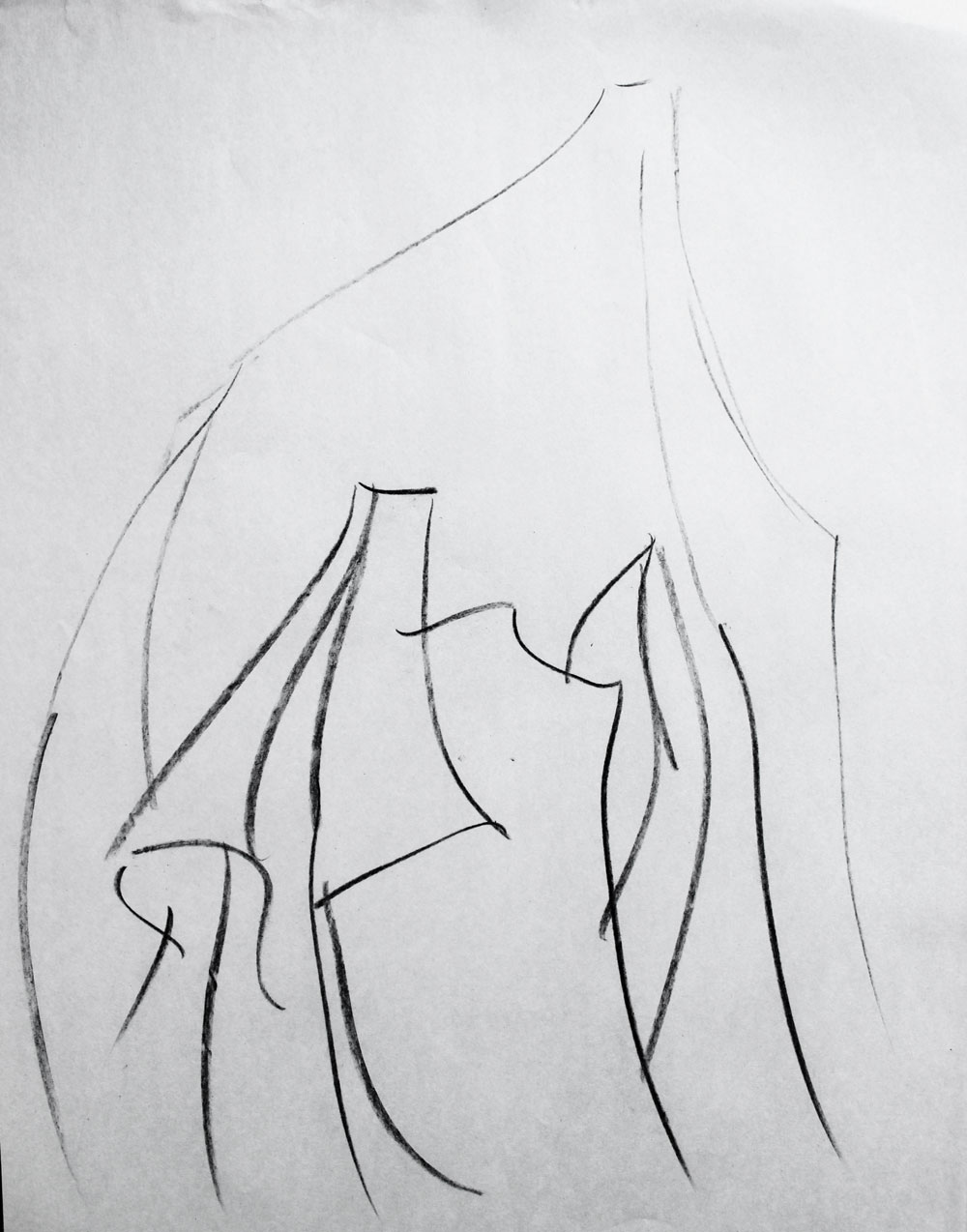
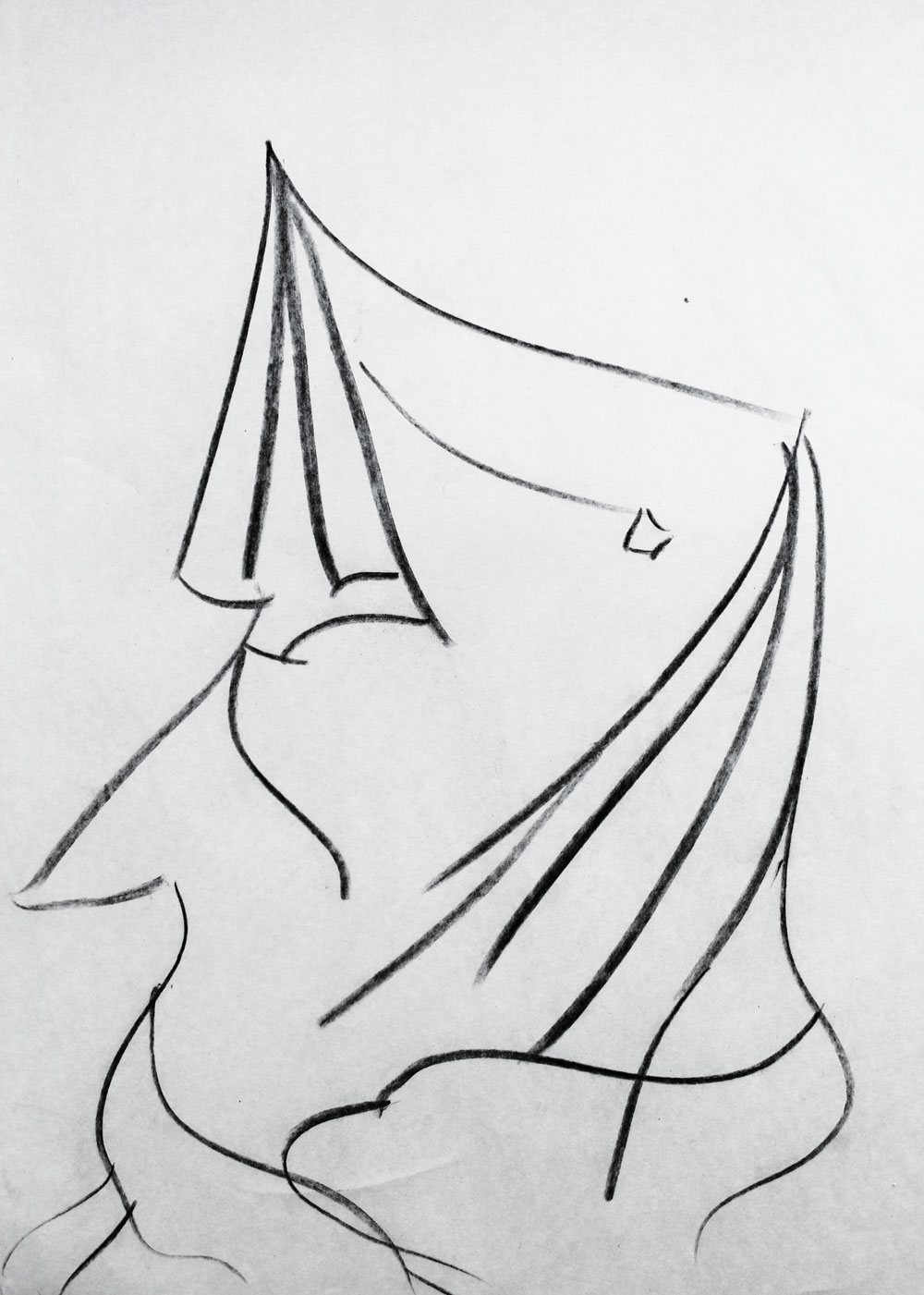
We completed a couple of experimental drawings where we had to use a variety of media to depict chaotic wires that our professor would move throughout the session. Every now and then she’d throw a challenge at us, like “erase a 5” x 5” section of your drawing and fill it in with something else!” To be honest, I’m not really sure what the point was.
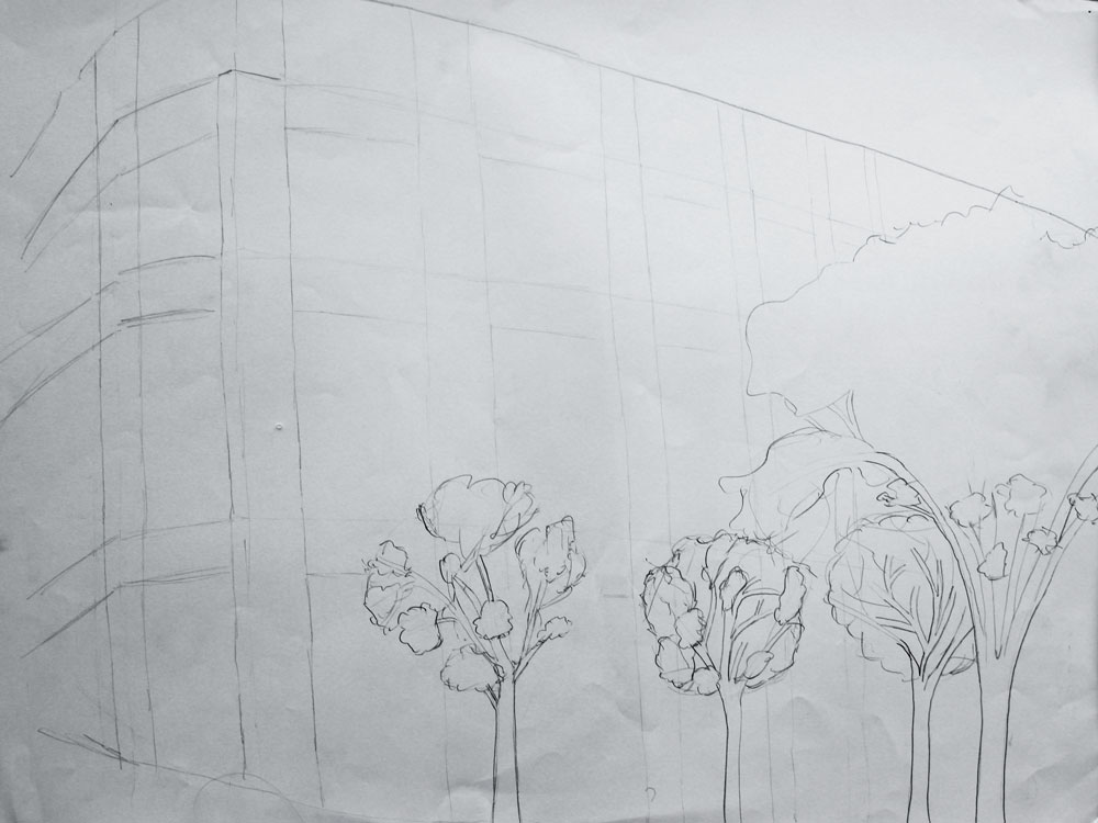
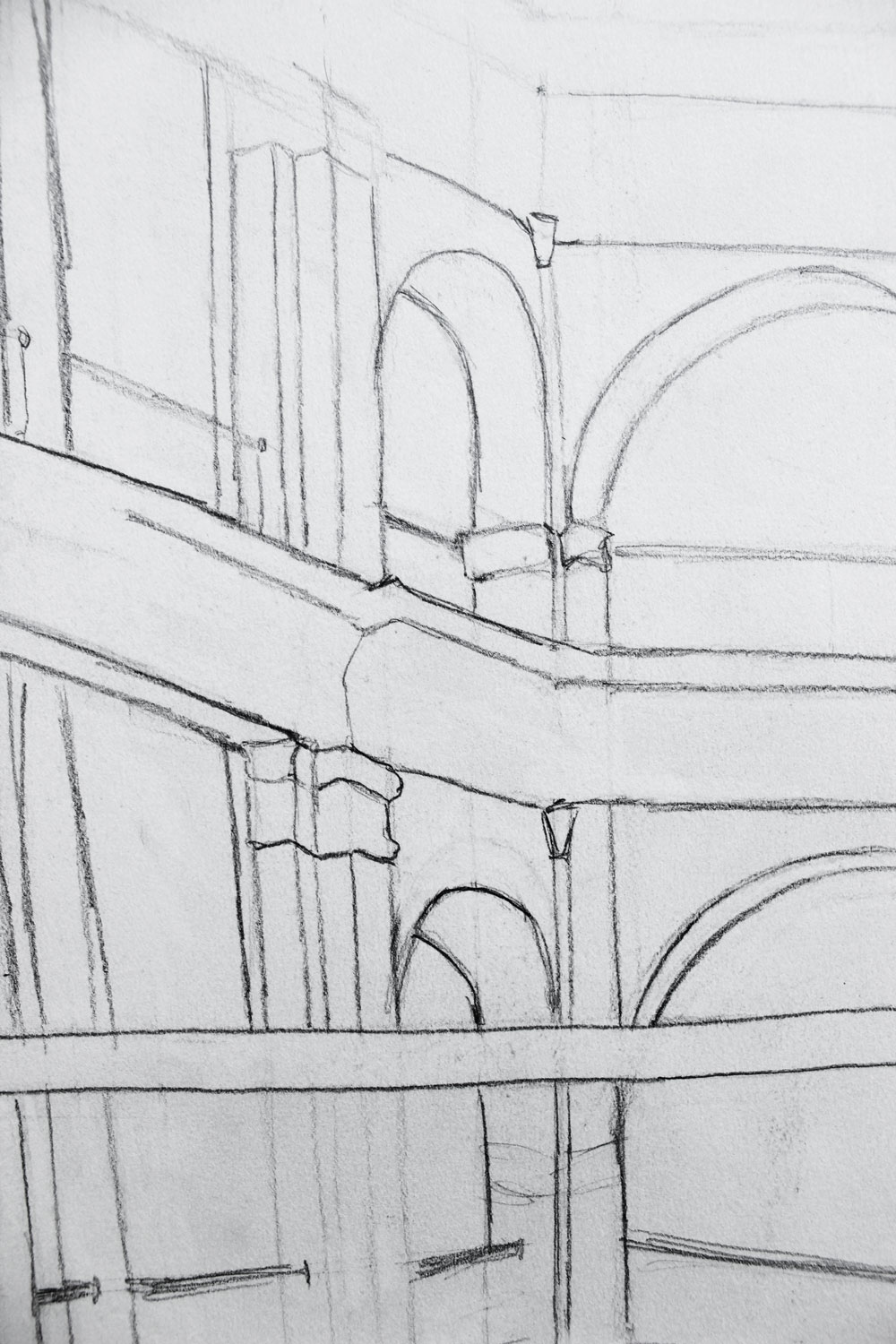
We did a number of line drawings in pencil to test how well we could capture three-dimensional space on a two-dimensional page. This first one is of the outside of the fine arts building on campus and took about forty minutes. My professor said she liked the trees.
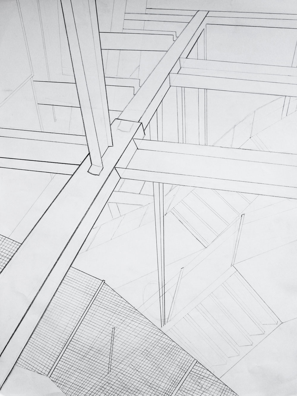
The next one shows the view if you look up towards the ceiling of the URBN Center, which is the building that houses the college of design. The perspective here is a little wonky, and I remember really struggling with this one.
This is from the second-floor balcony of our administration building, and again, the perspective is off.
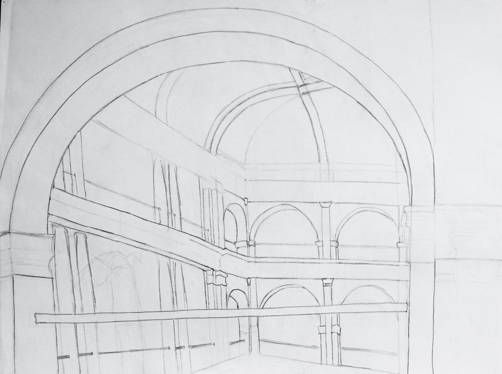
I remember being caught up in the details and only realizing the perspective was off when I took this picture and really saw the whole thing.
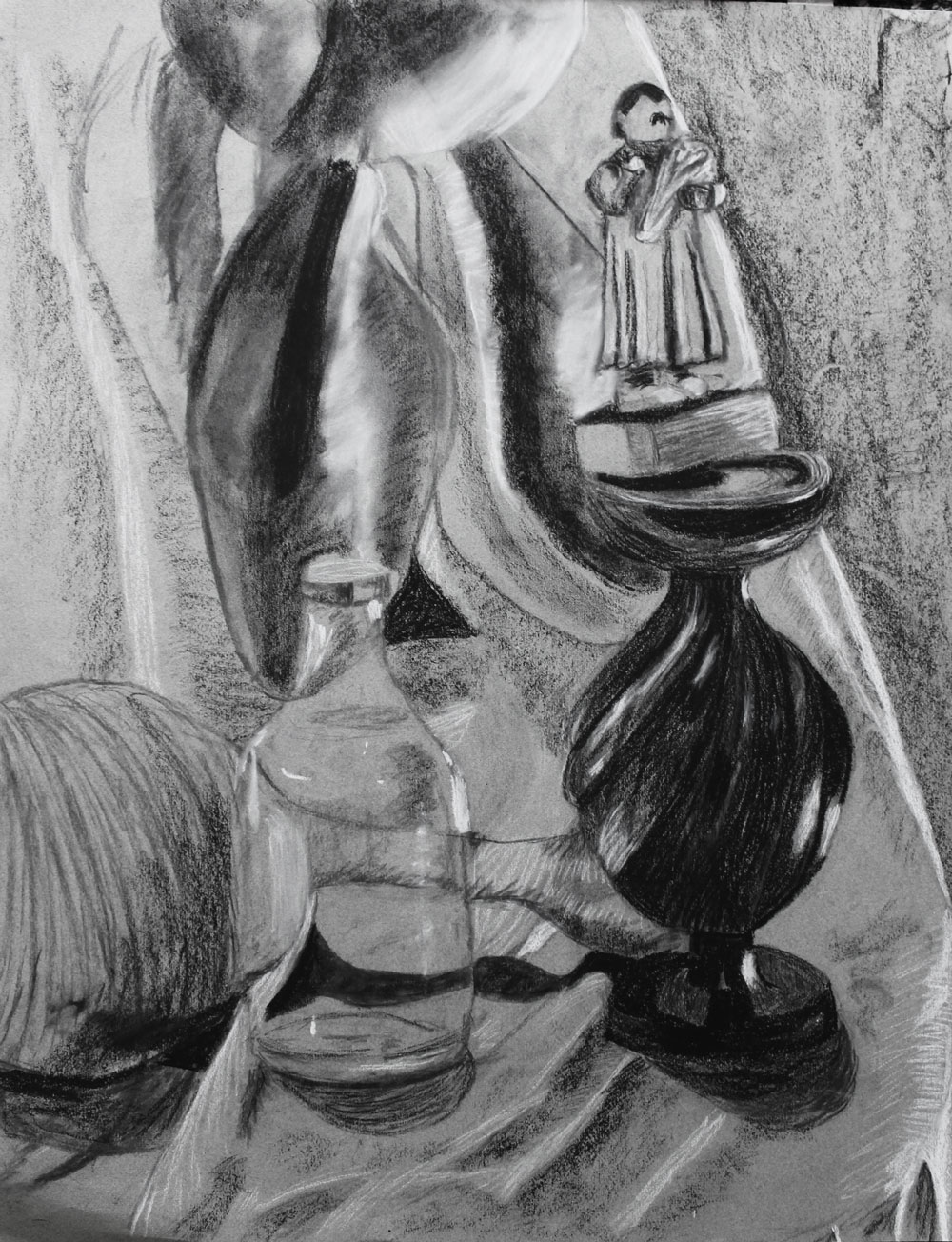
Later in the quarter, we moved on to charcoal. We did a lot of exercises where we covered the page in charcoal and had to erase out the negative space. Here, we depicted a bunch of stools stacked haphazardly in the center of the room:
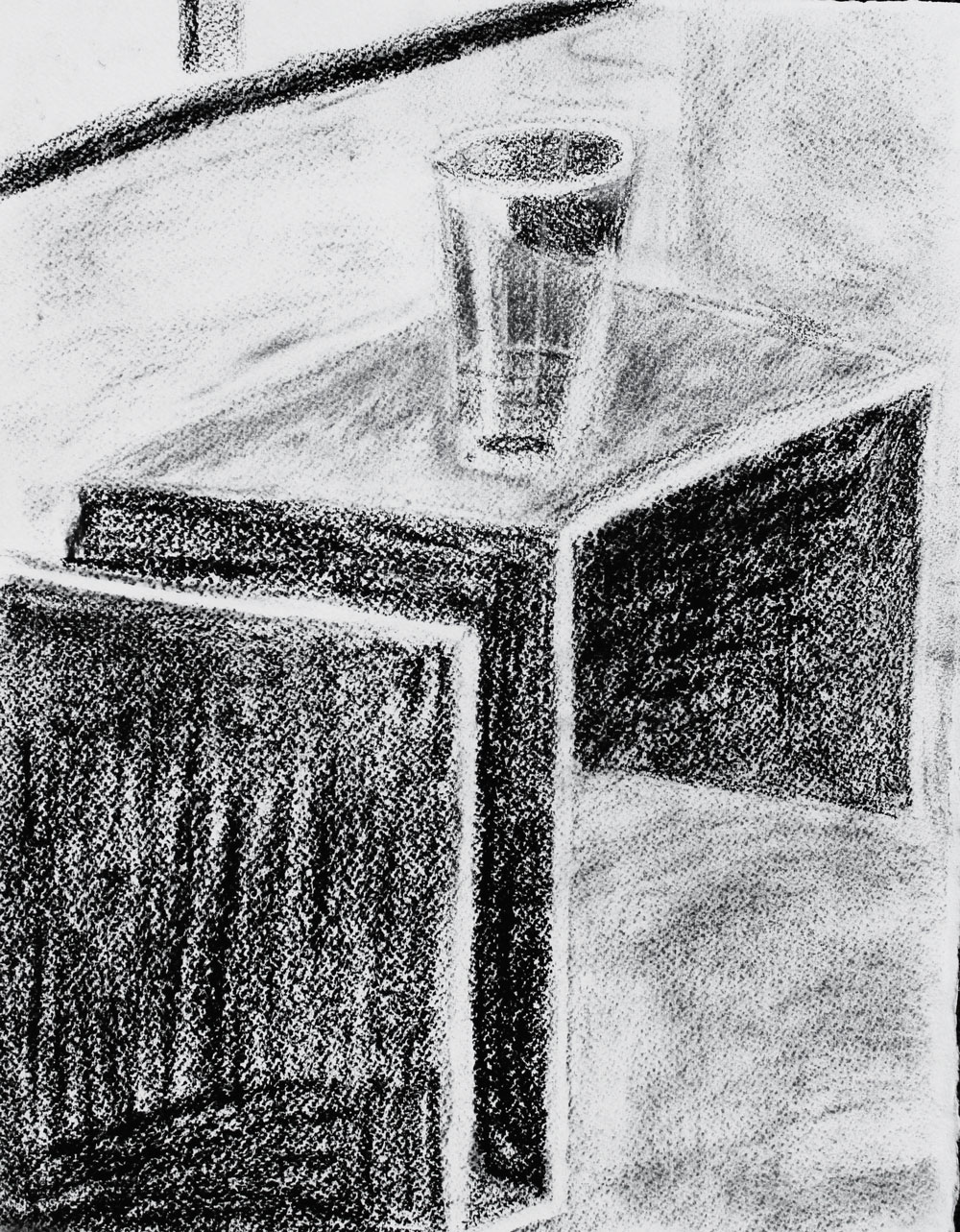
This is probably my most mediocre charcoal drawing. I do like the glass though.
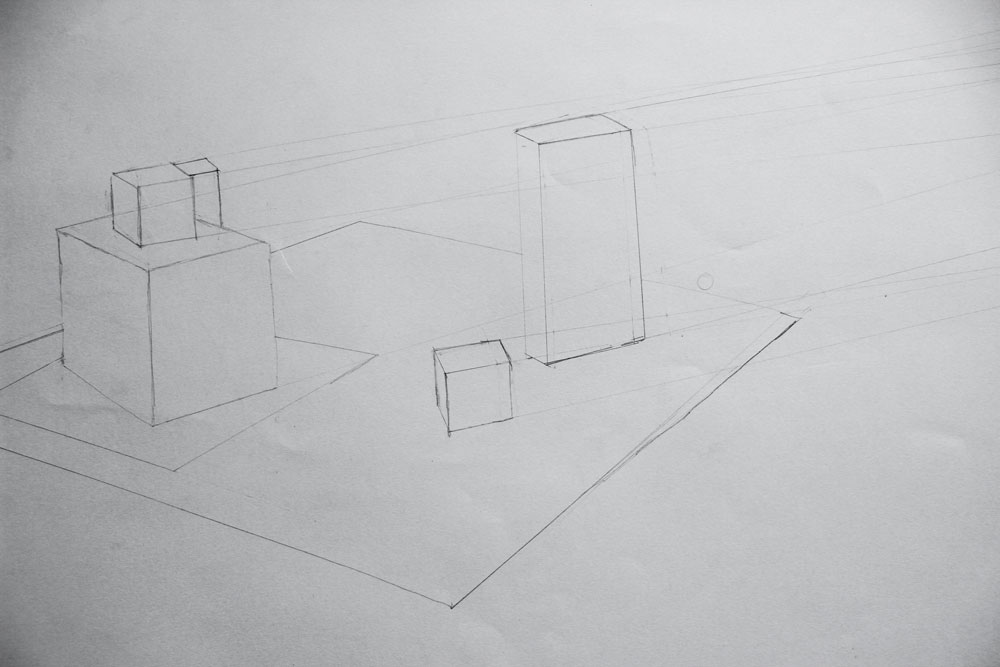
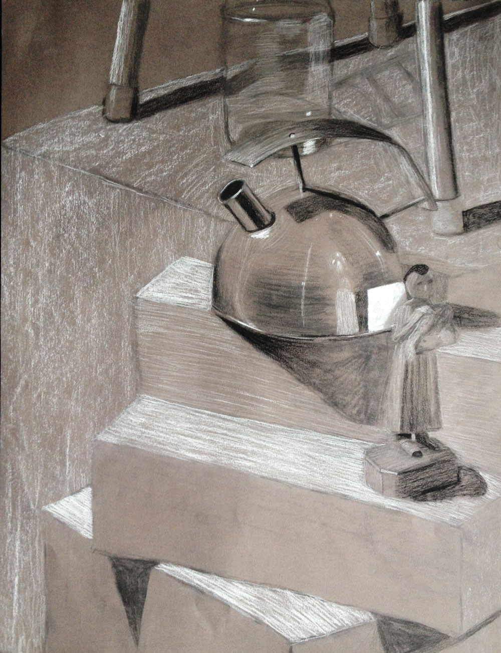
We drew a lot of white boxes in a dark room with a couple of spotlights shining on them. When you’re still learning, dramatic lighting is much easier to draw than more subtle lighting.
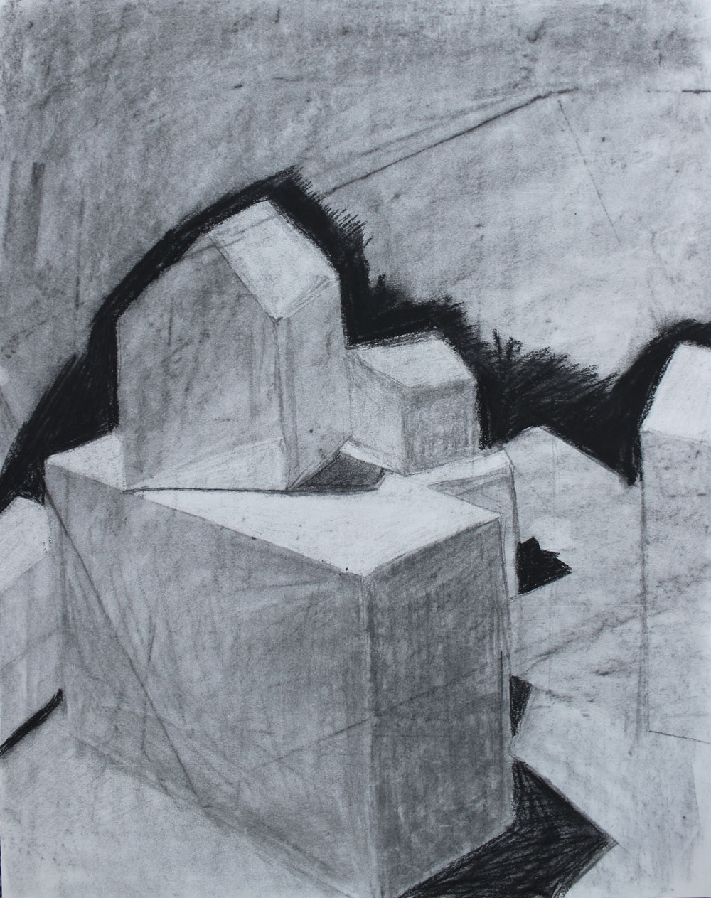
For this drawing, we got to make the setup ourselves, which was very exciting. We spent about ten minutes deciding which objects to put on the platform and where, drew for a whole three-hour session, then came back for the next class to find that it had been moved by another class! We had to set up as best as we could using our drawings as a reference, but because of the disturbance, our drawings are all a little ambiguous. I still like it though.
This next one is my absolute favorite and the one I’m most proud of. To someone drawing-averse like me, shiny and reflective objects are extremely scary, but I love how this came out.
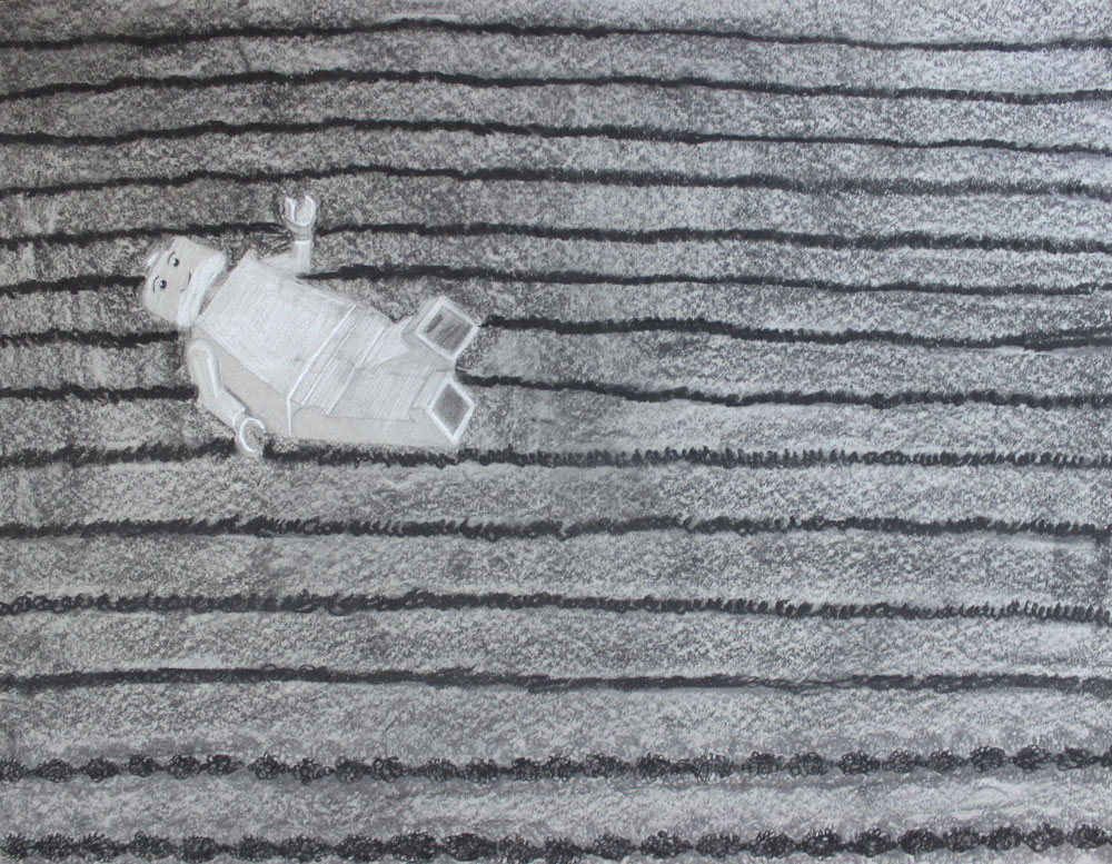
For the final, we drew words out of a hat and had to create a black and white drawing portraying that word. We also couldn’t include people in the piece. I got the word “desolate.” I wanted to show something that was abandoned, and I thought using a Lego man as a stand-in for a person was an interesting idea. I positioned him as if someone had just dropped him on the floor and forgot about him.
Ultimately, this was a hard class for me, but I’m glad I took it. My drawing skills greatly improved, and I had fun. I don’t think I’m going to be taking any drawing classes that aren’t required, but I enjoyed my experience with this class.
Non-Design Classes
Composition and Rhetoric I (Freshman English)
Even though I was a transfer student and had already taken quite a bit of college English, Drexel still made me take their freshman sequence. I remember really enjoying my professor but thinking the actual class was ineffective. I think the goal was to just get all freshman to be competent writers, but because the classes weren’t split up by ability, a lot of the students in each section were already terrific writers and a lot needed more help than we had time for. If you ask me, it makes more sense to really help the students that need help and challenge the ones that enjoy writing.
Still-Deciding
This class was where they stuck you if you got into the design college but hadn’t declared a major. I was nervous because I thought it would be silly, but it was a great class. It was taught by my academic advisor, and the goal was to get us to declare a major by the spring. We observed one upper-level class in a major we were considering each week and then wrote about it, and towards the end a panel of students from all the majors came in and answered our questions.
I had come into Drexel being pretty sure I wanted to be a graphic design major (which I did end up choosing), but the Product Design program director’s presentation to us was so good that I seriously considered Product Design for several months. I’m still considering minoring in it, but we’ll see!
The Drexel Experience
Every Drexel freshman has to take this class. In my college, it’s taught by your advisor if you’re undeclared (like I was) or by your program director if you’re in a program. As a freshman, it’s a great way to immediately get to know beneficial people for you to know. This is the class where you learn about the university’s resources and what’s available to you, and do Alcohol Edu, and stuff like that. It can be a drag, but it meets for an hour each week, so it’s not a big deal.
Conclusion
The first quarter of design school was a marathon of me fumbling my way through really painting for the first time, realizing that I’d be spending a fortune at the local art supply store, and pushing through a class for which I had no natural talent. I worked really hard, really struggled, pulled all-nighters, and questioned my ability to get everything done, but not once did I question my choice to come here.