I Learned Graphic Design by Being in an A Cappella Group
For three years while I was at the University of Chicago, I was in an all-female a cappella group called Men in Drag. It is during those years that I gained a solid foundation in graphic design and realized that I wanted to be a designer. When I joined Men in Drag in 2011, the group was just starting to climb. It was getting national recognition for recordings, and that would be the first year that it entered a competition. I sensed the group would benefit from a more polished visual presence, so despite barely knowing Photoshop, I volunteered.
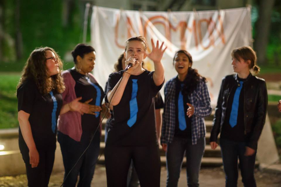
I started with what any excited college student would start with: t-shirt designs. My design was inspired by the group’s defacto costume (a white button-up shirt with a bright blue tie) and the classic tuxedo t-shirt. At the time, I just thought they were kind of funny and cute, but it quickly became clear that the shirts were incredibly recognizable the first time we went to a festival that spring and were referred to several times as the “blue tie girls.”
For the first year, I made myself busy designing concert posters, tickets, and programs. Men in Drag concerts were themed, so the visual identity for each concert had to be unique, but it still needed to be clear it was a Men in Drag concert. I muddled through InDesign (I had never used it before) in an attempt to create something wonderful each time, and the other girls in the group critiqued my work until time ran out.
Throughout my first year in Men in Drag I grew from someone who didn’t know anything about typography or hierarchy into someone who could put together a decent poster. That summer, I turned my attention to designing a new logo. I wanted something clean and professional, but still slightly whimsical, and I think I did a pretty decent job.


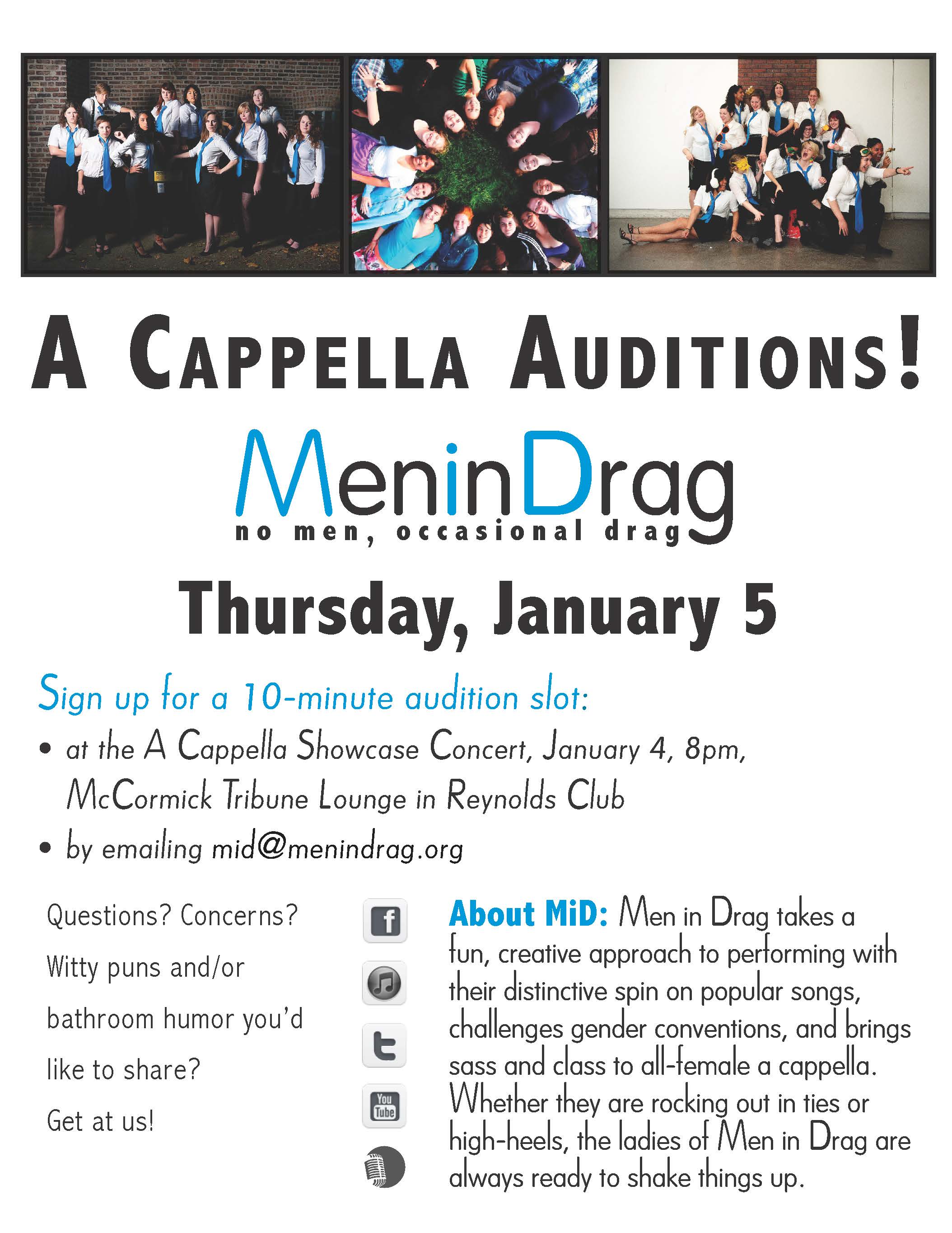
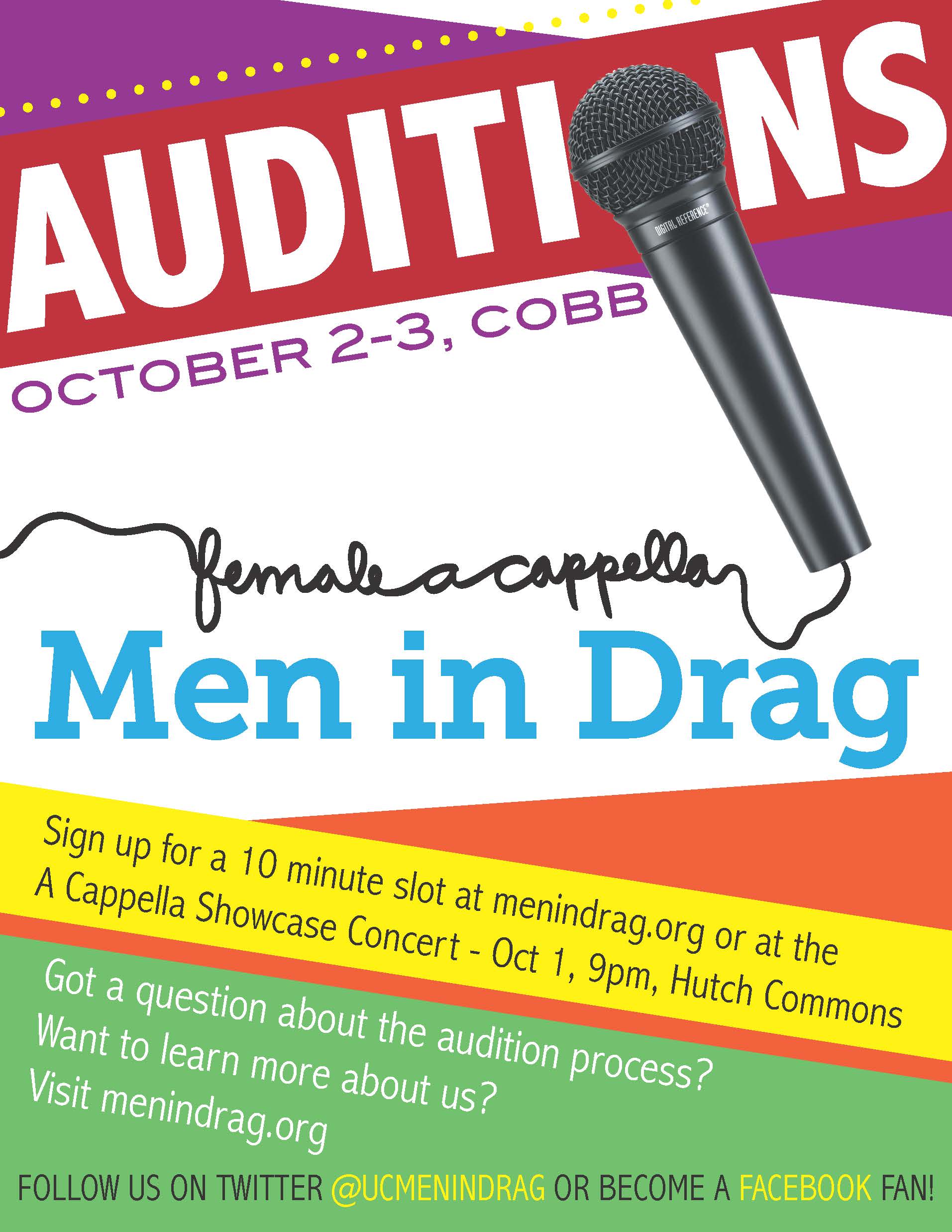
During the second year I started to find my groove. I was making smarter choices about typography and layout, and my designs began looking more polished. The 2012 audition poster has eyecatching colors and a composition that stands out on campus bulletin boards, but it still looks good when shared on social media. I even pulled out my old Wacom tablet for that microphone cord because I thought about the effect I wanted and how I could achieve that with the tools I had, rather than letting the tools dictate the design. There’s less text but still too much (why did I feel the need to explain why someone might wish to visit our website?)
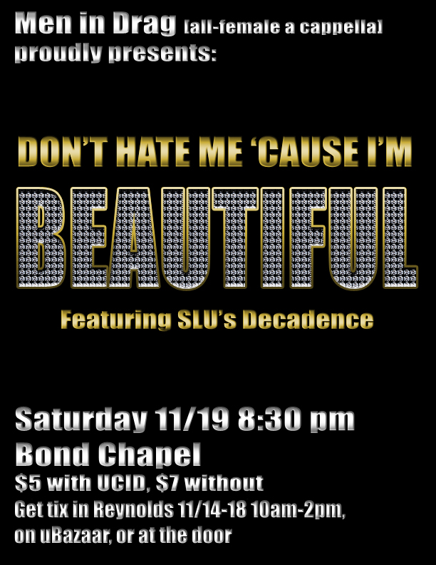
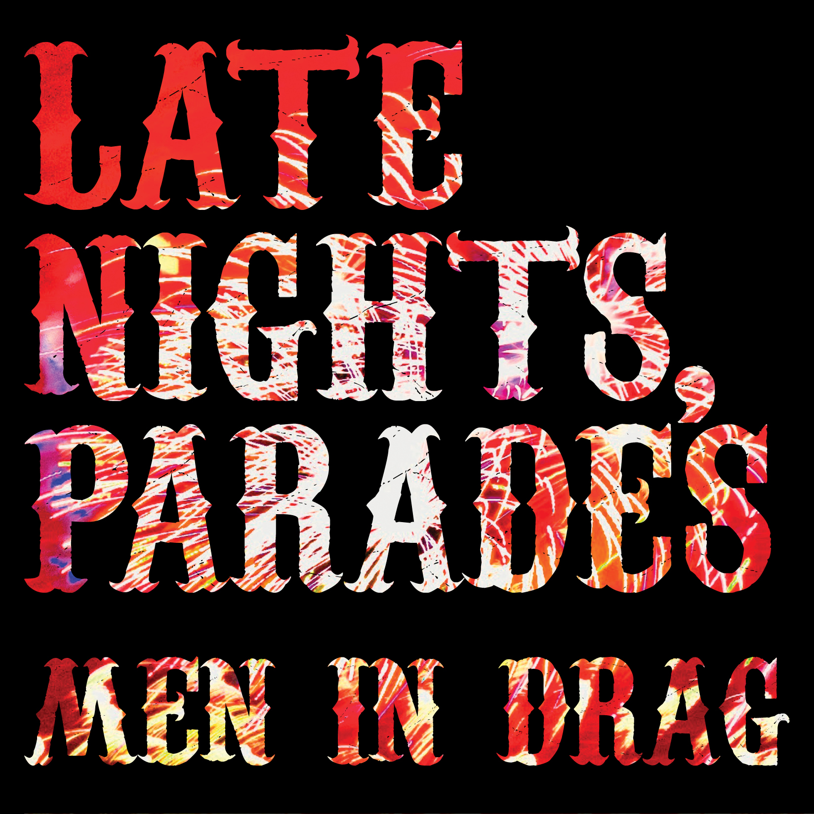
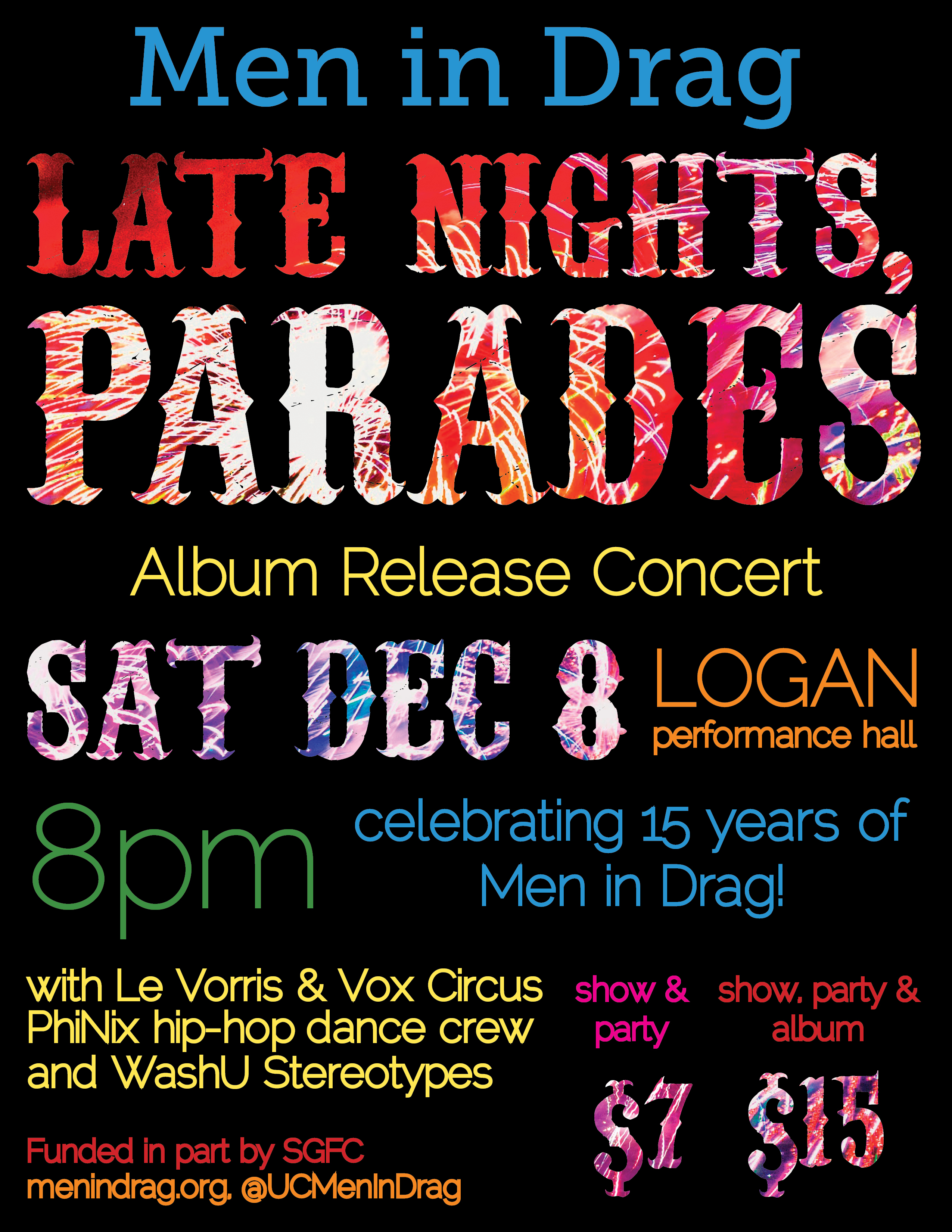
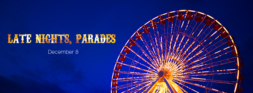
Later that year we released a CD and had a huge concert to celebrate. I wanted to make sure the album art (which I designed) matched concert branding in one cohesive system, and that was the first time I had really thought that way. I also made collateral to be used on social media to promote both the release concert and the album. The group chose to name the album Late Nights, Parades after a lyric in one of the songs, and we thought fireworks and a general summer summer carnival theme fit with the title and the effervescent songs. The gorgeous photos were taken at Navy Pier by our friend Mike Glista.
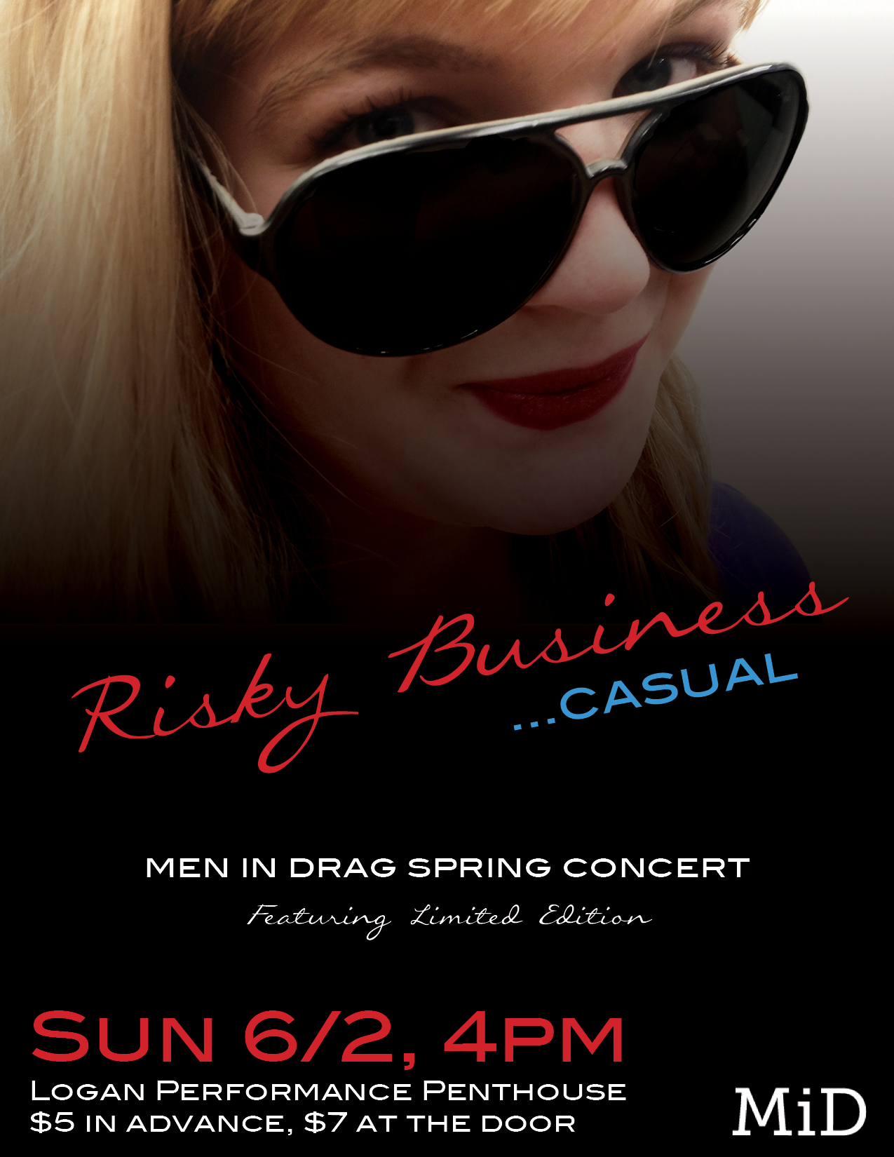
For the spring concert, we parodied the movie Risky Business so I wanted our poster to look like that poster.
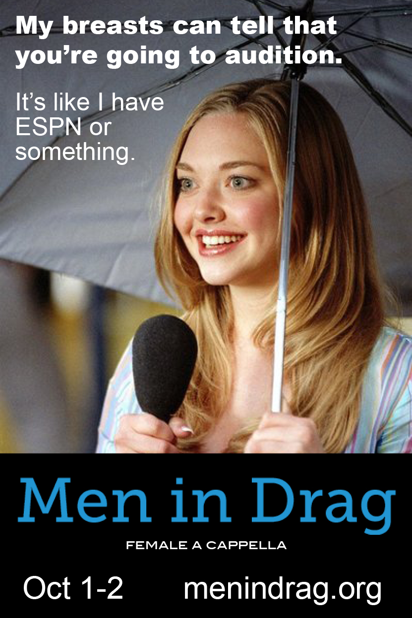
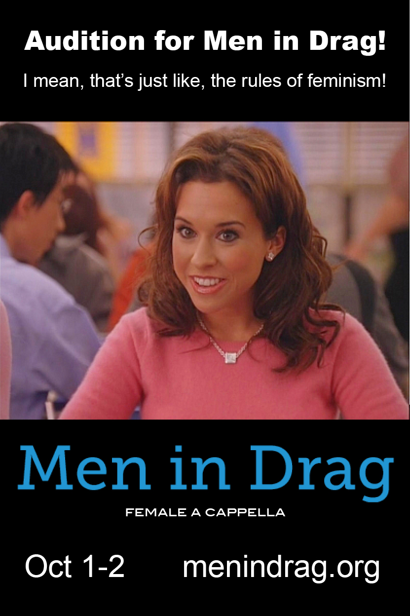
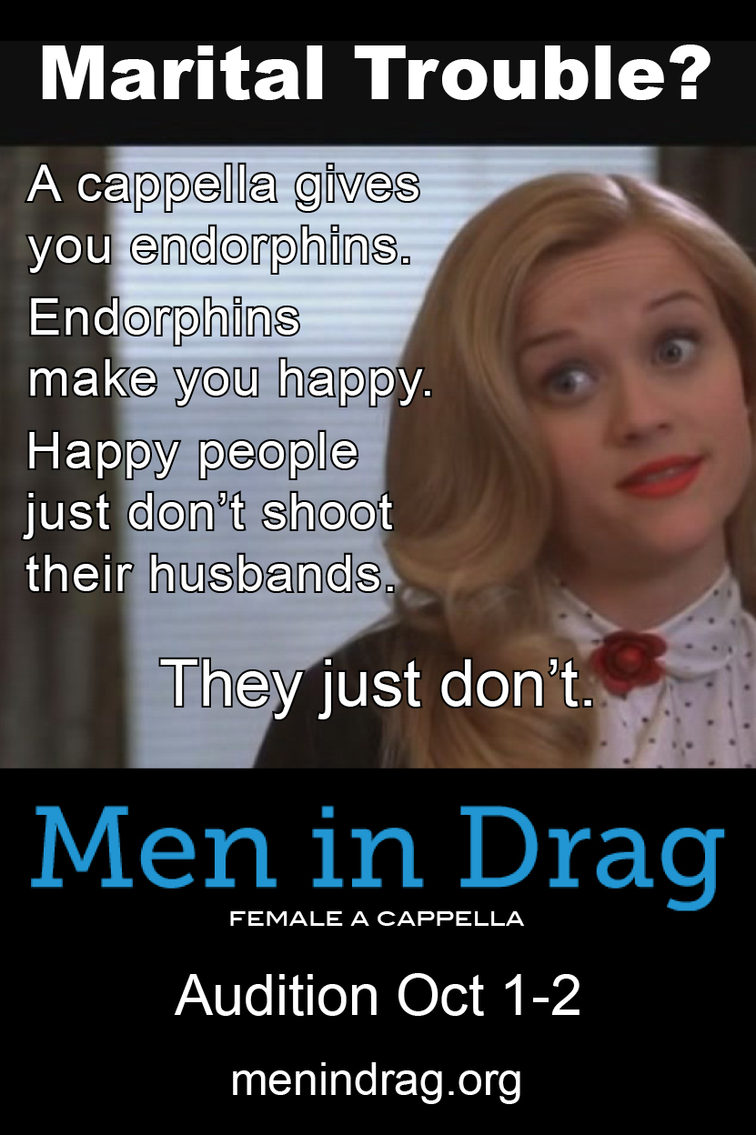
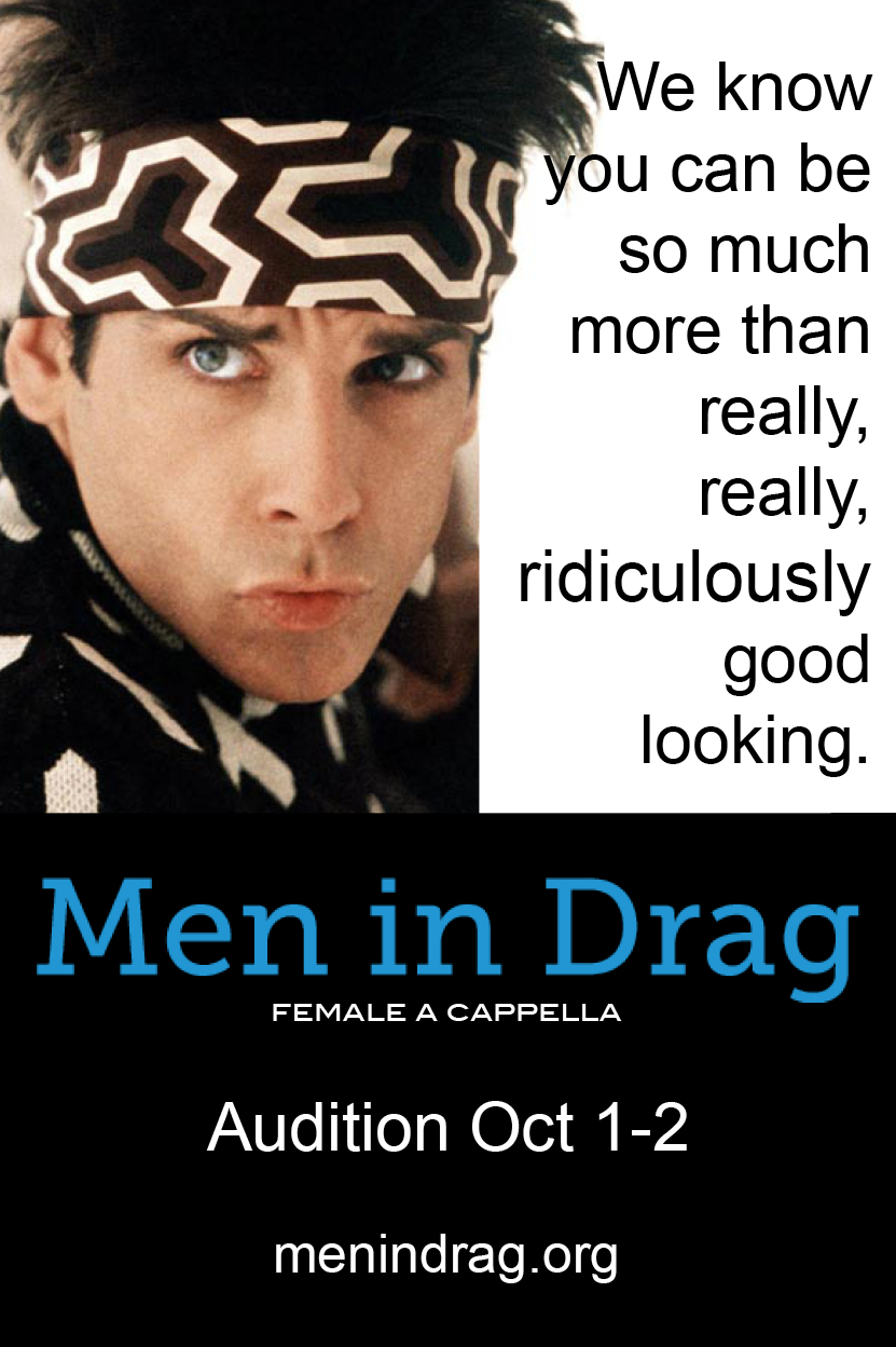
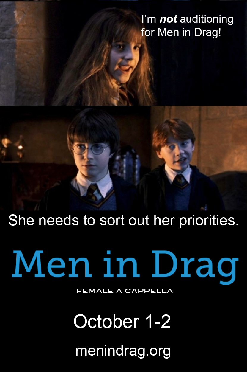
For auditions at the beginning of my last year in the group, we wanted to really focus on getting as many girls as possible to not only audition, but to choose to be in our group if they got into several. I knew what distinguished Men in Drag from the other groups on campus was that we were an extremely fun group of girls to hang out with, and we were all close friends. I decided that the best way to showcase this was by making funny posters. I wanted to take several different movies that our target auditionee would have watched growing up and make them look like memes. I decided on having five different posters that would plaster the campus and UChicago social media groups.
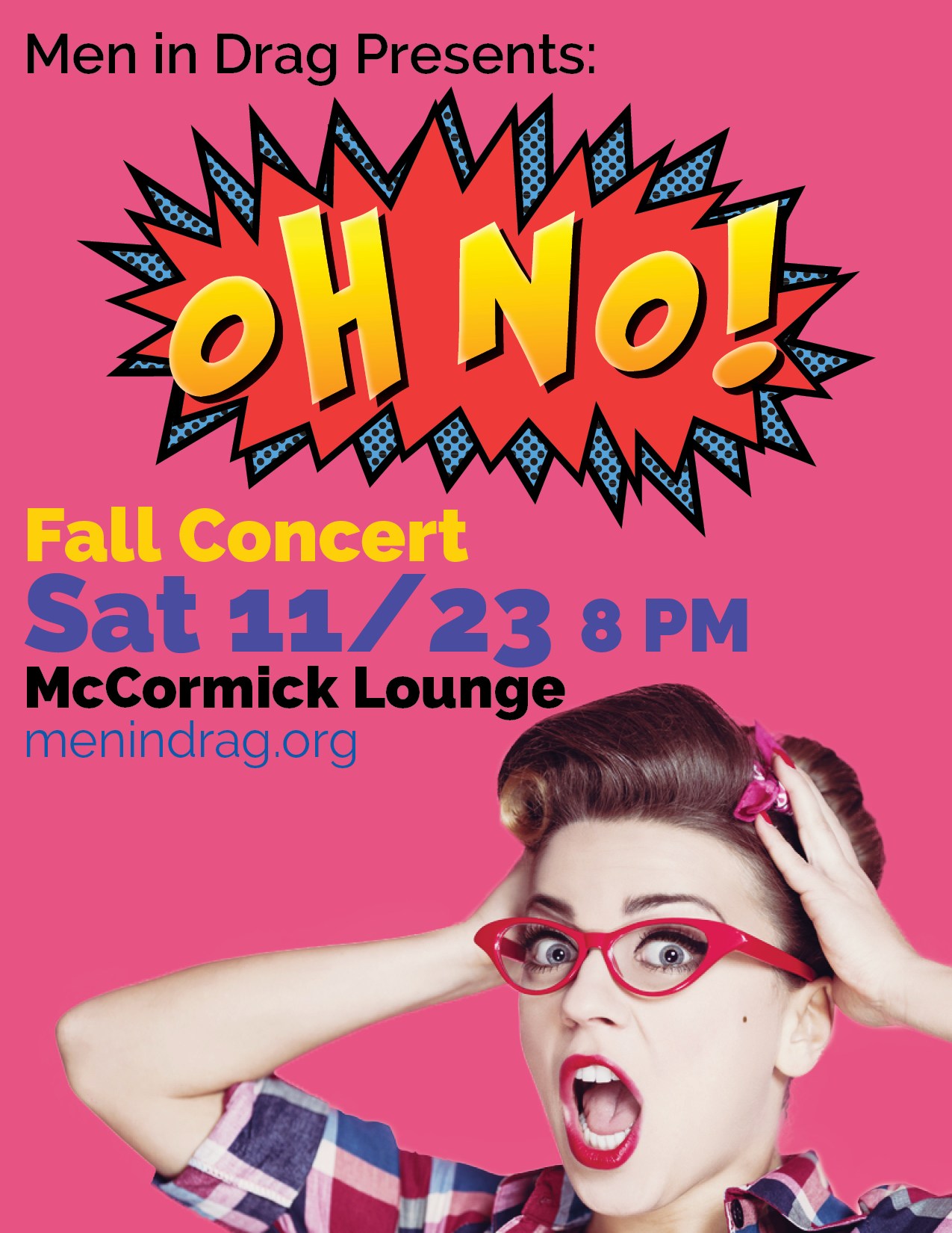
For the fall concert I continued the upward trend of solid design from the previous spring and used my first stock photo! I was also obviously obsessed with Raleway for a solid two years.
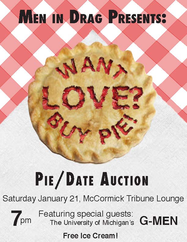
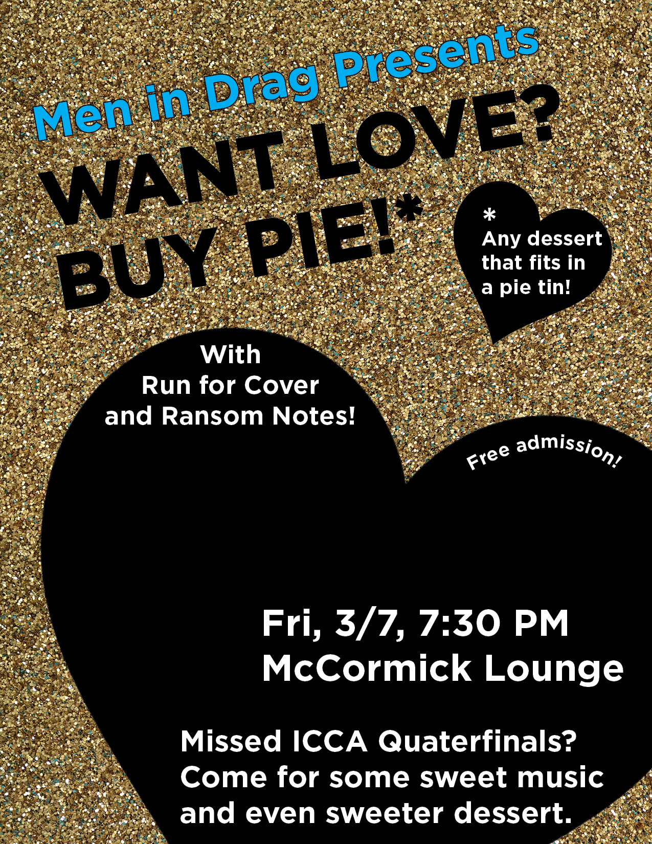
The 2014 poster for the annual Pie/Date auction was a step backward. We had been wearing black and gold, so I thought a background of gold glitter would be a great idea, but most people couldn’t tell what it was. My friend thought it looked like sand.
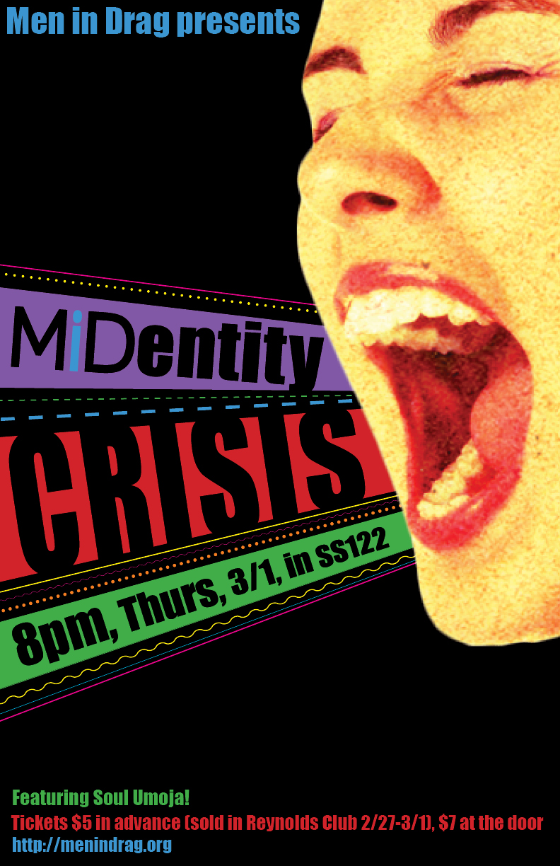
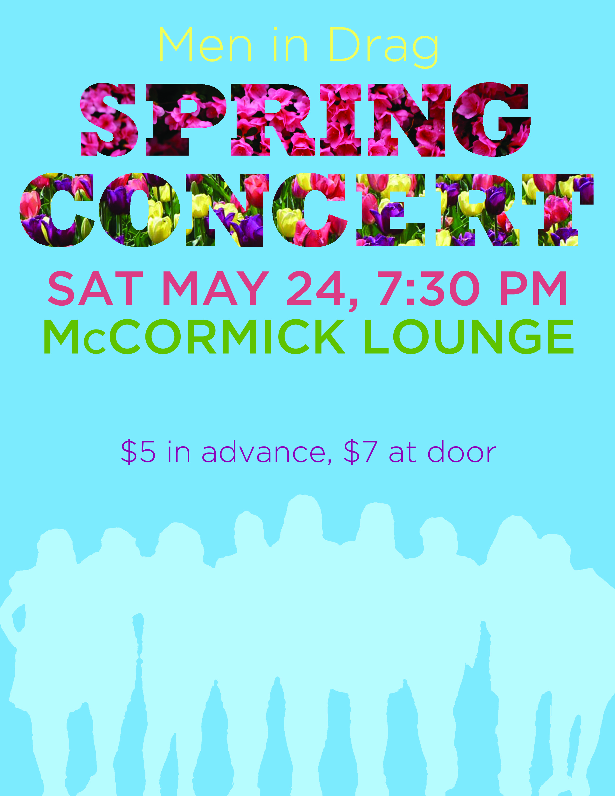
The spring concert was tough because we decided it shouldn’t have a theme. I didn’t have anything to go off of. The end result was somewhat polarizing, but I like it.
Ultimately, I learned design principles not from being in an a cappella group itself, but from filling a need I observed in an organization I cared about. No one else was stepping up, I had taken a couple graphic design classes in high school, and I cared too much to just not do anything. I think that’s how a lot of us fall into things we love.
I will always be grateful to that group and those girls for their patience with me while I was learning the ropes, and for encouraging and supporting me as I left UChicago to pursue design. It’s how I ended up here.