Dont Make Me Think by Steve Krug: A Review
★ ★ ★ ★ ★
Don’t Make Me Think by Steve Krug reads like part guidebook, part essay on why usability is important, how to do usability testing, and how to solve some common usability problems. If you’re interested in web design or development, or any kind of interactive design, I cannot recommend this book enough.
Summary
Much of this book is spent defining usability and showing the reader usable website features versus less usable ones.
Krug breaks usability down into seven attributes:
- Useful: does it do something people need done?
- Learnable: can people figure out how to use it?
- Memorable: do they have to relearn it each time they use it?
- Effective: does it get the job done?
- Efficient: does it do it with a reasonable amount of time and effort?
- Desirable: do people want it?
- Delightful: is using it enjoyable, or even fun?
Krug’s overriding principle of achieving usability is, “Don’t make me think.” He says it’s “the ultimate tie breaker when deciding whether a design works or it doesn’t.” This principle should be the guiding star when confronting design decisions. Clickable links and buttons should look clickable, for example, because if they don’t, the user has to take the time to figure out whether or not they can be clicked. Forms should be programmed so that it doesn’t matter which format the user enters a telephone number, date, city, or anything like that. The developers should do everything within their power to make every action of the user’s mindless and easy.
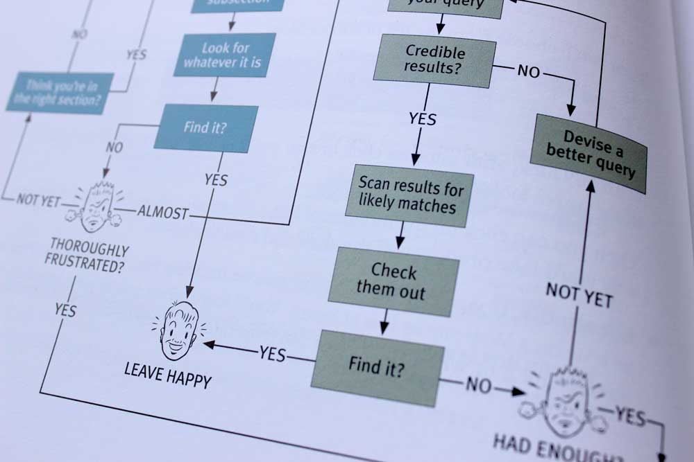
There is also a whole chapter describing how people use the web. Basically, they scan instead of read. Designers have to remember that users usually come to a site with a specific purpose in mind, and they scan the pages they come across to find phrases relevant to that purpose. They value speed over accuracy, and if they quickly click a link they think will take them to where they want to and it doesn’t, they just use the back button and try again. There’s no penalty for wrong guessing. Krug says that designing for this type of consumption is like designing for a billboard on the side of a highway.
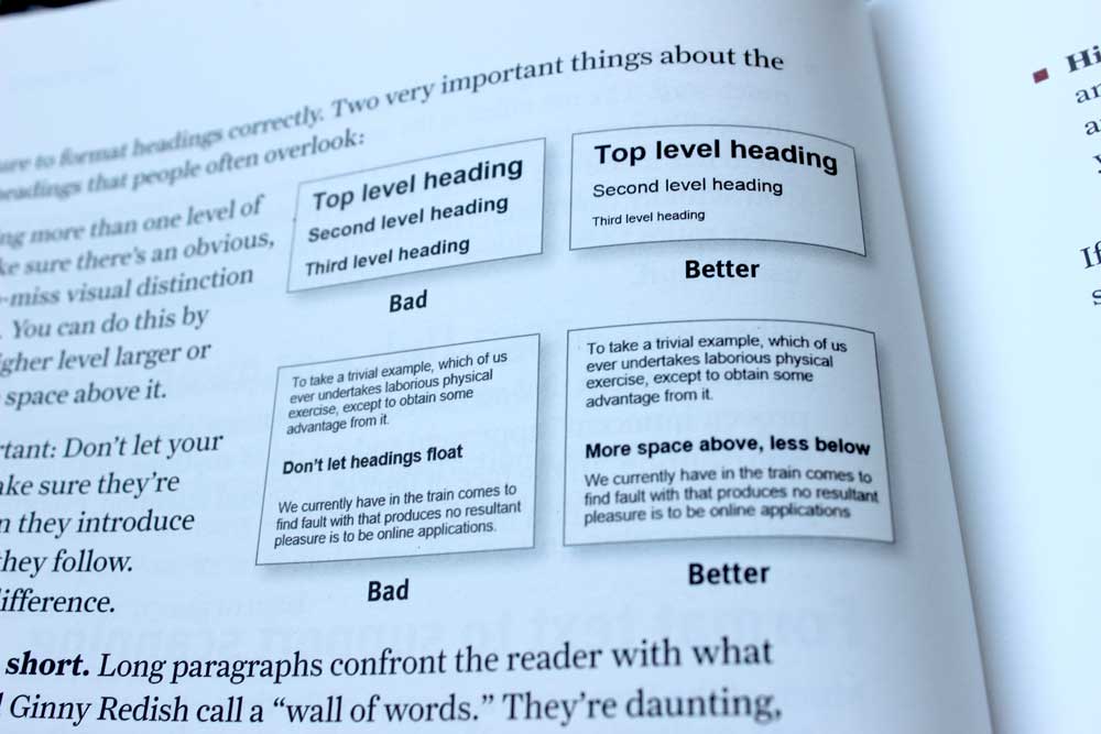
The thing I learned that stuck with me the most applies to both web and print design: don’t have floating headings. Headings should be closer to the content below them than above them. This makes it clear what section the heading belongs to.
Krug states in the beginning that he wouldn’t provide a list of hard-and-fast rules to follow when desigining or developing. However, there were several points he hit pretty hard:
Design Rules
- Don’t make me think
- Clarity trumps consistency (if you can make something significantly clearer by making it slightly inconsistent, do it)
- Break up pages into clearly defined areas
- Make it obvious what’s clickable
- Include ways for users to know where in the site they are, like breadcrumbs or highlighting the current section in the menu.
- Always have the site logo in the main navigation link to the home page.
- Include a search bar. There are tons of users who search instead of browse.
- Include a title on every page
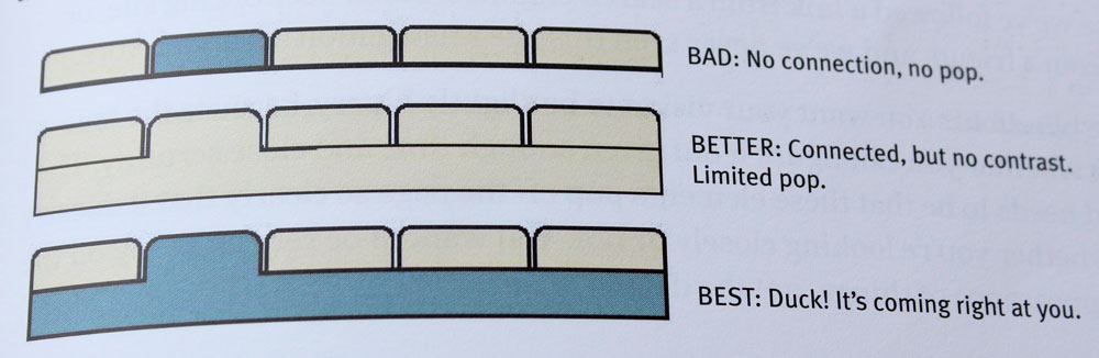
- Tabs are great but only if there’s a clear connection between the current tab and the content, and there’s a contrast in color between the current tab and the inactive ones.
Copyrighting Rules
- Format text to support scanning
- Guidance, when necessary, should be brief, timely, and unavoidable (like tips next to form fields, ‘what’s this’ links, and tool tips)
- Forego the instructions on how to use the site or fill out forms. Make it obvious.
- The home page needs to answer these four questions: what is this, what can I do here, what do they have here, and why should I be here and not somewhere else?
Mobile Design
- It’s okay for mobile users to have to tap more as long as they feel confident that those taps will take them where they want to go.
- Don’t assume mobile users are on the move. A lot of them are on their couches.
Usability Testing
- Testing one user early in the project is better than testing 50 near the end
- People are almost always surprised by usability tests
- Focus on fixing the most serious problems first
General Things to Remember About Users
- There is no average web user—they’re all unique and ideosyncratic
- Each user has a “rexervoir of goodwill” towards your site and your brand. It’s idiosyncratic, it’s situational, you can refill it, and sometimes a single mistake can empty it.
- Making your site accessible is simply the right thing to do
My Thoughts
Don’t Make Me Think is an excellent book. I read it as I set about designing my personal website, and it reminded me that the most important aspect to a website is that people know how to use it. There should be no fumbling, no guessing, no feeling around in the dark with a flashlight. Things should be as clear as possible.
I was always taught that in the design world, form follows function. Which is to say that our primary objective is to make sure the problem is solved, and our secondary one is to make sure the the solution looks good. But until this book, I never thought about how form can influence function. And this makes perfect sense: your website can be set-up and coded beautifully, but if the user interface is confusing and drives people away, you’ve got a big problem.
One place I disagreed with Krug was in his mobile section. He says, “The siren song of one-design-fits-all-screen-sizes has a long history of bright hopes, broken promises, and weary designers and developers. If there are two things I can tell you about scalable design (aka dynamic layout, fluid design, adaptive design, and responsive design), they’re these: it tends to be a lot of work, it’s very hard to do it well.”
I know I’m new to usability and web design in general, but I’ve only ever had bad experiences on mobile sites. Responsive sites, though hard to make, allow for a better experience in my opinion. That’s also the direction I’ve seen the field heading.
Ultimately, this is a great book. It was informative and a joy to read (Krug cracks jokes and has cartoons throughout), and it opened my mind to a new way of thinking. I highly recommend it!